


The Dark Side
Here are a few interiors that are exploring and expressing their dark side.
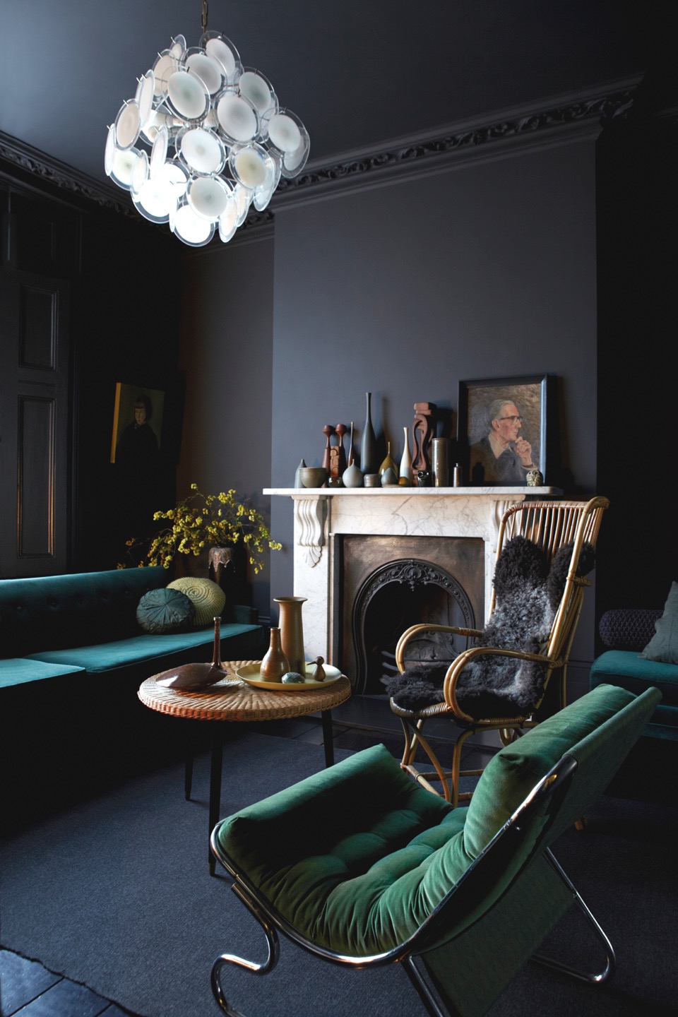
{Graham Atkins-Hughes' family home in London, styled by wife Jo Atkins-Hughes. Graham also photographs a lot of Abigail Ahern projects, and I can definitely see a similar taste and influence there. Image from Milk Magazine}
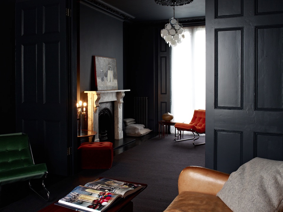
{From the same home as above, this dark panelled lounge exudes a moody confidence. 'Photographed by Graham Atkins-Hughes and styled by Jo Atkins-Hughes}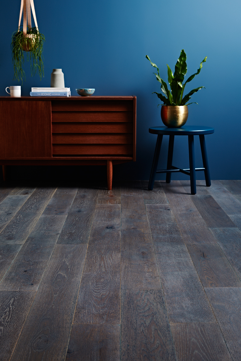
{Not quite as dark, but still strong, this scheme by Texture Design for Godfrey Hirst flooring campaign shows beautiful combinations of dark block colours and textures}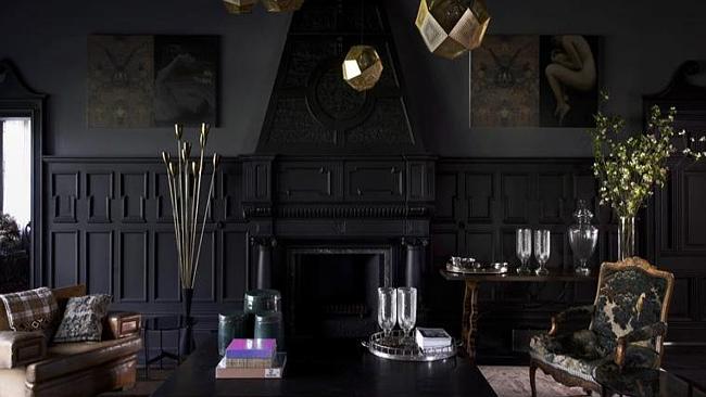
{This circa-1880s home in Armadale, Melbourne features dark walls with black panelling, taking this extravagant character home to a new level}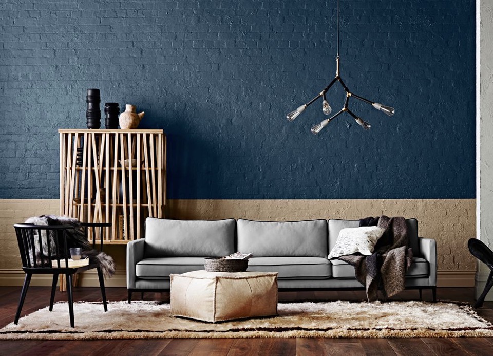
{Styling for the 2015 Dulux Colour Forecast 'Wildland' colours. Loving that deep sea blue wall}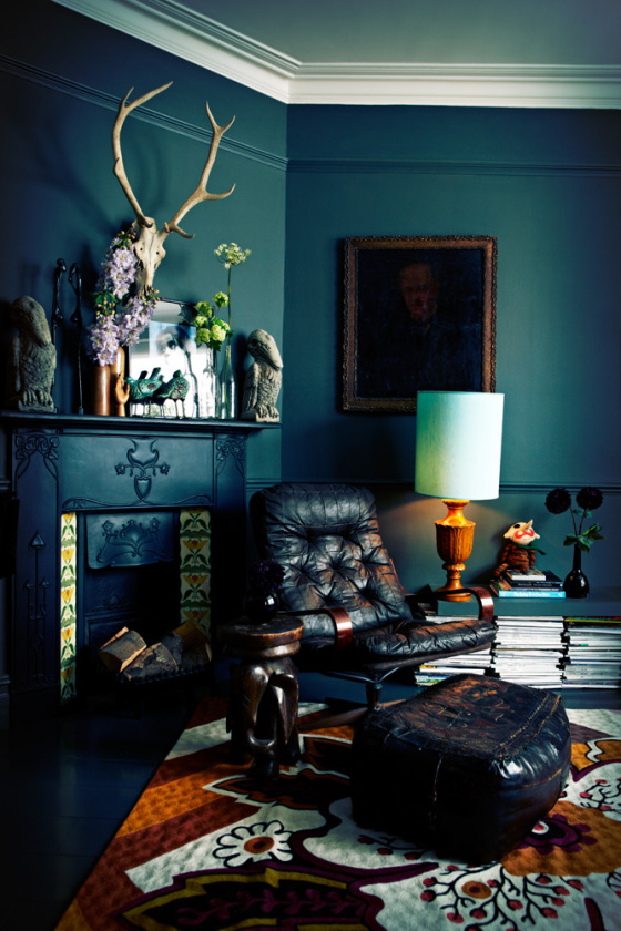
{Dark, moody interiors by the ever-impressive queen of dark interiors Abigail Ahern}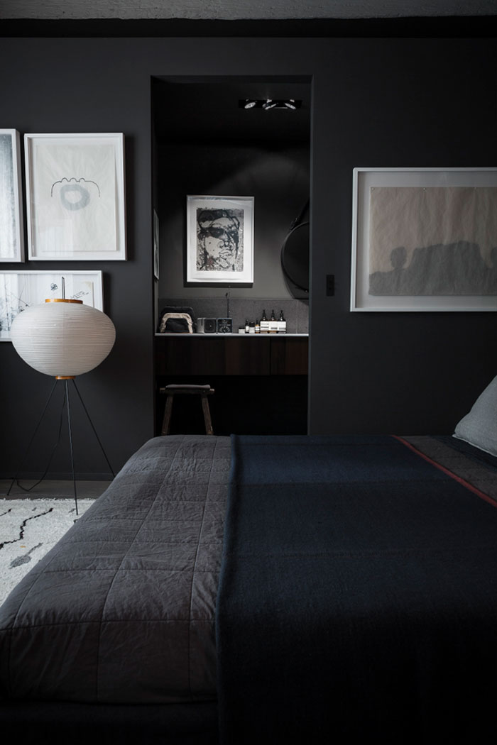
{Dark bedroom in shades of grey. Photo by Romain Ricard}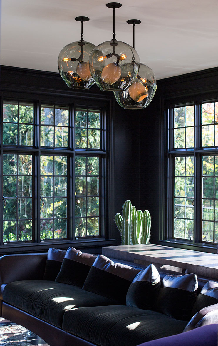
{Dark walls with black window frames allow the natural light and view to green foliage beyond to shine, not to mention the beautiful Lindsey Adelman pendant}
What do you think about dark interiors, especially in the Australian setting?
Would you or have you used dark interiors in your home?
xo Romona![]()
Concrete jungle
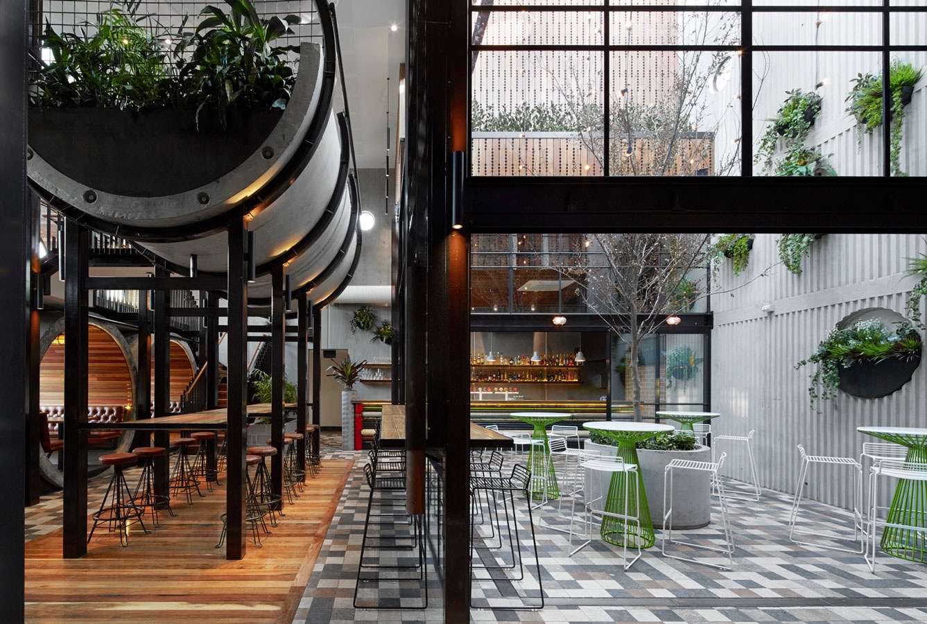
{Prahran Hotel interiors by Techné Architects}
Home Open
Before I get too soppy, the main reasons for this post were to give you some cheap update ideas for your home, a few tips for simple styling for sale and giving you a sneaky-peak into our lives and home. Enjoy.
Here are some simple tips for refreshing your home before sale:
1. Keep colours neutral.
You may love neon pink or cobalt blue but not everyone will - and not everyone has the imagination to see past it if they don’t like it. You don’t have to avoid colour, just stick to colour in flowers, soft furnishings and artwork.
2. Keep spaces bright.
I do love a good moody Abigail Ahern or Kelly Wearstler room, but I think this belongs in a space that you are going to inhabit for the long term. If you want to maximise the range of interest, keep it light, bright and airy. Lighting at many different levels adds interest - think combinations of candles, table lamps, floor lamps, overheads, wall sconces or whatever you have at your disposal.
3. Fresh flowers and plants (or even good fakes ones) are a must.
They bring colour, style and life (or appearance of life if faux) to your space, not to mention fragrance. Just don’t let the fragrance be too overpowering - air out spaces, keep water fresh and replace flowers if they start to get a bit droopy or pongy.
4. Decluttering is a given really.
Noone want to buy the house of a hoarder, who knows what else you might find after purchase. Pair back your living spaces and tidy display areas. That doesn’t mean depersonalise or make it impossible to live, but presenting the space how people would like to live (i.e. neat, organised, stylish) sells a lifestyle not just a house.
Feel free to disagree as every house has it’s own personality. Below are a few before and after’s of our own house to give you some ideas.
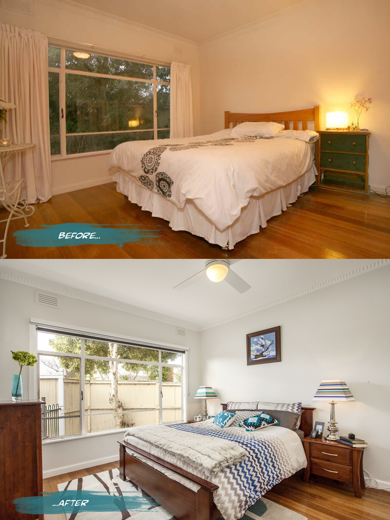
{In the master bedroom, all the curtains were removed from the house to bring more light into the spaces and reduce some of the heaviness of the rooms. Both block out blinds and sunshaders are in the bedrooms while just blockouts are in the living spaces. The walls are a pale grey, Nippon Nighthawk 1, and the ceiling light was replaced by a fan and light for much more comfortable summer sleeps. Adding a rug, cushions and throws for softness as well as customising my lamp shades makes it a bit more personal. Spaces can still have personality while being clutter free - just choose a few key pieces like books and photo frames to make the space feel lived in and not like a showroom}
Nautical dreams
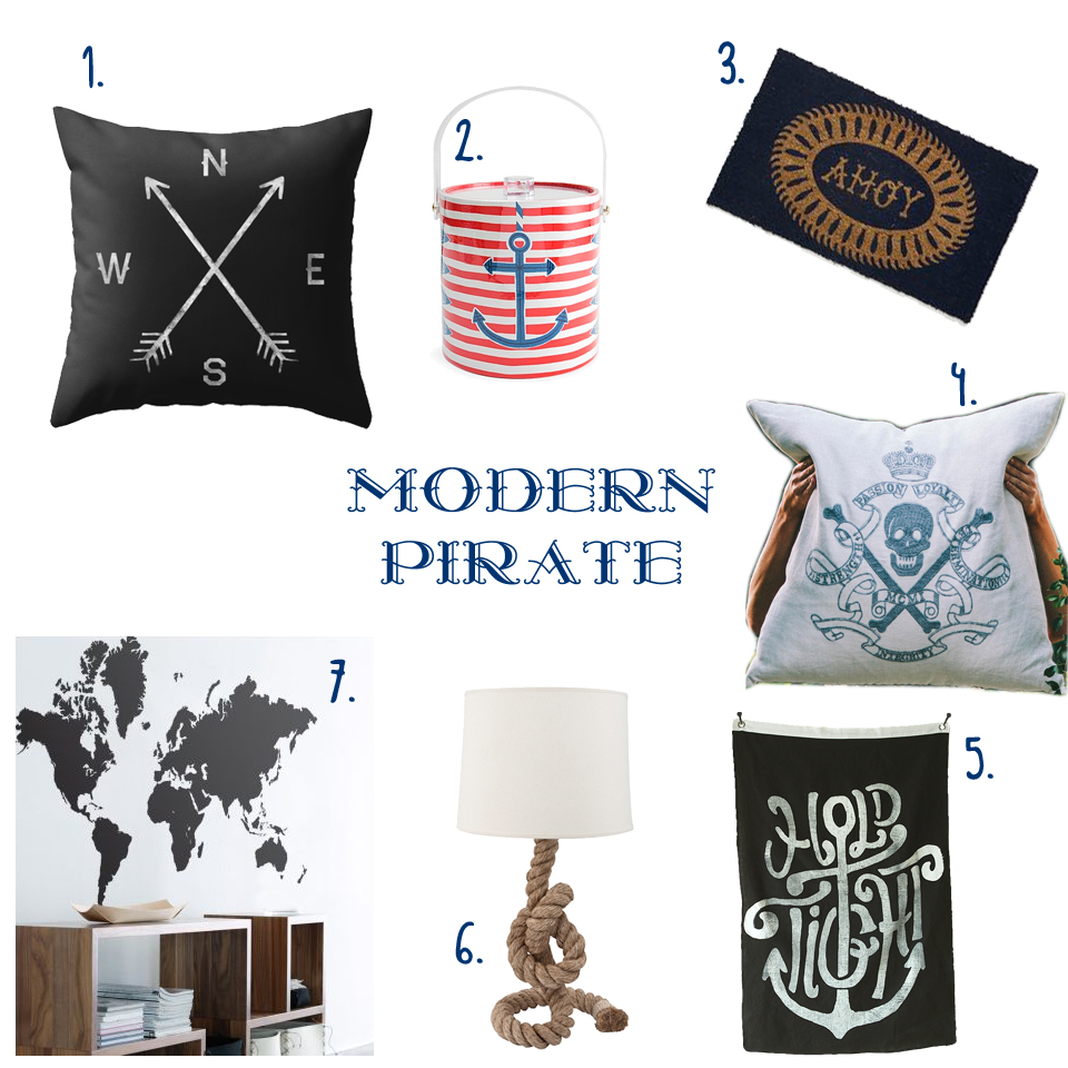
{ 1. Compass cushion, 2. Côte d'Azur Ice bucket, 3. Ahoy Door Mat, 4. Skull & Crossbones Cushion, 5. Hold Tight wall flag, 6. Pier Rope Table lamp, 7. World Map Sticker }
Do you Adore?
For some insane reason, I forgot to take ‘before’ shots, so had to trawl through my databases for some random shots of the ‘back room’ aka Laundry aka office aka crap-dumping-space. Unfortunately the only before pics I could find show just how much crap normally surrounded me in the office space, but fortunately the tidy-up pre- and post-painting make the overhaul look like much more than it was.
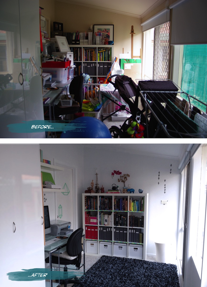
{Office before and after}
I had a bit of fun with Washi tape (and more since) after deciding against painting a decorative element and not being able to find a decal I liked. The basic tutorial for the washi tape jewel idea on the door was from Objects & Use. I’m waiting for more washi colours and patterns from etsy to go even crazier.
Ruby ruby ruby ruby!

{Vintage Valentine’s Day cards, Vintage & Nostalgia Co.}
So to get in the spirit of V-day, I am sharing a bunch of my favourite red and pink products-n-pics to get you in the mood, whether you celebrate valentines day or just want a spicy boost to life. Ruby, crimson, cherry, blood, fire engine, imperial, evil-queen apple, fuchsia, magenta, rust, salmon and all the Pantones in between, whatever your shade of choice, hopefully there is something here to tickle your fancy.
Industriart
“The idea started initially as an outlet for the many and varied things that my husband and I have collected over many years. However, for two hoarders, it is difficult to part with all your treasures at once, so the concept then became a shop of 'Pure Indulgence' selling only things that we like - retro, vintage, new, serious and not-so serious.”
Make sure you get on over and check out the wonders (and bargains!) ASAP. I have my eye on more than a few of the furniture items and eclectic baubles in the front room and that cool secret back area. I can’t wait for the next Perth trip to do some real damage!
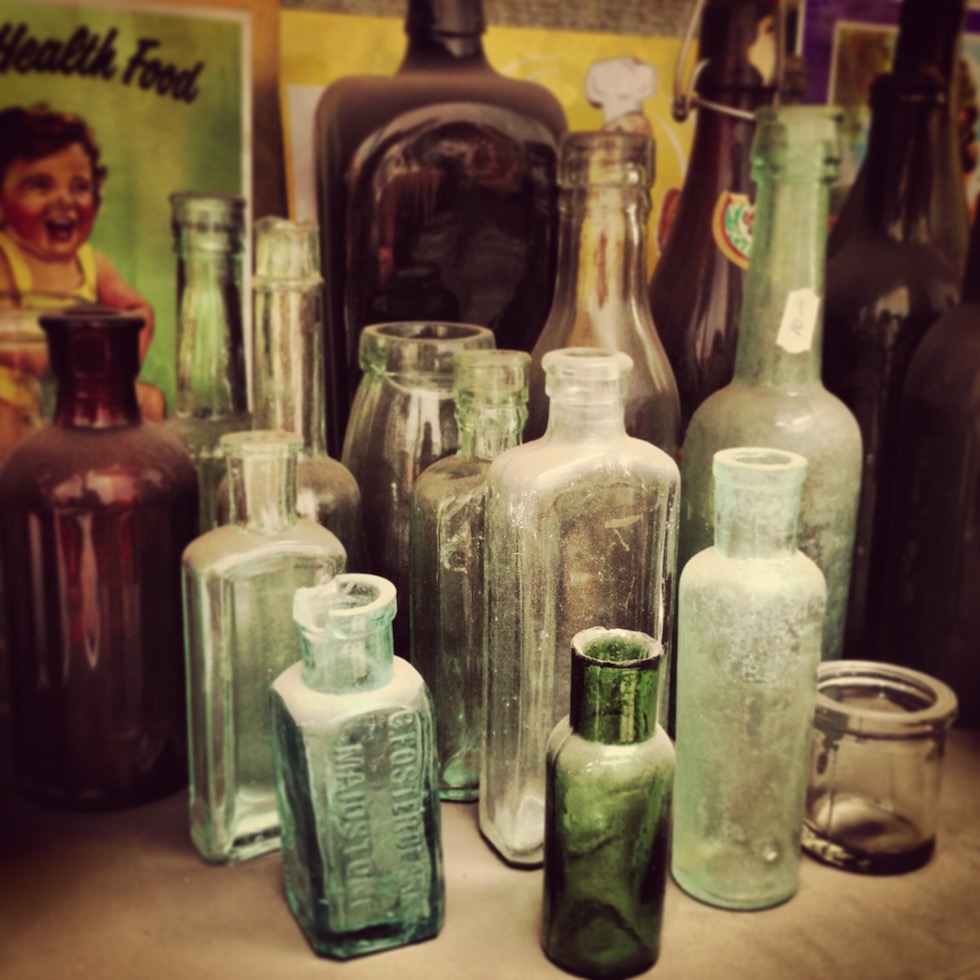
{Vintage glass treasures. Some of these are now in my personal collection}
Emerald Delights
Along with pretty much all of the design and blogging world at the moment, I am in love with all the greeny goodness popping up all over the place since Pantone announced Emerald as its colour of the year for 2013. Just for a bit of visual candy, here are a few of my favourite interiors, products and miscellaneous images featuring variations of this striking gemstone hue.
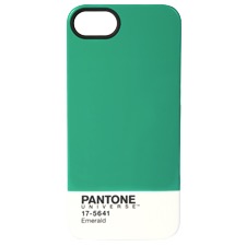
{Pantone’s limited Edition Mug and iPhone5 cover in Emerald}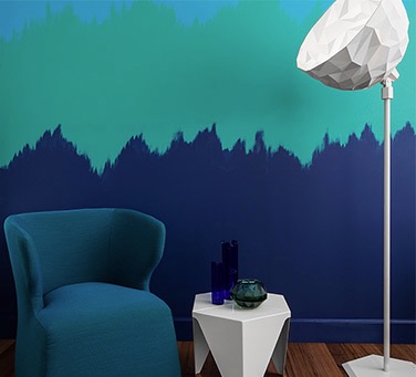
{Dulux’s Empower Palette - Image styled by Bree Leech featuring Dulux Liberty, Bahaman Bliss and Misty Blue}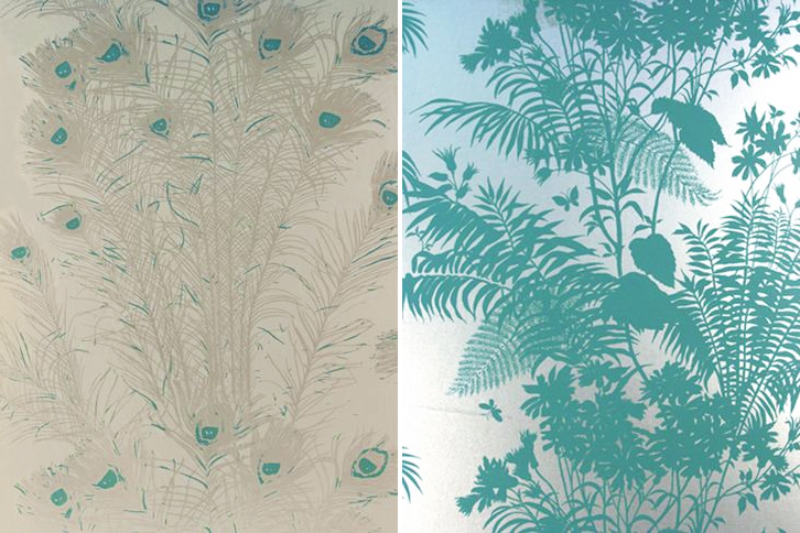
{Florence Broadhurst Peacock Feathers & Shadow Floral wallpapers from Signature Prints}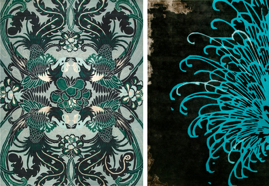
{Night Bird by Catherine Martin, Bansyu by Akira Isogawa, both at Designer Rugs}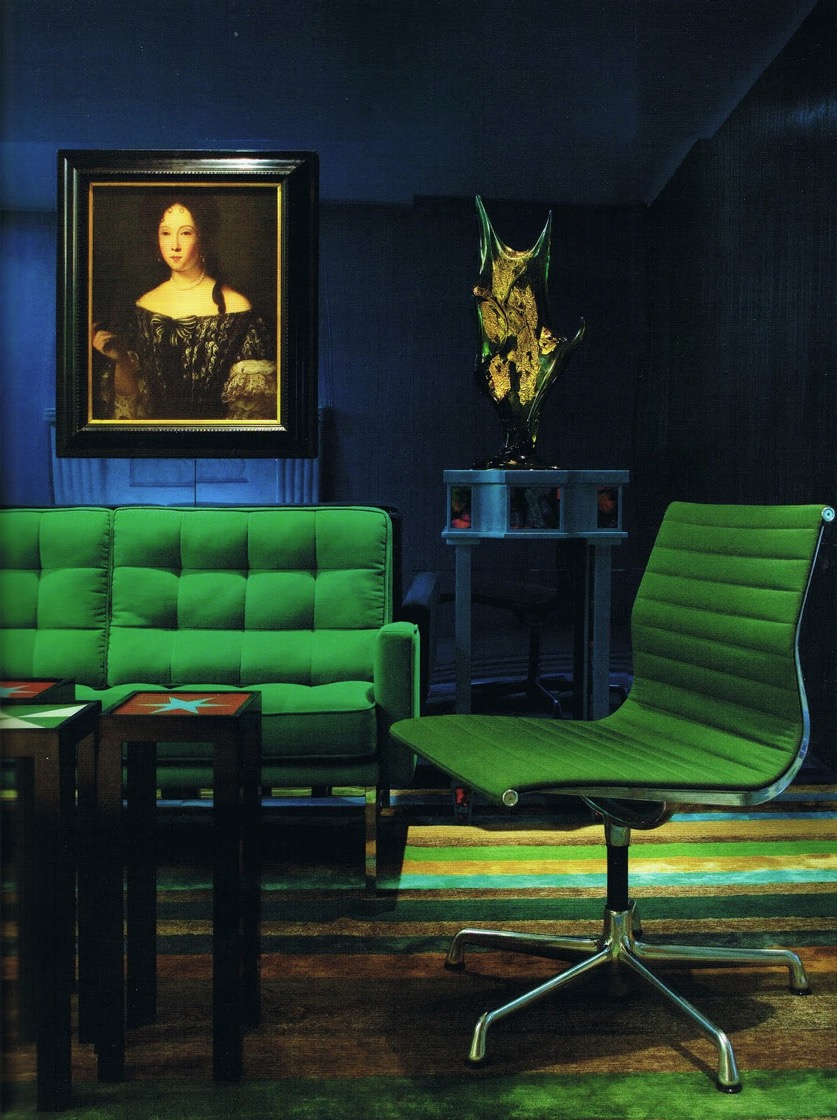
{Emerald vintage Florence Knoll & Charles Eames furniture. Interiors by Doug & Gene Meyer.}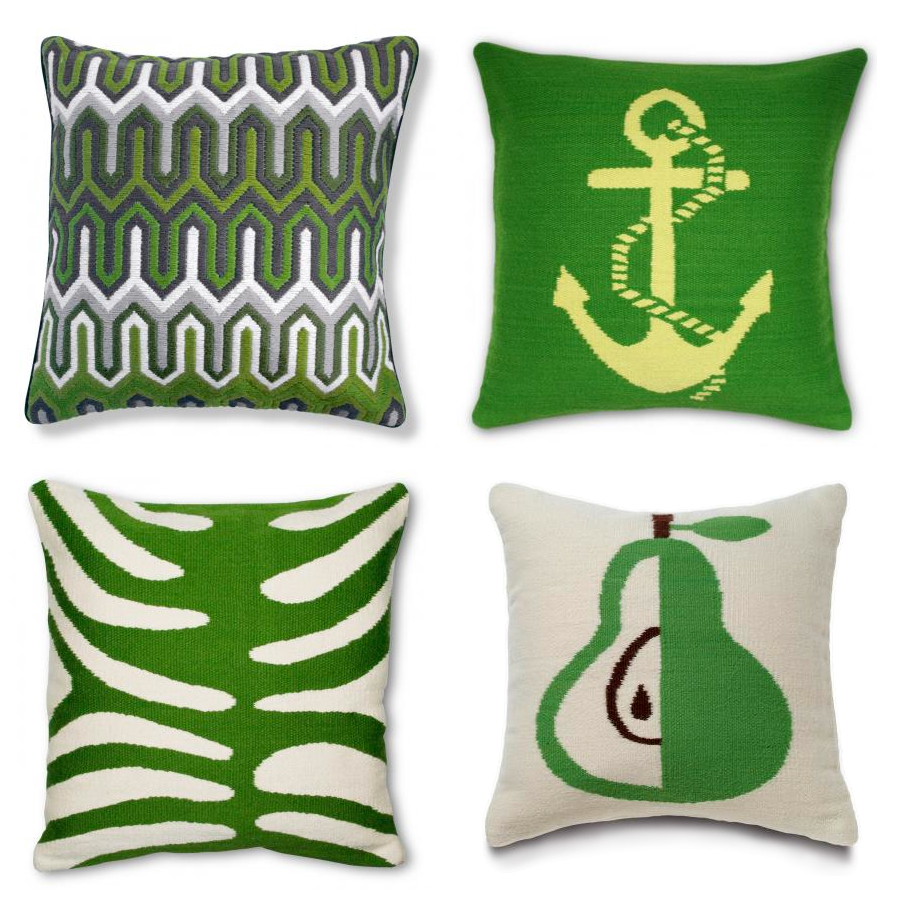
{Jonathan Adler Needlepoint pillows}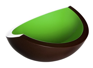
{Husque Bowl Macadamia Nut in Green}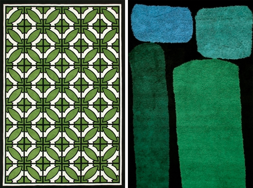
{South Beach by Greg Natale, Jewel by Dinosaur Designs, both at Designer Rugs}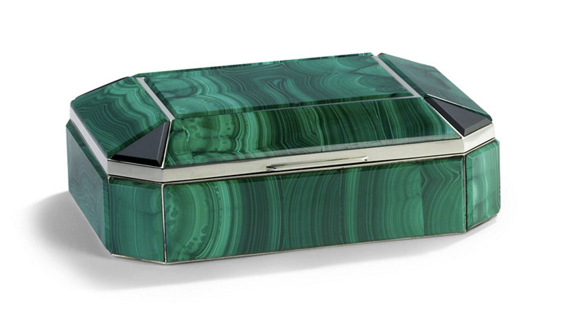
{Bianca Malachite Box by Ralph Lauren Home}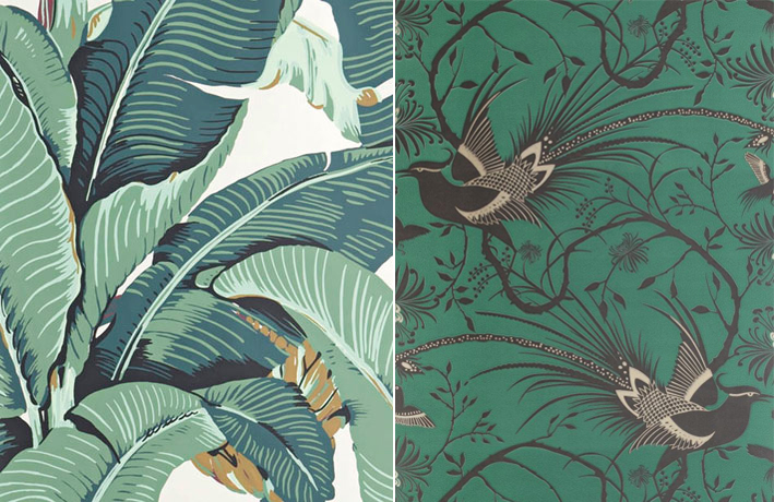
{Martinique Beverley Hills wallpaper; Catherine Martin for Mokum Imperial Pheasant in Emerald} 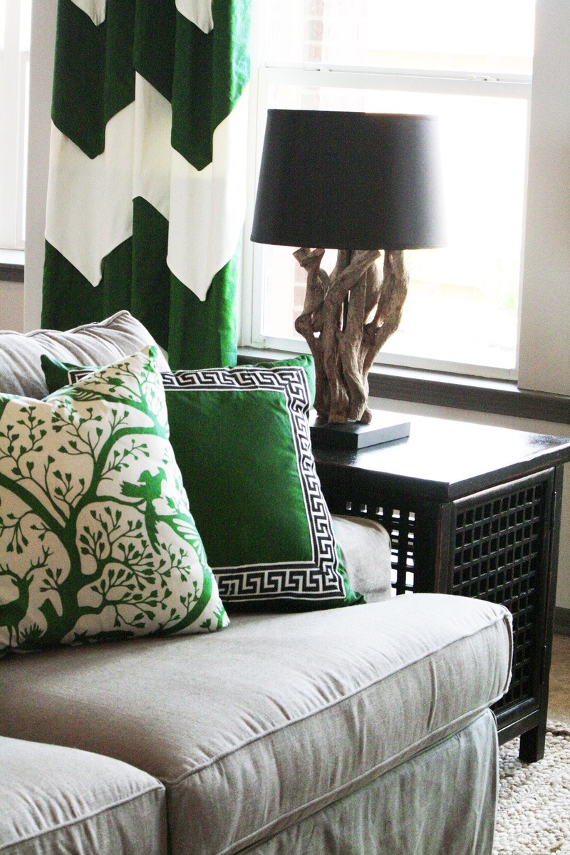
{Emerald accents. Interiors by Charm Home Design}
{Interiors by Diamond Baratta. Image via House of Turquoise}
{Interiors by Greg Natale, featuring his South Beach rug}
{Pont Max Juvenal, Aix en Provence, 2008. Patrick Blanc}
Of course I couldn’t resist throwing a green-walled building in there. You can see a few more on my previous post, Vertical Green. I am hoping to do another post on green walls this year, since the last one didn’t even scratch the surface of the beauty that is out there.
These bright emerald visuals make me giddy. Yes, I’ll admit some of them are straying more into teal and turquoise territory, but that is the beauty of perception - maybe your eyes will see a whole different picture. I hope you enjoyed this quick (and a little lazy) post. Until next time.
xo Romona
![]()
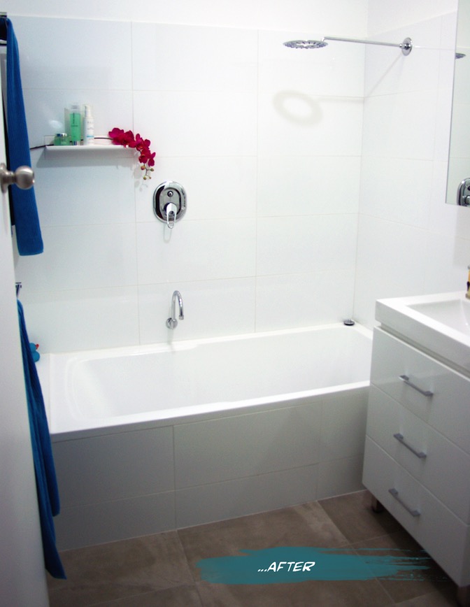
Bathroom... After
Work started early on a Monday morning. Dad, hubby and I got stuck into ripping off the wall tiles. As with most old houses (with the added bonus of previous owners who have attempted DIY renovations themselves) the wall structure was no longer (if ever) level or square. There was also the unhelpful surprise of most of the wall sheeting coming off with the tiles. The flooring didn’t fare any better - also ripping half up with the tiles. Previous work scraps had been tossed in the wall cavity - I like to think for reuse as insulation - and a few little creatures had been making there nests around the bath supports. On Tuesday the plumber started his work relocating the bath, shower and vanity fixtures and putting in the pipes for the new toilet (yay!). Once that was completed, we could start on sheeting and patching up the walls, floor and front of bath. Waterproofing was painted over all surfaces and allowed to dry (time for a well deserved bevie break). The rest of the week was spent cutting, tiling, painting and cleaning out dust and debris, in time for the plumber to finish up and fit off the following week. For a more visual step by step of the process, you can check out my Instagram page. You can also read more about the bathroom ‘Before’ the renovation here.
Drum roll…. the finished product! What do you think? We are very happy with it, of course, and I catch myself walking past the door quite slowly now just to admire the view. In fact on seeing this post, hubby commented that he can’t even remember the bathroom before, even though it was only two weeks ago. Purged.
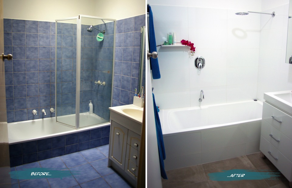
{The Sandon Bathroom - Before and After}
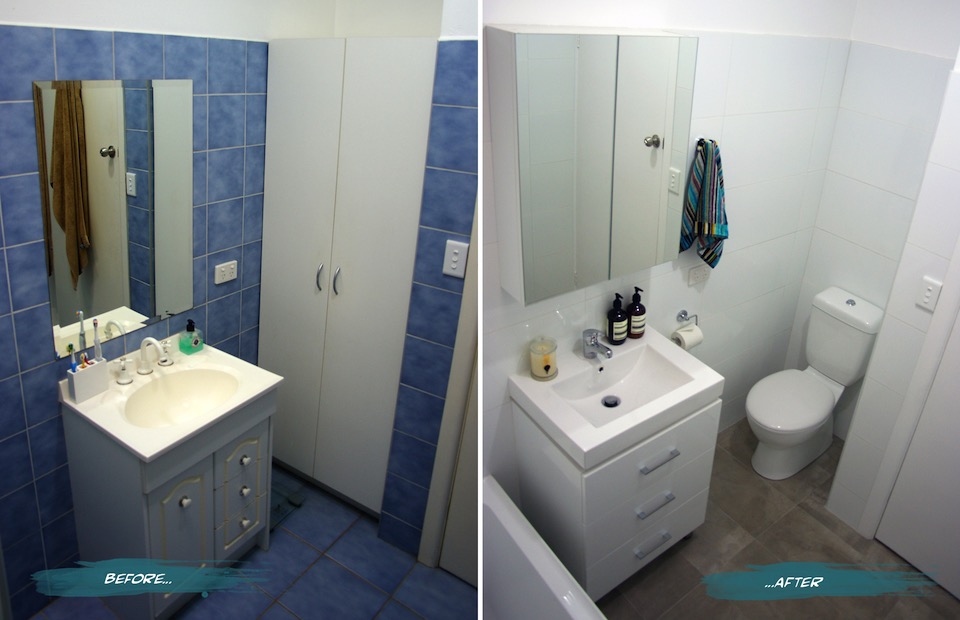
{Bathroom Vanity and Toilet - Before and After}
Here’s a summary of a few of the changes and features we have in the new and improved Sandon House Bathroom.
The vanity was moved closer to the bath to allow for the toilet, but still enough room for the much larger bath (we went from a 600mm to a 820mm wide - much more user-friendly). If we had an OH&S inspector in-house, they would definitely approve. You can read more about the troubles I’ve had with the narrow old bath in the previous post. The bath is not only wider, but taller. It took a few goes to get used to stepping over it, but it’s very handy with keeping small children from toppling over and into it. Plus during one of my habitual, long relaxing soaks, I don’t have to have the water full to the brim to actually be covered and stay warm.
{The finished product}
Our second toilet - hooray! On plan it looked like a bit of a tight squeeze, but we have since found that there is more than enough room and it is quite a comfortable space. It’s still quite precious and we are not used to having the second option, but I’m sure that will end soon. The seat is soft-closing (the slowest we have ever seen actually - almost ridiculously so), which helps prevent slamming noises becoming a child wake-up-call in the middle of the night.
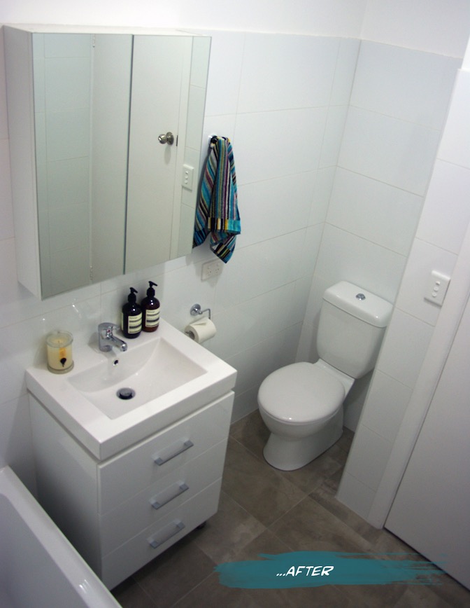
{New Mizu Vanity and Toilet from Reece}
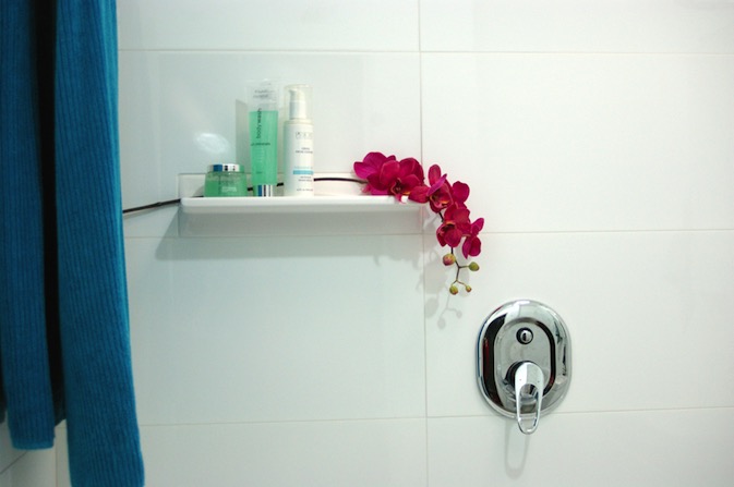
We added a tile shelf high enough to keep expensive shampoos from becoming very expensive bubble bath, as well as far enough away from the shower head to be a pool collector. I find them a great idea when you don’t have the building room to put in alcoves or set-in shelving. As long as you keep it simple, it allows the featured items to stand out without becoming a feature itself. We added an extra towel rail from before and made them double. Not necessarily for two towels, more for the aid in drying. My husband finally gets a towel rail of his own, as opposed to the hook on the back of the door where it never really dries. At the moment the kids towels hang on the back of the door, but we allowed space for another towel rail to be added if and when we need it (big enough to hang bath sheets because once you go up from towels to sheets, you can’t go back!)
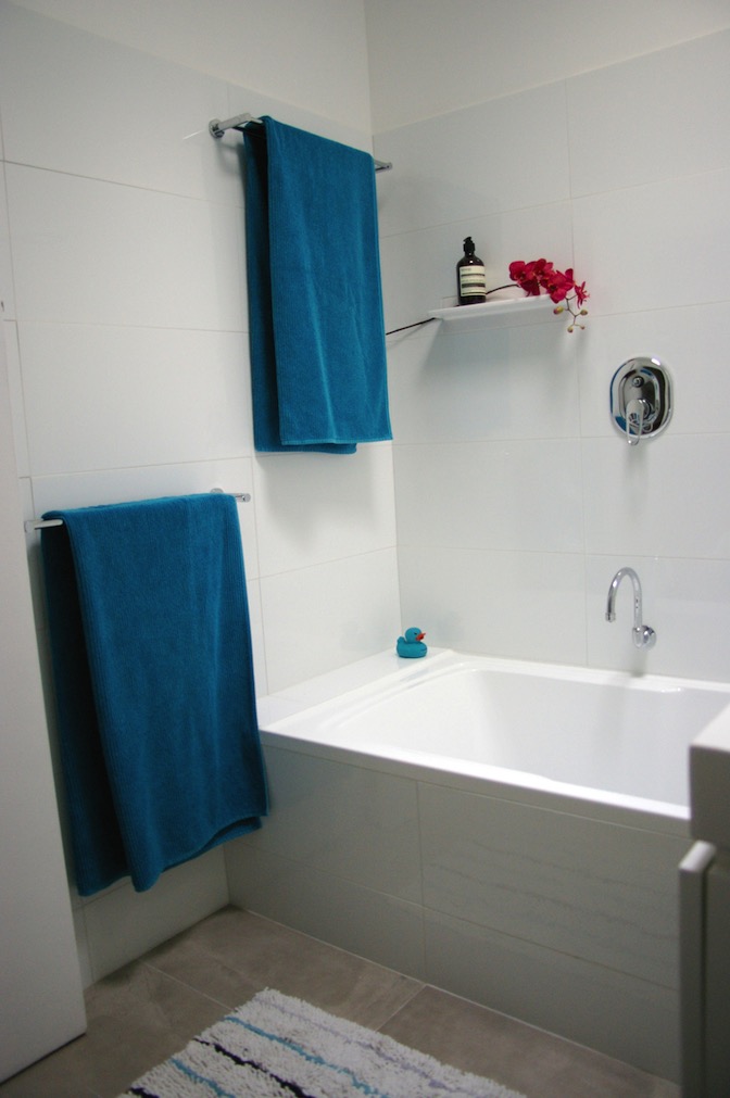
{New huge bath and surrounds}
I chose white wall tiles and a white vanity for brightness, simplicity and longevity. Even though we haven’t changed the skylight, the white reflects the light much more and creates a connection with the outside that belies its central location. The concrete-style grey porcelain floor tiles also give the space a neutrality that is much easier to style and change with soft furnishings and accessories. I had chosen a sleek minimal bath spout, but on further thought, we swapped it for a gooseneck swivel style so that we can run the bath and get it out of the way when the kids are in there, avoiding bumped heads. The Shower diverter mixer was placed far enough left that you can easily turn the water on without getting sprayed, and high enough that the kids shouldn’t be able to play with it for a little while longer. You may notice that I haven’t chosen very ‘designer-y’ fixtures. This bathroom for us is a family bathroom, and with two growing boys that will undoubtedly test the strength and endurance of the fixtures, we went to the budget end of the market. Fixtures are items that are easy enough to replace in a few years, so our money was directed more towards the items that are more difficult to change, such as the bath and tiles.
{Bright white large-format tiles allow us to play with colour}
Having said that, after years of low pressure and uncomfortable showers, the selection of the shower head was quite important. My husband wanted a good soaking while I wanted to make sure that it was still water-efficient. We found our compromise in the Halo shower head from Reece and so far soooooo good.
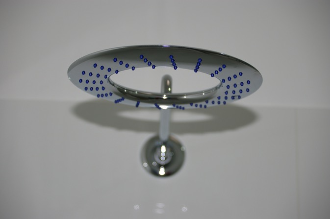
{Halo shower head from Reece}
If you would like me to post the plans, let me know - but photos are more fun, right? If there is anything that you want to ask about the project or specific products please do. I am more than happy to have conversations about it in the comments section below or over email.
FYI - Some of the items pictured and their sources:
- Bath, Vanity, Toilet and fixtures from Reece.
- Wall tiles from National Tiles
- Floor tiles, towel racks and hooks from Vision Bathrooms
- Hand towel by Missoni
- Aesop Resurrection Hand Wash and Balm
- Ecoya Metro Jar soy candle in Wild Frangipani
I hope you enjoyed this exciting little project with me. Time to plan the next one! (Sorry honey)
xo Romona
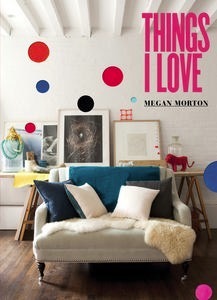
Things I Love
![]()
Rug update
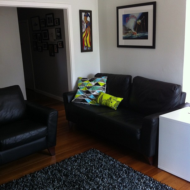
{Black and Grey Noodle-pile Artizen Rug from Carpet Court, in its new home}
Inspired by the new floor dressing (and big red sale signs), I had to nab a few new cushions to brighten the space and add a pop of colour. Glad I found these two (pictured above) at Adairs, combining the latest trends of geometry and neon, with an architectural twist, in Home Republic’s Sketchbook collection. Love it. Bye for now.
xo Romona
![]()
Unearthing Treasures
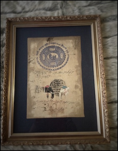
Inspired by Carpet Court’s new Love the Look competition (How hard is it to choose between team Darren and team Stacey!), I went rummaging through my boxes of trinkets and collected items from my travels and explorations. You know the ones - the pieces you’ll put up in your one-day house (the one with room to spare - a library, a sitting room, a chic powder room off the entry foyer, maybe even a gift-wrapping room à la Martha Stewart). The piece that caught my eye was right there on my bedroom wall. The exquisite hand-painted Indian wedding ceremony on a government stamped paper that I found in a market in Jaipur, India.

{Indian Government Stamp and painted Wedding Ceremony Artwork, from a market in Jaipur, India}
Another work from the same market is the black and white elephant heads (below right). Until I photographed them for this competition, I had forgotten how much I liked looking at all the scribbly detail in them.
{Indian Government Stamp and painted Elephant head Artwork, from a market in Jaipur, India}
They are totally out of place in my current bedroom. As it stands, it’s a mismatched explosion of objects - and not in a good way (thus the desire to refurb it, stat!) I love mixing vintage with contemporary, but the pieces have to be right and I feel it has to be done with a cautious hand and keen eye.
I had been meaning to reinvent my bedroom into a palace worthy of old Hollywood. Glamourous crystal and blinding chrome. Tufted velvet and mirrored lucite-legged vanities. All look but don’t touch. Now though, I am having to remind myself that yes, although I love the look of these in magazines, could I live there? Especially with two young boys (one who likes to crawl into bed with us after pushing most things off the dresser with his cars, and another that I’m sure will do the same as soon as he is able to get out of the cot).
I’ve decided to go back to basics. Firstly, I have to decide what, if anything, I want to keep from my current room or if there is anything that I already own that I want to introduce into the new room (such as an art work or armchair). I think I will be keeping more than I’d like to (budgetary reasons), but upcycling is under-rated, so I’ll see how I can change the items that I can’t afford to replace, to fit the new style. If you follow me on Pinterest, you may have noticed that my DIY folder is getting more of a work out lately than usual. With two kids, and without the disposable income that we had before them, I can hardly do the complete Jonathan Adler meets Kelly Wearstler that I’d like to.
Secondly, research images that attract and excite me, and define what it is about that image that gets me going. Is it the whole package, a particular furniture item, the colours - warm or cool, the scale, the layout, the fact that its tidy, what? Then see how it can be applied or worked into the canvas that is my room. Again, Pinterest and Houzz are wonderful resources for finding inspiration and products. Of course, its always fun flicking through drool-worthy magazines like Belle, Real Living, Sanctuary and Home Beautiful when you can find the time. I embrace my iDevices, but I am not quite ready to part with my monthly deliveries of hard copies just yet, thank you.
Luckily time is on my side. With a bathroom renovation due in October, it may be a few more months before I have the spare coin to put towards the fabrics or wall paper that will make it really worth doing. There’s nothing wrong with taking time to make sure that you really do love that particular pattern you chose, and not just because its on-trend or was used in that house by that guy in that magazine, you know the one! For now, I am just trying to remind myself to keep the basics somewhat neutral, so I can really go nuts on the replaceable items like headboard fabric or bedding or window dressing.
OK, so I think I have successfully gone completely off topic. Maybe one day I’ll be able to do it with the charm and imperceptible manner of Ross Noble or Billy Connolly. Until then, I will just say that I will revisit the idea of finding hidden treasures in your home when inspiration strikes. I’m hoping to also bring you a little introduction to our planned bathroom reno coming up - I look forward to some peer feedback if you feel like it. Ciao for now.
xo Romona
P.S. (again) Sorry that comments aren’t allowed at the moment. I really want to hear any feedback you have but iWeb is disagreeing with me and I need to find a new program. Excuses, excuses!
Please feel free to email/tweet/FB post me - would love to hear from you!
UPDATE: Hopefully comments should work now….
![]()