


The James Street Residence by Romona Sandon Designs
In designing our home it was important for me to balance the comfort and lifestyle needs of my young family with my environmentally sustainable goals from my work in Sustainable Architecture. I wanted to test if low-cost sustainable design could still be convenient and aesthetically pleasing to the clients (my family). I also wanted to test people's perception of what an eco-house should be or look like.
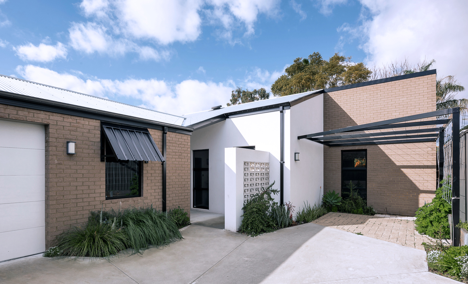
{The James Street Residence, by Romona Sandon Designs, Front facade}
With the kitchen, I wasn't aiming to do anything new or innovative. I wanted timeless and simple. A canvas devoid of colour so it could be injected by way of homewares and appliances and food and family. I guess I never strayed far from what I had always wanted, even showing this colour palette (or lack thereof) in previous posts, such as the Monochrome Kitchen. Cabinetry either flows through to the ceiling or is capped by bulkheads, to reduce surfaces that dust could collect on, reducing potential allergens.
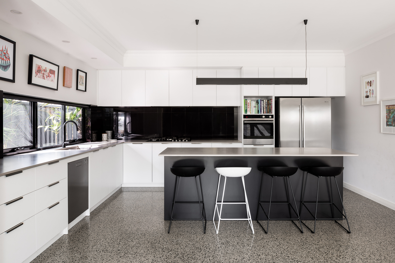
{Monochrome kitchen of the James Street Residence, by Romona Sandon Designs. Image by Dion Robeson.}
Passive solar design principles were utilised where possible within the council and R-codes on a small rear battle-axe block. Large north-facing windows and doors allow winter sun to penetrate and store heat in the thermal mass of the polished concrete floor. The polished concrete floor was high on my list of features that I really wanted in this house - surprisingly, planning for this quite early on in the design process kept the cost quite comparable with alternative floor coverings.
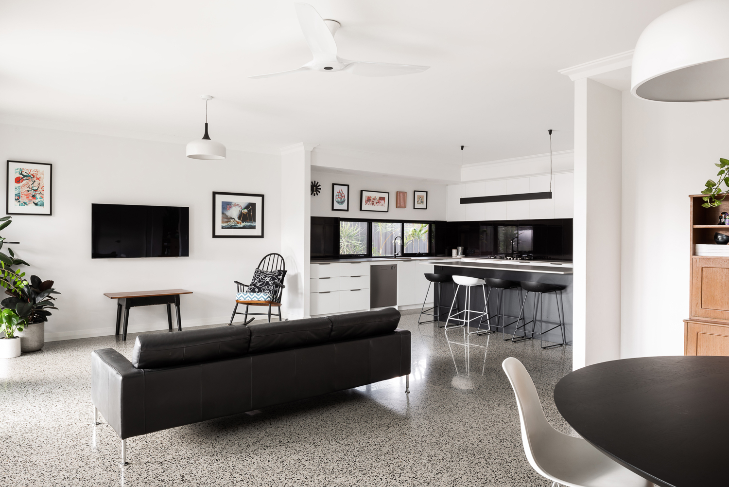
{Open-plan living space of the James Street Residence, by Romona Sandon Designs. Image by Dion Robeson.}
Insulated cavity brick construction helps contain winter heat. Cross-ventilation allows excess heat to be dissipated in summer. A SolarStar solar-powered thermostat-controlled roof cavity ventilation system also rids the building of excess heat when needed. In the two years of occupancy, no active heating or cooling has been necessary except for the Big Ass ceiling fans (their name, as well as description!)
Solatubes with integrated PV (photo-voltaic solar panel) LED day and night lighting is used in conjunction with natural daylight and low-energy lighting elsewhere. Low VOC (Volatile organic compound) paints and carpets are used throughout to reduce sick-building syndrome (off-gassing). PV's sufficiently power the house with a larger inverter for future-proofing. East/west openings were minimised and treated with Low-E glazing where unavoidable, as well as awning shading.
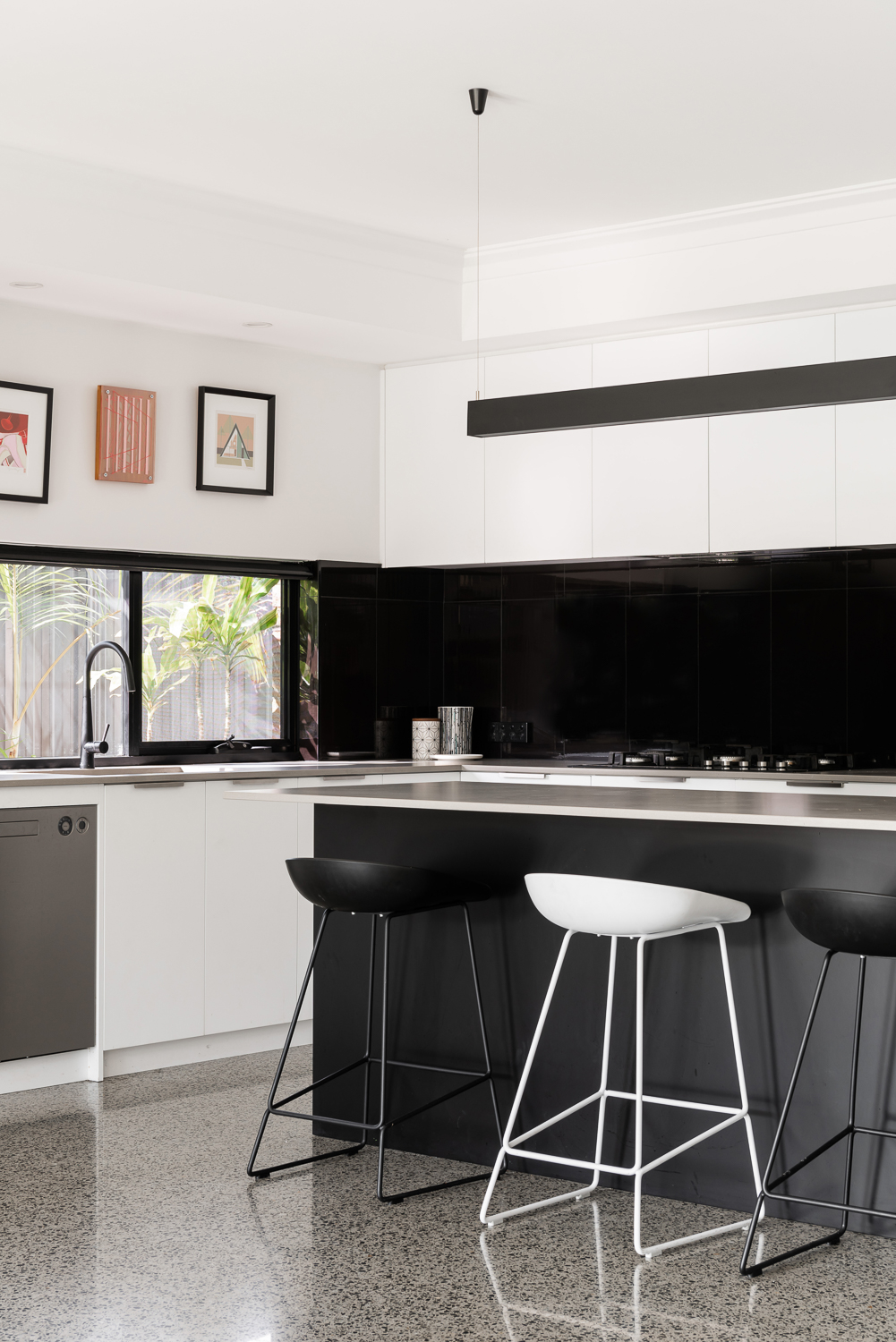
{Kitchen details of the James Street Residence, by Romona Sandon Designs. Image by Dion Robeson.}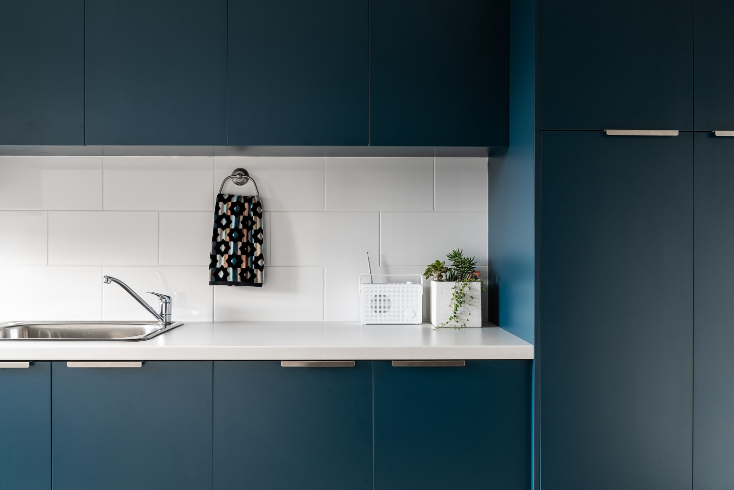
{Laundry details of the James Street Residence, by Romona Sandon Designs. Image by Dion Robeson.}
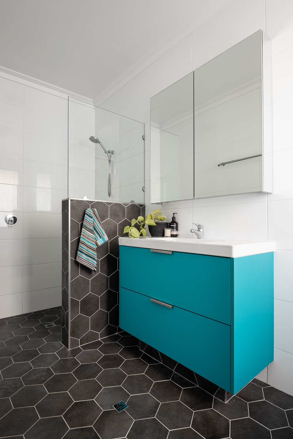
The bathrooms features hobless showers for accessibility. The glass above the half-height wall allows light to penetrate fully into the bathroom to reduce mould build up.
{Master ensuite details of the James Street Residence, by Romona Sandon Designs. Image by Dion Robeson.}
Curtains and blinds are opened and closed to allow optimal light and heat inside, which is also aided by deciduous vine plantings on the north for additional summer shading of openings. While we wait for the grape vine to grow, we use a combination of shade sails and a passionfruit vine that we trim back in winter to allow more sun through. In the mean time, we are drowning in fat juicy passionfruit and the kids adore it!
The garden also considered sustainable design elements in the use of reclaimed breeze blocks for the entry, edible garden courtyard and native or self-sown water-wise planting. Indoor plants are used for improved indoor air quality and visual calm.
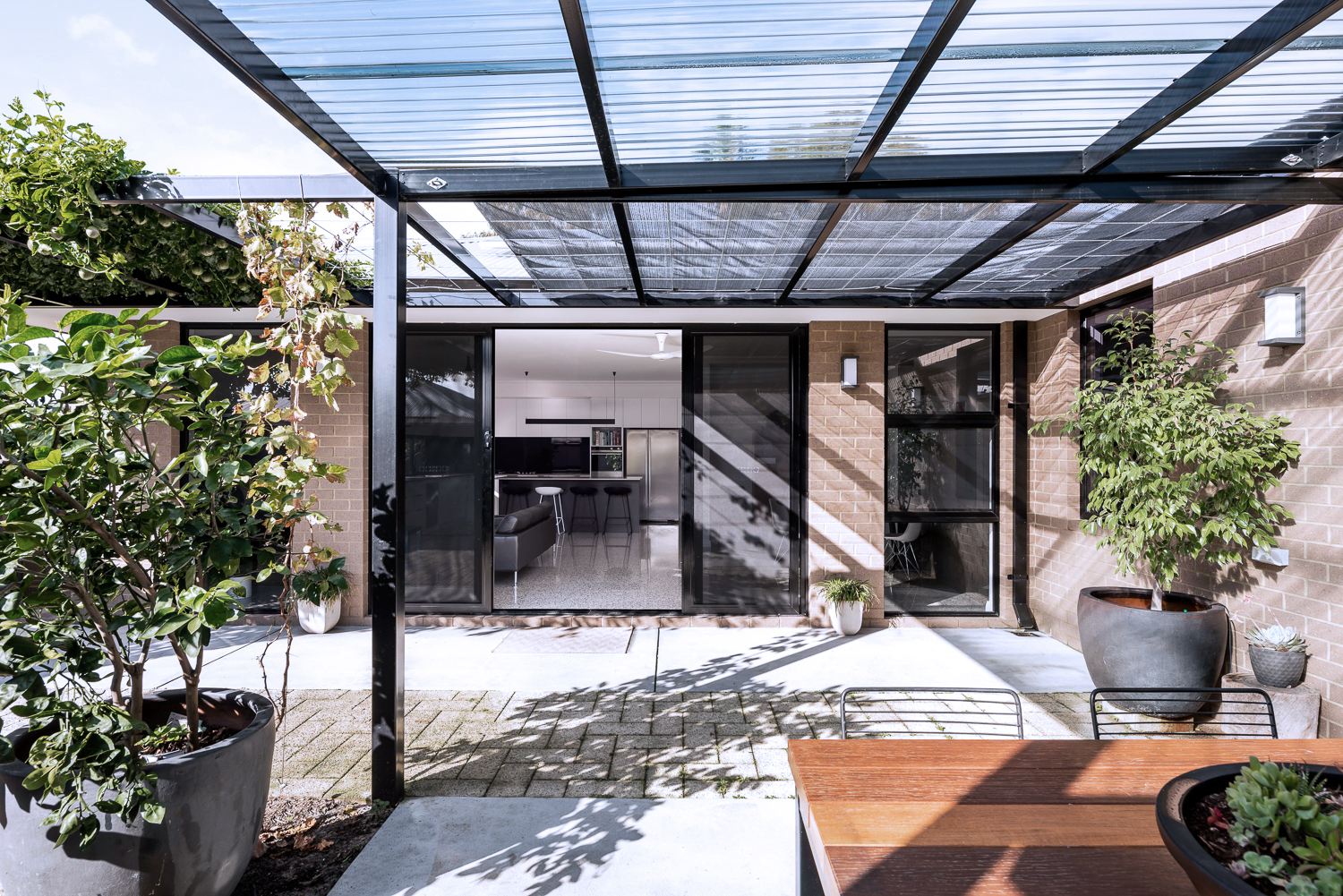
{North-facing, rear exterior of the James Street Residence, by Romona Sandon Designs.}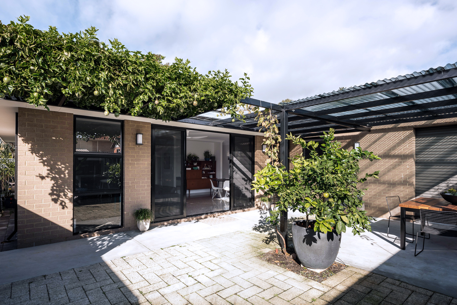
{North-facing, rear exterior of the James Street Residence, by Romona Sandon Designs.}
As a sustainable designer, I see it's discrepancies and the details that could have been improved, with time, money and less council limitations.
As an architect, I see the features that I could have amplified and where I wish our money could have stretched to.
As the client, it is perfect. It is the perfect design for how my family and I live, our budget at this stage of our life, and the place and site that we built it on. It is our home and I'm proud of it.
xo Romona![]()
Modern House at Big Hill
House at Big Hill by Kerstin Thompson Architects, near Victoria's Great Ocean Road, is characterised by a strong, triangular form and a restrained, honest material palette. Semi-recessed into the site, the home opens up to take advantage of the surrounding coastal and bush views. I love the simplicity of the smooth natural grey concrete block walls and concrete floor, with the subtle warmth of the plywood accents for storage and partitions. The black ceilings allow them to disappear and push the viewer through the walled space to the spectacular views beyond. Although definitely robust in form, this form creates intimate spaces where light and shadow, cool and warm, smooth and textured complement rather than compete.
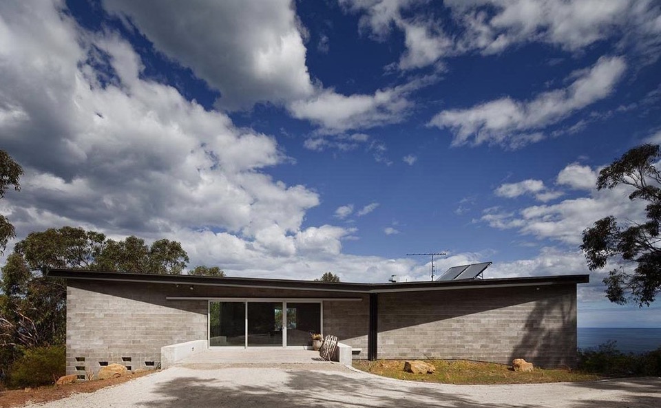
{The dark roof form helps blend the house into the bush landscape}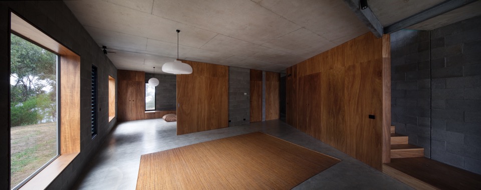
{Contrasting smooth cool concrete floors and natural grey block walls with warm continuous blackbutt plywood Armourpanel surfaces by Big River} 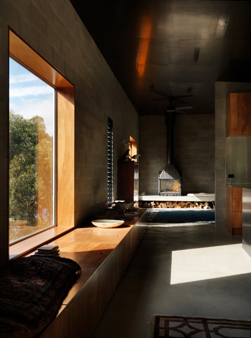
{Dark picture frame windows are recessed to create deep plywood window seats for soaking up the surrounds}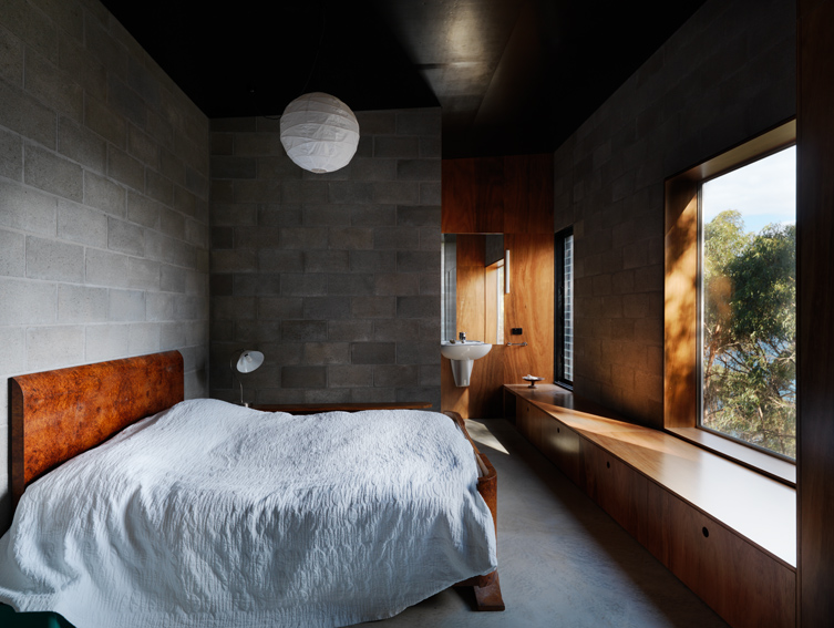
{Bedroom with Armourpanel plywood storage doubling as deep window seat}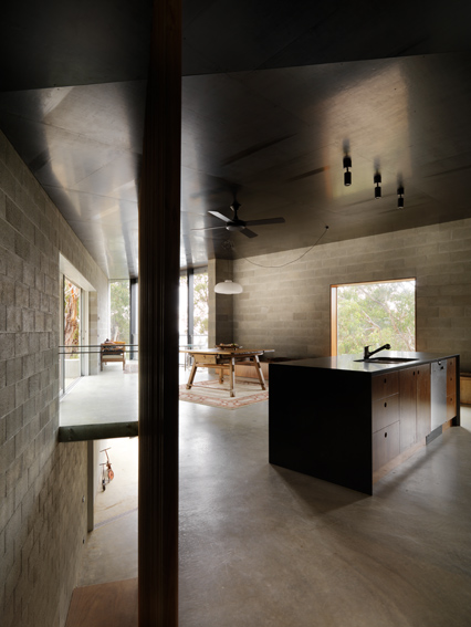
{Open kitchen kept simple with concrete and dark timbers}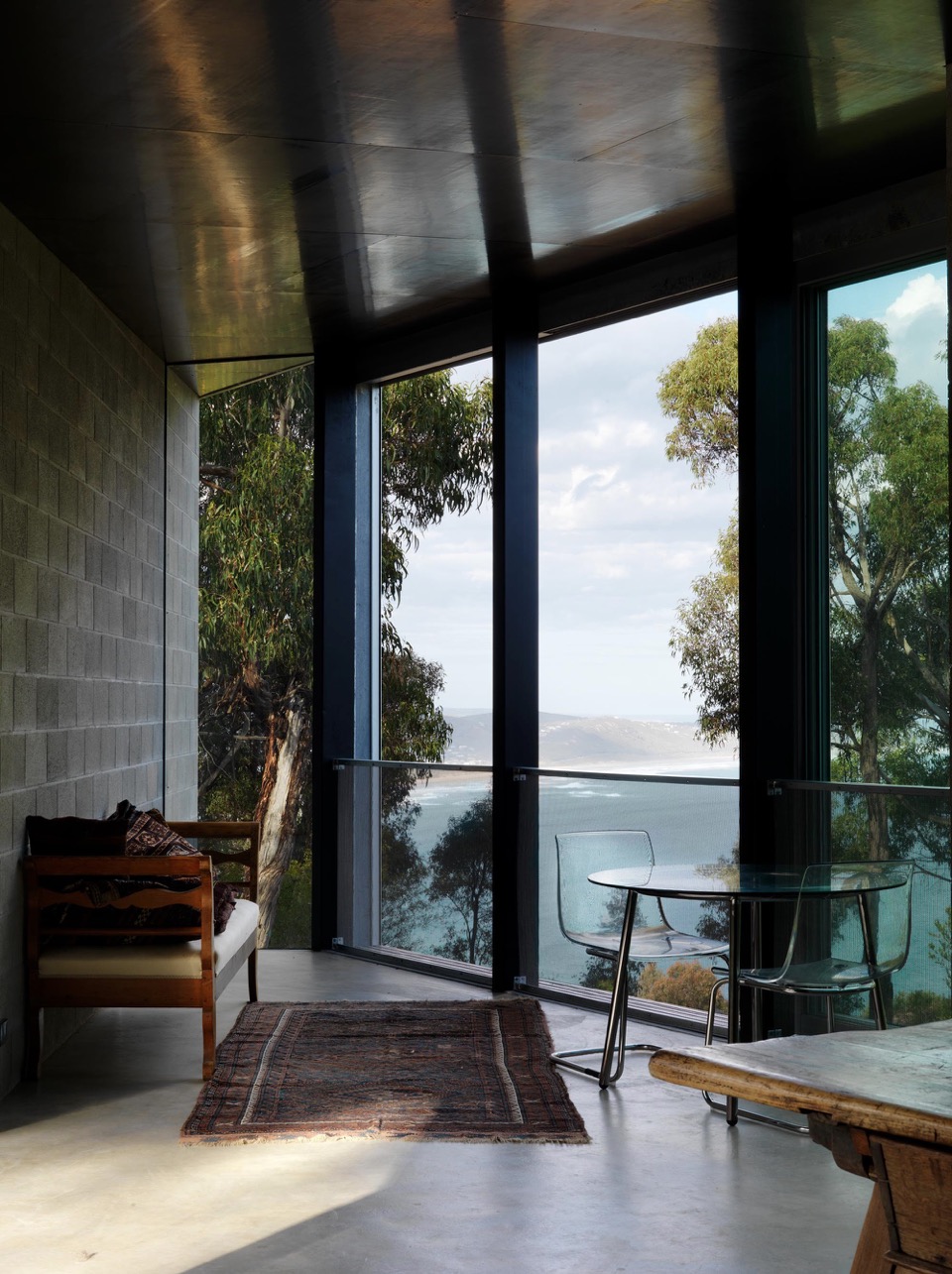
{Space furniture in this living space retains the view as the hero}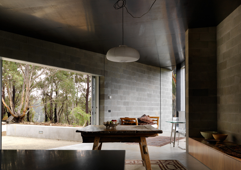
{Opening to the bush beyond}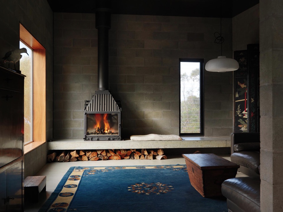
{Insitu concrete step doubles as seat and storage}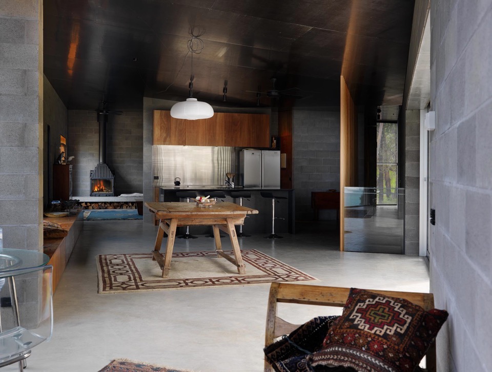
{Custom plywood joinery doubles as seating and storage, minimising need for additional furniture}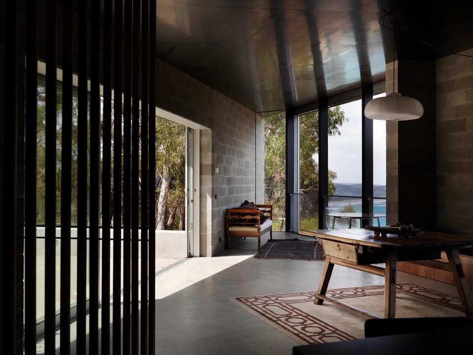
{Smooth concrete floors flow to outdoor spaces}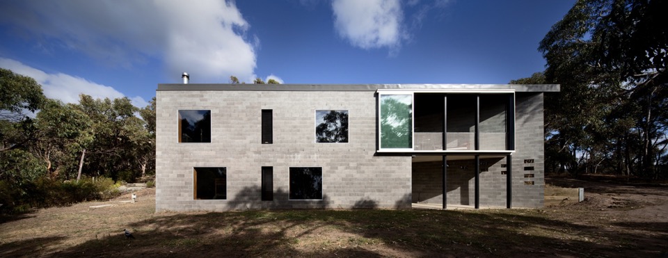
{Robust form to lower terrain}
Images courtesy of Kerstin Thompson Architects and photographed by Trevor Mein.
xo Romona![]()
Australian Interior Design Awards 2015 - Residential Award
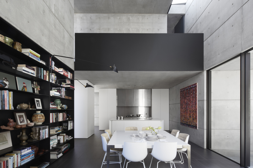
{This dining room is composed of the perfect balance of bright white, raw concrete and moody black accents. Although these Serge Mouille lamps seem to be everywhere at the moment, you can't deny that they have a massive impact with their insectoid arms reaching into the space as few other lighting forms can}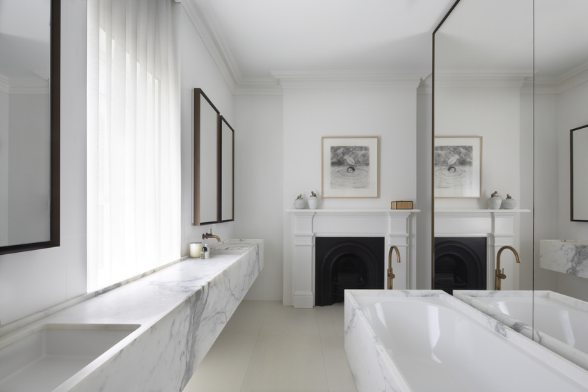
{Modern luxe with heritage charm in the bathroom. Marble with burnished brass, shadowed iron and bright white}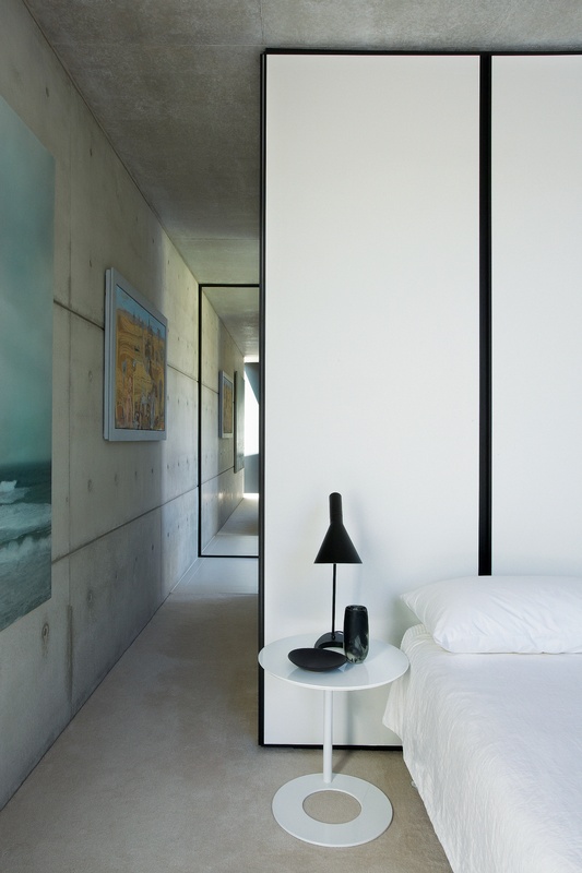
{In love with this black-edged panel diving wall - the perfect simple, graphic bedhead. Not to mention that black AJ table lamp, always on the top of my bedside/office table lamp wish-list!}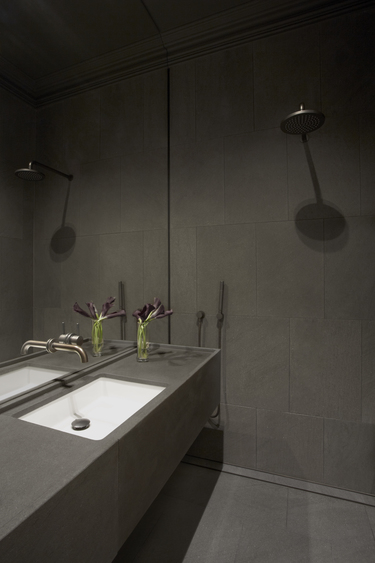
{Dark and moody ensuite, a perfect retreat}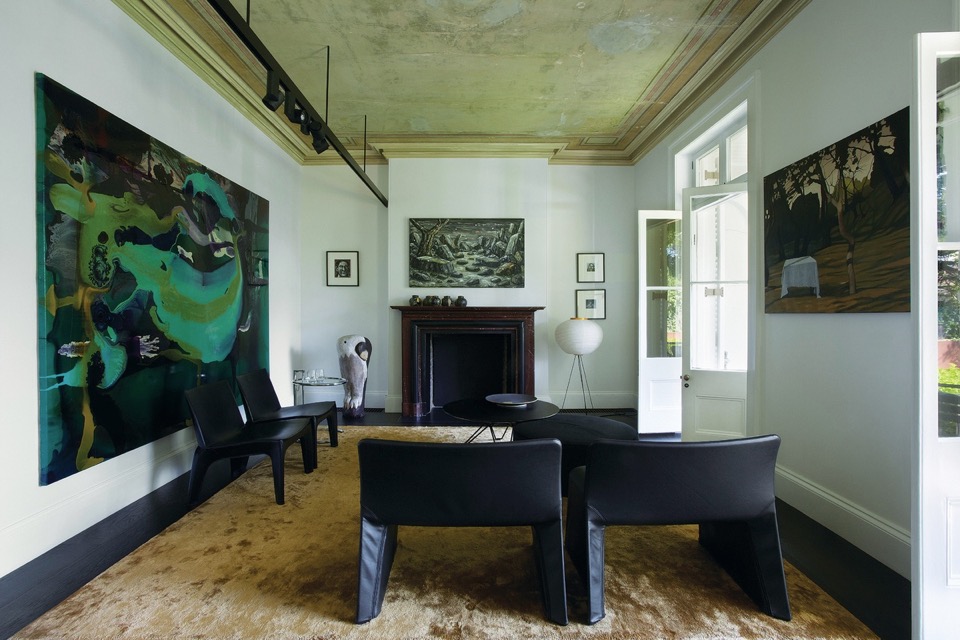
{Gilded patina underfoot and overhead pick up warm elements in the artwork, acting as a respite from other cool spaces in the home}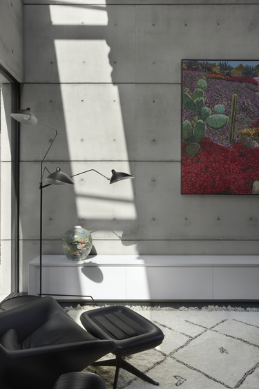
{I love the beautiful blank canvas of monochromatic materials and textures, allowing a stunning collection of artwork to stand out, with classic modern furniture and lighting}
Images by Sharrin Rees.
xo Romona![]()
A beginner’s guide to illuminating your home
All too often, lighting is seen as merely an interior design afterthought. However, with a little creative thinking, lights can dramatically enhance the look of homes. If you’re new to property design and you want to make the very most of the illuminations now available, take a look at these simple but effective suggestions.
Maximise natural light
Firstly, bear in mind that it’s not just artificial lights that can help to boost the appeal of your property. Sunlight can also play a major role in this. By allowing solar rays to stream into your rooms, you can give them a more spacious, airy and open feel. With this in mind, it’s important to select suitable window dressings. One great way to ensure you make the most of the natural light on offer is to take advantage of the sunscreen roller blinds available from window furnishing specialists like The Blinds Company. These products filter natural light to keep rooms bright while also reducing heat and glare, and stopping harmful UV rays from entering your home.
{Full height sheer curtains provide light, texture and interest to this bedroom space in Bondi by C+M Studio. Photography by Caroline McCredie}
Linen love
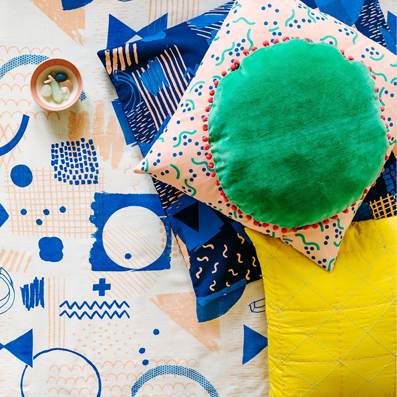
{Arro Home cushions and linen by Beci Orpin. I ended up getting the bottom Sketchbook floor cushion pictured, which rotates between an accent thrown on the bed, a handy floor cushion and an extra head rest when napping on the couch}
Kid-size creations

{Tables Four Two in the classic grey colour set by Sheree B Product Design. She also does other colour schemes, but this was the best. She is incredibly friendly and helpful too!}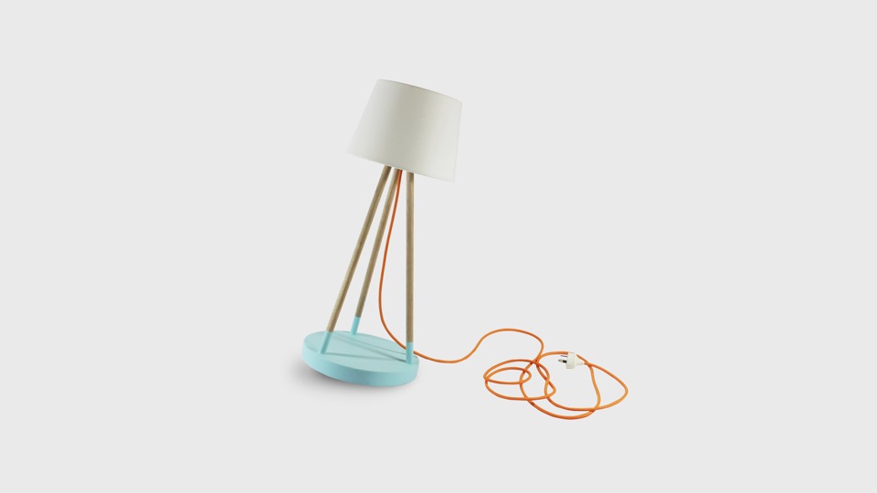
{Treehorn Designs Oh Buoy small lamp in blue. Not sure if I would put this in the boys room or steal it for myself}
Home Open
Before I get too soppy, the main reasons for this post were to give you some cheap update ideas for your home, a few tips for simple styling for sale and giving you a sneaky-peak into our lives and home. Enjoy.
Here are some simple tips for refreshing your home before sale:
1. Keep colours neutral.
You may love neon pink or cobalt blue but not everyone will - and not everyone has the imagination to see past it if they don’t like it. You don’t have to avoid colour, just stick to colour in flowers, soft furnishings and artwork.
2. Keep spaces bright.
I do love a good moody Abigail Ahern or Kelly Wearstler room, but I think this belongs in a space that you are going to inhabit for the long term. If you want to maximise the range of interest, keep it light, bright and airy. Lighting at many different levels adds interest - think combinations of candles, table lamps, floor lamps, overheads, wall sconces or whatever you have at your disposal.
3. Fresh flowers and plants (or even good fakes ones) are a must.
They bring colour, style and life (or appearance of life if faux) to your space, not to mention fragrance. Just don’t let the fragrance be too overpowering - air out spaces, keep water fresh and replace flowers if they start to get a bit droopy or pongy.
4. Decluttering is a given really.
Noone want to buy the house of a hoarder, who knows what else you might find after purchase. Pair back your living spaces and tidy display areas. That doesn’t mean depersonalise or make it impossible to live, but presenting the space how people would like to live (i.e. neat, organised, stylish) sells a lifestyle not just a house.
Feel free to disagree as every house has it’s own personality. Below are a few before and after’s of our own house to give you some ideas.
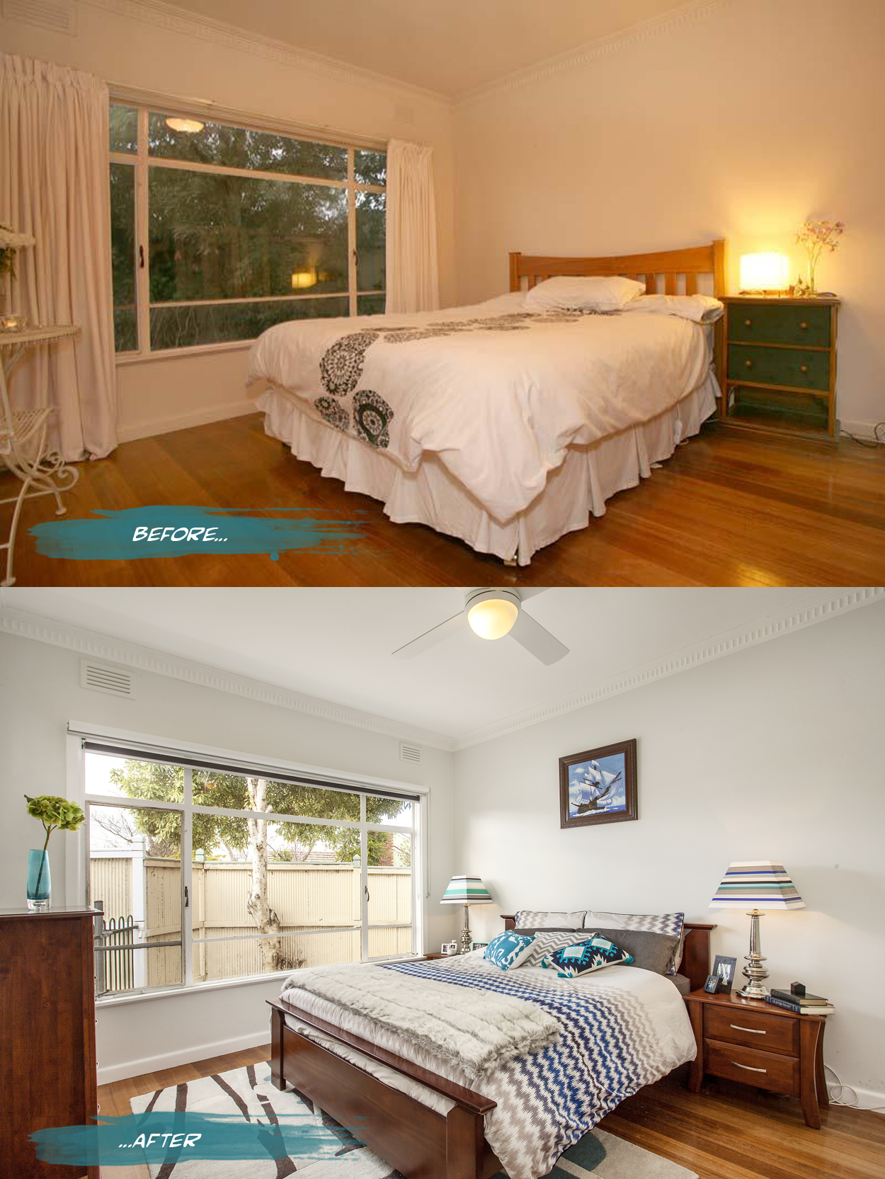
{In the master bedroom, all the curtains were removed from the house to bring more light into the spaces and reduce some of the heaviness of the rooms. Both block out blinds and sunshaders are in the bedrooms while just blockouts are in the living spaces. The walls are a pale grey, Nippon Nighthawk 1, and the ceiling light was replaced by a fan and light for much more comfortable summer sleeps. Adding a rug, cushions and throws for softness as well as customising my lamp shades makes it a bit more personal. Spaces can still have personality while being clutter free - just choose a few key pieces like books and photo frames to make the space feel lived in and not like a showroom}
Nautical dreams
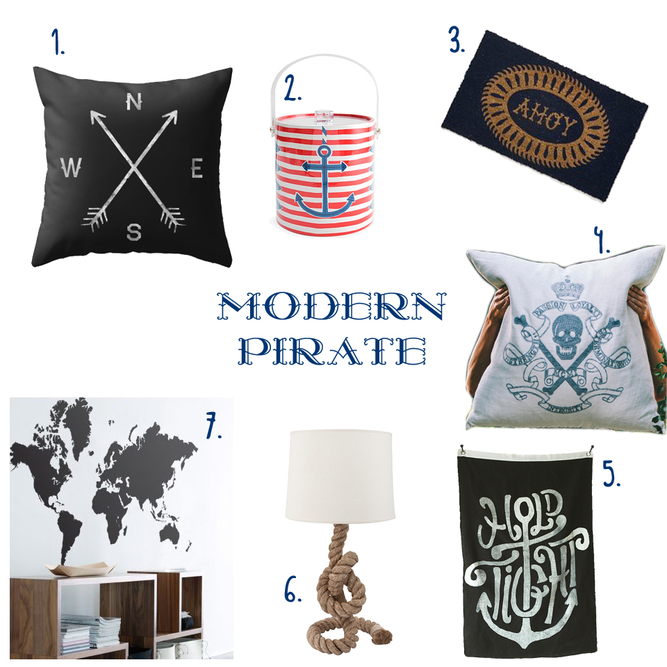
{ 1. Compass cushion, 2. Côte d'Azur Ice bucket, 3. Ahoy Door Mat, 4. Skull & Crossbones Cushion, 5. Hold Tight wall flag, 6. Pier Rope Table lamp, 7. World Map Sticker }
Great Gatsby!
Really, who wouldn’t love this opulent, polished, brilliantly deco bedroom. OTT? No way!

{Gatsby’s sleek and stylish 1920’s bedroom from the Baz Luhrmann film. Via Architectural Digest}
I know I have gushed endlessly over Catherine Martin’s work with Mokum, Porter’s Paints and Designer Rugs, but how can I not start with the gorgeous interior decor from the Production and Costume Designer of the movie (not to mention director’s wife).
DesignEX 13
The Hives exhibition was the stand-out for me with its gorgeous collaborative pieces. “When designers, interdisciplinary practitioners and leading industrial enterprises put their heads together, the results can be exciting, unexpected and intriguing. Curator Anne Maree-Sargeant returns the popular Hives exhibit to designEX 2013 with a highly considered display of products that bring together covetable objects from visionaries and brands under the themes of Innovation and Collaboration”.
My favourite for years has been the WebLight by Design By Them (along with everything else they do!). I fell in love with the gentle image of the aptly-named wispy-looking light set amongst a bright green forrest on their webpage years ago. “WebLight is the result of an exploration into the potential possibilities of reusing plastic bags. Made from recycled content, each WebLight is individually hand made and features an intricate pattern of texture and holes that are the direct result of its unique forming process.”
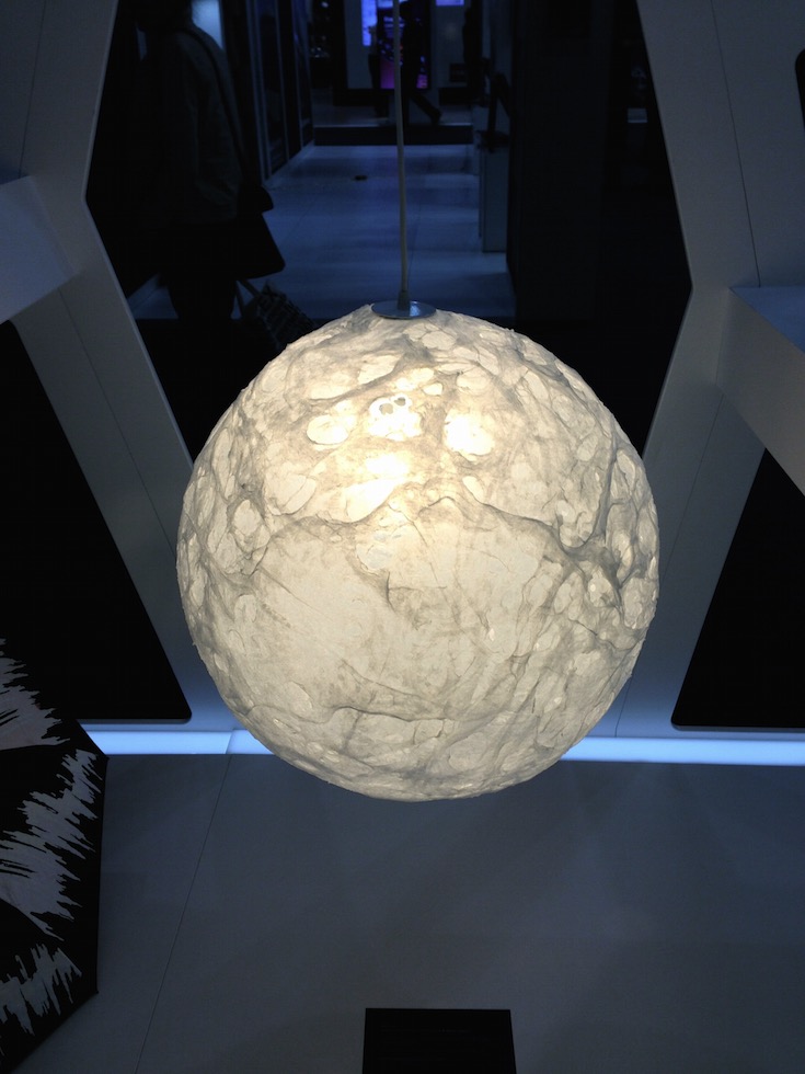
{Weblight by Design By Them}
Another creation I was looking forward to seeing in person was the precise Hoshigame by Artemide. Developed with Japanese fashion designer, Issey Miyake, the sustainably designed, foldable lampshade explores the intersection of creativity and mathematics. Made from fabric derived from recycled PET bottles, “Miyake's unique folding technology allows a single piece of fabric in a flat 2D shape to be unfolded into a 3D shade of statuesque form. The structure of the recycled material, together with an additional surface treatment allows 'Hoshigame' to perfectly keep its shape without the need for an internal frame, and to be stored flat when not in use and then re-shaped when needed.” Although smaller than I expected, it was still a thing of beauty.

{Hoshigame by Artemide + Issey Miyake}
Here are a few other highlights from the Hives exhibition and lots more from the show.
Now that's efficient
“Located in Barcelona's hip Born district, the tiny apartment is a remodelled pigeon loft. Christian [Schallert] says its design was inspired by the space-saving furniture aboard boats, as well as the clean lines of a small Japanese home”. I personally love that the bed slides under the balcony and converts to a step, chair or lounge. Great work by architect Barbara Appolloni. Enjoy!
xo Romona
![]()
Aqua vital!
As usual some of these are around my house already and others I am just abso coveting and dropping hints to hubby and family (this is also a good way to see if they read the blog!)

{Baby Rhino, aqua resin by Fenton & Fenton - it’s taking me back to a bit of bebop and rocksteady TMNT days}
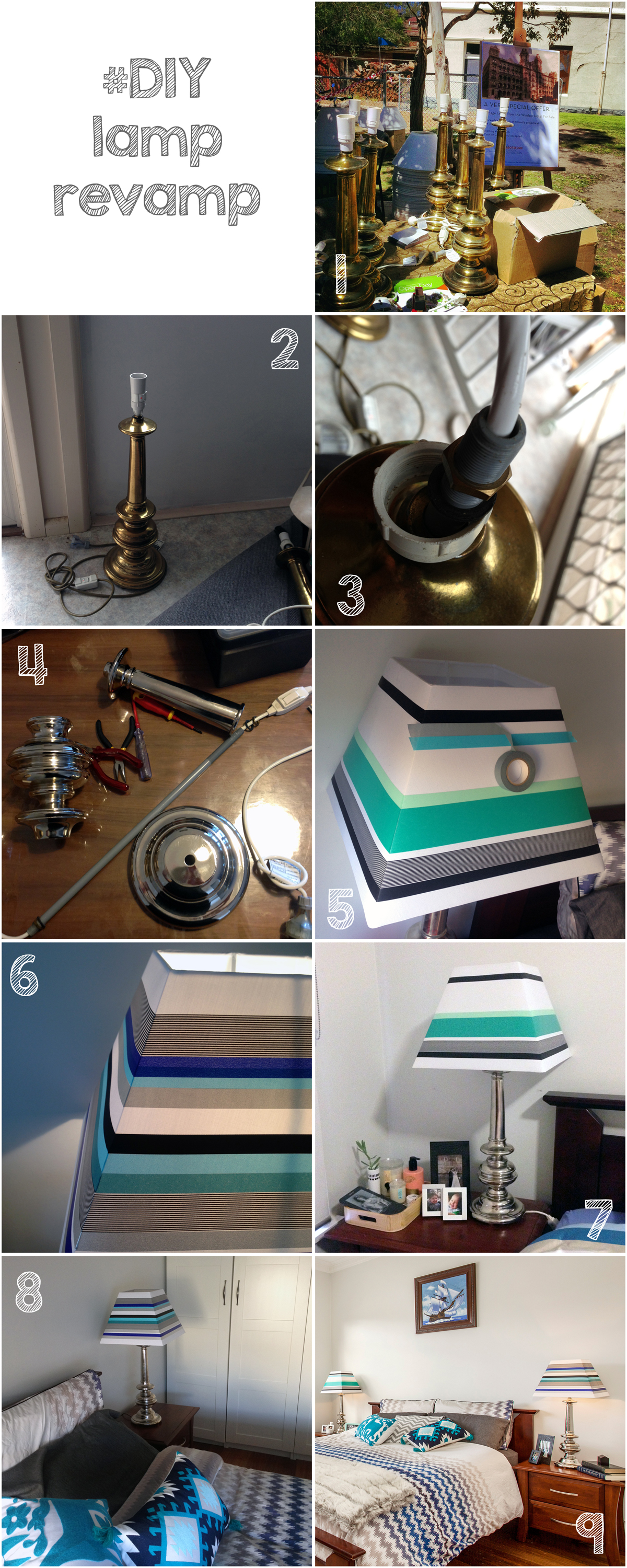
Lamp revamp
Spotlight on Australian Designers | Catherine Martin
Catherine Martin really needs no introduction. Costume Designer. Production Designer. Set Designer. Art Director. Oscar, AFI, BAFTA and Tony Award winner. Wife to the equally talented Baz Luhrmann. Mum. This chick does it all!
As if that wasn’t enough, design collaborations are now a regular occurrence for her, in the form of wallpapers for Porter’s Paints, rugs for Designer Rugs, textiles and bedding through Anthropologie and I’m sure the list will continue for this extremely talented Australian.
I had to think long and hard about which were my favourite pieces of Catherine’s. I could easily put down every rug in her multiple collections, and the majority of her wallpapers, but have forced myself to narrow it down to just a few.
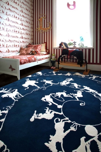
{Circus Silhouettes by Catherine Martin. Rug for Designer Rugs. Wallpaper for Porter’s Paints}
The first should be one that I was coveting for years (in preparation of my first baby’s room, while pregnant). Expectedly highly theatrical, the navy Circus Silhouettes would have been a dramatic and stylish addition to my baby boy’s room, encouraging movement and fun. Of course, budget and the fact that I would HATE to get any vomit or other baby-nasties on this beauty ceased the purchase, but its still on the ‘One-Day’ list - I think the energy and whimsy in this is ageless and definitely is not restricted to kids rooms. The walls in the image above also feature her complementing design for Porter’s Paints.
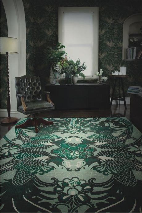
{Night Bird rug by Catherine Martin for Designer Rugs}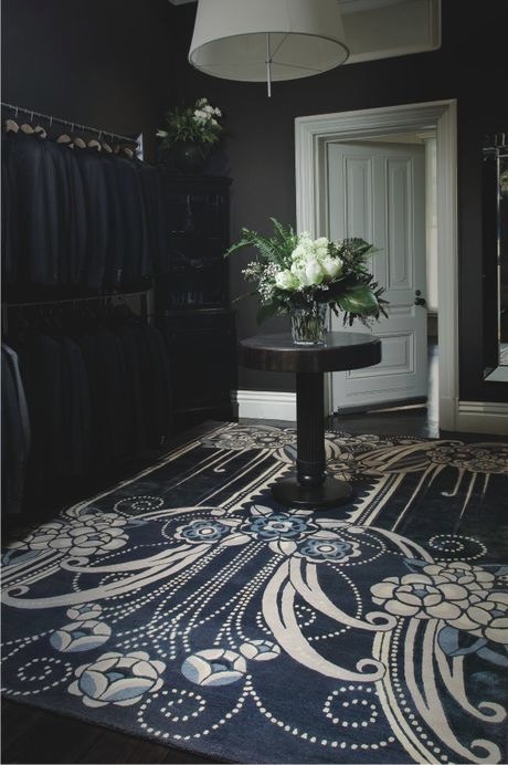
{Black Pearl rug by Catherine Martin for Designer Rugs}
Now let’s just say I love the entire Deco collection with Designer Rugs. I can’t wait to see them featured in Baz’s The Great Gatsby in May 2013. If I HAD to pick a favourite, it would probably be the magic, flow and art deco romance of Night Bird, although Black Pearl comes a very close second. Hmm... Maybe tied first. It would certainly upgrade a bedroom into a Boudoir. And how about this custom stair runner adapted from her Lace rug design - to die for!
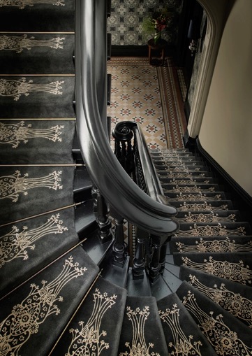
{Lace stair runner by Catherine Martin}
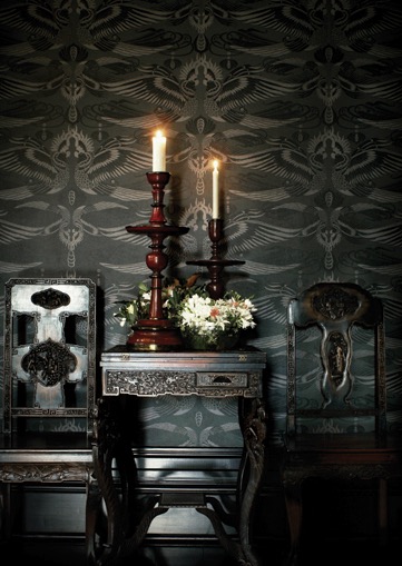
{Imperial Pheasant wallpaper by Catherine Martin for Mokum Porter’s Paints. Shown here in Lacquer}
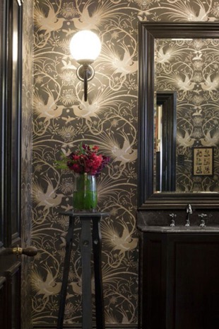
{Cockatoo wallpaper by Catherine Martin for Porter’s Paints. Shown here in Black Neutral}
Most of Catherine Martin’s wallpaper range links in with the rug designs, as a complement or feature in its own right. Mokum Imperial Pheasant comes in a range of colourways, my faves being the Ming Blue or Vintage White (seen at Grand Designs here), or for something dark and dramatic but still linking to home and Fauna Australiana, the Cockatoo wallpaper in Black Neutral is divine.
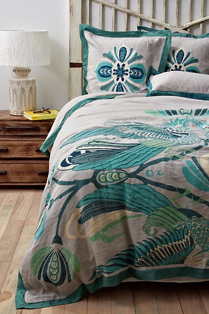
{Cockatoo Bedding available through Anthropologie}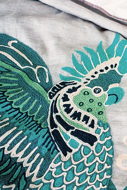
{Cockatoo Bedding Detail, Anthropologie}
To add more products to her arsenal, there is this gorgeous duvet and pillow covers in shades of green, teal, aqua and navy (my absolute favourite combo!) on a neutral grey backdrop with her signature Australiana in the form of giant Art-Deco-meets-Arts&Crafts-Movement Cockatoos. Detailed and divine.
As usual, follow the links to enjoy the rest of her collections, and I’m sure get lost in the other millions of perfect products and design collaborations that are on offer at these companies.
Now after all this exciting designer eye-candy, I’m off to Magnolia Square for some more arty goodness. Will try and lock up my cards and cash, but somehow never seem to succeed. If I can stop the retail therapy long enough to take some pictures, I may do a post about. Alternatively, it’s on all weekend so check it out yourself. Be warned. You will spend. Good luck.
xo Romona
![]()
Unearthing Treasures
Inspired by Carpet Court’s new Love the Look competition (How hard is it to choose between team Darren and team Stacey!), I went rummaging through my boxes of trinkets and collected items from my travels and explorations. You know the ones - the pieces you’ll put up in your one-day house (the one with room to spare - a library, a sitting room, a chic powder room off the entry foyer, maybe even a gift-wrapping room à la Martha Stewart). The piece that caught my eye was right there on my bedroom wall. The exquisite hand-painted Indian wedding ceremony on a government stamped paper that I found in a market in Jaipur, India.

{Indian Government Stamp and painted Wedding Ceremony Artwork, from a market in Jaipur, India}
Another work from the same market is the black and white elephant heads (below right). Until I photographed them for this competition, I had forgotten how much I liked looking at all the scribbly detail in them.

{Indian Government Stamp and painted Elephant head Artwork, from a market in Jaipur, India}
They are totally out of place in my current bedroom. As it stands, it’s a mismatched explosion of objects - and not in a good way (thus the desire to refurb it, stat!) I love mixing vintage with contemporary, but the pieces have to be right and I feel it has to be done with a cautious hand and keen eye.
I had been meaning to reinvent my bedroom into a palace worthy of old Hollywood. Glamourous crystal and blinding chrome. Tufted velvet and mirrored lucite-legged vanities. All look but don’t touch. Now though, I am having to remind myself that yes, although I love the look of these in magazines, could I live there? Especially with two young boys (one who likes to crawl into bed with us after pushing most things off the dresser with his cars, and another that I’m sure will do the same as soon as he is able to get out of the cot).
I’ve decided to go back to basics. Firstly, I have to decide what, if anything, I want to keep from my current room or if there is anything that I already own that I want to introduce into the new room (such as an art work or armchair). I think I will be keeping more than I’d like to (budgetary reasons), but upcycling is under-rated, so I’ll see how I can change the items that I can’t afford to replace, to fit the new style. If you follow me on Pinterest, you may have noticed that my DIY folder is getting more of a work out lately than usual. With two kids, and without the disposable income that we had before them, I can hardly do the complete Jonathan Adler meets Kelly Wearstler that I’d like to.
Secondly, research images that attract and excite me, and define what it is about that image that gets me going. Is it the whole package, a particular furniture item, the colours - warm or cool, the scale, the layout, the fact that its tidy, what? Then see how it can be applied or worked into the canvas that is my room. Again, Pinterest and Houzz are wonderful resources for finding inspiration and products. Of course, its always fun flicking through drool-worthy magazines like Belle, Real Living, Sanctuary and Home Beautiful when you can find the time. I embrace my iDevices, but I am not quite ready to part with my monthly deliveries of hard copies just yet, thank you.
Luckily time is on my side. With a bathroom renovation due in October, it may be a few more months before I have the spare coin to put towards the fabrics or wall paper that will make it really worth doing. There’s nothing wrong with taking time to make sure that you really do love that particular pattern you chose, and not just because its on-trend or was used in that house by that guy in that magazine, you know the one! For now, I am just trying to remind myself to keep the basics somewhat neutral, so I can really go nuts on the replaceable items like headboard fabric or bedding or window dressing.
OK, so I think I have successfully gone completely off topic. Maybe one day I’ll be able to do it with the charm and imperceptible manner of Ross Noble or Billy Connolly. Until then, I will just say that I will revisit the idea of finding hidden treasures in your home when inspiration strikes. I’m hoping to also bring you a little introduction to our planned bathroom reno coming up - I look forward to some peer feedback if you feel like it. Ciao for now.
xo Romona
P.S. (again) Sorry that comments aren’t allowed at the moment. I really want to hear any feedback you have but iWeb is disagreeing with me and I need to find a new program. Excuses, excuses!
Please feel free to email/tweet/FB post me - would love to hear from you!
UPDATE: Hopefully comments should work now….
![]()