


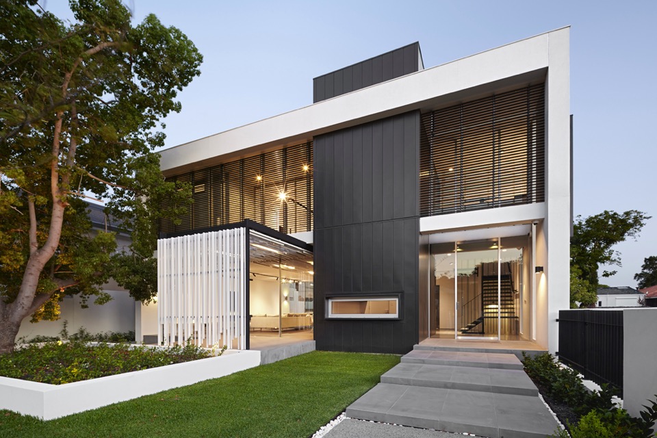
The James Street Residence by Romona Sandon Designs
In designing our home it was important for me to balance the comfort and lifestyle needs of my young family with my environmentally sustainable goals from my work in Sustainable Architecture. I wanted to test if low-cost sustainable design could still be convenient and aesthetically pleasing to the clients (my family). I also wanted to test people's perception of what an eco-house should be or look like.
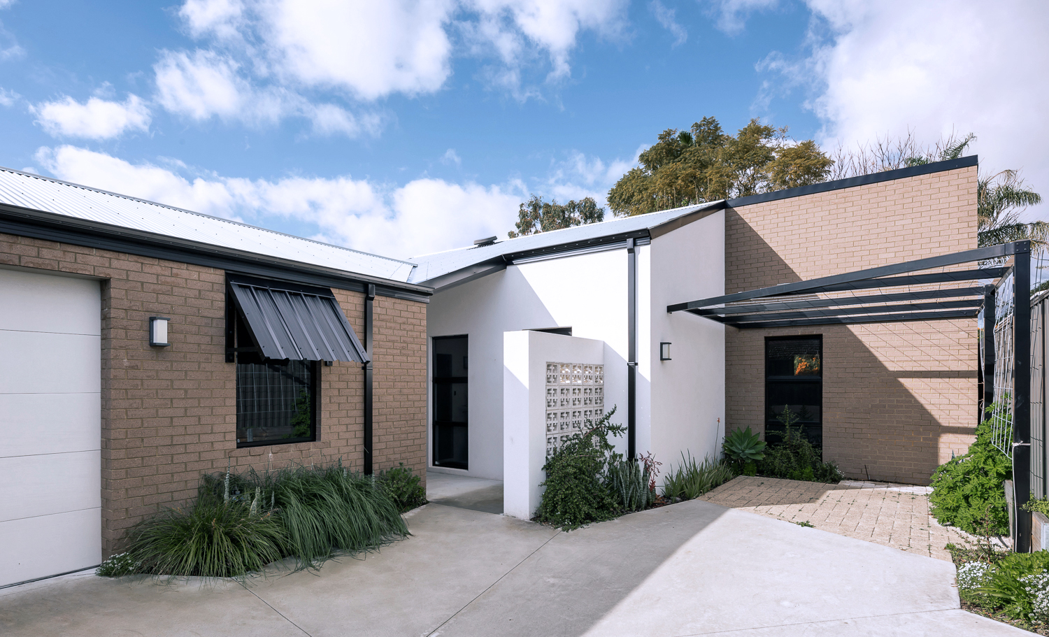
{The James Street Residence, by Romona Sandon Designs, Front facade}
With the kitchen, I wasn't aiming to do anything new or innovative. I wanted timeless and simple. A canvas devoid of colour so it could be injected by way of homewares and appliances and food and family. I guess I never strayed far from what I had always wanted, even showing this colour palette (or lack thereof) in previous posts, such as the Monochrome Kitchen. Cabinetry either flows through to the ceiling or is capped by bulkheads, to reduce surfaces that dust could collect on, reducing potential allergens.
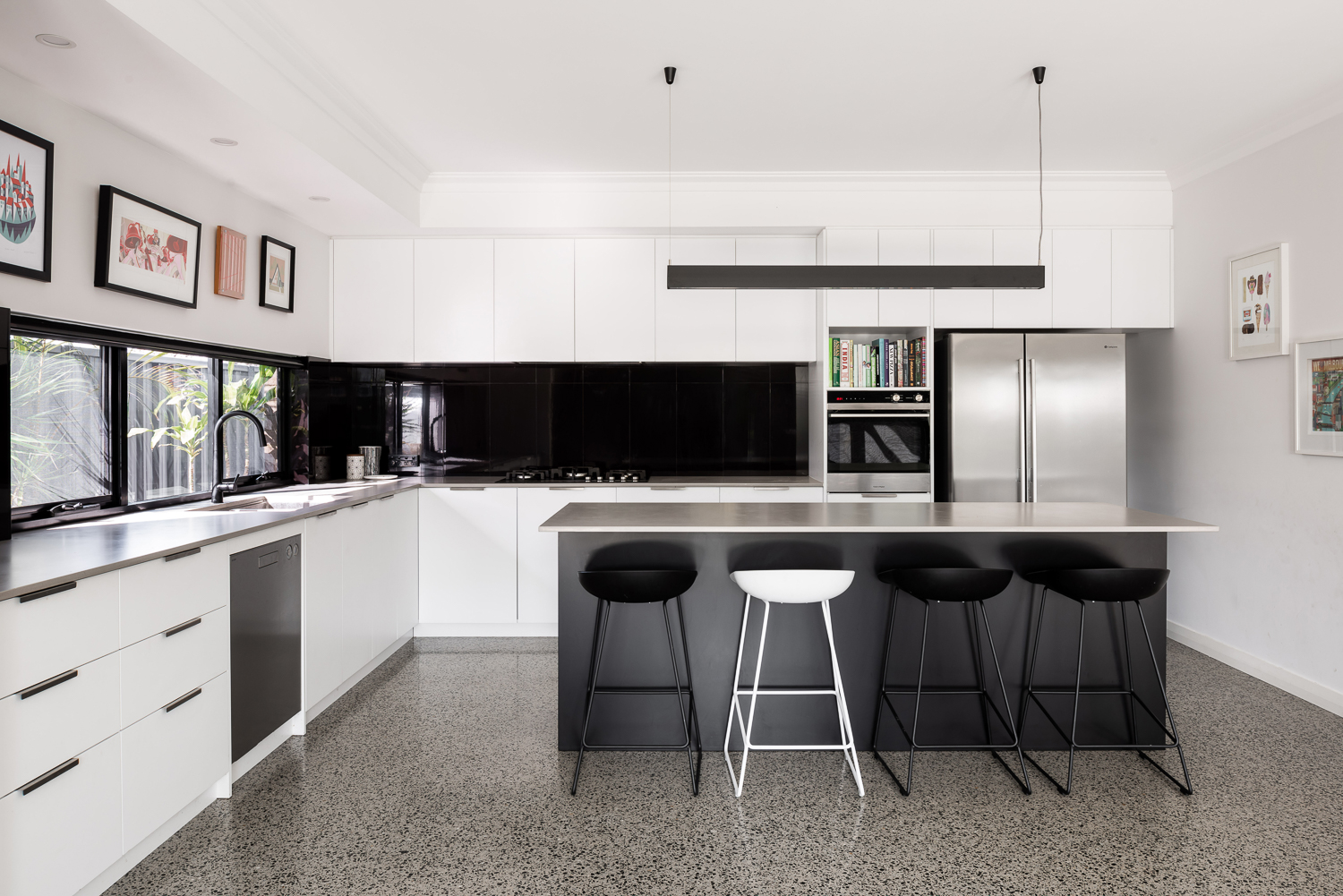
{Monochrome kitchen of the James Street Residence, by Romona Sandon Designs. Image by Dion Robeson.}
Passive solar design principles were utilised where possible within the council and R-codes on a small rear battle-axe block. Large north-facing windows and doors allow winter sun to penetrate and store heat in the thermal mass of the polished concrete floor. The polished concrete floor was high on my list of features that I really wanted in this house - surprisingly, planning for this quite early on in the design process kept the cost quite comparable with alternative floor coverings.
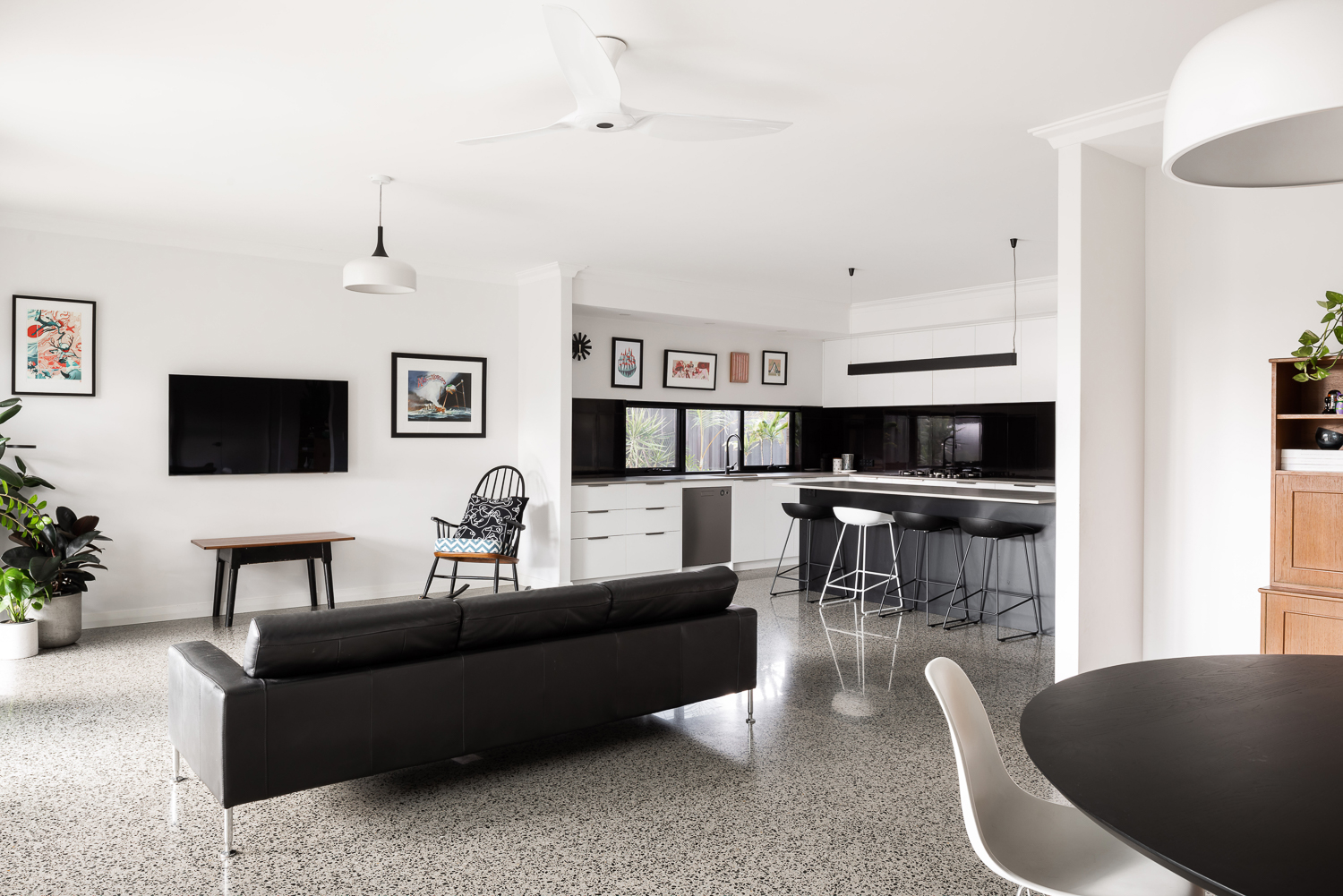
{Open-plan living space of the James Street Residence, by Romona Sandon Designs. Image by Dion Robeson.}
Insulated cavity brick construction helps contain winter heat. Cross-ventilation allows excess heat to be dissipated in summer. A SolarStar solar-powered thermostat-controlled roof cavity ventilation system also rids the building of excess heat when needed. In the two years of occupancy, no active heating or cooling has been necessary except for the Big Ass ceiling fans (their name, as well as description!)
Solatubes with integrated PV (photo-voltaic solar panel) LED day and night lighting is used in conjunction with natural daylight and low-energy lighting elsewhere. Low VOC (Volatile organic compound) paints and carpets are used throughout to reduce sick-building syndrome (off-gassing). PV's sufficiently power the house with a larger inverter for future-proofing. East/west openings were minimised and treated with Low-E glazing where unavoidable, as well as awning shading.
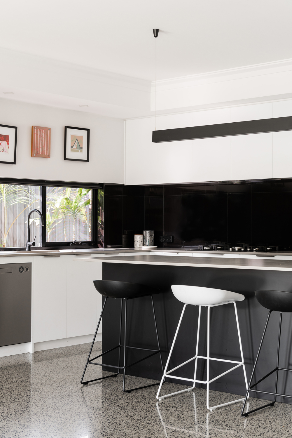
{Kitchen details of the James Street Residence, by Romona Sandon Designs. Image by Dion Robeson.}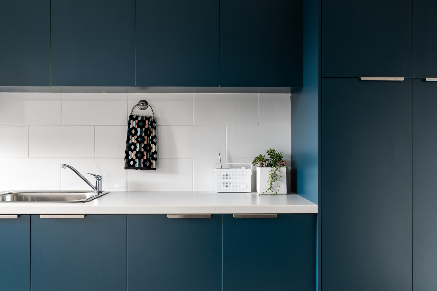
{Laundry details of the James Street Residence, by Romona Sandon Designs. Image by Dion Robeson.}
The bathrooms features hobless showers for accessibility. The glass above the half-height wall allows light to penetrate fully into the bathroom to reduce mould build up.
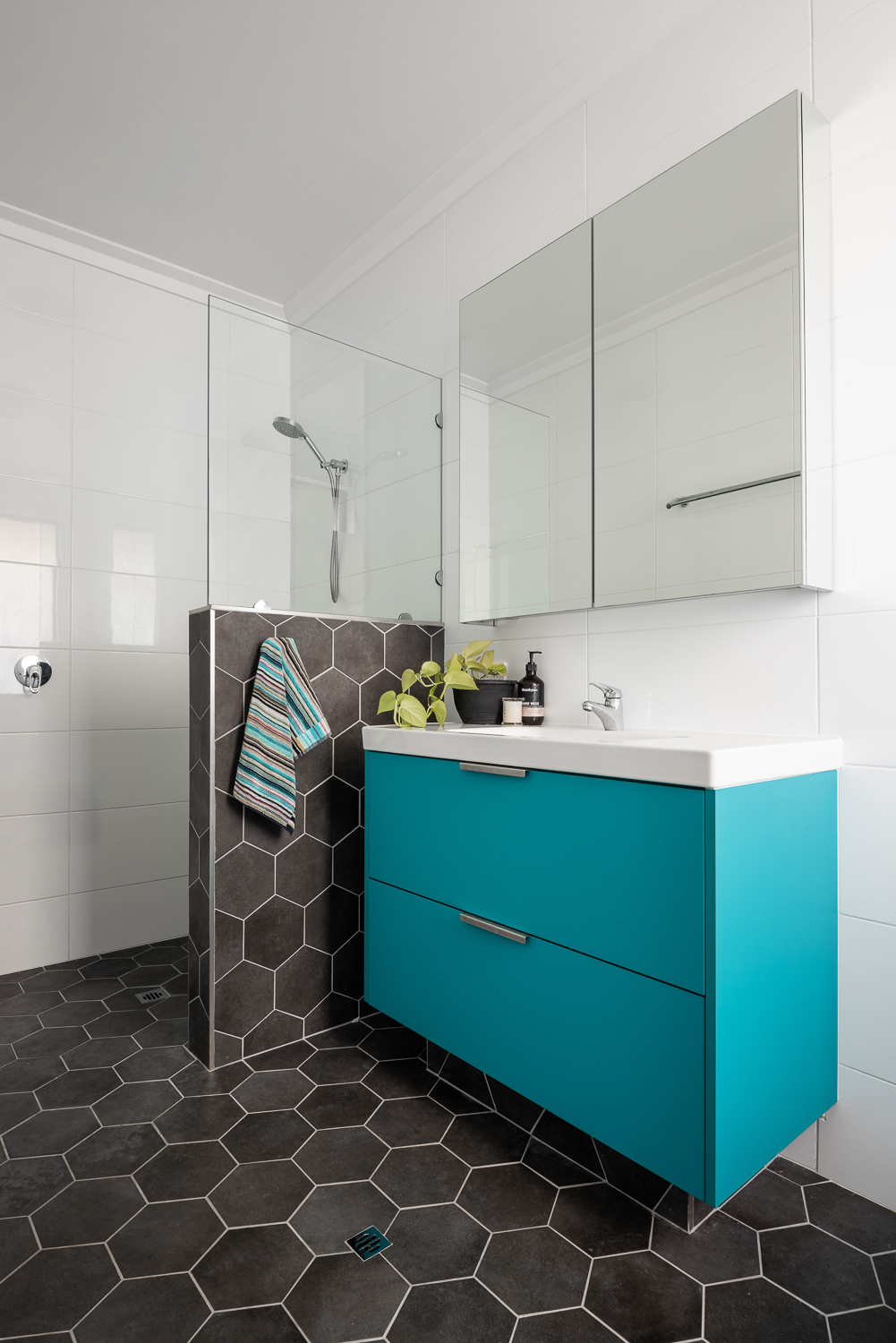
{Master ensuite details of the James Street Residence, by Romona Sandon Designs. Image by Dion Robeson.}
Curtains and blinds are opened and closed to allow optimal light and heat inside, which is also aided by deciduous vine plantings on the north for additional summer shading of openings. While we wait for the grape vine to grow, we use a combination of shade sails and a passionfruit vine that we trim back in winter to allow more sun through. In the mean time, we are drowning in fat juicy passionfruit and the kids adore it!
The garden also considered sustainable design elements in the use of reclaimed breeze blocks for the entry, edible garden courtyard and native or self-sown water-wise planting. Indoor plants are used for improved indoor air quality and visual calm.
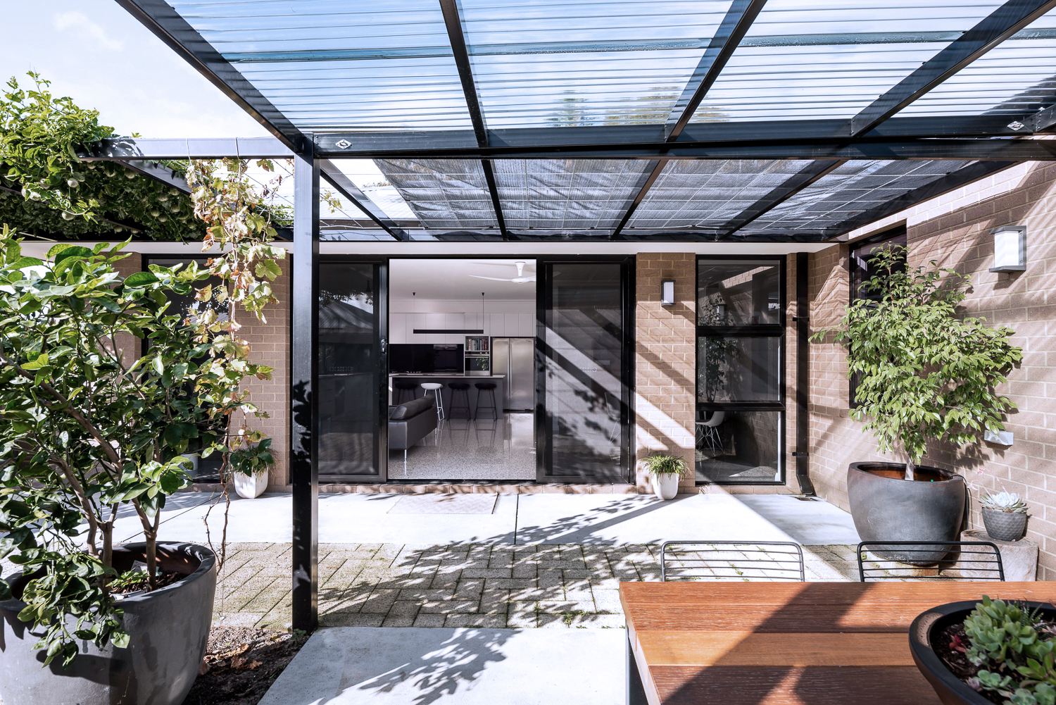
{North-facing, rear exterior of the James Street Residence, by Romona Sandon Designs.}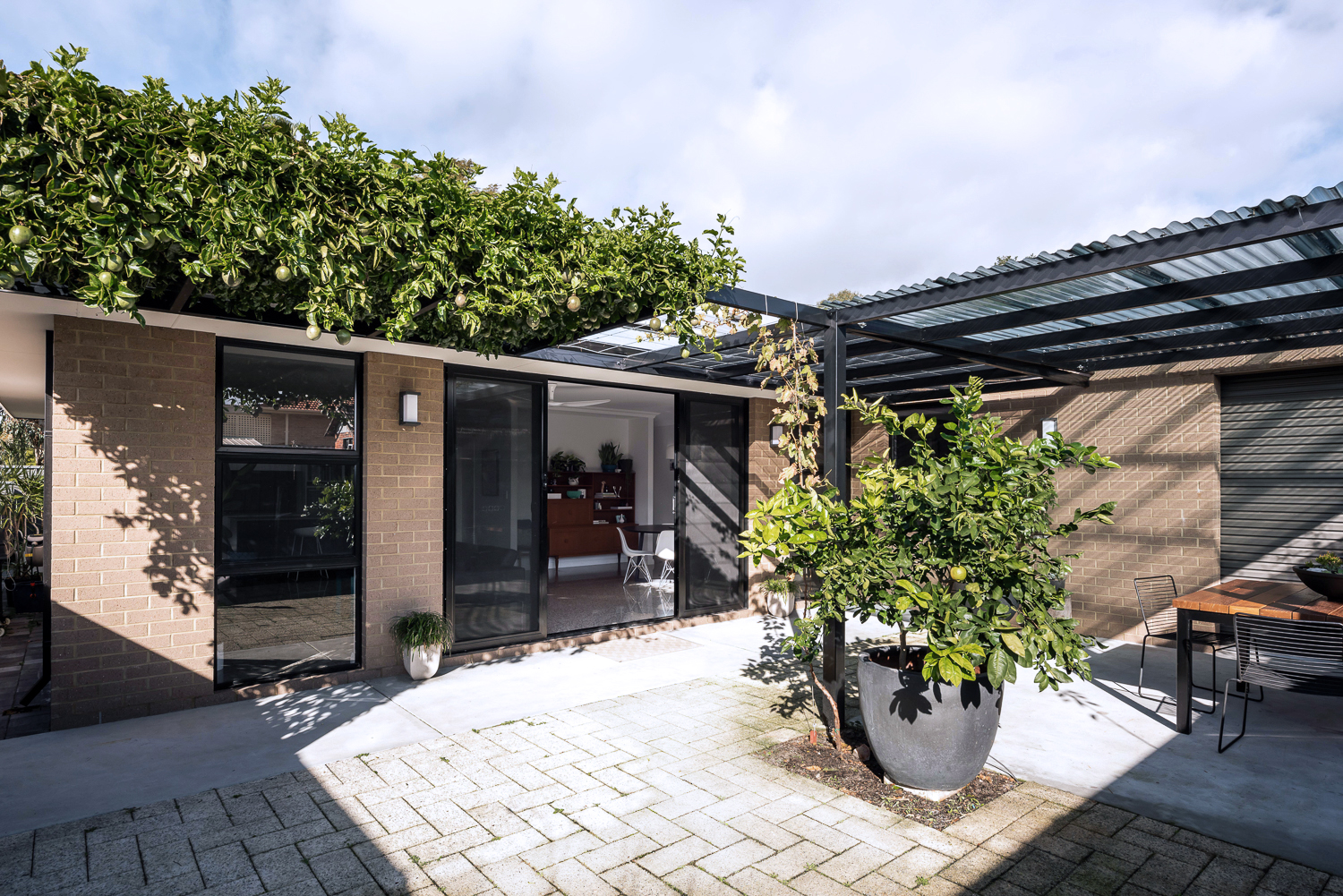
{North-facing, rear exterior of the James Street Residence, by Romona Sandon Designs.}
As a sustainable designer, I see it's discrepancies and the details that could have been improved, with time, money and less council limitations.
As an architect, I see the features that I could have amplified and where I wish our money could have stretched to.
As the client, it is perfect. It is the perfect design for how my family and I live, our budget at this stage of our life, and the place and site that we built it on. It is our home and I'm proud of it.
xo Romona![]()
Local Heroes: Gallery House by Craig Steere Architects
{Complementary materiality of off-white render, stone, timber and zinc cladding}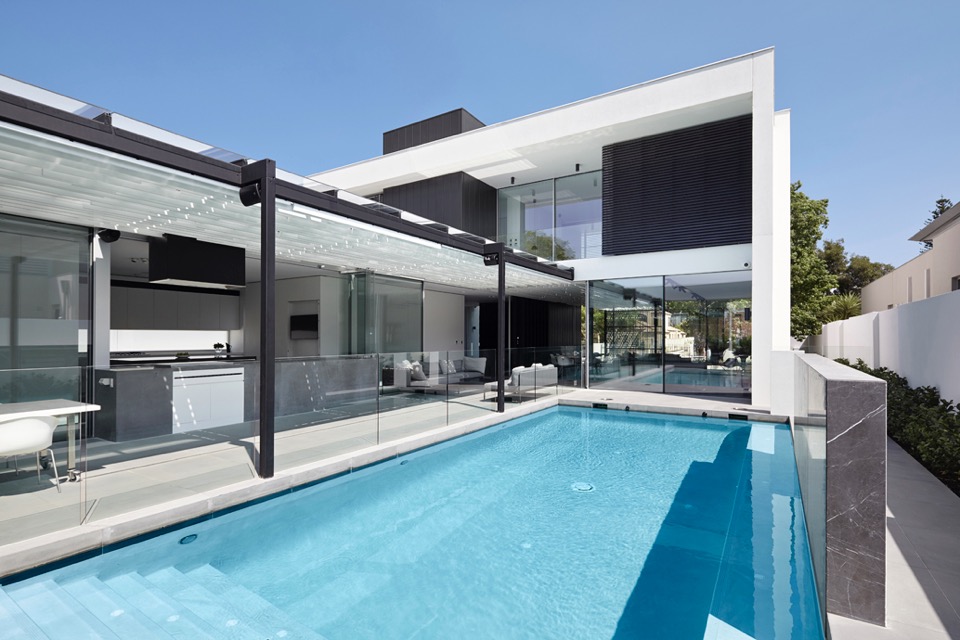
{How beautiful is that pergola?!}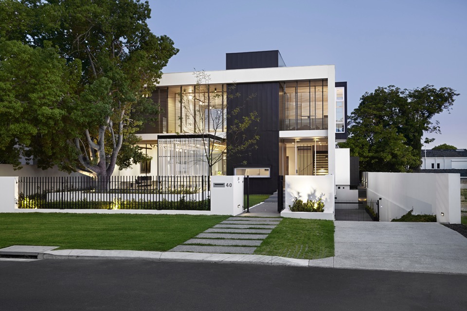
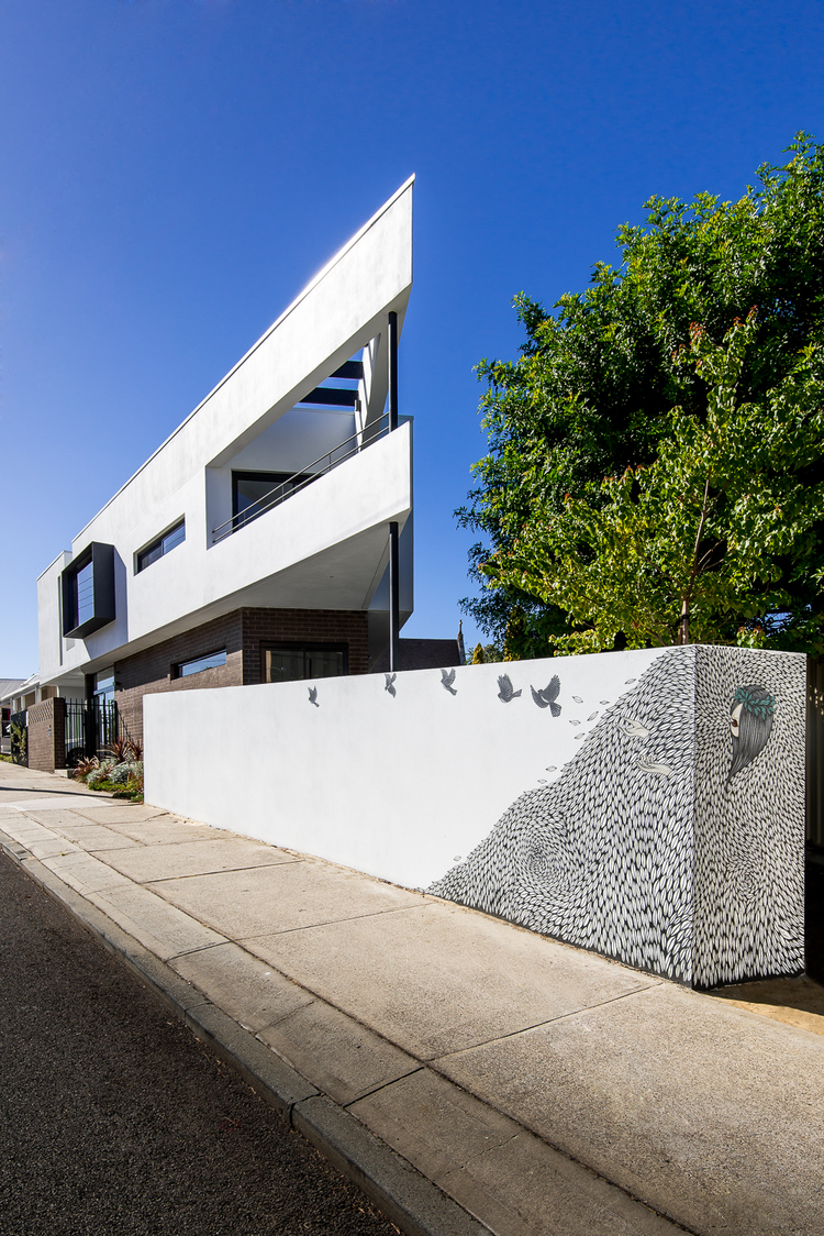
{Classic but contemporary frontage in Nedlands}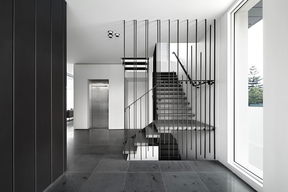
{Crossing linear elements continue with steel balustrade and stone stairs}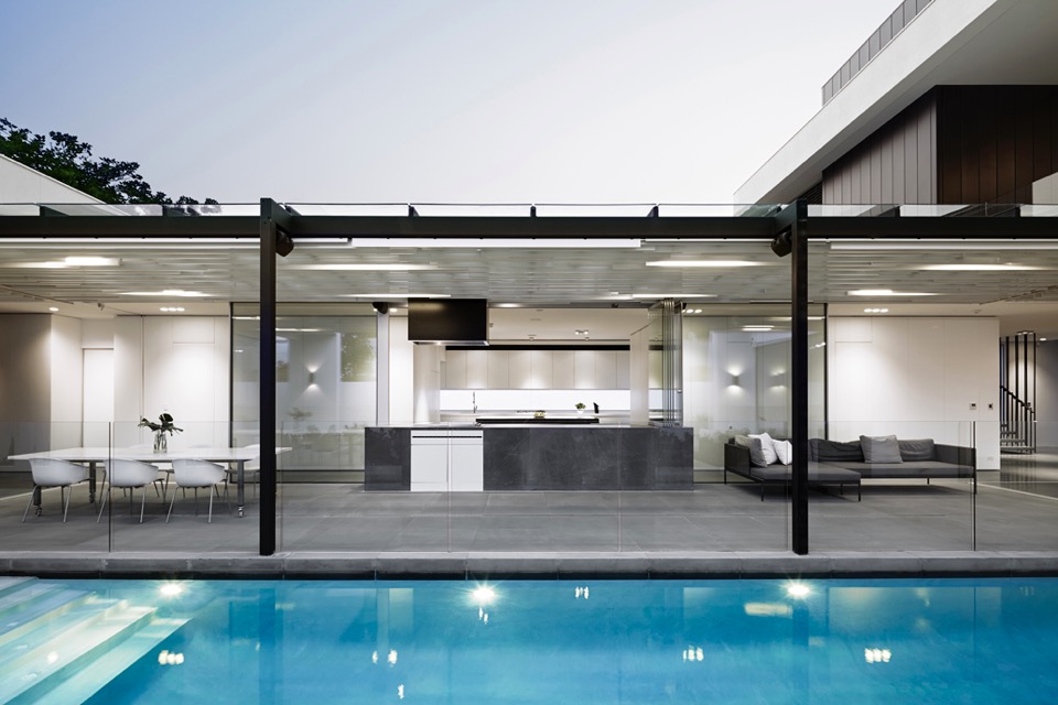
{Visual and physical connection between outside and in}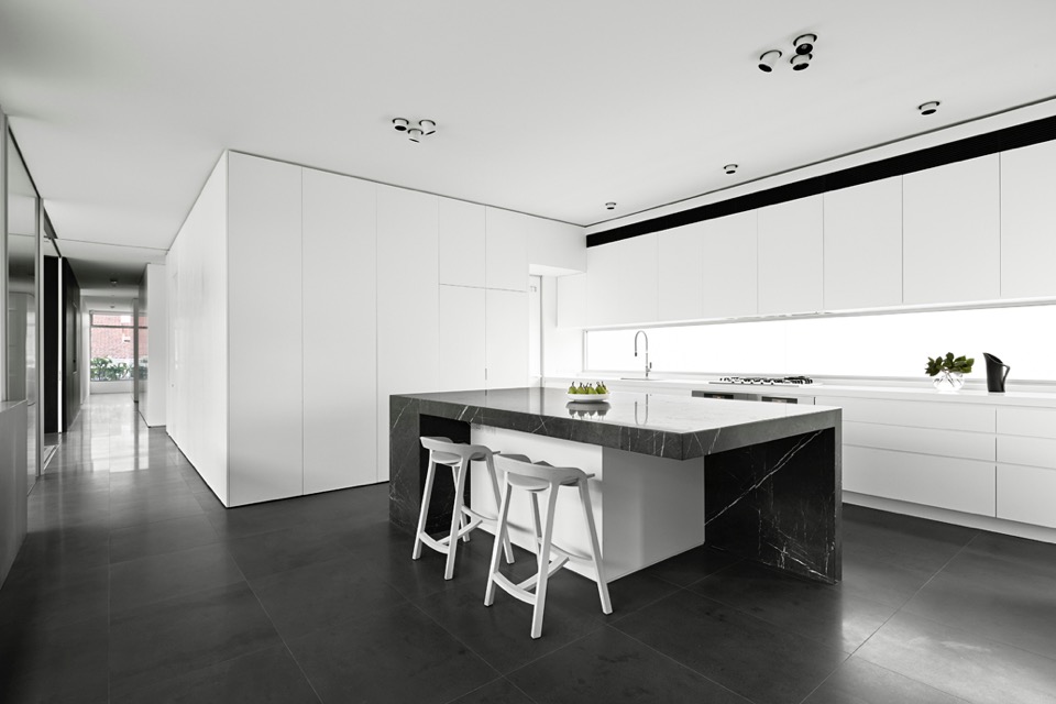
{I love a clean monochrome kitchen. It gives a great base to personalise with homely touches later}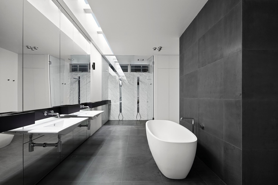
{Simple palette and colour scheme continue through into wet areas}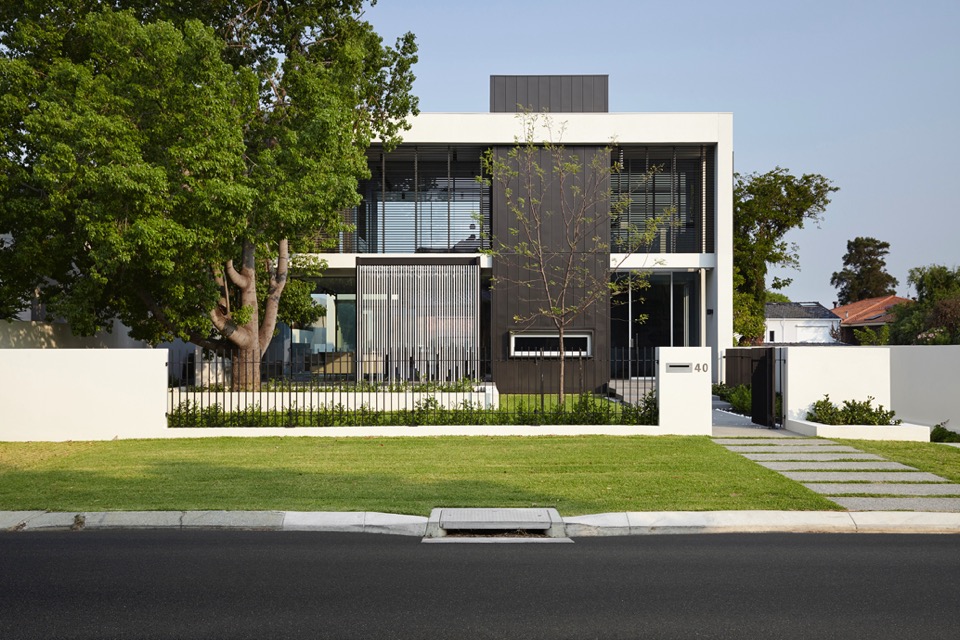
{Overlapping linear elements give aesthetic cohesion}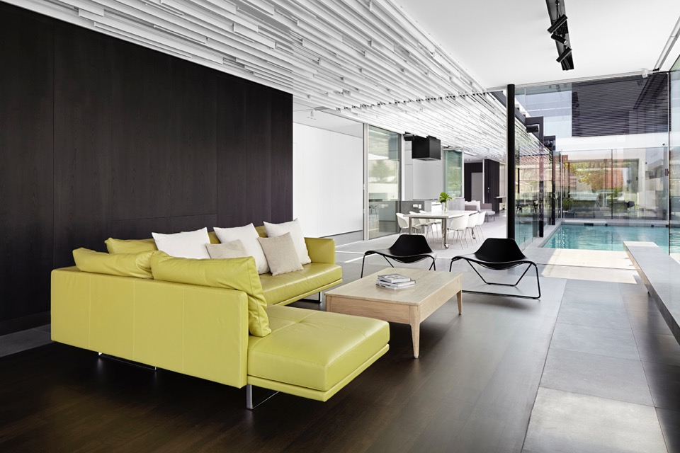
{That ceiling is amazing! I would not have enjoyed drawing up those details, but what a result!}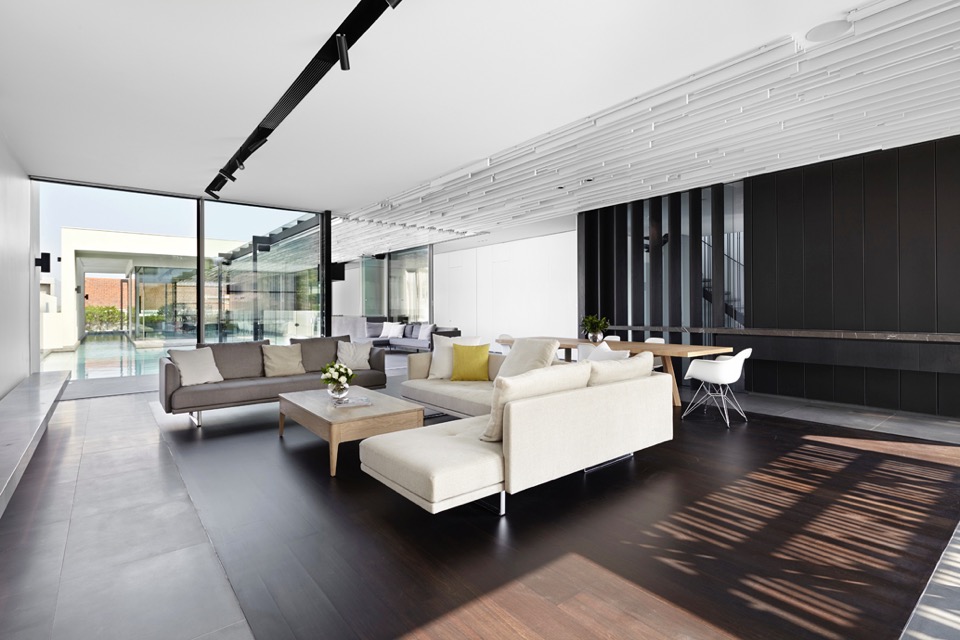
{A touch of warmth to the monochromatic palette, with timber floor insert}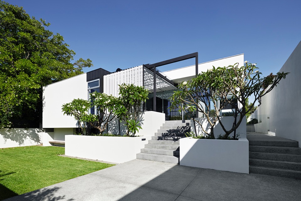
{Sculptural Frangipani trees create organic silhouettes against the linear}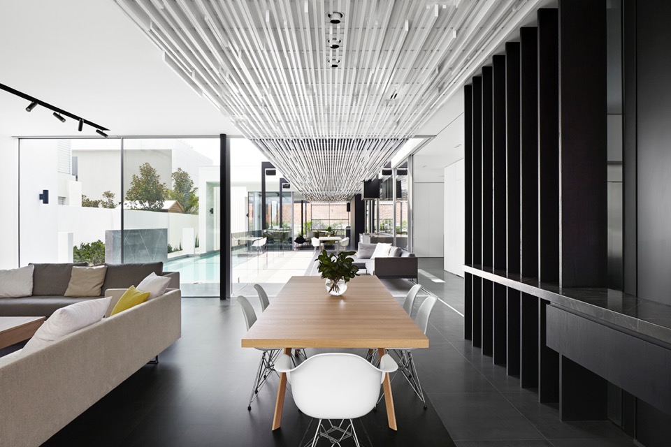
{Ceiling and pergola structures linking the pavilion and courtyard spaces}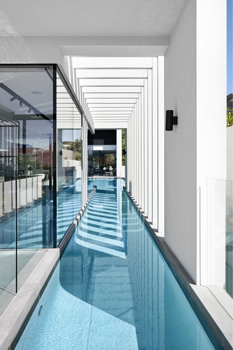
{Visually striking linear elements, that would be amazing to take in from the pool, day or night}
I feel the need to point out that while passive solar design principles have been applied with siting, material selection and active tech, the 6 star energy rating achieved is the NCC (National Construction Code) minimum, since this rating system goes up to 10 stars. Just keep this in mind, when designing or building your next home - time spent aiming for a higher rating early on will save you time and money later on.
Regardless of this small point, this house is a beautiful example of contemporary residential architecture and looks like it would be a joy to live in.
xo Romona![]()
Local Heroes: Triangle House by Robeson Architects
But I digress, this isn't a lecture on residential sustainability, rather the exploration of something beautiful born out of perceived limitations. Triangle House on a tight 180m2 triangular block in Mt Lawley, Perth showcases the ingenuity of Robeson Architects and to me is one example of Perth architecture at an international standard. What better way to start this series than with a project that initially grabbed me on Pinterest, but really had me hooked when I found out it was not only Australian, but super-local (Mt Lawley!) and a fellow female architect. Enjoy!
{The stunning triangular form juts out with supercool artwork below at street level by Robert Jenkins (@theblackmountains). So recognisable to me now that we have a wall of his around the corner in Bassendean, and you may have seen me go a little insta-happy over}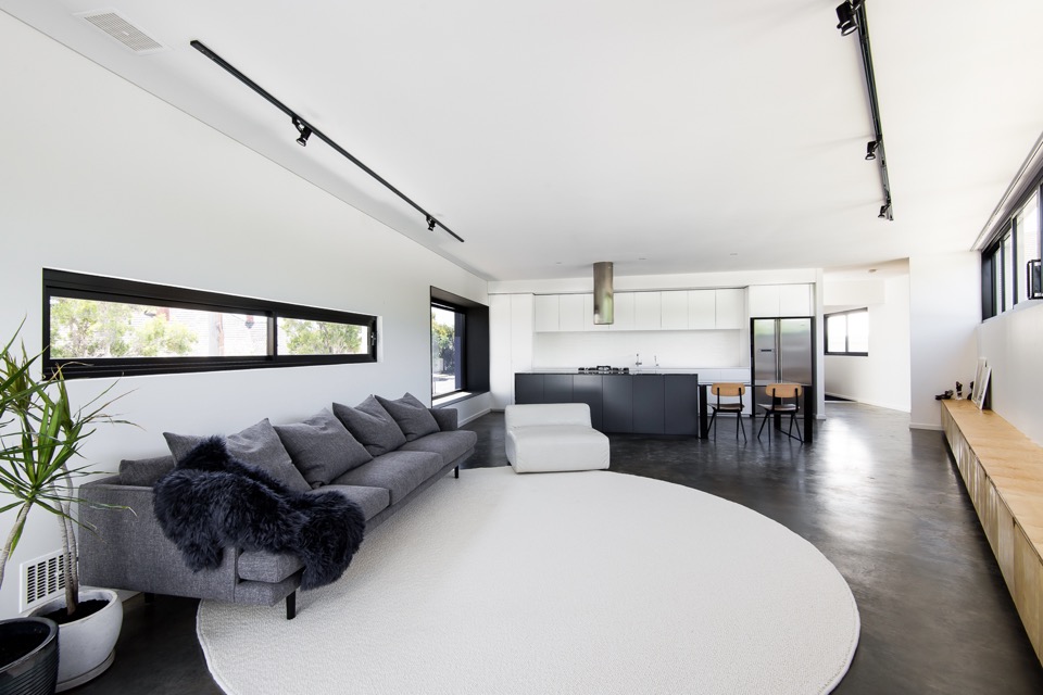
{This was one of the first images that made me fall for the place. Of course those who know me, know my tendency towards black, white and grey, but it also has all my other loves - big white kitchen, contrasting black frames, deep polished concrete flooring, minimal timber accents, big snuggly Jardan grey wool couch, indoor potted sculptural Dracaena, statement linear ceiling lighting, even the furry throw - my god Simone, you can do no wrong in my eyes! In fact, if I plonked my gorgeous tan fur-baby on that rug, the picture would be complete}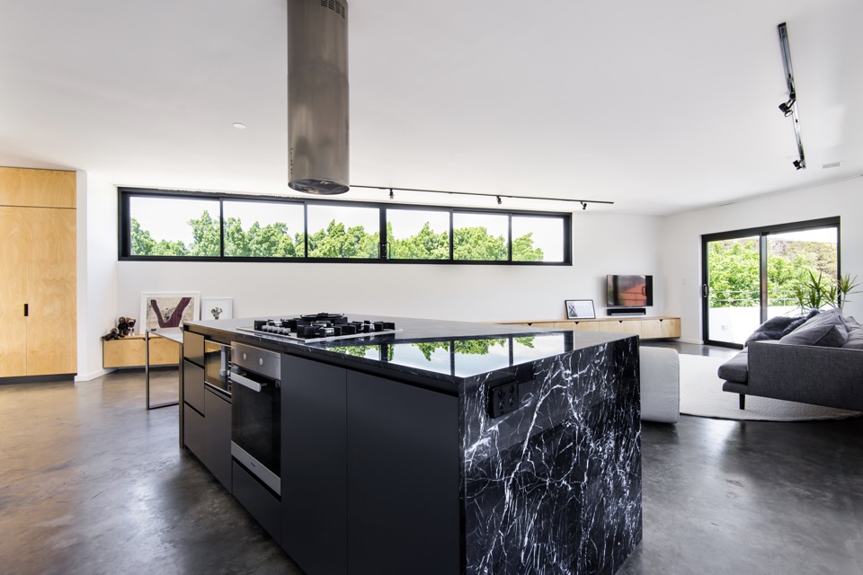
{Brutal black kitchen island wrapped in electric-veined Nero Marquita marble adds drama to the monochromatic space}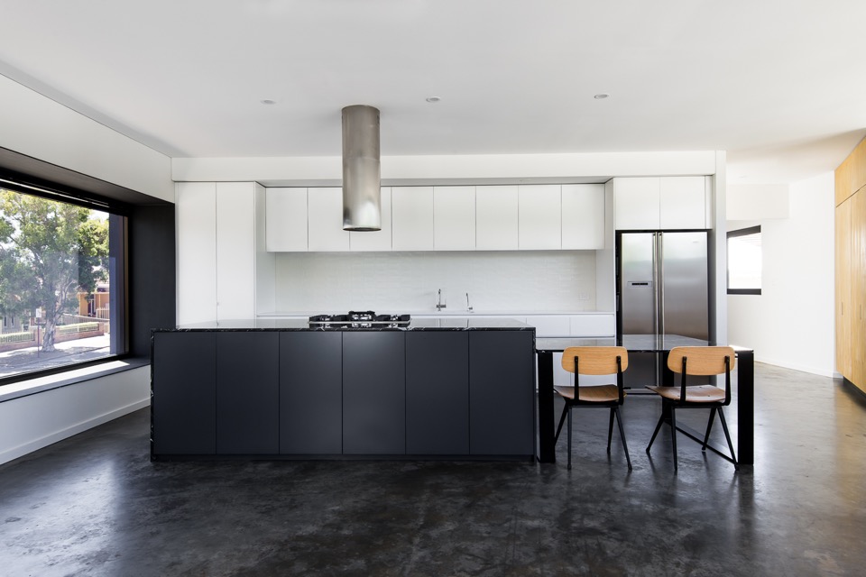
{Just a beautiful kitchen in blocked monochrome, and I love that massive projected north-facing window, done in one-way glass boxed out in steel for privacy}
{Extending the black-framed picture window to the heavens with a waterfall skylight}
{Sharp-edged deck space making the most of a difficult site and adding a bit of drama to Vincent Street}
{Clean gallery feel to the downstairs office softened by multiple but complementary textures and material finishes, like the burnished concrete floor, blackened LVL stair treads and black steel}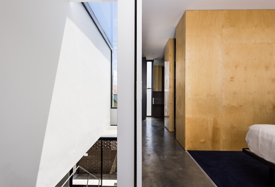
{Simple but inspiring void spaces and linear movement}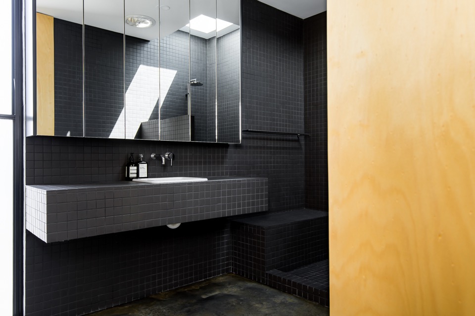
{Clean and minimal bathroom in continuous matt charcoal tile with clever hidden storage. Love the concrete bathroom floor, but I'm unable to convince my husband that I won't snap my other leg if we have that} 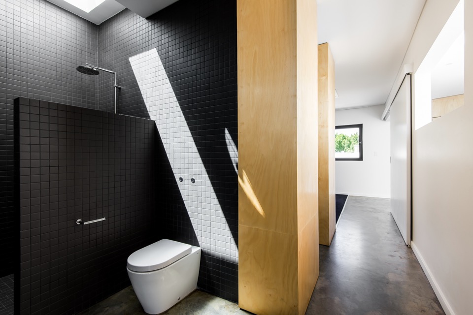
{You know it's good when even the dunny makes you go Oooo}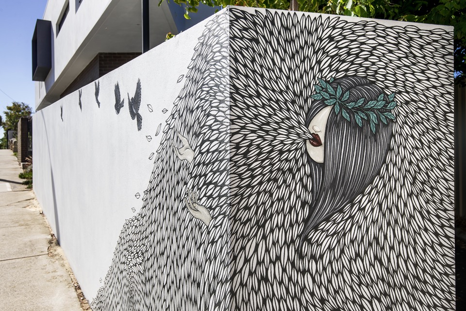
{Detail of the cool mural work at Vincent street level by Robert Jenkins}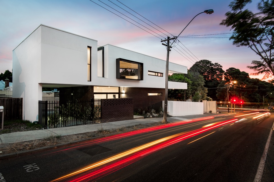
{Image by Dion Photography}
{Image by Dion Photography}
All images are from Robeson Architects (big thanks Simone) and Dion Photography. If my house turns out even half as nice, I'll be wanting some shots done by those guys. Simply brilliant!
Doesn't it make you proud to have some lovely architecture in Perth (and Australia)? What are your thoughts on this place?
I'm hoping to showcase a bunch of other local talented architects and their projects soon, so feel free to let me know if there are any that stand out to you.
Hope you enjoyed!
xo Romona![]()
Interior Design Solutions that will Enhance your Life
It’s all too easy to get stuck in a design rut when it comes to your home. However, with a little creative thinking, it’s possible to revamp your property. The following simple but effective design tips could help you to improve your house and they might even enhance your life.
Window dressings that put you in control
If you assume window dressings are just there to look pretty and give you some added privacy, think again. By choosing these home accessories carefully, you can bring added comfort to your rooms. For example, it’s now possible to purchase stylish and highly practical blockout blinds and curtains. Available from window dressing specialists like Curtainworld, these accessories give you complete control over light levels in your home. Whether you want total darkness to help you sink into peaceful slumber or you’re keen to create the movie-theatre experience in your lounge, these blinds and curtains can help.
{Chambers Street Residence in South Yarra, Melbourne by MIM Design}
Soft furnishings that exude style and bring added comfort
Another quick and easy way to refresh the look and feel of your property is to add some new soft furnishings. While a simple rug and a few cushions may not seem much when you consider them on their own, when you adorn your rooms with an array of lavish new accessories, they can have a transformative impact. Thick pile rugs for your floors, soft throws for your seats and a scattering of stylish cushions on your couch and bed can really bring your rooms to life.
{I'd love to cosy up in this place right now! Appartement Lyon 5 By Maison HAND in Elle Decoration. Photo by Romain Ricard}
Bring the outside in
Another simple and satisfying way to enhance your home is to bring the outside in. Most people have at least a scattering of small pot plants in their properties, but why not take this a step further and introduce big, bold plants that make a real style statement? From the Zanzibar gem to the golden cane palm and Madagascar dragon tree, there’s certainly no shortage of options to choose from. This greenery can be used to liven up otherwise bare corners, soften stark walls and generally add a jungle look to your rooms.
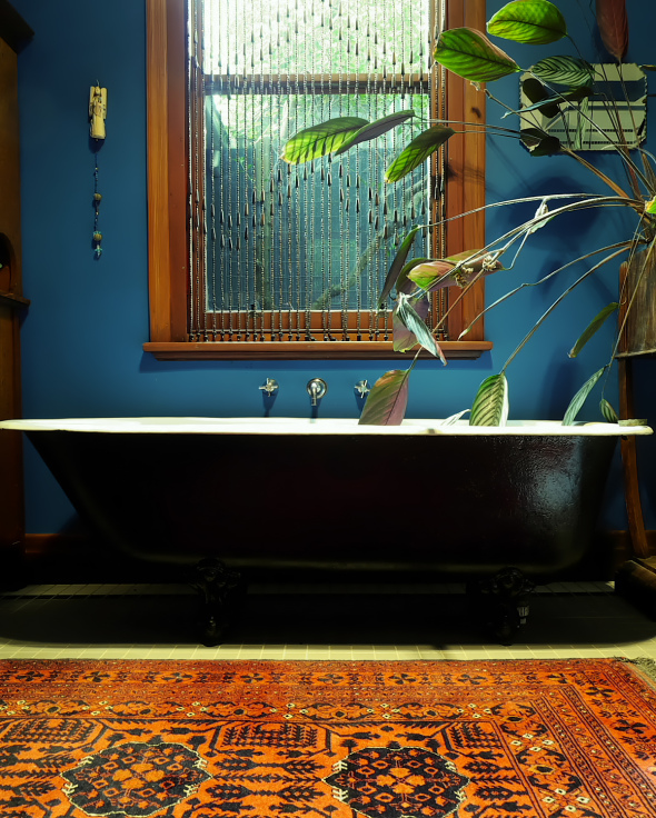
{Jazmina's beautiful Melbourne bathroom featured in The Room Illuminated}
As well as improving the appearance of your home, plants may help to boost your health. According to research conducted by Professor Margaret Burchett and Dr Fraser Torpy from the University of Technology Sydney, indoor greenery can remove pollutants, cleanse stale air and reduce symptoms such as sore eyes and headaches. The scientists also suggest that plants can help to minimise feelings of stress and fatigue. The best thing is, you don’t have to splash much cash to get your hands on these home accessories and, as long as you care for them properly, they’ll give you many years of enjoyment.
I hope you all enjoyed these few tips from our contributor Gail Newland. I personally love seeing plants of all sizes inside. Thanks Gail!
Do you have any tips of your own to share?
xo Romona![]()
Australian Interior Design Awards 2015 - Residential Award
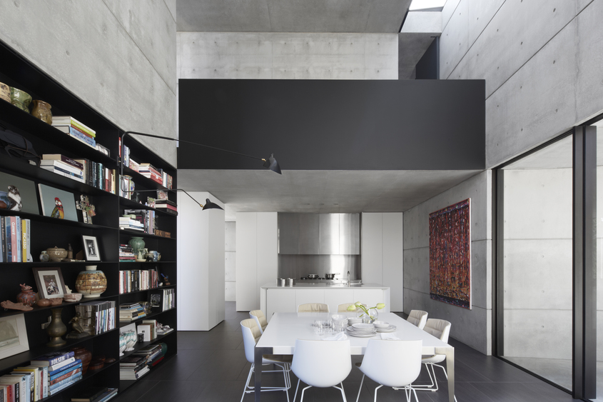
{This dining room is composed of the perfect balance of bright white, raw concrete and moody black accents. Although these Serge Mouille lamps seem to be everywhere at the moment, you can't deny that they have a massive impact with their insectoid arms reaching into the space as few other lighting forms can}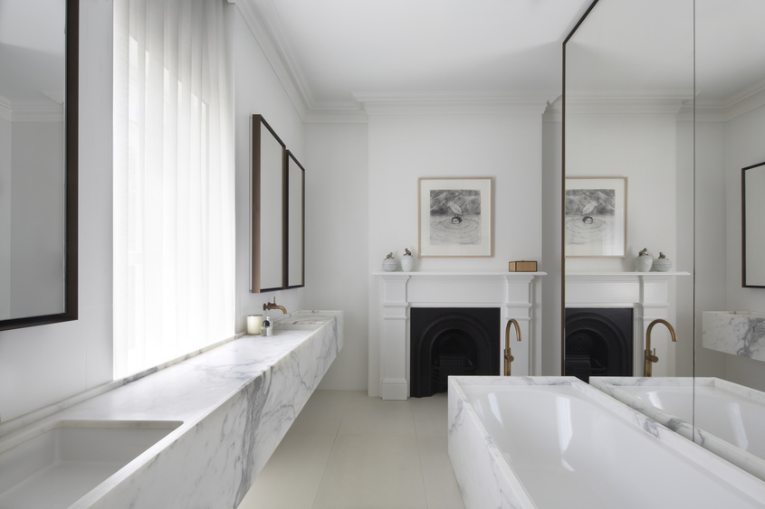
{Modern luxe with heritage charm in the bathroom. Marble with burnished brass, shadowed iron and bright white}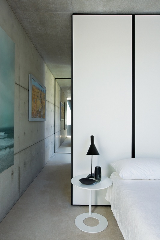
{In love with this black-edged panel diving wall - the perfect simple, graphic bedhead. Not to mention that black AJ table lamp, always on the top of my bedside/office table lamp wish-list!}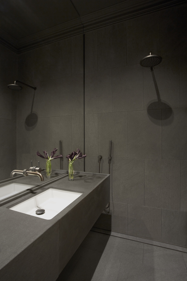
{Dark and moody ensuite, a perfect retreat}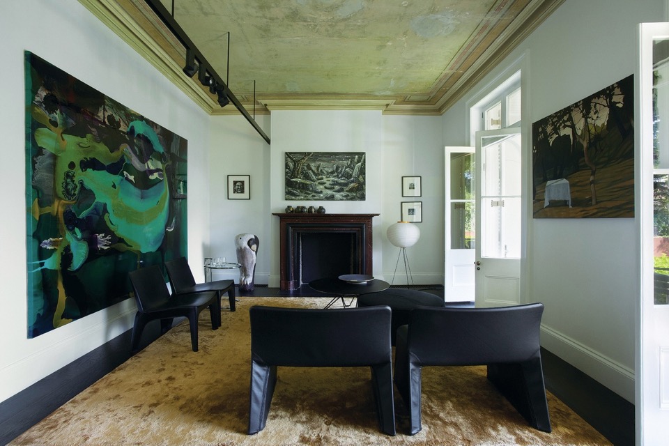
{Gilded patina underfoot and overhead pick up warm elements in the artwork, acting as a respite from other cool spaces in the home}
{I love the beautiful blank canvas of monochromatic materials and textures, allowing a stunning collection of artwork to stand out, with classic modern furniture and lighting}
Images by Sharrin Rees.
xo Romona![]()
Concrete jungle
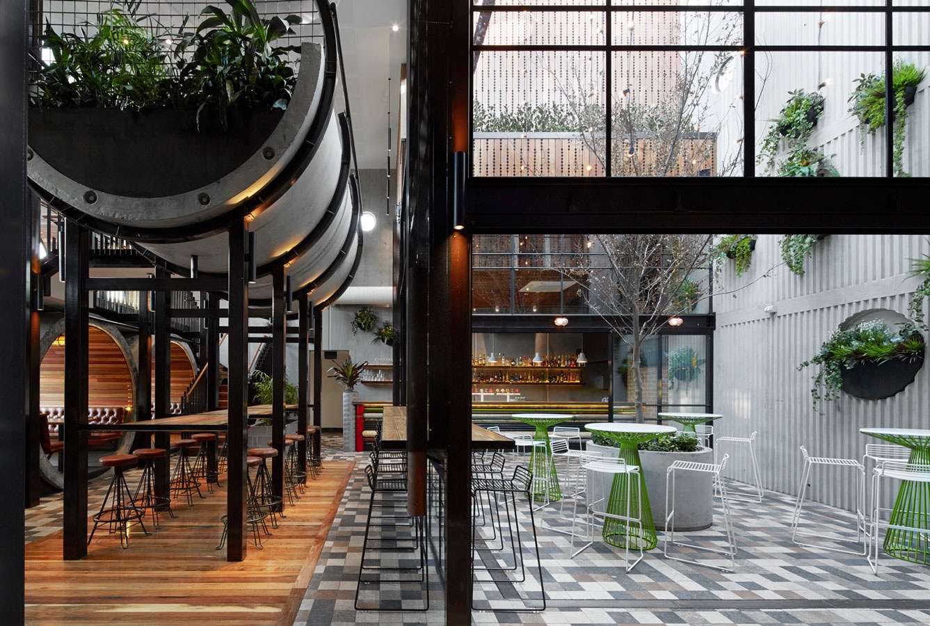
{Prahran Hotel interiors by Techné Architects}
Home Open
Before I get too soppy, the main reasons for this post were to give you some cheap update ideas for your home, a few tips for simple styling for sale and giving you a sneaky-peak into our lives and home. Enjoy.
Here are some simple tips for refreshing your home before sale:
1. Keep colours neutral.
You may love neon pink or cobalt blue but not everyone will - and not everyone has the imagination to see past it if they don’t like it. You don’t have to avoid colour, just stick to colour in flowers, soft furnishings and artwork.
2. Keep spaces bright.
I do love a good moody Abigail Ahern or Kelly Wearstler room, but I think this belongs in a space that you are going to inhabit for the long term. If you want to maximise the range of interest, keep it light, bright and airy. Lighting at many different levels adds interest - think combinations of candles, table lamps, floor lamps, overheads, wall sconces or whatever you have at your disposal.
3. Fresh flowers and plants (or even good fakes ones) are a must.
They bring colour, style and life (or appearance of life if faux) to your space, not to mention fragrance. Just don’t let the fragrance be too overpowering - air out spaces, keep water fresh and replace flowers if they start to get a bit droopy or pongy.
4. Decluttering is a given really.
Noone want to buy the house of a hoarder, who knows what else you might find after purchase. Pair back your living spaces and tidy display areas. That doesn’t mean depersonalise or make it impossible to live, but presenting the space how people would like to live (i.e. neat, organised, stylish) sells a lifestyle not just a house.
Feel free to disagree as every house has it’s own personality. Below are a few before and after’s of our own house to give you some ideas.
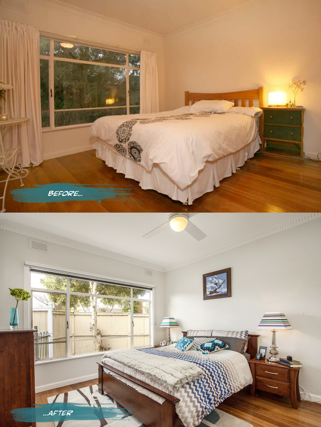
{In the master bedroom, all the curtains were removed from the house to bring more light into the spaces and reduce some of the heaviness of the rooms. Both block out blinds and sunshaders are in the bedrooms while just blockouts are in the living spaces. The walls are a pale grey, Nippon Nighthawk 1, and the ceiling light was replaced by a fan and light for much more comfortable summer sleeps. Adding a rug, cushions and throws for softness as well as customising my lamp shades makes it a bit more personal. Spaces can still have personality while being clutter free - just choose a few key pieces like books and photo frames to make the space feel lived in and not like a showroom}
Nautical dreams

{ 1. Compass cushion, 2. Côte d'Azur Ice bucket, 3. Ahoy Door Mat, 4. Skull & Crossbones Cushion, 5. Hold Tight wall flag, 6. Pier Rope Table lamp, 7. World Map Sticker }
Now that's efficient
“Located in Barcelona's hip Born district, the tiny apartment is a remodelled pigeon loft. Christian [Schallert] says its design was inspired by the space-saving furniture aboard boats, as well as the clean lines of a small Japanese home”. I personally love that the bed slides under the balcony and converts to a step, chair or lounge. Great work by architect Barbara Appolloni. Enjoy!
xo Romona
![]()
Aqua vital!
As usual some of these are around my house already and others I am just abso coveting and dropping hints to hubby and family (this is also a good way to see if they read the blog!)

{Baby Rhino, aqua resin by Fenton & Fenton - it’s taking me back to a bit of bebop and rocksteady TMNT days}
Bathroom... After
Work started early on a Monday morning. Dad, hubby and I got stuck into ripping off the wall tiles. As with most old houses (with the added bonus of previous owners who have attempted DIY renovations themselves) the wall structure was no longer (if ever) level or square. There was also the unhelpful surprise of most of the wall sheeting coming off with the tiles. The flooring didn’t fare any better - also ripping half up with the tiles. Previous work scraps had been tossed in the wall cavity - I like to think for reuse as insulation - and a few little creatures had been making there nests around the bath supports. On Tuesday the plumber started his work relocating the bath, shower and vanity fixtures and putting in the pipes for the new toilet (yay!). Once that was completed, we could start on sheeting and patching up the walls, floor and front of bath. Waterproofing was painted over all surfaces and allowed to dry (time for a well deserved bevie break). The rest of the week was spent cutting, tiling, painting and cleaning out dust and debris, in time for the plumber to finish up and fit off the following week. For a more visual step by step of the process, you can check out my Instagram page. You can also read more about the bathroom ‘Before’ the renovation here.
Drum roll…. the finished product! What do you think? We are very happy with it, of course, and I catch myself walking past the door quite slowly now just to admire the view. In fact on seeing this post, hubby commented that he can’t even remember the bathroom before, even though it was only two weeks ago. Purged.
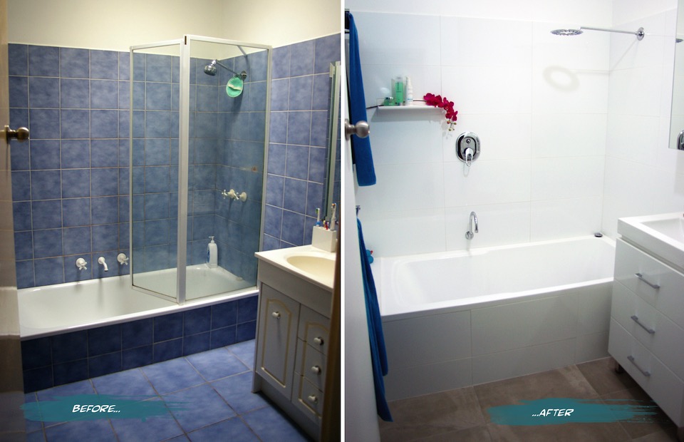
{The Sandon Bathroom - Before and After}
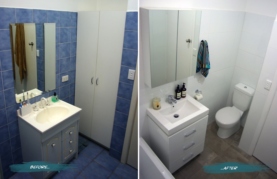
{Bathroom Vanity and Toilet - Before and After}
Here’s a summary of a few of the changes and features we have in the new and improved Sandon House Bathroom.
The vanity was moved closer to the bath to allow for the toilet, but still enough room for the much larger bath (we went from a 600mm to a 820mm wide - much more user-friendly). If we had an OH&S inspector in-house, they would definitely approve. You can read more about the troubles I’ve had with the narrow old bath in the previous post. The bath is not only wider, but taller. It took a few goes to get used to stepping over it, but it’s very handy with keeping small children from toppling over and into it. Plus during one of my habitual, long relaxing soaks, I don’t have to have the water full to the brim to actually be covered and stay warm.
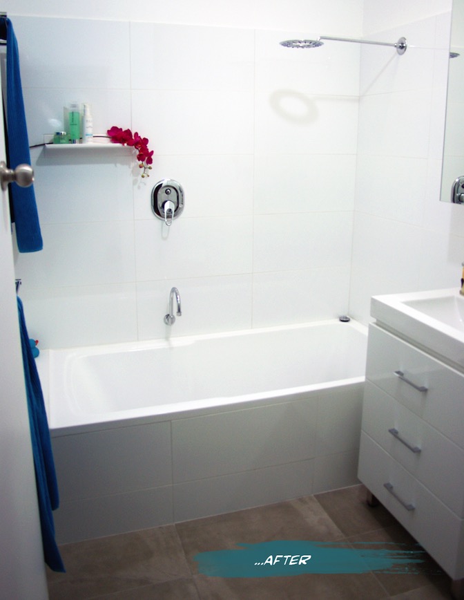
{The finished product}
Our second toilet - hooray! On plan it looked like a bit of a tight squeeze, but we have since found that there is more than enough room and it is quite a comfortable space. It’s still quite precious and we are not used to having the second option, but I’m sure that will end soon. The seat is soft-closing (the slowest we have ever seen actually - almost ridiculously so), which helps prevent slamming noises becoming a child wake-up-call in the middle of the night.
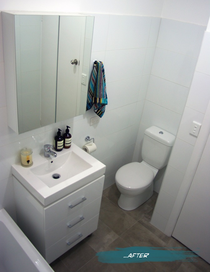
{New Mizu Vanity and Toilet from Reece}
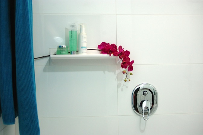
We added a tile shelf high enough to keep expensive shampoos from becoming very expensive bubble bath, as well as far enough away from the shower head to be a pool collector. I find them a great idea when you don’t have the building room to put in alcoves or set-in shelving. As long as you keep it simple, it allows the featured items to stand out without becoming a feature itself. We added an extra towel rail from before and made them double. Not necessarily for two towels, more for the aid in drying. My husband finally gets a towel rail of his own, as opposed to the hook on the back of the door where it never really dries. At the moment the kids towels hang on the back of the door, but we allowed space for another towel rail to be added if and when we need it (big enough to hang bath sheets because once you go up from towels to sheets, you can’t go back!)
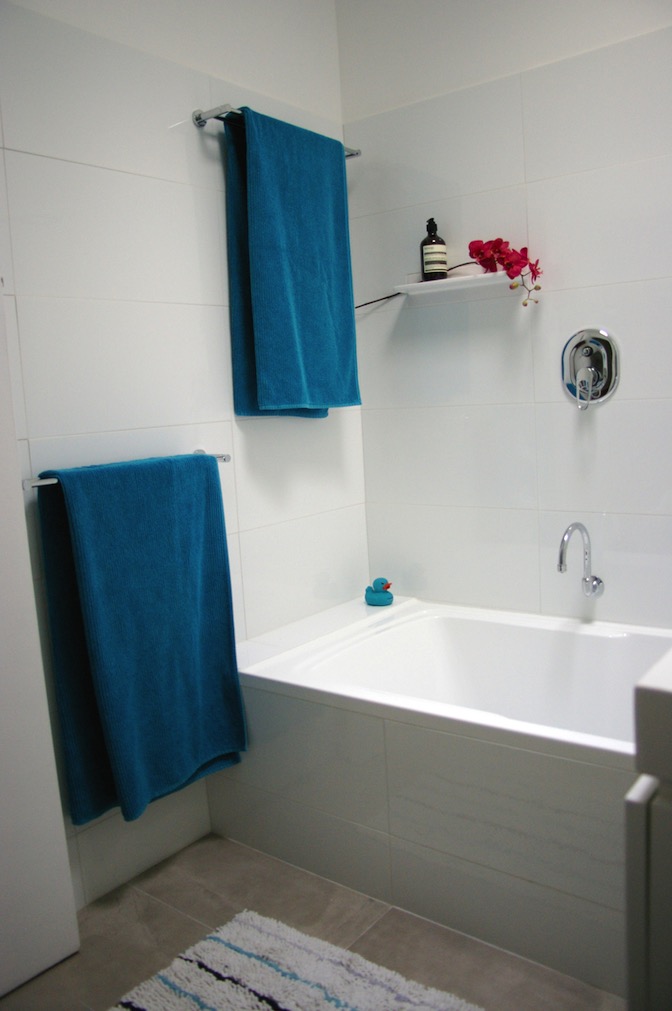
{New huge bath and surrounds}
I chose white wall tiles and a white vanity for brightness, simplicity and longevity. Even though we haven’t changed the skylight, the white reflects the light much more and creates a connection with the outside that belies its central location. The concrete-style grey porcelain floor tiles also give the space a neutrality that is much easier to style and change with soft furnishings and accessories. I had chosen a sleek minimal bath spout, but on further thought, we swapped it for a gooseneck swivel style so that we can run the bath and get it out of the way when the kids are in there, avoiding bumped heads. The Shower diverter mixer was placed far enough left that you can easily turn the water on without getting sprayed, and high enough that the kids shouldn’t be able to play with it for a little while longer. You may notice that I haven’t chosen very ‘designer-y’ fixtures. This bathroom for us is a family bathroom, and with two growing boys that will undoubtedly test the strength and endurance of the fixtures, we went to the budget end of the market. Fixtures are items that are easy enough to replace in a few years, so our money was directed more towards the items that are more difficult to change, such as the bath and tiles.
{Bright white large-format tiles allow us to play with colour}
Having said that, after years of low pressure and uncomfortable showers, the selection of the shower head was quite important. My husband wanted a good soaking while I wanted to make sure that it was still water-efficient. We found our compromise in the Halo shower head from Reece and so far soooooo good.
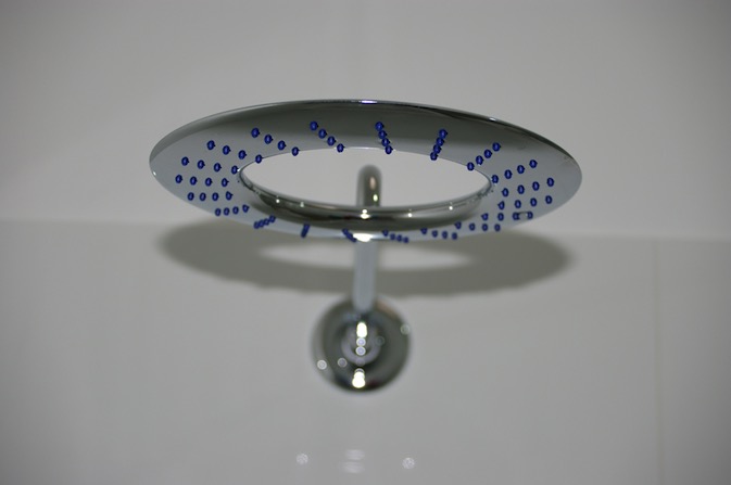
{Halo shower head from Reece}
If you would like me to post the plans, let me know - but photos are more fun, right? If there is anything that you want to ask about the project or specific products please do. I am more than happy to have conversations about it in the comments section below or over email.
FYI - Some of the items pictured and their sources:
- Bath, Vanity, Toilet and fixtures from Reece.
- Wall tiles from National Tiles
- Floor tiles, towel racks and hooks from Vision Bathrooms
- Hand towel by Missoni
- Aesop Resurrection Hand Wash and Balm
- Ecoya Metro Jar soy candle in Wild Frangipani
I hope you enjoyed this exciting little project with me. Time to plan the next one! (Sorry honey)
xo Romona
Bathroom Before…
First up, I would like to justify why we wanted to do this. It's not a cheap exercise and I think updating a bathroom for aesthetic sake alone can be costly, time-consuming and if not done correctly won’t give you the value-add you were expecting.
If you are going to rip it all out, take the time to assess what works and what doesn't.
What features you like and what you detest? What do the occupants need? Is your situation changing - will you need to accommodate growing children, elderly or disabled access? How easy it is to move around, do you bump into anything, are the towel racks too low, too high or too few? Do you need to update your fixtures and fitting to more sustainable, water-saving options? If you are thinking of selling in the future, what would appeal to the largest audience?
Obviously, the aesthetic update is always a big motivator. I love blue, but not this blue and not this pattern and not in this quantity, all over the floors and walls. Yes, of course, I have seen much worse in my travels, and if there were not other issues with the bathroom we could have easily put up with it for a few more years or until we moved on elsewhere. So here are a few of the glaring issues that we have had in our years with this bathroom.
Problem One - The Bath
The existing bath was just that. A Bath. Not a shower bath. Definitely not something that any person (let alone an occasionally pregnant person) should be standing up in. The narrow 600mm wide rounded-bottom bath has always been a bit of a nightmare to shower in. Elbows knocking into glass panes, tiles and fixtures, knees knocking while attempting to stay upright with splayed feet on a narrow curving base. Nothing to hang on to that wouldn't go down for the count with you. I learnt the hard way that you should back out rather than turn around to get out while heavily pregnant - hint - you get stuck… really stuck! An embarrassing few minutes can be spent deciding whether to soap or scream your way out of it.
Problem Two - The Vanity
While admittedly the rest of the house isn't level either (a problem made even more apparent while dad cursed his way through a lot of the refurb), the vanity was especially tilted. Angling towards the back wall to create the perfect ecosystem for a rainbow collection of mould and nasties. Although we wiped it down often, it wouldn't take long to fight its way back and I definitely would not have wanted to see a swab of that cultivated and rising out of a petrie dish. The chipboard doors were also moisture damaged, splitting from their nasty cream laminate.
Problem Three - The Toilet (or lack there of)
A husband, two rapidly growing boys (one starting potty training), friends with numerous young, interstate family and guests that stay with us, and an inexplicable need to all go to the toilet at once meant that our single sad little toilet was not meeting expectations. A second toilet - never thought that would be a major player on my wish list. No longer having to hold it while others day dream or read or check emails or whatever it is that some seem to do on the toilet for so long. The privacy. The convenience. Oh, could it possibly ever be true?!
Originally there was also the problem of icky dirty beige-cream walls, ceilings, doors, frames, everywhere (throughout the house not just the bathroom) but this has been slowly rectified. Vivid White is over all doors and frames, and a soft grey (Nippon Nighthawk) covers most walls (except wet area, which have moisture resistant Vivid White paint on all surfaces). I must admit that the simple few coats of white paint over the walls and ceiling in the bathroom made it much more tolerable and bought us some time to save.
Here are a few before pictures to visualise what we were dealing with.
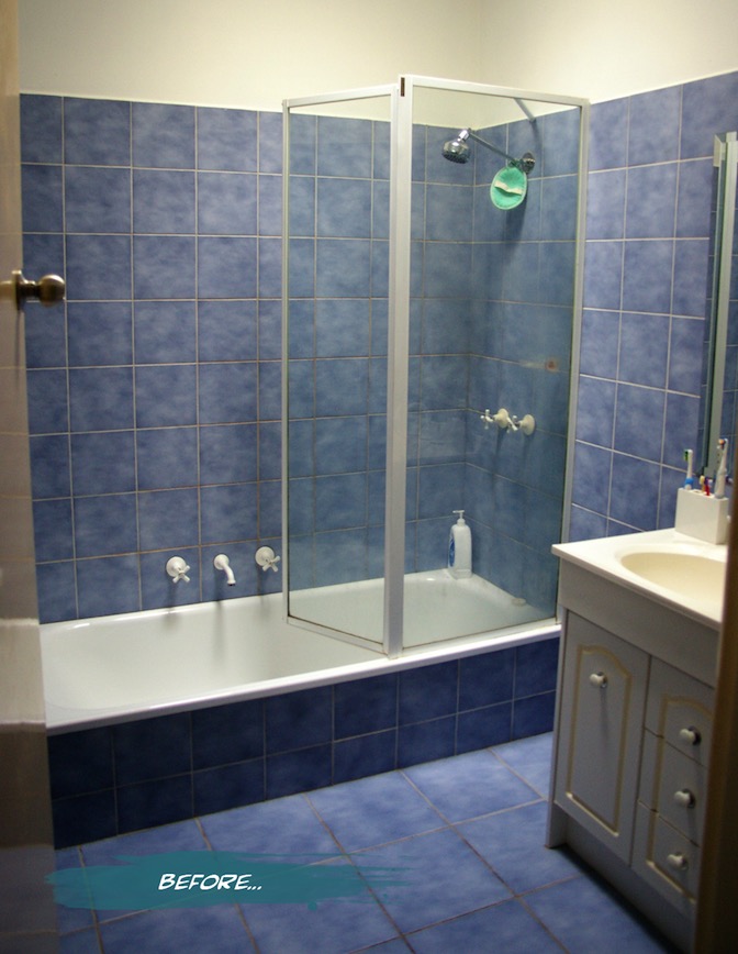
{Before: The bright blue mottled tiles on the walls and floor, too-narrow bath and far-from-level vanity.}
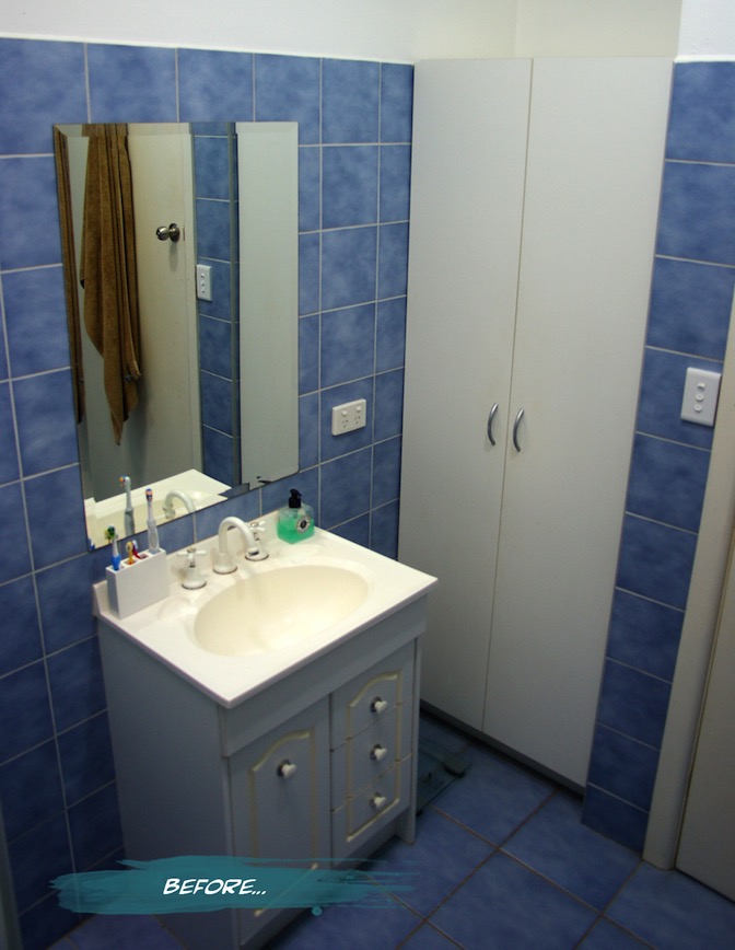
{Before: The falling apart vanity and flatpack cupboard taking up valuable floor space}
I realise that it doesn’t look that bad from a distance. It was the details and the functionality that really cemented the idea of renovating. Some of you may have noticed, if you follow me on Instagram or Twitter, that we have nearly finished the transition from old and shabby to sleek and modern. Although Dad and Hubby did their parts super quick, and the plumber has been very obliging with his time, we still have a few things that we are waiting on (shower screen and a few finishing touches). I’ll pop some pics and deets of the finished results up very soon. Stay tuned…
xo Romona
![]()
Let the Demolition Begin
Just a quick note to let you know that I will be a bit absent over the next week or two - demolition starts on our one and only bathroom on Monday, and work will be speedy to fit in with my wonderful parent's visit to help (all the way from Perth). Dad's a builder, so I am very much relying on his instruction, knowledge and old-school builder attitude of getting in there and doing it right. I will hopefully have time to take lots of pictures and put together a before-and-after piece once it’s finished. Since I've put it in writing now, I really hope that it turns out great!
Hopefully with the parents over I might also get a little babysitting and have time to put together another post or two - bonus!
Until then, hope you have a happy and colourful weekend.
xo Romona
PS. Stay tuned to my Instagram for occasional progress updates