


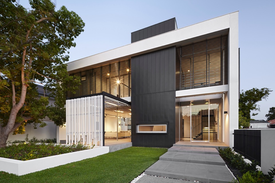
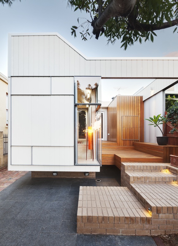
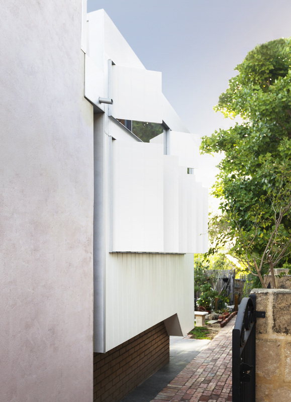
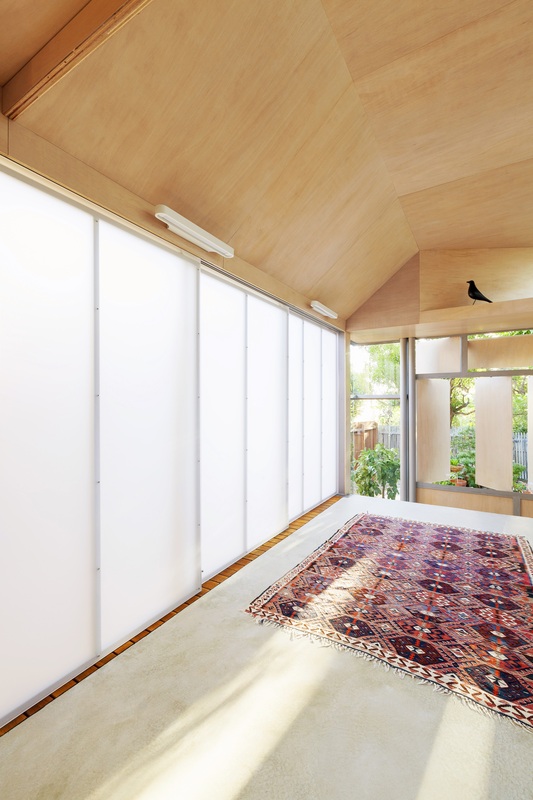
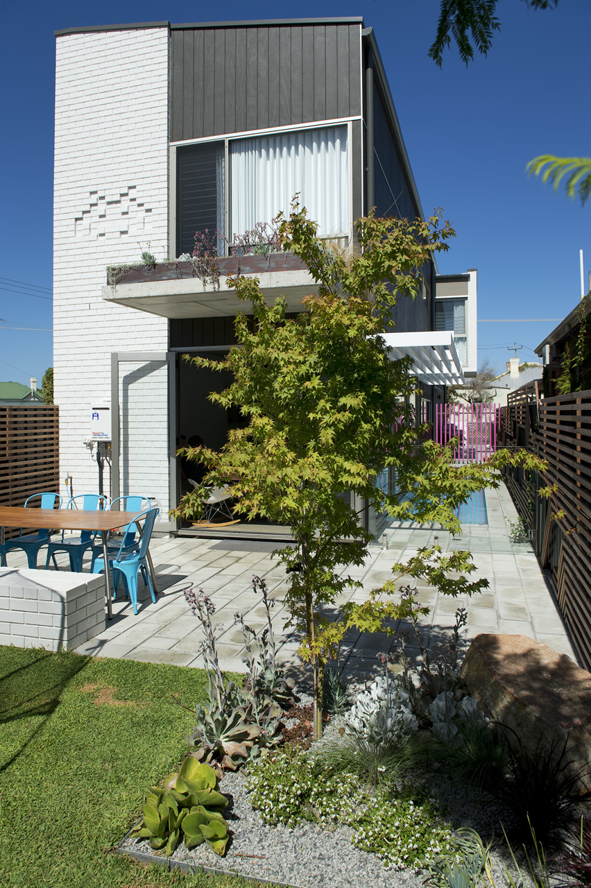
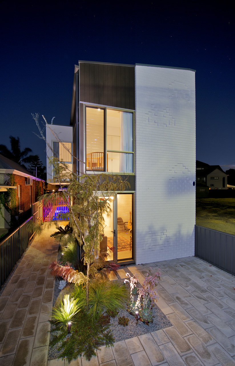
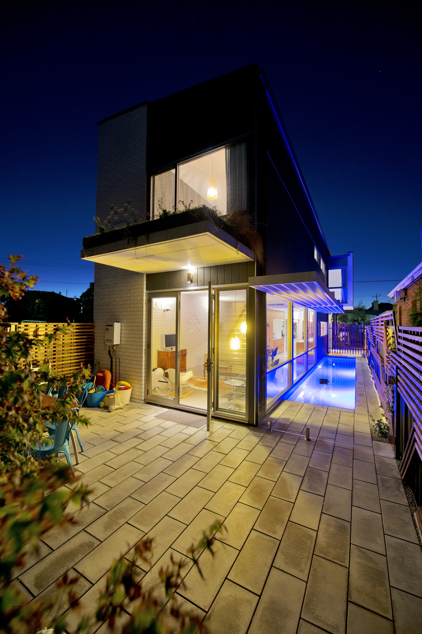
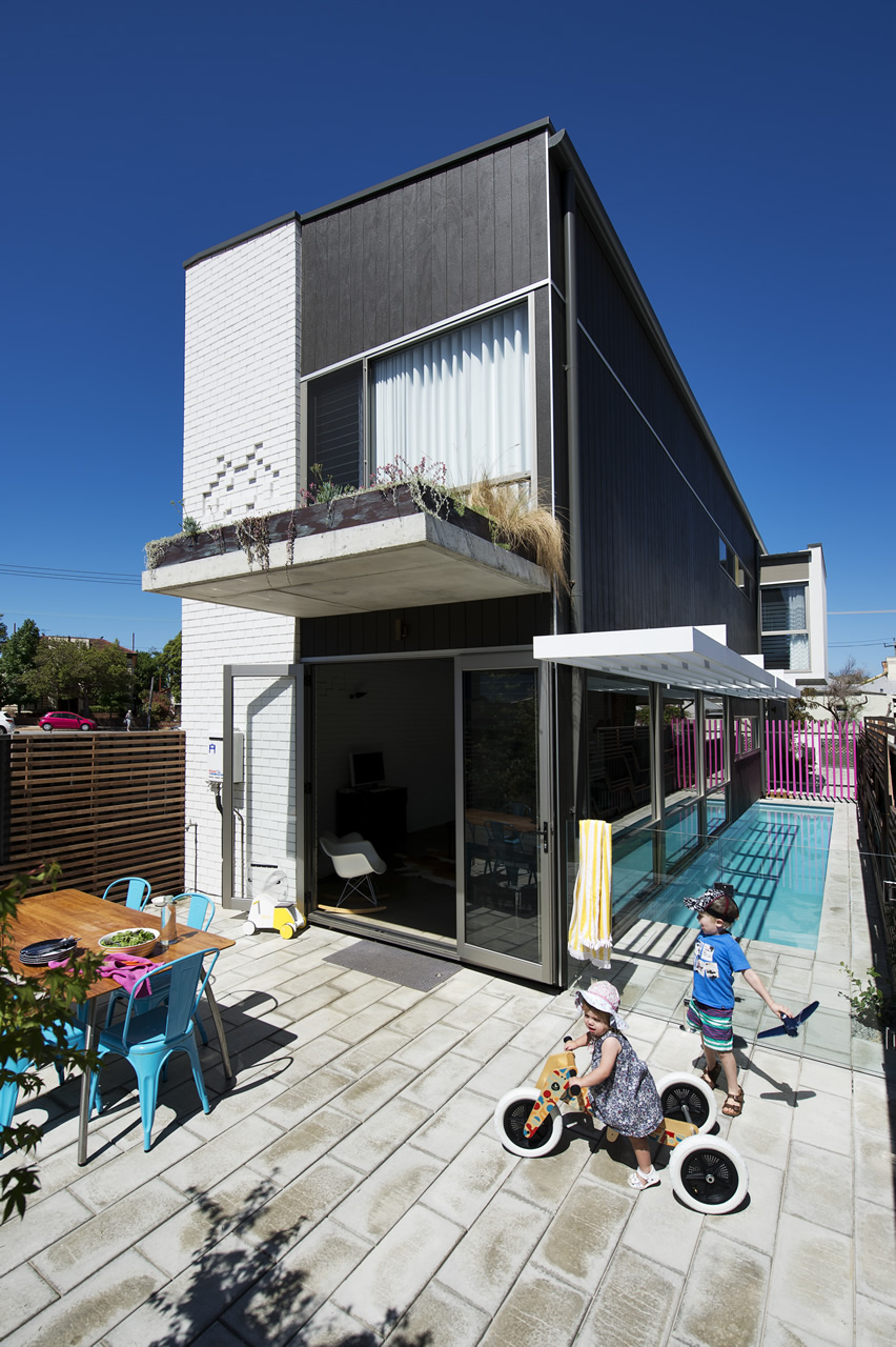
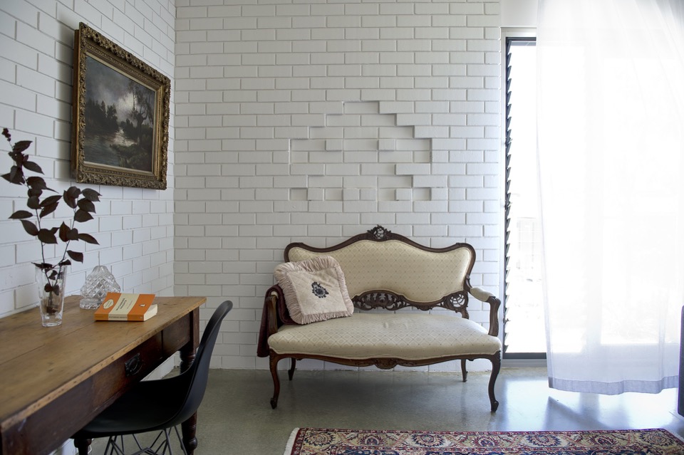
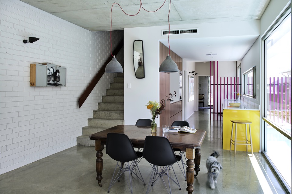
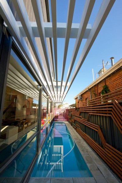
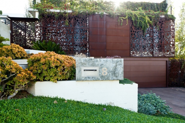
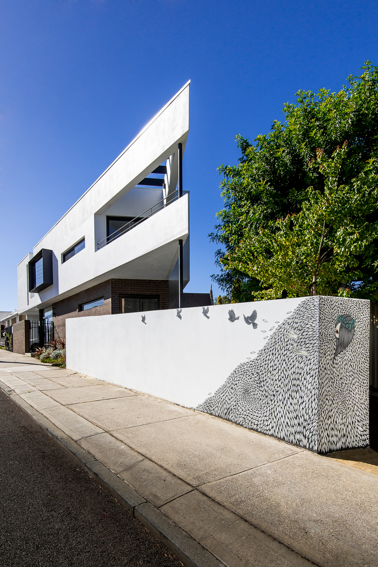
The James Street Residence by Romona Sandon Designs
In designing our home it was important for me to balance the comfort and lifestyle needs of my young family with my environmentally sustainable goals from my work in Sustainable Architecture. I wanted to test if low-cost sustainable design could still be convenient and aesthetically pleasing to the clients (my family). I also wanted to test people's perception of what an eco-house should be or look like.
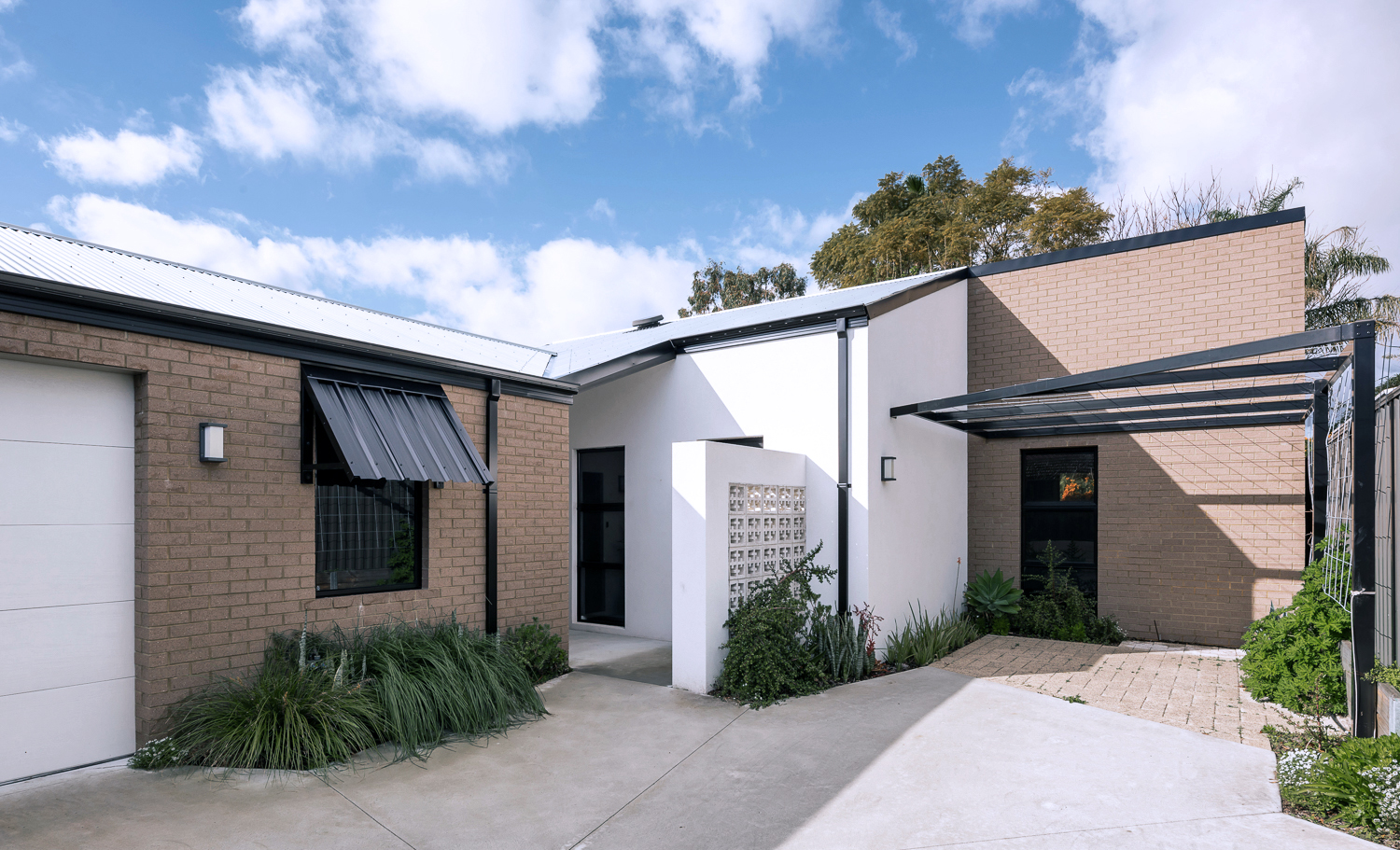
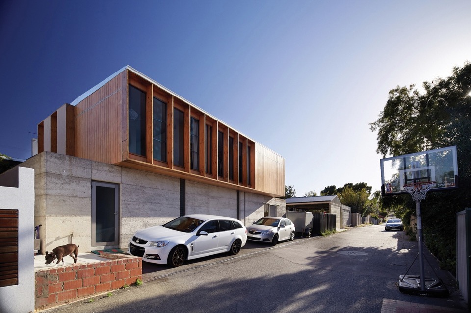
{The James Street Residence, by Romona Sandon Designs, Front facade}
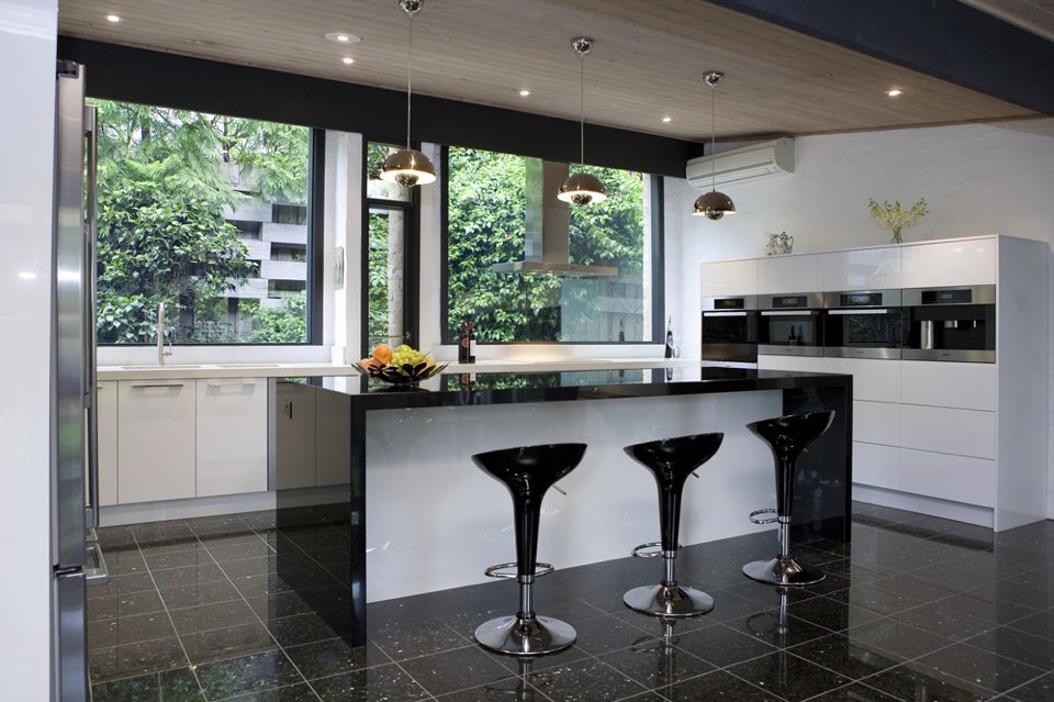
With the kitchen, I wasn't aiming to do anything new or innovative. I wanted timeless and simple. A canvas devoid of colour so it could be injected by way of homewares and appliances and food and family. I guess I never strayed far from what I had always wanted, even showing this colour palette (or lack thereof) in previous posts, such as the Monochrome Kitchen. Cabinetry either flows through to the ceiling or is capped by bulkheads, to reduce surfaces that dust could collect on, reducing potential allergens.
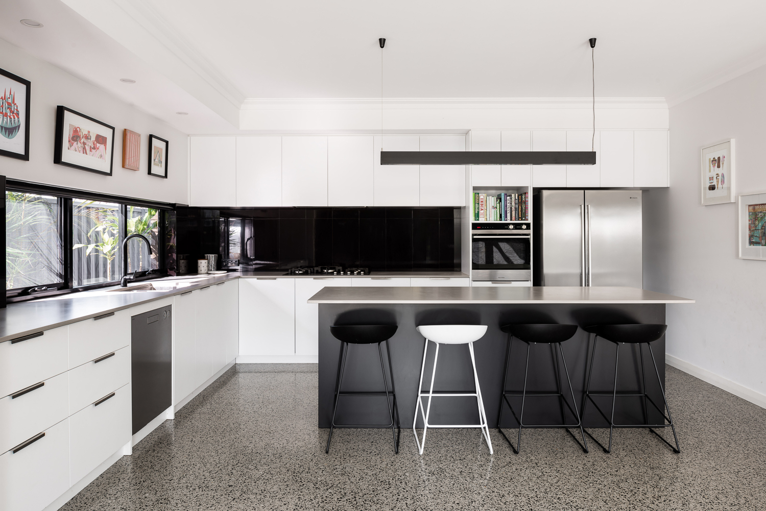
{Monochrome kitchen of the James Street Residence, by Romona Sandon Designs. Image by Dion Robeson.}
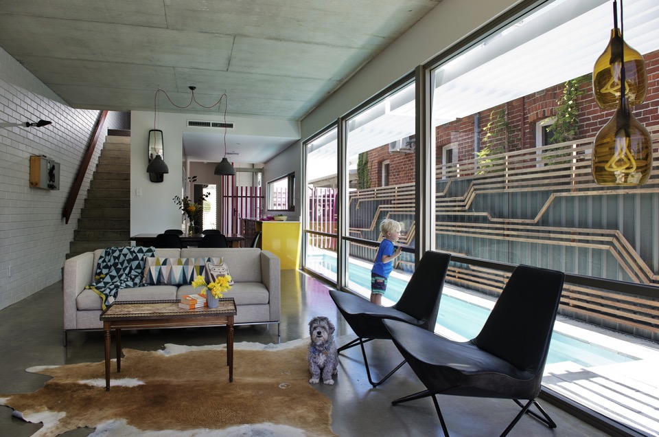
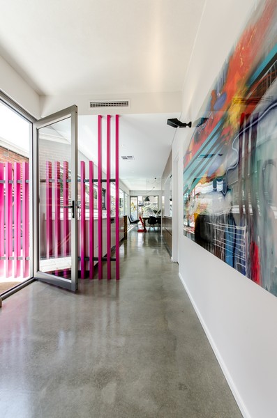
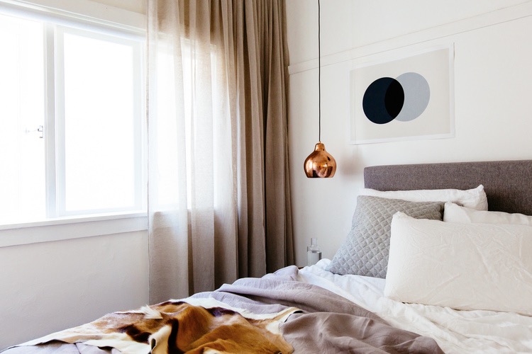
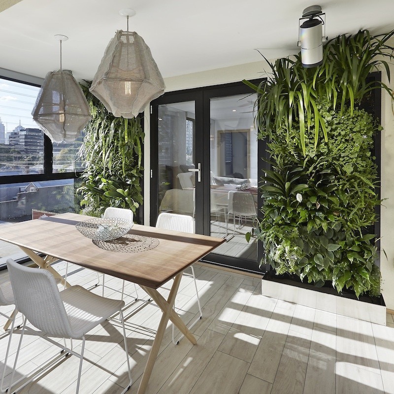
Passive solar design principles were utilised where possible within the council and R-codes on a small rear battle-axe block. Large north-facing windows and doors allow winter sun to penetrate and store heat in the thermal mass of the polished concrete floor. The polished concrete floor was high on my list of features that I really wanted in this house - surprisingly, planning for this quite early on in the design process kept the cost quite comparable with alternative floor coverings.
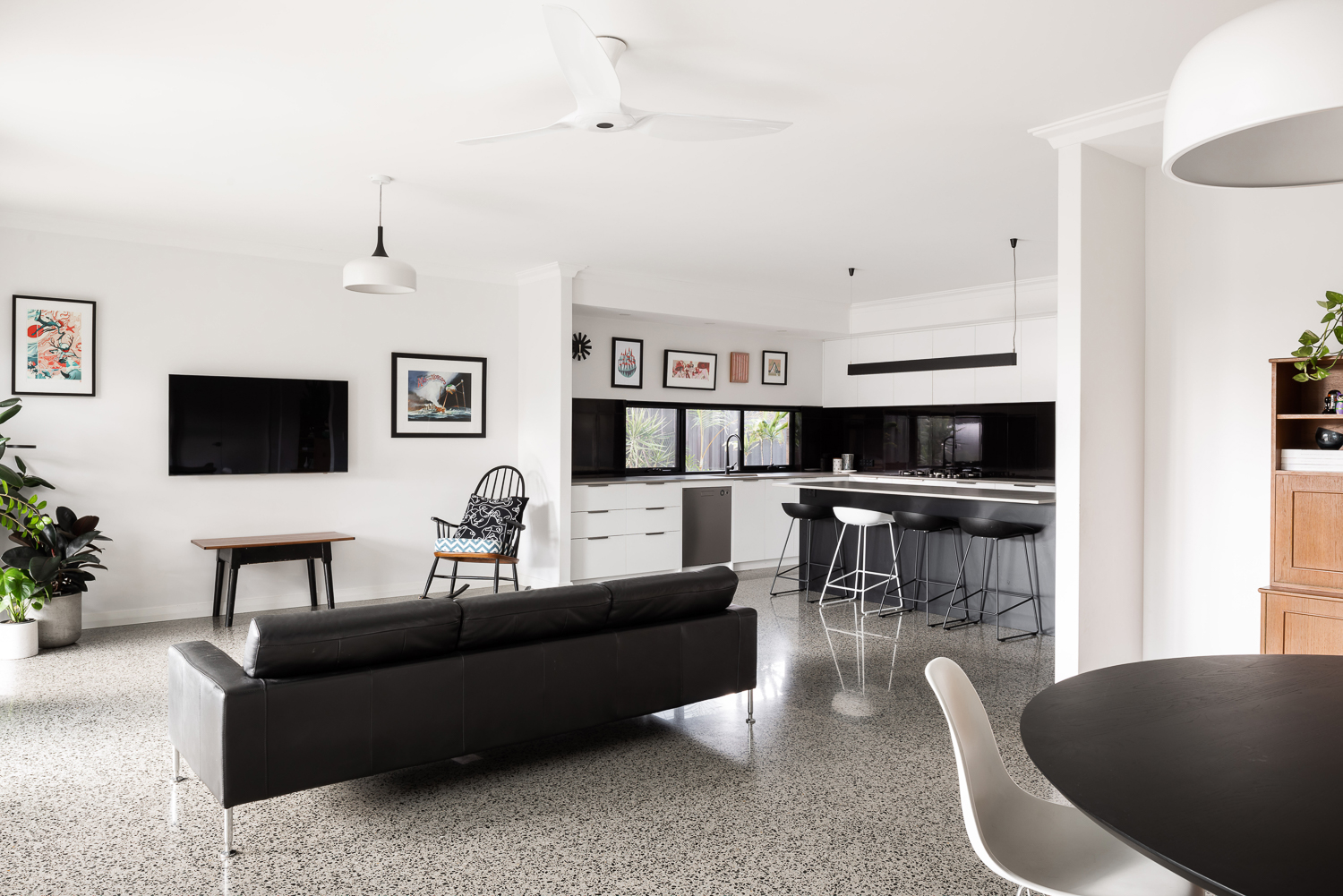
{Open-plan living space of the James Street Residence, by Romona Sandon Designs. Image by Dion Robeson.}
Insulated cavity brick construction helps contain winter heat. Cross-ventilation allows excess heat to be dissipated in summer. A SolarStar solar-powered thermostat-controlled roof cavity ventilation system also rids the building of excess heat when needed. In the two years of occupancy, no active heating or cooling has been necessary except for the Big Ass ceiling fans (their name, as well as description!)
Solatubes with integrated PV (photo-voltaic solar panel) LED day and night lighting is used in conjunction with natural daylight and low-energy lighting elsewhere. Low VOC (Volatile organic compound) paints and carpets are used throughout to reduce sick-building syndrome (off-gassing). PV's sufficiently power the house with a larger inverter for future-proofing. East/west openings were minimised and treated with Low-E glazing where unavoidable, as well as awning shading.
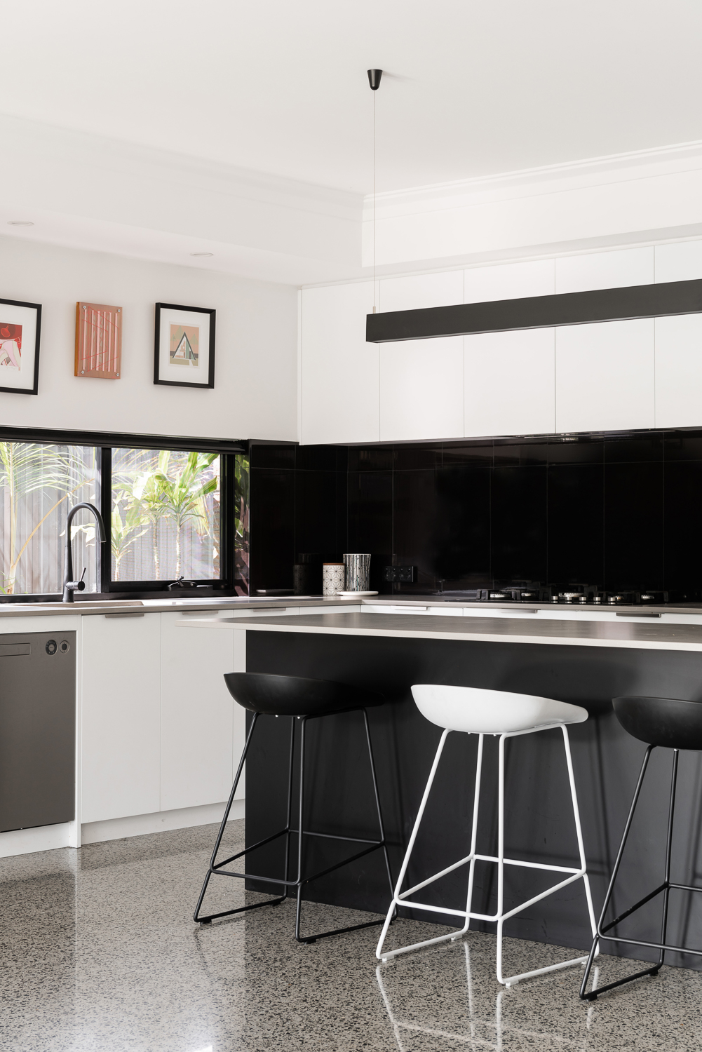
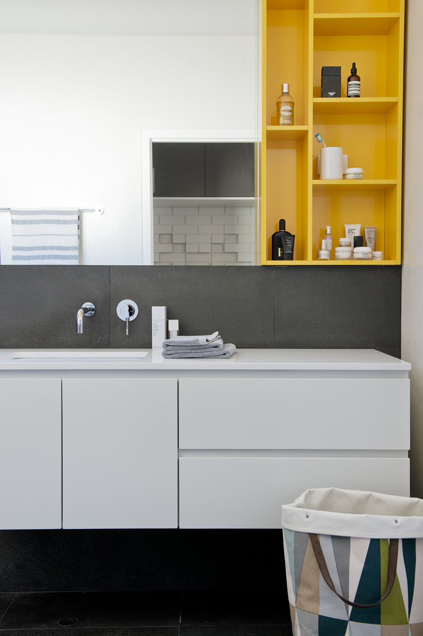
{Kitchen details of the James Street Residence, by Romona Sandon Designs. Image by Dion Robeson.}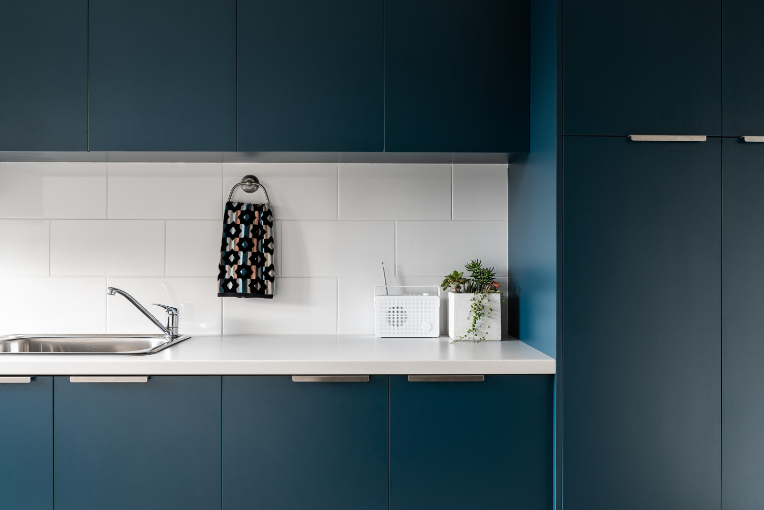
{Laundry details of the James Street Residence, by Romona Sandon Designs. Image by Dion Robeson.}
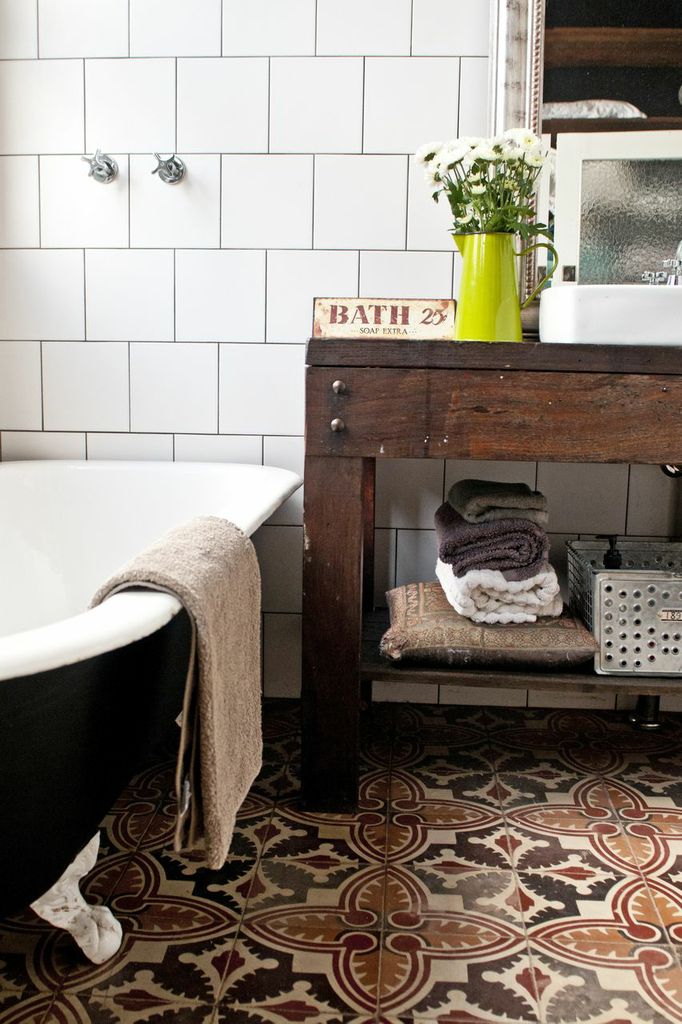
The bathrooms features hobless showers for accessibility. The glass above the half-height wall allows light to penetrate fully into the bathroom to reduce mould build up.
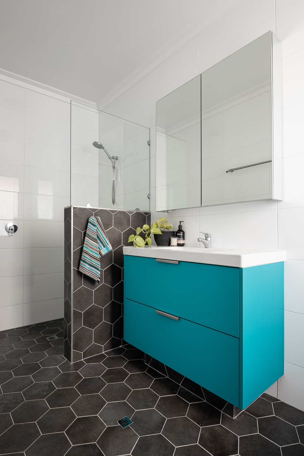
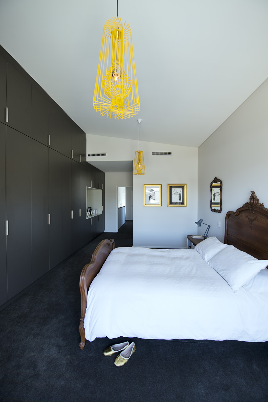
{Master ensuite details of the James Street Residence, by Romona Sandon Designs. Image by Dion Robeson.}
Curtains and blinds are opened and closed to allow optimal light and heat inside, which is also aided by deciduous vine plantings on the north for additional summer shading of openings. While we wait for the grape vine to grow, we use a combination of shade sails and a passionfruit vine that we trim back in winter to allow more sun through. In the mean time, we are drowning in fat juicy passionfruit and the kids adore it!
The garden also considered sustainable design elements in the use of reclaimed breeze blocks for the entry, edible garden courtyard and native or self-sown water-wise planting. Indoor plants are used for improved indoor air quality and visual calm.
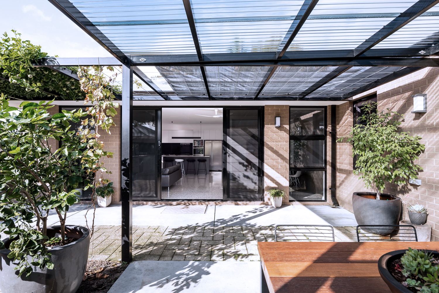
{North-facing, rear exterior of the James Street Residence, by Romona Sandon Designs.}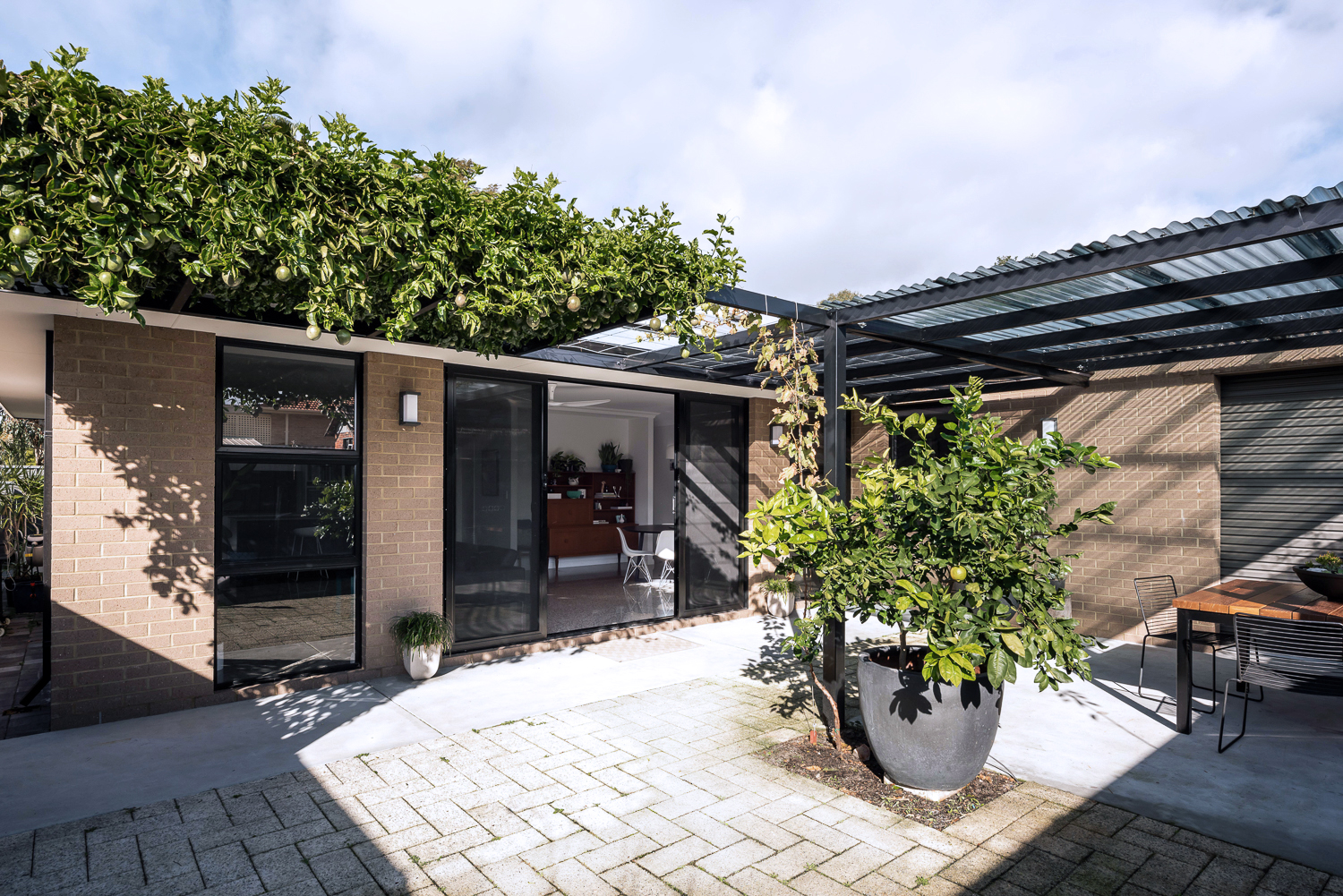
{North-facing, rear exterior of the James Street Residence, by Romona Sandon Designs.}
As a sustainable designer, I see it's discrepancies and the details that could have been improved, with time, money and less council limitations.
As an architect, I see the features that I could have amplified and where I wish our money could have stretched to.
As the client, it is perfect. It is the perfect design for how my family and I live, our budget at this stage of our life, and the place and site that we built it on. It is our home and I'm proud of it.
xo Romona![]()
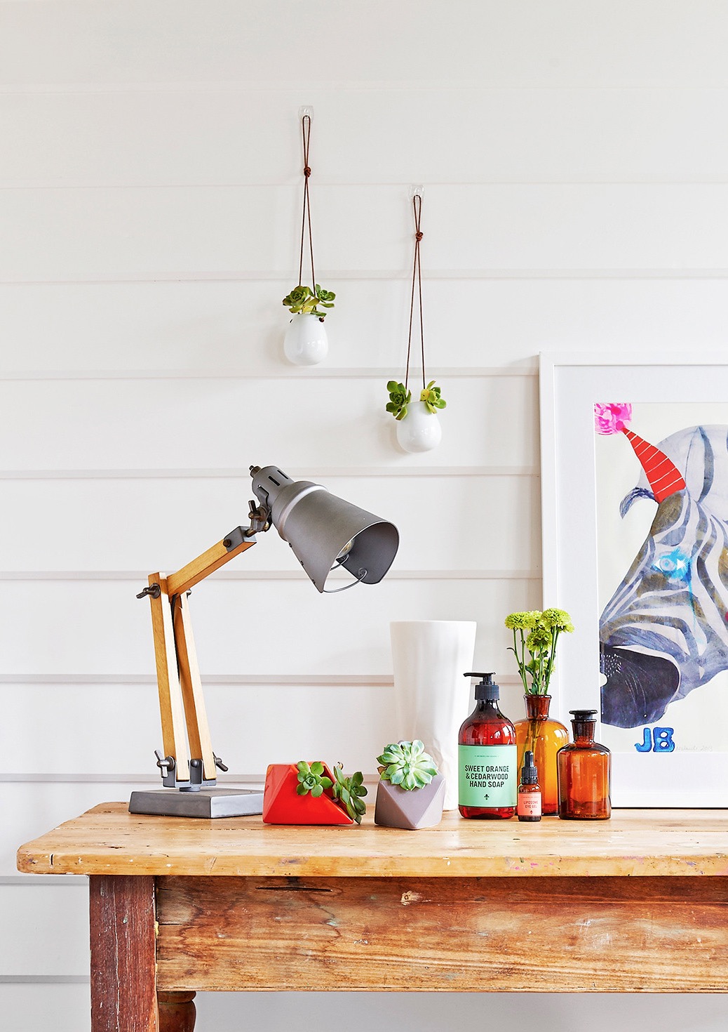
May Lust List
I thought I'd do a small post on a couple of designs and products that I am totally lusting after right now. I've been on a self-imposed homewares embargo (mainly so I can have some fun once we are in the new house, and also, like I said, no paid work = no spare mula!) so here are a few things that would be added-to-cart asap in any other circumstance… well, maybe with a lotto win, but one can dream. Or I can just live vicariously through any of you lucky people who happen to purchase up after seeing this.

{A Cutipol Mezzo cutlery set}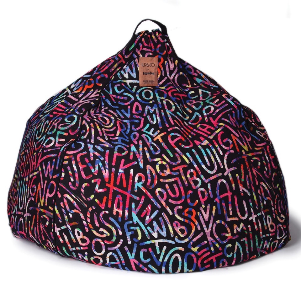
{An Elise Raspanti Art Series Kip & Co beanbag!}
{Blue Heaven LED Neon artwork (or any of their ice creams) by Electric Confetti}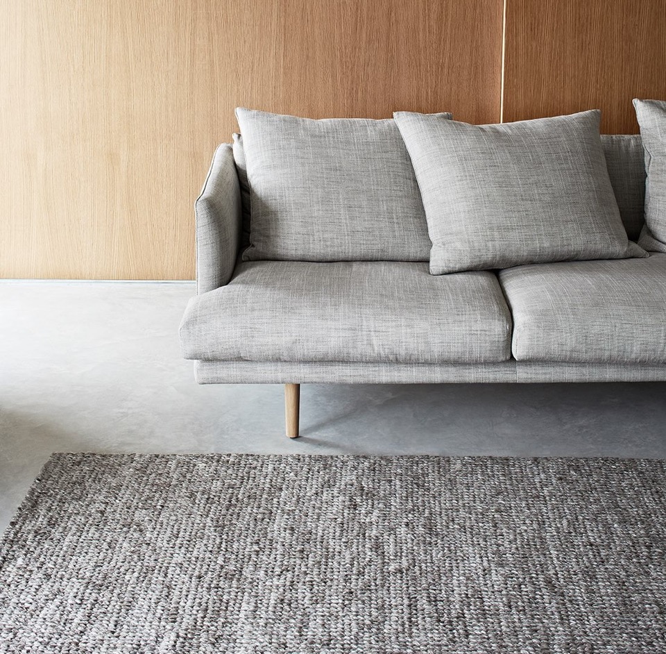
{Sierra weave Armadillo & Co rug in Pumice has been on my list since I felt it at a trade fair a few years ago. Sooo soft and luxurious!}
{Love this Sketch Inc for Lucie Kaas Thief Wall Hook by Urbaani, available at Top3. Becky Kemp's Kokeshi Dolls are also fantastic - check out her insta @sketchinc to see some of her amazing work}
{The impressively multi-functional Woodieful chair/table/storage/bucket from new start-up Woodieful in Slovenia. I love adaptable 'slashie' furniture! It is available through their Kickstarter campaign here, although you better hurry - only 9 days to go. And yes, they do ship to Australia!}
{These Dita stools from Grazia & Co, seen here in the stunning Port Phillip Bay penthouse apartment by We Are Huntly. Photo by Brooke Holm}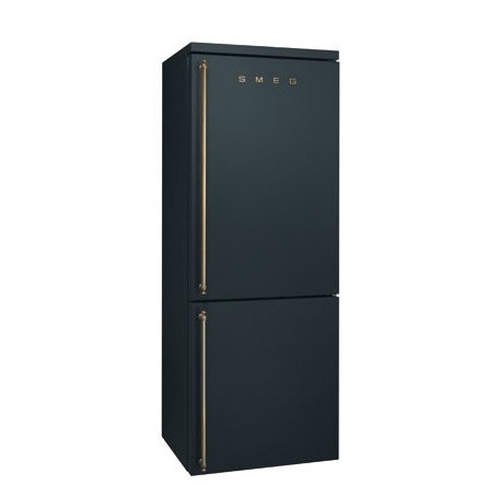
{A matte black Anthracite finish Smeg fridge, because why not}
What are you lusting after?
xo Romona![]()
Local Heroes: Gallery House by Craig Steere Architects
{Complementary materiality of off-white render, stone, timber and zinc cladding}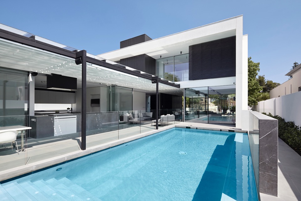
{How beautiful is that pergola?!}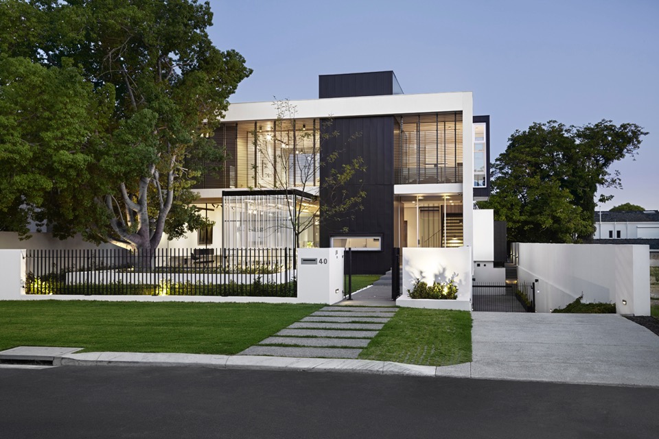
{Classic but contemporary frontage in Nedlands}
{Crossing linear elements continue with steel balustrade and stone stairs}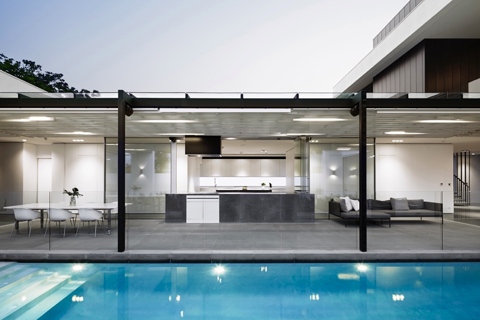
{Visual and physical connection between outside and in}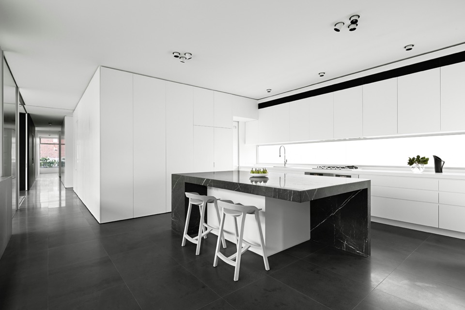
{I love a clean monochrome kitchen. It gives a great base to personalise with homely touches later}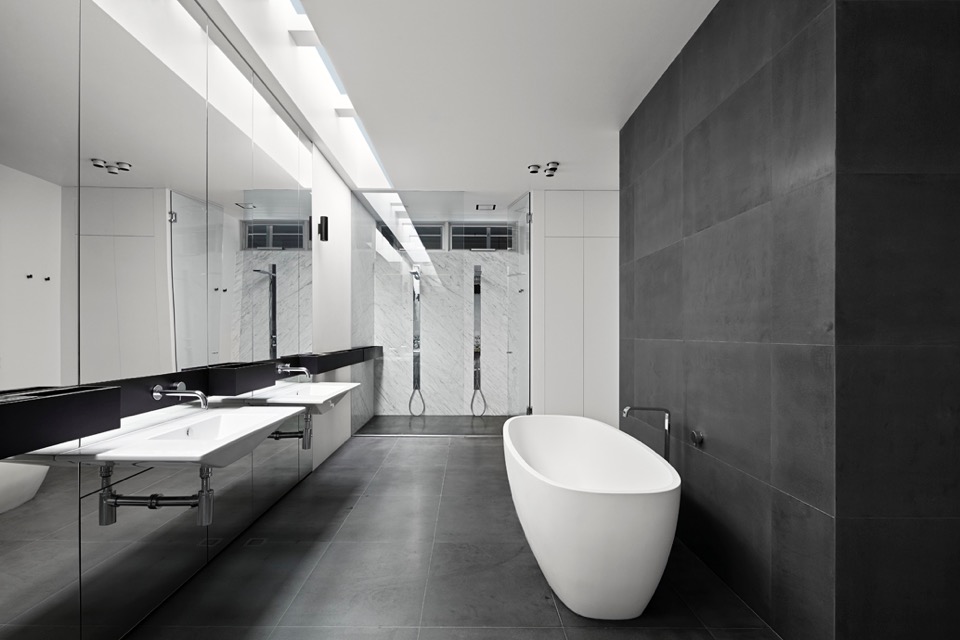
{Simple palette and colour scheme continue through into wet areas}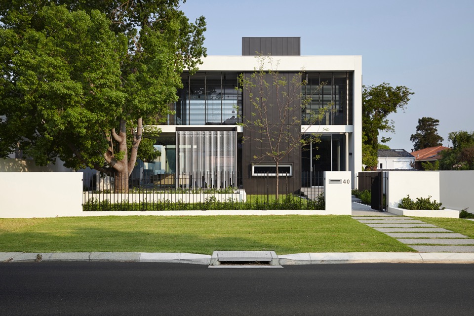
{Overlapping linear elements give aesthetic cohesion}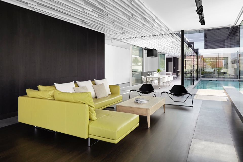
{That ceiling is amazing! I would not have enjoyed drawing up those details, but what a result!}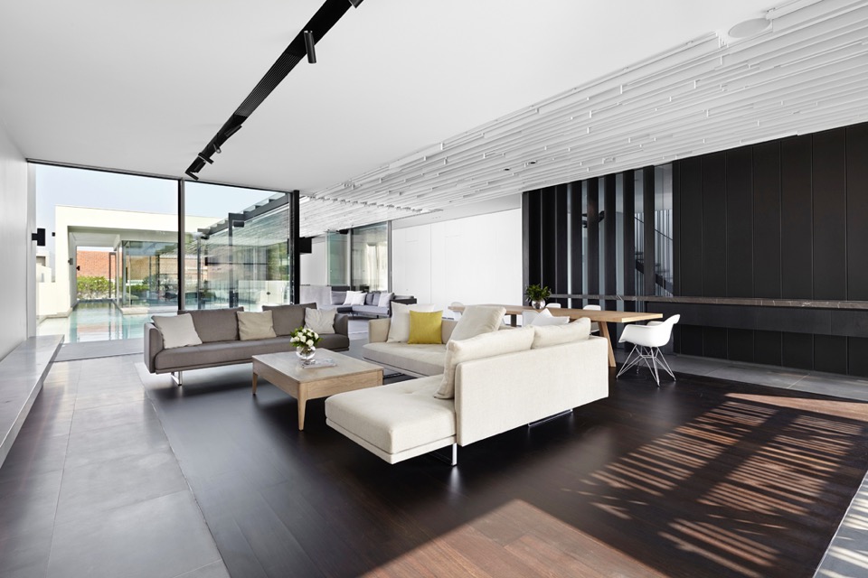
{A touch of warmth to the monochromatic palette, with timber floor insert}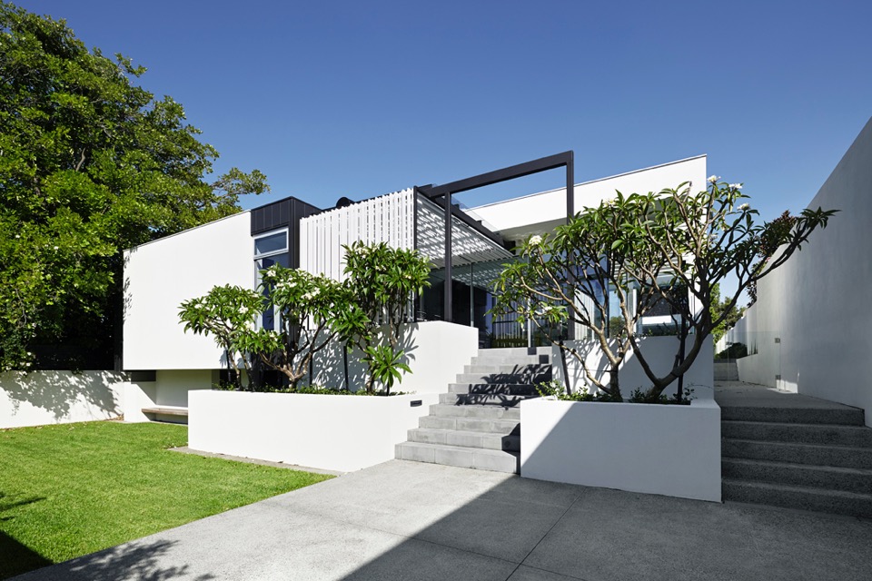
{Sculptural Frangipani trees create organic silhouettes against the linear}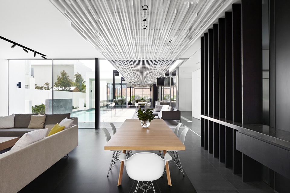
{Ceiling and pergola structures linking the pavilion and courtyard spaces}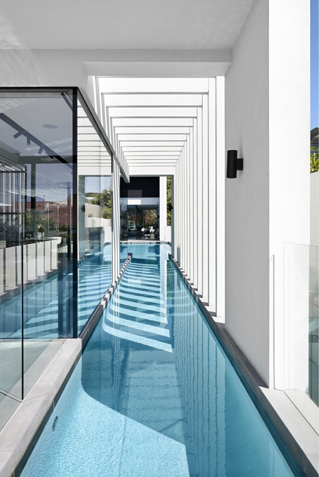
{Visually striking linear elements, that would be amazing to take in from the pool, day or night}
I feel the need to point out that while passive solar design principles have been applied with siting, material selection and active tech, the 6 star energy rating achieved is the NCC (National Construction Code) minimum, since this rating system goes up to 10 stars. Just keep this in mind, when designing or building your next home - time spent aiming for a higher rating early on will save you time and money later on.
Regardless of this small point, this house is a beautiful example of contemporary residential architecture and looks like it would be a joy to live in.
xo Romona![]()
Modern House at Big Hill
House at Big Hill by Kerstin Thompson Architects, near Victoria's Great Ocean Road, is characterised by a strong, triangular form and a restrained, honest material palette. Semi-recessed into the site, the home opens up to take advantage of the surrounding coastal and bush views. I love the simplicity of the smooth natural grey concrete block walls and concrete floor, with the subtle warmth of the plywood accents for storage and partitions. The black ceilings allow them to disappear and push the viewer through the walled space to the spectacular views beyond. Although definitely robust in form, this form creates intimate spaces where light and shadow, cool and warm, smooth and textured complement rather than compete.
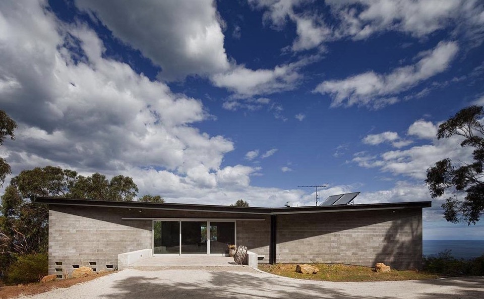
{The dark roof form helps blend the house into the bush landscape}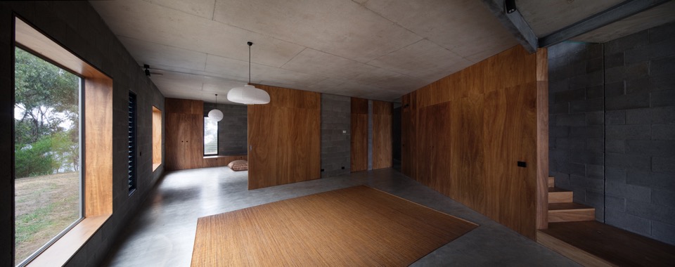
{Contrasting smooth cool concrete floors and natural grey block walls with warm continuous blackbutt plywood Armourpanel surfaces by Big River} 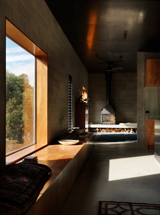
{Dark picture frame windows are recessed to create deep plywood window seats for soaking up the surrounds}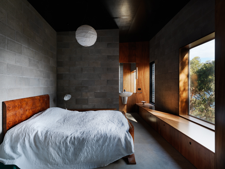
{Bedroom with Armourpanel plywood storage doubling as deep window seat}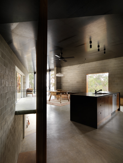
{Open kitchen kept simple with concrete and dark timbers}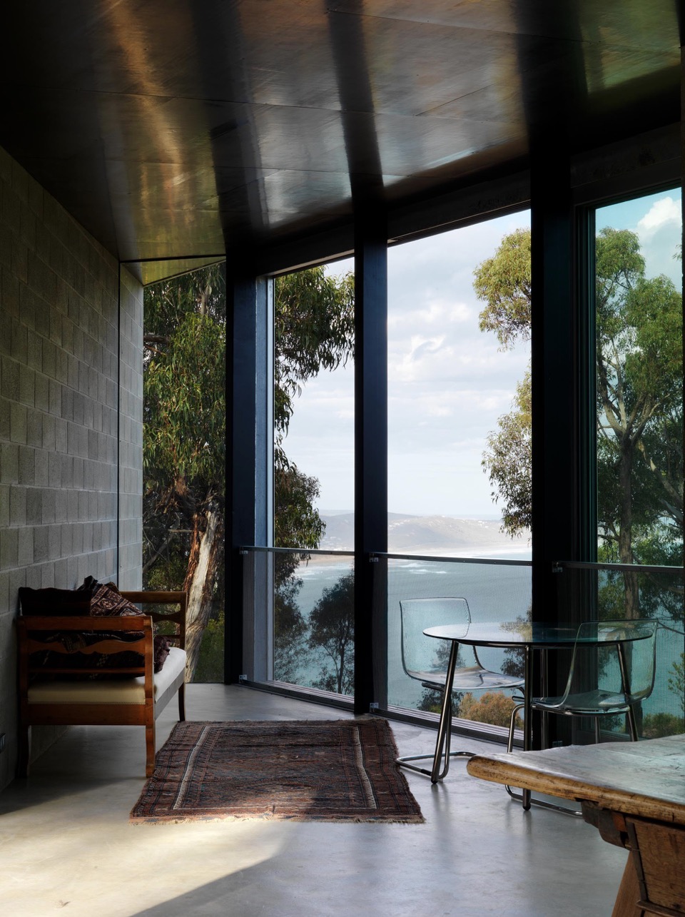
{Space furniture in this living space retains the view as the hero}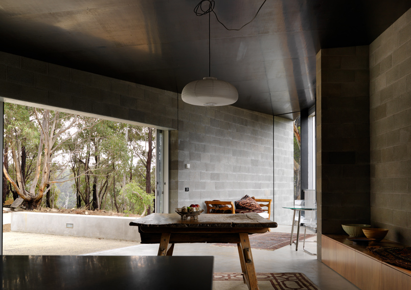
{Opening to the bush beyond}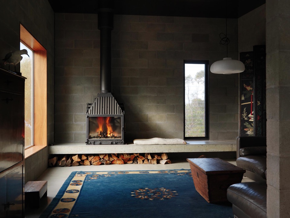
{Insitu concrete step doubles as seat and storage}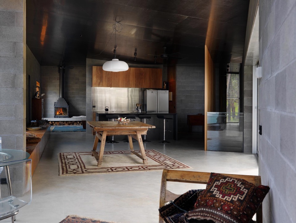
{Custom plywood joinery doubles as seating and storage, minimising need for additional furniture}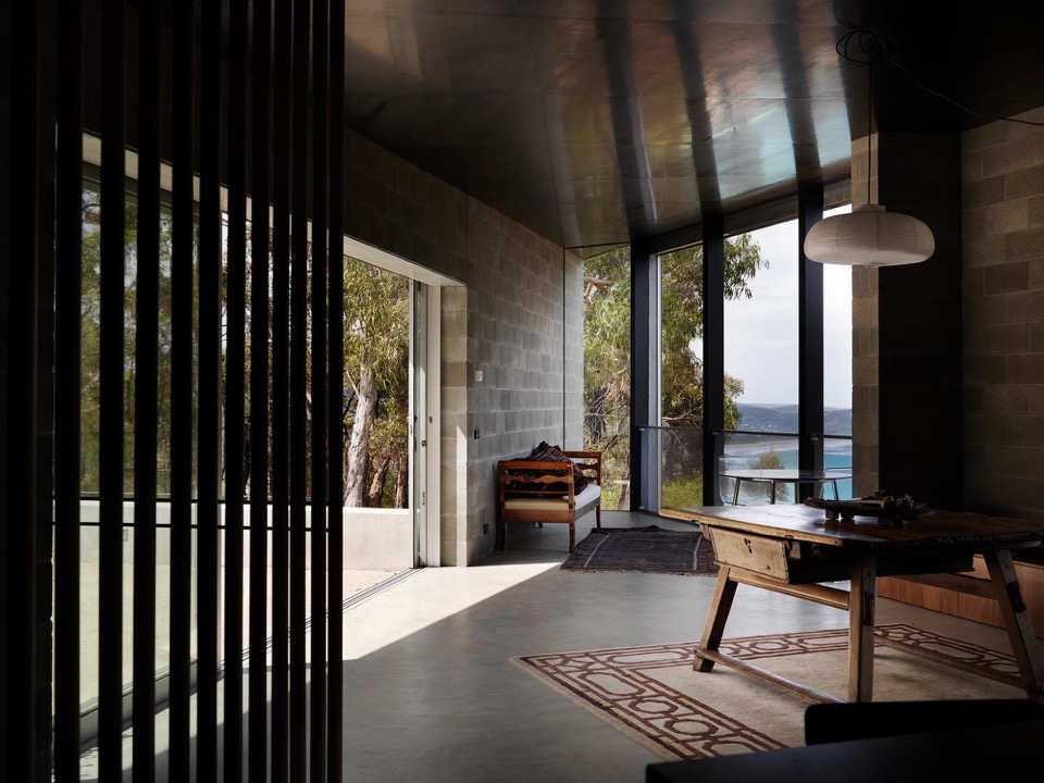
{Smooth concrete floors flow to outdoor spaces}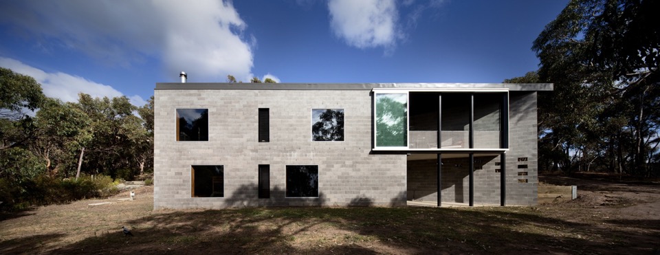
{Robust form to lower terrain}
Images courtesy of Kerstin Thompson Architects and photographed by Trevor Mein.
xo Romona![]()
Local Heroes: Bellevue Terrace by Philip Stejskal Architecture
{Loving those brick steps taking their time meandering up to the new level}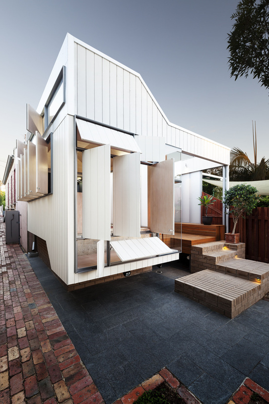
{Open-wide. Come inside}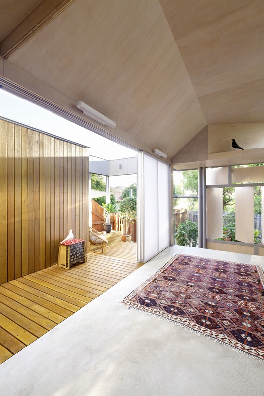
{Who doesn't want a naked room like this, kept simple with a burgundy Persian and two chatting Eames birds}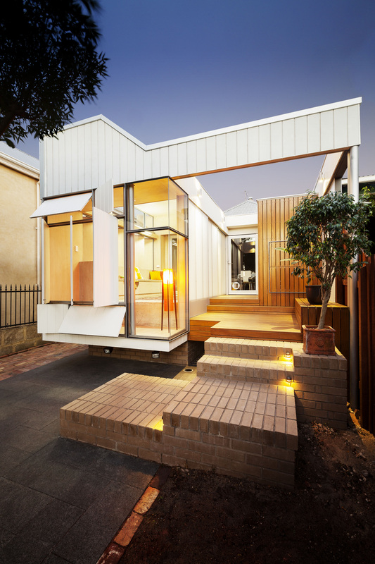
{Open to reveal the internal glow}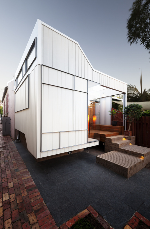
{Closed to weather, allowing privacy and comfort as required}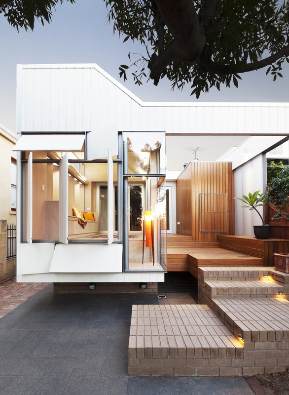

{Filtered light and screened privacy without feeling boxed in}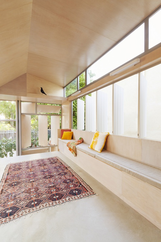
{Open room with custom in-built joinery for storage and seating}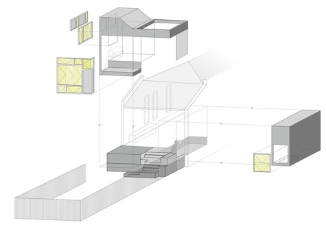
{Exploded axonometric of addition}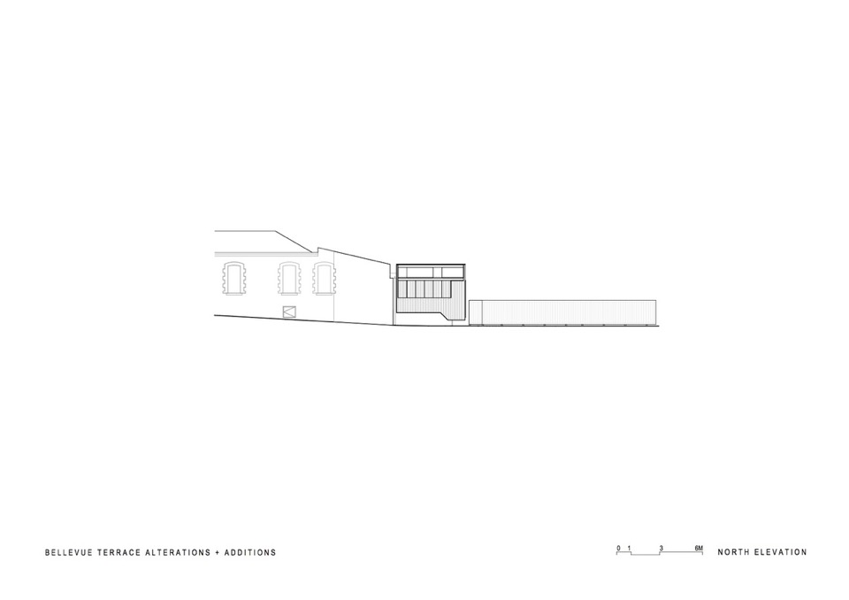
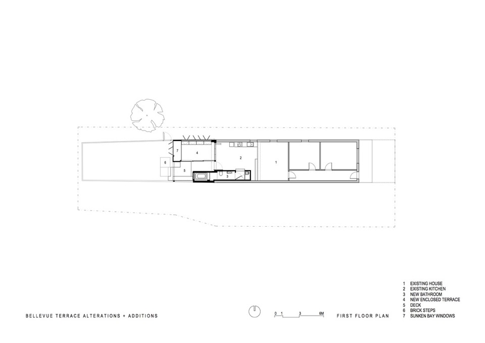
All images are from Philip Stejskal Architecture with Photography by Bo Wong.
Share your thoughts? Can you picture living in a space like this?
xo Romona![]()
Local Heroes: Florence Street by KADA
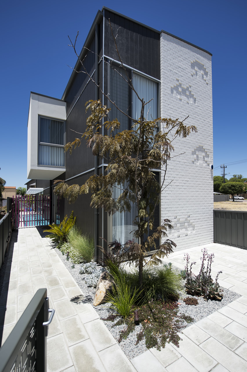
I love how the home has fun elements scattered throughout, in the form of bright sunny pops of colour or embossed brickwork space-invaders. How could you not be happy in this house?
For more information on the Florence St project visit Klopper & Davis Architects.
xo Romona![]()
Local Heroes: Lake House by Jonathan Lake Architects
{To the street, Lake House takes the form of a timber box elevated on the bold box of rammed-concrete. LVL fins provided added privacy as well as character}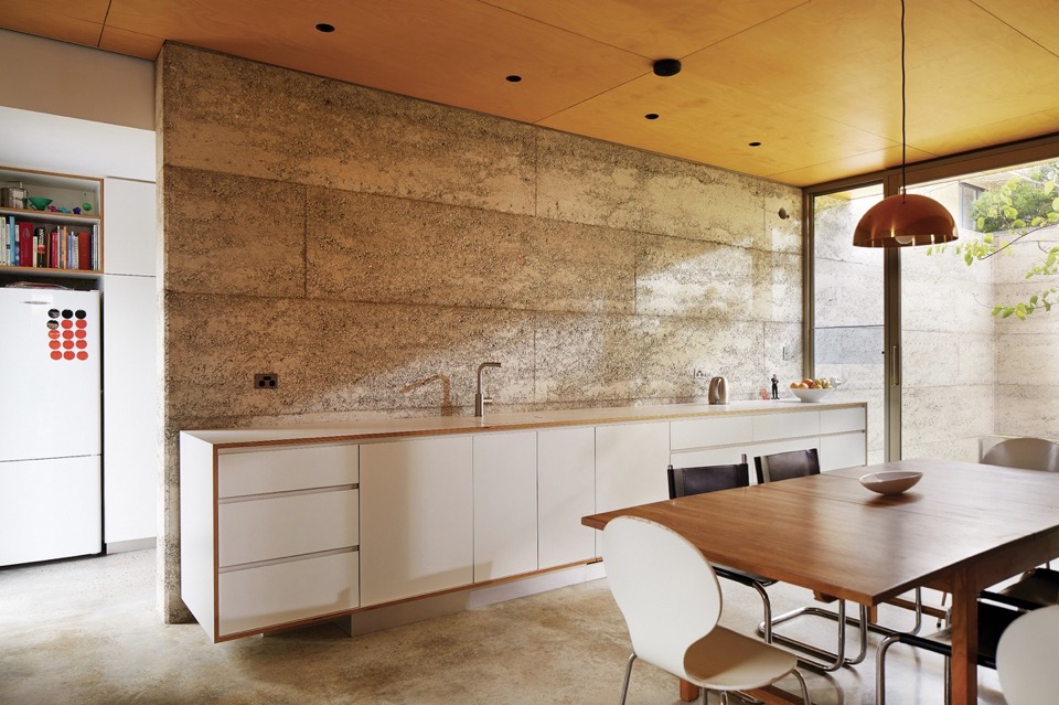
{Structural rammed concrete walls are left revealed as a raw, textural backdrop for kitchen and living spaces. Ply wrapped cabinetry adds warmth and the appearance of integrated furniture} 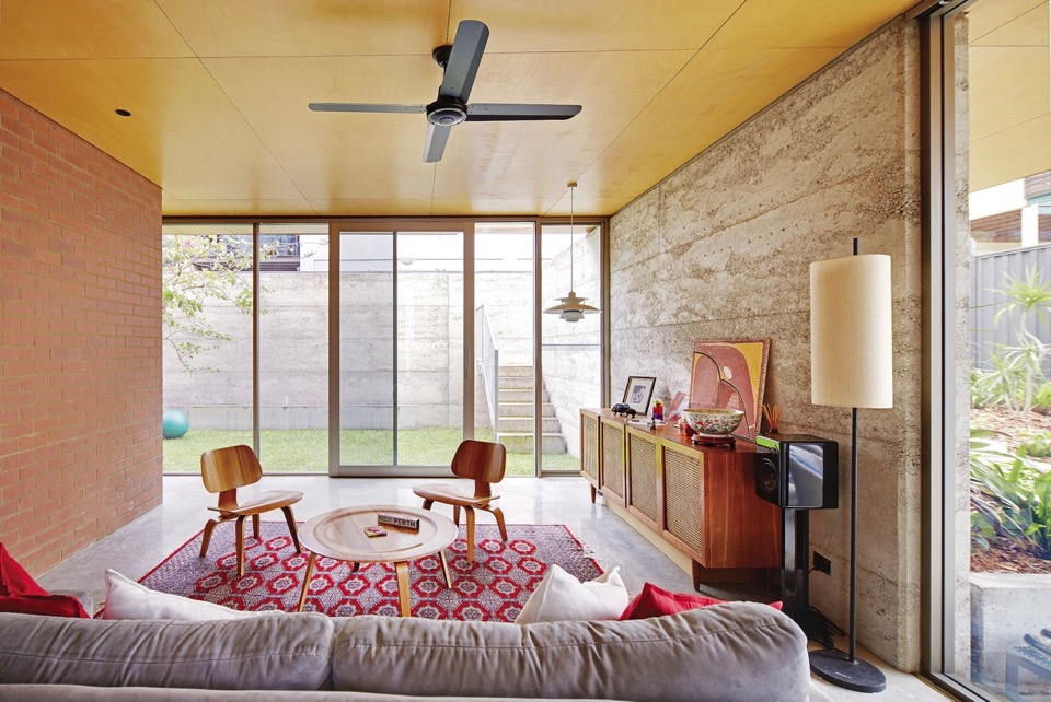
{The compact living space extends into the adjacent north-facing courtyard for indoor/outdoor entertaining. Loving all those honest materials and textures! Artwork: Shirley Purdie, Nnideudia, 1994}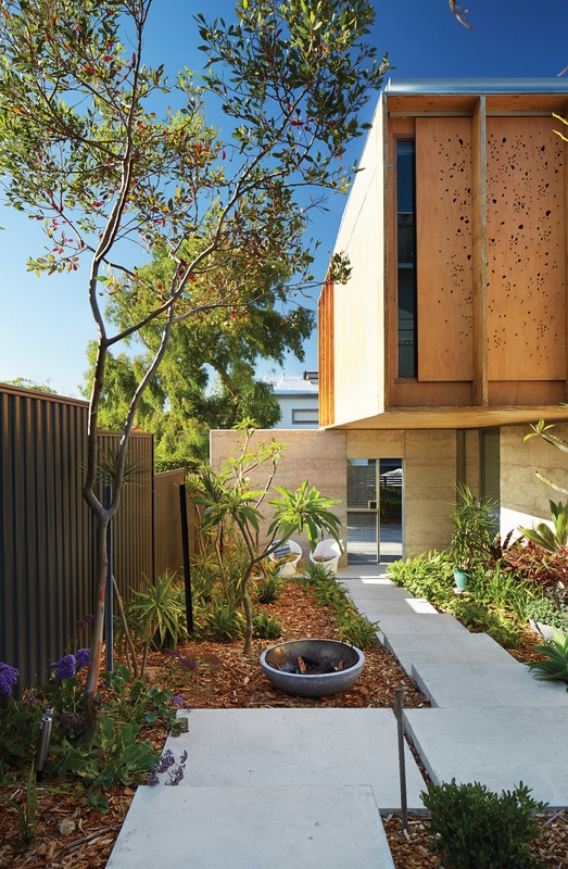
{Colour-filled perforations in the plywood screens act as both an artwork and visual privacy, sun-shading and temperature control}
{Sunlight passing through the plywood screens, which feature a pattern created by artist Pamela Gaunt, casts vibrant patterns across the concrete floors and white walls. Screens are CNC routed with pebble-shaped penetrations filled with coloured acrylic}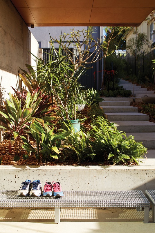
{Instead of wasting valuable site space with driveways and garage, circulation spaces are edged with lush native and subtropical planting}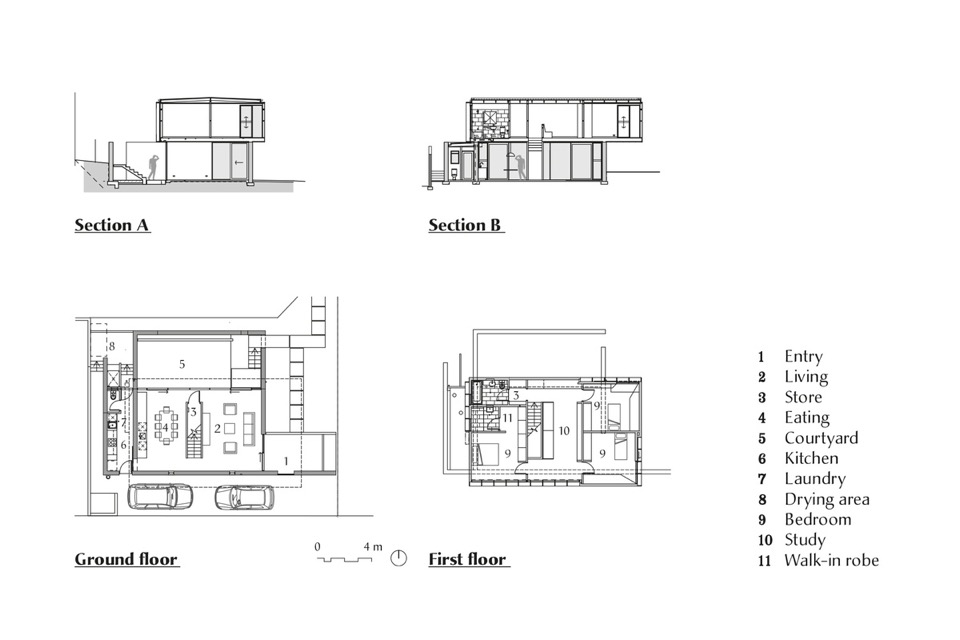
{Lake House documentation by Jonathan Lake Architects. Image source}
For more information on this project, visit Jonathan Lake Architects. Images by Robert Frith.
xo Romona![]()
Local Heroes: Marimekko House by Ariane Prevost
This stunning multi-material home in Perth suburb of Mosman Park is by the outrageously talented Ariane Prevost. Architect's designing and constructing for themselves (with of course plenty of time, patience, money, attention to detail, great trades and an agreeable partner) can result in the most amazing homes! Her abstract use of seemingly mundane materials comes together in an exciting collection of interweaving spaces. And how great is that kitchen?! A simple palette of colours taken from the raw materials and textures of the building, layered with artwork and those amazing Marimekko fabric covered soft furnishings. These fabrics and patterns inspired the enveloping cor-ten screens that give the house its name.
{Cor-ten Marimekko-inspired cut screens to the front facade allowing privacy to this open-planned home. Image by Heather Robbins of Red Images Fine Photography via House Nerd (an awesome Perth blog you should also check out!)}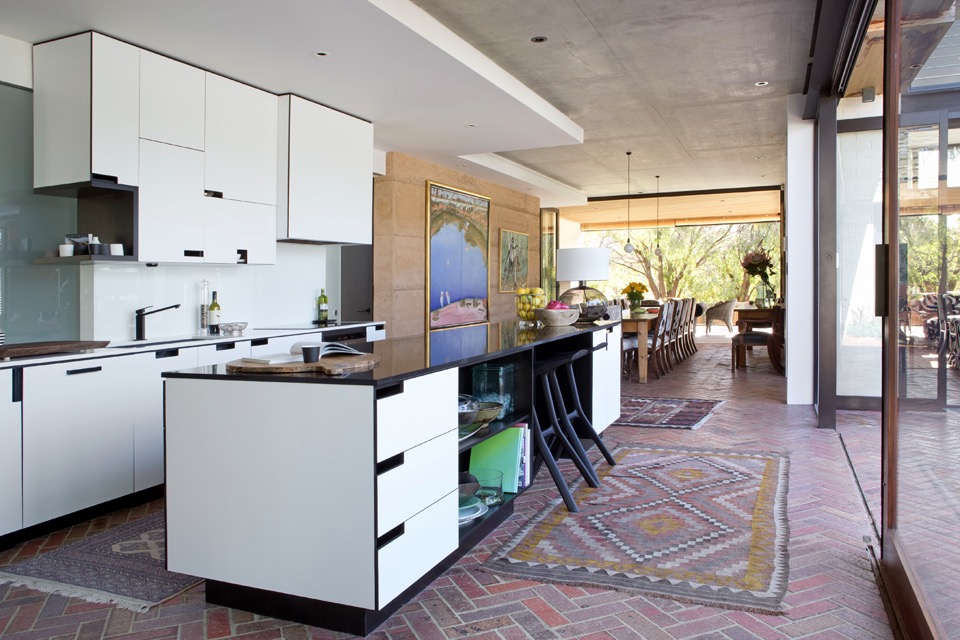
{Brick herringbone floors throughout internal spaces allow seamless blending to exterior zones. Image by Angelita Bonetti}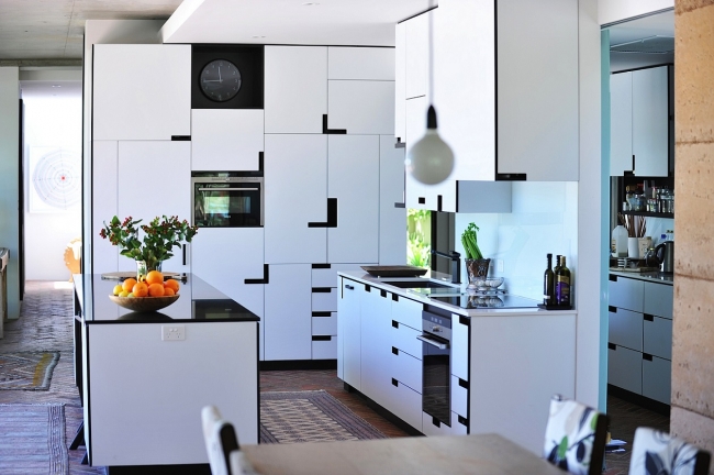
{That stunningly detailed monochrome kitchen! Image by Red Images}
{Creative use of typically common materials adds interest and worth beyond the actual costs}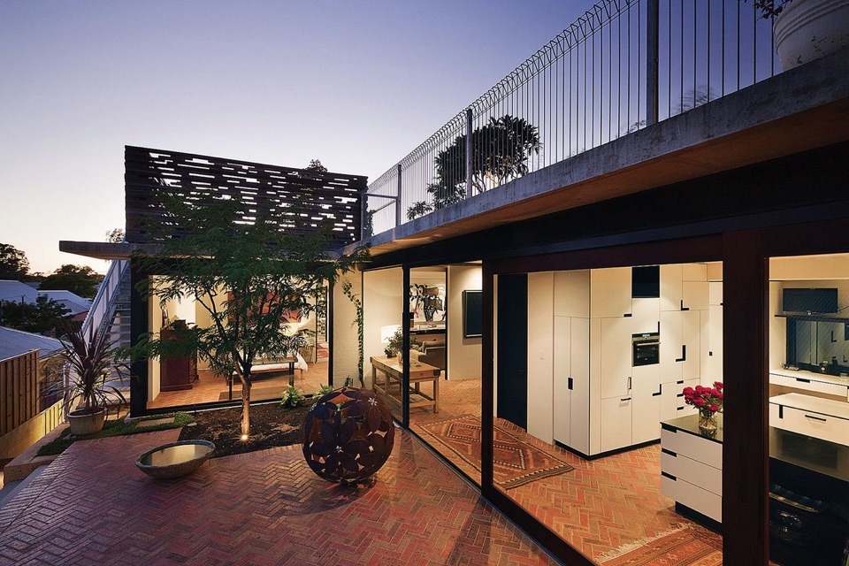
{Love that monochrome, tetrus-like joinery patterning. Working closely with cabinet makers and joiners resulting in stunning outcomes}
{Massive front door with handle made from a piece of old bridge timber. Image by Red Images}
{That monochrome Marimekko fabric! Image by Red Images}
{Open facade and spaces blurs the line between inside and out. Image by Bo Wong}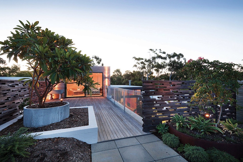
{Landscaped roof terrace with screens from reclaimed roofing timbers}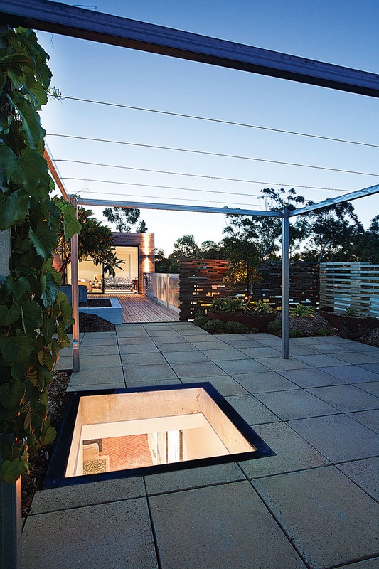
{Deciduous grape-vine pergolas for summer shade allowing winter sun penetration}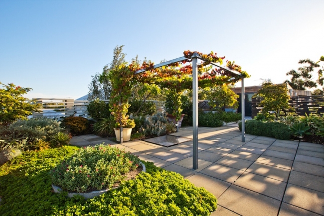
{Roof terrace at a later date, with succulents and vines now fully established and so lush. Image by Red Images}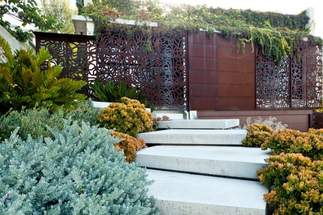
{Trailing concrete steps through lush succulents. Image by Red Images}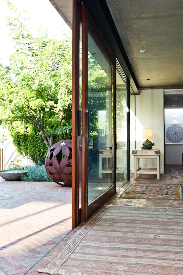
{Blurring the divide between outside and in. Image by Red Images}
It must be amazing to live in such an open and flowing home, although I must admit that my severely-mosquito-attracting skin does shudder just a little. Might just have to plant a little extra Lavender, Spearmint and Lemongrass around.
Hope you enjoyed!
xo Romona![]()
Local Heroes: Triangle House by Robeson Architects
But I digress, this isn't a lecture on residential sustainability, rather the exploration of something beautiful born out of perceived limitations. Triangle House on a tight 180m2 triangular block in Mt Lawley, Perth showcases the ingenuity of Robeson Architects and to me is one example of Perth architecture at an international standard. What better way to start this series than with a project that initially grabbed me on Pinterest, but really had me hooked when I found out it was not only Australian, but super-local (Mt Lawley!) and a fellow female architect. Enjoy!
{The stunning triangular form juts out with supercool artwork below at street level by Robert Jenkins (@theblackmountains). So recognisable to me now that we have a wall of his around the corner in Bassendean, and you may have seen me go a little insta-happy over}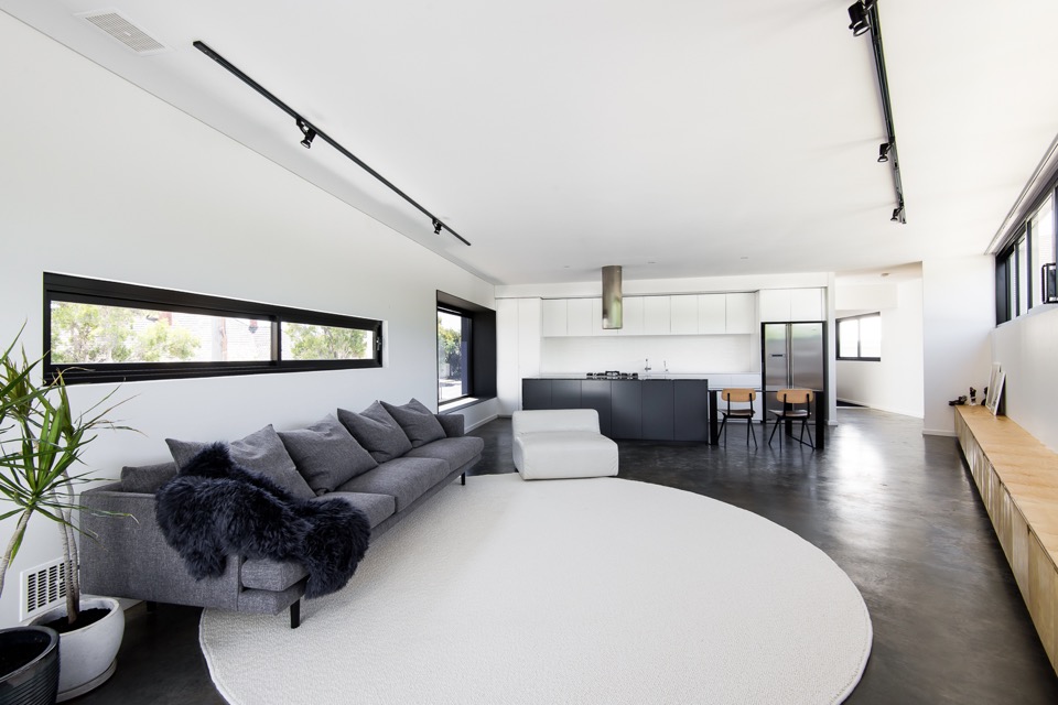
{This was one of the first images that made me fall for the place. Of course those who know me, know my tendency towards black, white and grey, but it also has all my other loves - big white kitchen, contrasting black frames, deep polished concrete flooring, minimal timber accents, big snuggly Jardan grey wool couch, indoor potted sculptural Dracaena, statement linear ceiling lighting, even the furry throw - my god Simone, you can do no wrong in my eyes! In fact, if I plonked my gorgeous tan fur-baby on that rug, the picture would be complete}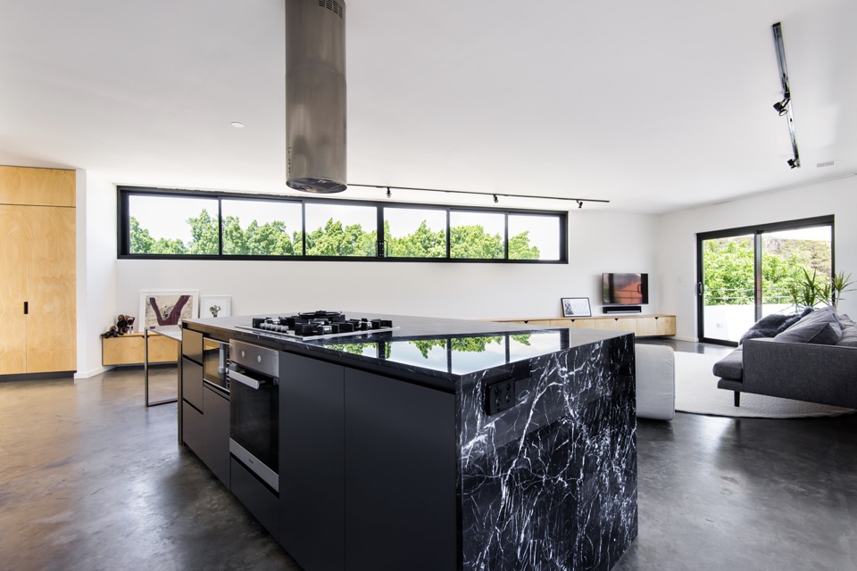
{Brutal black kitchen island wrapped in electric-veined Nero Marquita marble adds drama to the monochromatic space}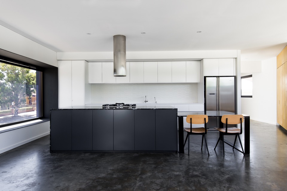
{Just a beautiful kitchen in blocked monochrome, and I love that massive projected north-facing window, done in one-way glass boxed out in steel for privacy}
{Extending the black-framed picture window to the heavens with a waterfall skylight}
{Sharp-edged deck space making the most of a difficult site and adding a bit of drama to Vincent Street}
{Clean gallery feel to the downstairs office softened by multiple but complementary textures and material finishes, like the burnished concrete floor, blackened LVL stair treads and black steel}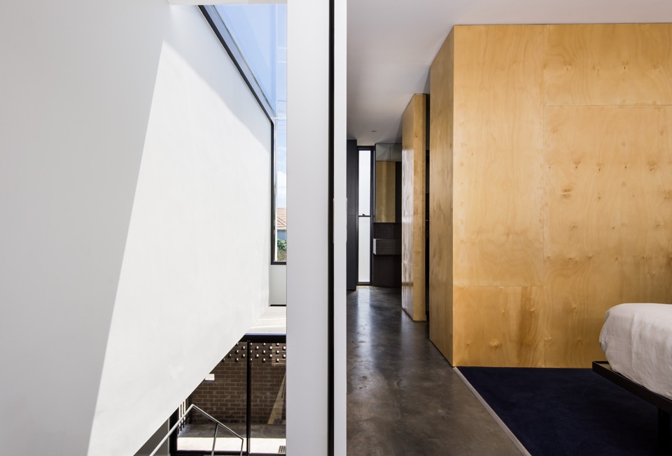
{Simple but inspiring void spaces and linear movement}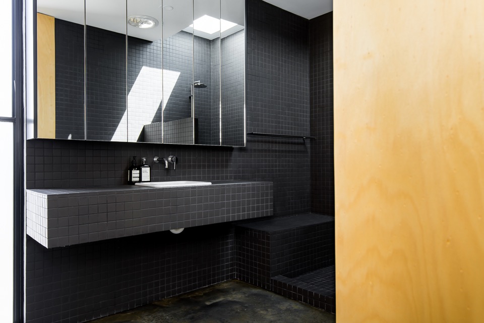
{Clean and minimal bathroom in continuous matt charcoal tile with clever hidden storage. Love the concrete bathroom floor, but I'm unable to convince my husband that I won't snap my other leg if we have that} 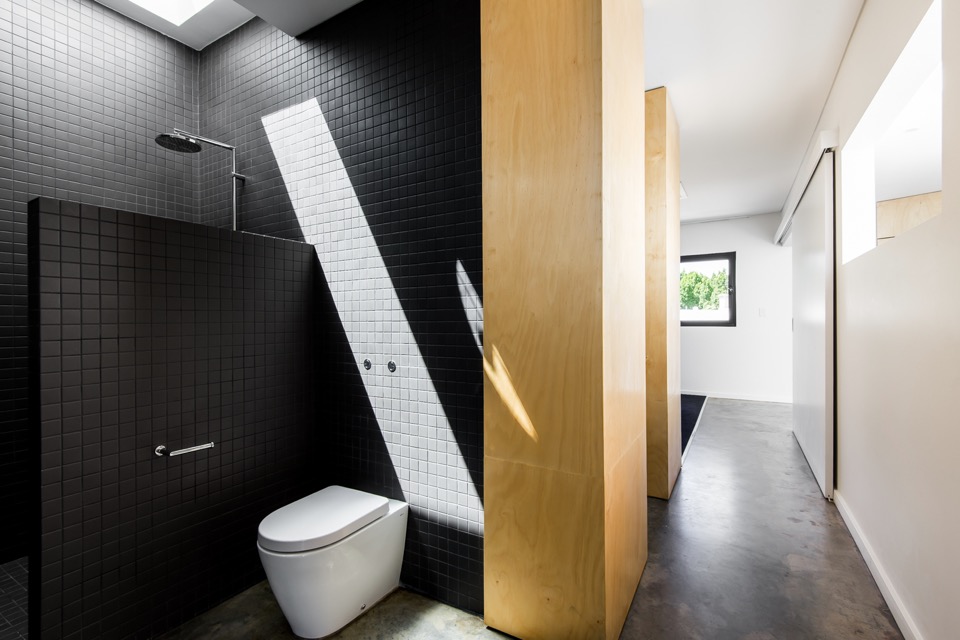
{You know it's good when even the dunny makes you go Oooo}
{Detail of the cool mural work at Vincent street level by Robert Jenkins}
{Image by Dion Photography}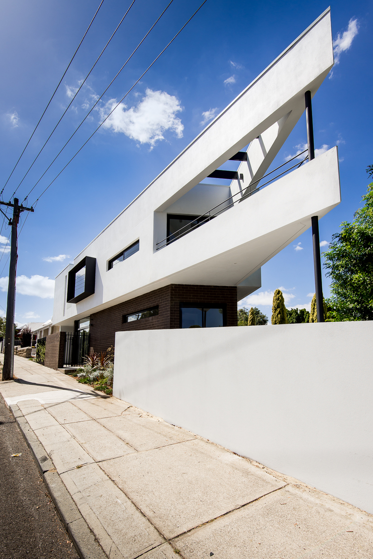
{Image by Dion Photography}
All images are from Robeson Architects (big thanks Simone) and Dion Photography. If my house turns out even half as nice, I'll be wanting some shots done by those guys. Simply brilliant!
Doesn't it make you proud to have some lovely architecture in Perth (and Australia)? What are your thoughts on this place?
I'm hoping to showcase a bunch of other local talented architects and their projects soon, so feel free to let me know if there are any that stand out to you.
Hope you enjoyed!
xo Romona![]()
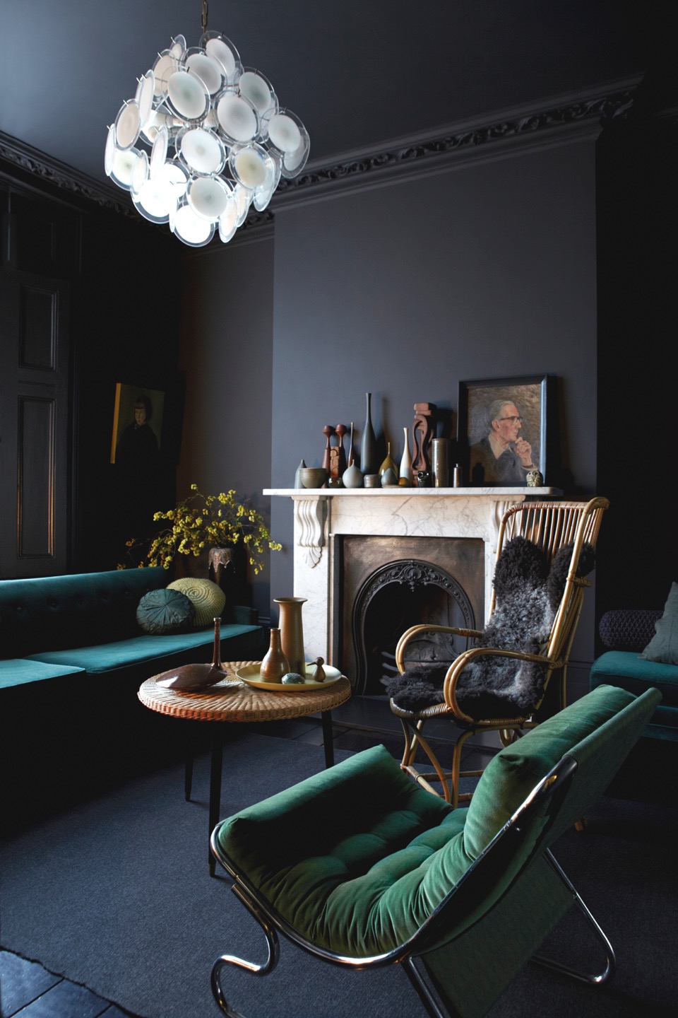
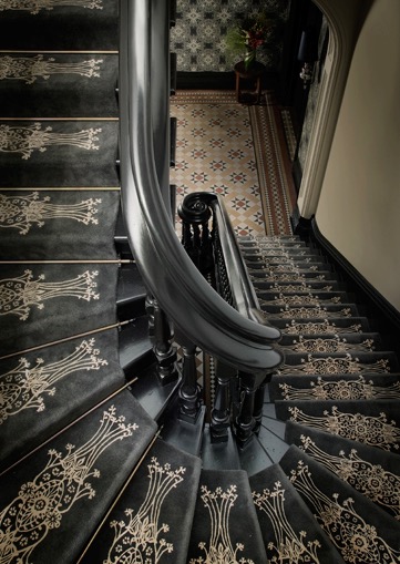
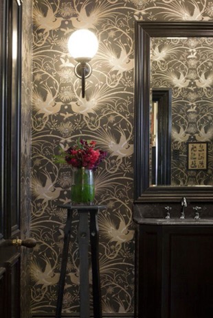
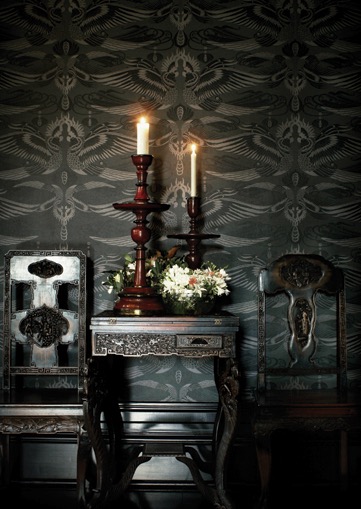
The Dark Side
Here are a few interiors that are exploring and expressing their dark side.
{Graham Atkins-Hughes' family home in London, styled by wife Jo Atkins-Hughes. Graham also photographs a lot of Abigail Ahern projects, and I can definitely see a similar taste and influence there. Image from Milk Magazine}
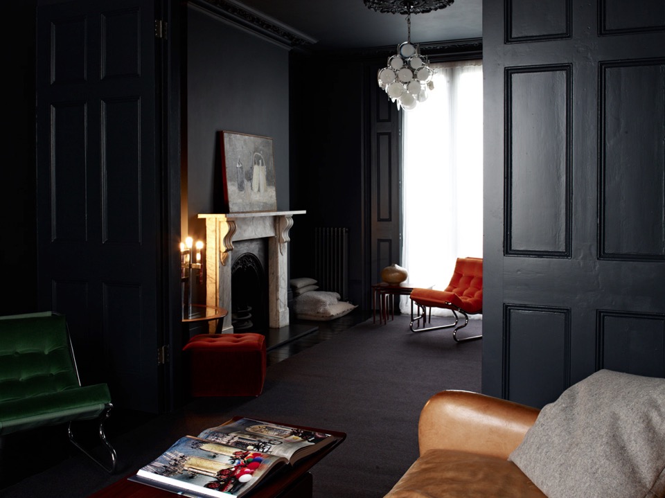
{From the same home as above, this dark panelled lounge exudes a moody confidence. 'Photographed by Graham Atkins-Hughes and styled by Jo Atkins-Hughes}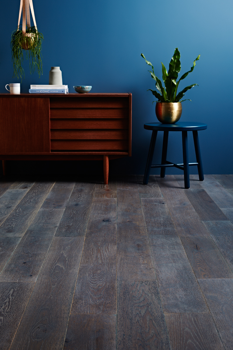
{Not quite as dark, but still strong, this scheme by Texture Design for Godfrey Hirst flooring campaign shows beautiful combinations of dark block colours and textures}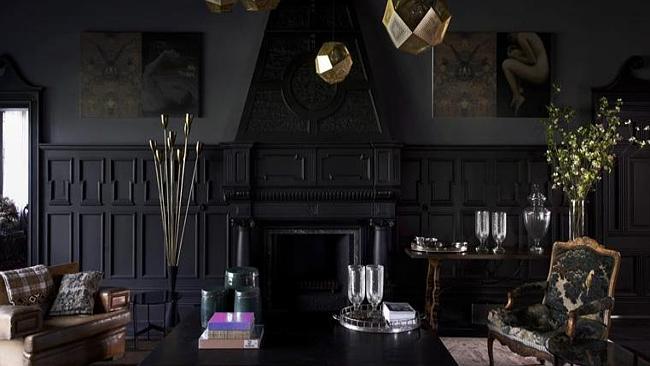
{This circa-1880s home in Armadale, Melbourne features dark walls with black panelling, taking this extravagant character home to a new level}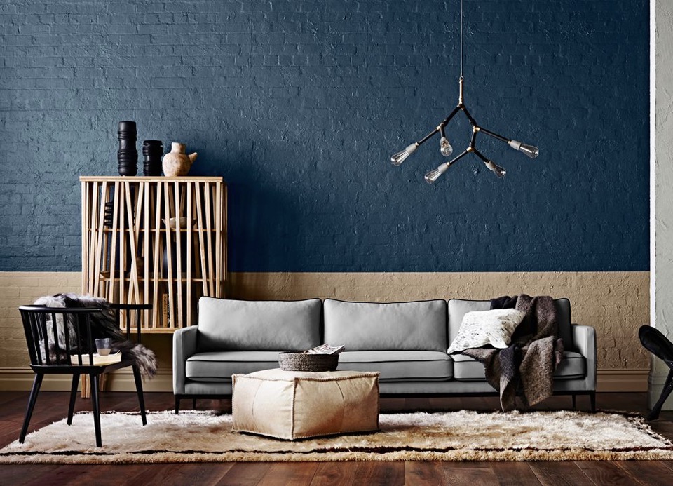
{Styling for the 2015 Dulux Colour Forecast 'Wildland' colours. Loving that deep sea blue wall}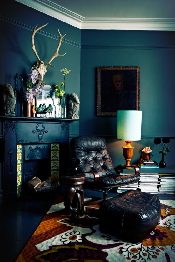
{Dark, moody interiors by the ever-impressive queen of dark interiors Abigail Ahern}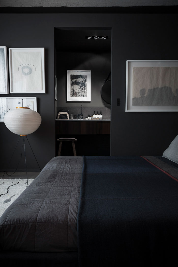
{Dark bedroom in shades of grey. Photo by Romain Ricard}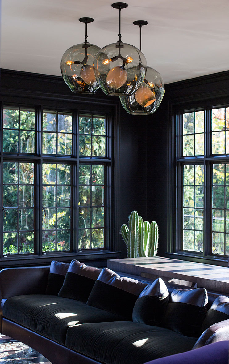
{Dark walls with black window frames allow the natural light and view to green foliage beyond to shine, not to mention the beautiful Lindsey Adelman pendant}
What do you think about dark interiors, especially in the Australian setting?
Would you or have you used dark interiors in your home?
xo Romona![]()
Interior Design Solutions that will Enhance your Life
It’s all too easy to get stuck in a design rut when it comes to your home. However, with a little creative thinking, it’s possible to revamp your property. The following simple but effective design tips could help you to improve your house and they might even enhance your life.
Window dressings that put you in control
If you assume window dressings are just there to look pretty and give you some added privacy, think again. By choosing these home accessories carefully, you can bring added comfort to your rooms. For example, it’s now possible to purchase stylish and highly practical blockout blinds and curtains. Available from window dressing specialists like Curtainworld, these accessories give you complete control over light levels in your home. Whether you want total darkness to help you sink into peaceful slumber or you’re keen to create the movie-theatre experience in your lounge, these blinds and curtains can help.
{Chambers Street Residence in South Yarra, Melbourne by MIM Design}
Soft furnishings that exude style and bring added comfort
Another quick and easy way to refresh the look and feel of your property is to add some new soft furnishings. While a simple rug and a few cushions may not seem much when you consider them on their own, when you adorn your rooms with an array of lavish new accessories, they can have a transformative impact. Thick pile rugs for your floors, soft throws for your seats and a scattering of stylish cushions on your couch and bed can really bring your rooms to life.
{I'd love to cosy up in this place right now! Appartement Lyon 5 By Maison HAND in Elle Decoration. Photo by Romain Ricard}
Bring the outside in
Another simple and satisfying way to enhance your home is to bring the outside in. Most people have at least a scattering of small pot plants in their properties, but why not take this a step further and introduce big, bold plants that make a real style statement? From the Zanzibar gem to the golden cane palm and Madagascar dragon tree, there’s certainly no shortage of options to choose from. This greenery can be used to liven up otherwise bare corners, soften stark walls and generally add a jungle look to your rooms.
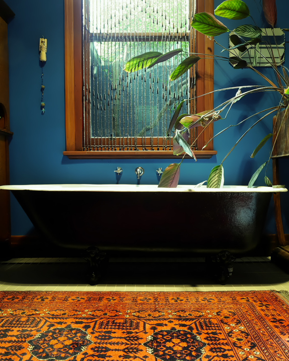
{Jazmina's beautiful Melbourne bathroom featured in The Room Illuminated}
As well as improving the appearance of your home, plants may help to boost your health. According to research conducted by Professor Margaret Burchett and Dr Fraser Torpy from the University of Technology Sydney, indoor greenery can remove pollutants, cleanse stale air and reduce symptoms such as sore eyes and headaches. The scientists also suggest that plants can help to minimise feelings of stress and fatigue. The best thing is, you don’t have to splash much cash to get your hands on these home accessories and, as long as you care for them properly, they’ll give you many years of enjoyment.
I hope you all enjoyed these few tips from our contributor Gail Newland. I personally love seeing plants of all sizes inside. Thanks Gail!
Do you have any tips of your own to share?
xo Romona![]()
Good Kitchen Design: How to make the most of your space
Your kitchen should be designed to work in sync with your lifestyle, yet too often it is the opposite way around. As home design continues to revolutionise itself the modern kitchen is a world away from its past incarnations. Previously seen as a room of preparation and storage, the modern kitchen is open, inviting and acts as the epicentre of the home, truly the heart of the modern family unit. This rise in status has resulted in an increased desire for a kitchen that reflects upon the household, effective and efficient. Check out these newest kitchen design rules to mould your own classic, modern kitchen.
Establish your Design Reasoning
The first and most important design rule is to decide what motivation you have for your kitchen. This can be divided into three broad categories; Functionality - If your kitchen has inadequate bench, storage or stove space you may be inclined to re-design. Style - If you're looking to update your kitchen with modern cabinetry, appliances or colour schemes. Value - If you're looking to add additional value to your home for re-sale value. Without establishing your design motivation you'll end up with a scattered and poorly functional kitchen.
Start with the Kitchen Triangle
The Kitchen Triangle, or 'work triangle' as defined by the National Kitchen and Bath association, is an imaginary line drawn between the three vital work stations of your kitchen. The sink, oven top and fridge. You should be able to easily transition to each centre without the space being cluttered or too far apart (not more than three metres between each point).
Aesthetics
If the Kitchen Triangle is a symbol of an efficient kitchen, your surfaces, cabinetry and appliances will represent the style. Try to maintain streamlined surfaces, cabinets should reach the ceiling or run flush with a bulkhead. This limits wasted space which impairs your design with inefficiency, as well as preventing a recess for catching dust. Consider integrating appliances within the design through the use of integrated front panels. This technique can blend a dishwasher into the overall style of your kitchen seamlessly.

Lighting and Colour
Lighting and colour are also key components of strong kitchen design. Be aware that colours may dictate mood in certain homes. Neutral palates are thought to create calm while using bright, bold colours on splashbacks can create a more direct aesthetic. When it comes to lighting, consider using energy efficient LED’s or compact fluorescents in work spaces. Adding dimming switches or floor lights can also be used to create mood and atmosphere at your discretion.
Designing your ultimate kitchen, a room which is both effective and efficient while retaining a warmth, joy and connection, is a massive undertaking. As the centre of your families health and wellbeing there are a range of factors from design, to mathematical and aesthetic, which will dictate your finished product. Consider the needs of your family and your home and with these hints and tips you’ve taken the first step towards your perfect, designer kitchen.
I hope you found these kitchen design tips useful. Let me know what you think ![]()
xo Romona
* All images from The Kitchen Place.![]()
Follow my blog with Bloglovin
Australian Interior Design Awards 2015 - Residential Award
{This dining room is composed of the perfect balance of bright white, raw concrete and moody black accents. Although these Serge Mouille lamps seem to be everywhere at the moment, you can't deny that they have a massive impact with their insectoid arms reaching into the space as few other lighting forms can}
{Modern luxe with heritage charm in the bathroom. Marble with burnished brass, shadowed iron and bright white}
{In love with this black-edged panel diving wall - the perfect simple, graphic bedhead. Not to mention that black AJ table lamp, always on the top of my bedside/office table lamp wish-list!}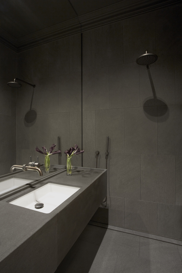
{Dark and moody ensuite, a perfect retreat}
{Gilded patina underfoot and overhead pick up warm elements in the artwork, acting as a respite from other cool spaces in the home}
{I love the beautiful blank canvas of monochromatic materials and textures, allowing a stunning collection of artwork to stand out, with classic modern furniture and lighting}
Images by Sharrin Rees.
xo Romona![]()
2015 Dulux Colour awards
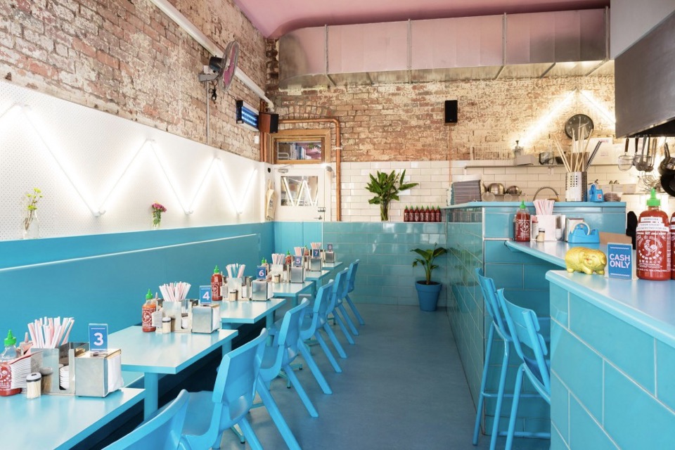
{The coolest Vietnamese Restaurant in Smith St, Collingwood, Phamily Kitchen by Matthew Van Kooy won the Commercial Interior Public Space and Hospitality Award. I'm loving those tiles and I have those pot plants! Photo by Dan Aulsebrook}
A beginner’s guide to illuminating your home
All too often, lighting is seen as merely an interior design afterthought. However, with a little creative thinking, lights can dramatically enhance the look of homes. If you’re new to property design and you want to make the very most of the illuminations now available, take a look at these simple but effective suggestions.
Maximise natural light
Firstly, bear in mind that it’s not just artificial lights that can help to boost the appeal of your property. Sunlight can also play a major role in this. By allowing solar rays to stream into your rooms, you can give them a more spacious, airy and open feel. With this in mind, it’s important to select suitable window dressings. One great way to ensure you make the most of the natural light on offer is to take advantage of the sunscreen roller blinds available from window furnishing specialists like The Blinds Company. These products filter natural light to keep rooms bright while also reducing heat and glare, and stopping harmful UV rays from entering your home.
{Full height sheer curtains provide light, texture and interest to this bedroom space in Bondi by C+M Studio. Photography by Caroline McCredie}
The Monochrome Kitchen
My obsession at the moment is designing the perfect kitchen for my family - it needs to be robust enough to handle the two boys, clean and simple enough for my ‘minimalist’ husband and eclectic enough to suit my many varies tastes. Easy, right!
I have always loved a black and white kitchen, the bar constantly moving on the proportional scale between the two. A few years ago, I would have been happy with almost all crisp, glossy white, but I have been swinging towards textured black with glossy white accents lately, as it seems so many of you are as well. Here are a few (and by that I mean heaps!) of black and white kitchens to get you inspired.
{Loved this even before I saw it was Greg Natale’s work - should have guess that from the pattern and mouldings but I always end up loving his style}
{Striking Kitchen in 33 Mackenzie Street Tower Melbourne By Elenberg Fraser}
Designer Insights

Here are the links to my recommended products above:
[1] Holiday table by Callum Campbell
[2] Wall boxes by Bonnie & Neil
[3] Bedding by Hunting for George
[4] Oh Buoy small lamp in blue by Treehorn Design
[5] limestone Factory Pendant by Inkster Maken
It was fun picking some beautiful trends and products out for them - thanks Tudor for inviting me to take part!
xo Romona
Chrissy Time
{Beautifully crafted Papier-mâché Christmas ornaments by Mozi. I have a few from last year, so can't wait to get some more to add to the collection}
Sustainable House Day 2014
By partaking in Sustainable House Day you can tap into local knowledge to learn how to successfully integrate renewable energy, recycling, and other sustainable practices into your home and lifestyle. This unique event is a valuable resource for anyone looking for inspiration, ideas and the key to sustainable living.
Homeowners, sponsors and local sustainable groups look forward to sharing their knowledge with you, plus I'll be volunteering at the Harrisdale home in WA for the day. There are homes and gardens open to the public throughout Australia. You can find more information about each house and its features on the webpage. This is a national event, but since I'm volunteering here in Perth, I've just highlighted a few WA ones below.
{Carla and Ben’s House, 128A Roseberry St, Bedford WA}
Linen love
{Arro Home cushions and linen by Beci Orpin. I ended up getting the bottom Sketchbook floor cushion pictured, which rotates between an accent thrown on the bed, a handy floor cushion and an extra head rest when napping on the couch}
How Hardwood Flooring Has Changed
Hardwood flooring has changed profoundly in recent years. These changes in floorboard technology, colour and texture mean that hardwood can fit a greater number of interiors than ever before. Here’s our visual recap to the latest trends in hardwood flooring.
Sustainable Sourcing
Individuals are often concerned that their decision to fit natural hardwood will lead to the demise of natural habitat. In truth, thanks to organisation such as the FSC (FSC Forest Stewardship Council), hardwoods from trusted vendors are sourced from sustainable forests where trees are consumed based on a rigorous and controlled quota and new trees are planted instead. This process is called managed sourcing. Your vendor of choice will be able to share the origin of the hardwood.
{Solid Hardwood Flooring}
Win Tickets to Decor + Design Melbourne's International Seminar Series
Melbourne, here I come!
Aside from catching up with all my wonderful Melburnians, I'm itching to get back to Melbourne for the Decor + Design and Furnitex conferences this July. Although rebranded from the previously called Decoration + Design, if past events are anything to go by, attendance is a must - so much designer eye candy! (I've posted about past events here). Furnitex and Vivid are always a highlight, and the international and local speakers they organise are truly inspiring. We are super lucky enough to have double passes to each D+D International Seminar Series speaker to give away - more information on the giveaway at the end of the post!
This year there is a great lineup of local and international speakers, springing from all fields of interior design and architecture, from trend-forecasters to designers.

{Kari Whitman, Interior Designer to the stars}
Black and White
{Harbour House by uber-talented Arent&Pyke. How yum is that Christian Liaigre console table?!}
Terrariums and Potted Green
{Ceramic Diamond Planters on table and Petite hanging Vase on the wall, both by LoveHate and available at Cranmore Home}
Concrete jungle
{Prahran Hotel interiors by Techné Architects}
Home Open
Before I get too soppy, the main reasons for this post were to give you some cheap update ideas for your home, a few tips for simple styling for sale and giving you a sneaky-peak into our lives and home. Enjoy.
Here are some simple tips for refreshing your home before sale:
1. Keep colours neutral.
You may love neon pink or cobalt blue but not everyone will - and not everyone has the imagination to see past it if they don’t like it. You don’t have to avoid colour, just stick to colour in flowers, soft furnishings and artwork.
2. Keep spaces bright.
I do love a good moody Abigail Ahern or Kelly Wearstler room, but I think this belongs in a space that you are going to inhabit for the long term. If you want to maximise the range of interest, keep it light, bright and airy. Lighting at many different levels adds interest - think combinations of candles, table lamps, floor lamps, overheads, wall sconces or whatever you have at your disposal.
3. Fresh flowers and plants (or even good fakes ones) are a must.
They bring colour, style and life (or appearance of life if faux) to your space, not to mention fragrance. Just don’t let the fragrance be too overpowering - air out spaces, keep water fresh and replace flowers if they start to get a bit droopy or pongy.
4. Decluttering is a given really.
Noone want to buy the house of a hoarder, who knows what else you might find after purchase. Pair back your living spaces and tidy display areas. That doesn’t mean depersonalise or make it impossible to live, but presenting the space how people would like to live (i.e. neat, organised, stylish) sells a lifestyle not just a house.
Feel free to disagree as every house has it’s own personality. Below are a few before and after’s of our own house to give you some ideas.
{In the master bedroom, all the curtains were removed from the house to bring more light into the spaces and reduce some of the heaviness of the rooms. Both block out blinds and sunshaders are in the bedrooms while just blockouts are in the living spaces. The walls are a pale grey, Nippon Nighthawk 1, and the ceiling light was replaced by a fan and light for much more comfortable summer sleeps. Adding a rug, cushions and throws for softness as well as customising my lamp shades makes it a bit more personal. Spaces can still have personality while being clutter free - just choose a few key pieces like books and photo frames to make the space feel lived in and not like a showroom}
Nautical dreams
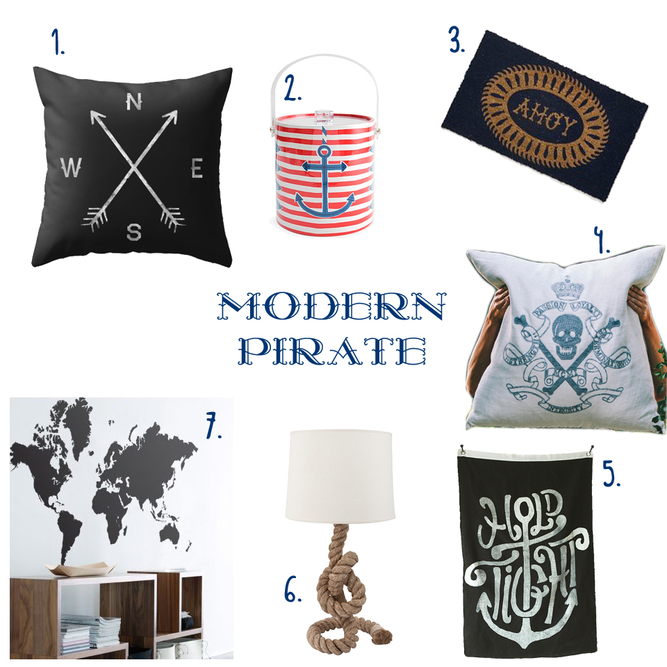
{ 1. Compass cushion, 2. Côte d'Azur Ice bucket, 3. Ahoy Door Mat, 4. Skull & Crossbones Cushion, 5. Hold Tight wall flag, 6. Pier Rope Table lamp, 7. World Map Sticker }
Melbourne Decoration + Design 2013

{Paul Townsin’s Me + Me Too Lamps, made of moulded concrete and so, so beautiful in person}
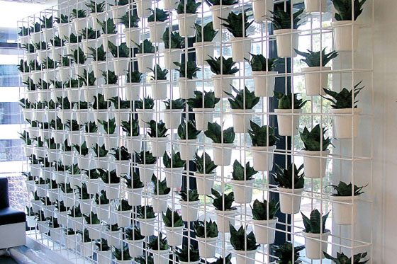
Vertical Green #2
I have been through some of the benefits of green walls with some examples previously, here, but since there have been so many fantastic examples of late, I felt the need to give you all a second helping of green delights.
{The Florafelt F12 Greenwall growing panel by Fytogreen Australia as used in Kim & Matt's outdoor space on The Block Sky High 2013. The panels are made from 100% recycled PET plastic felt and are available from The Block Shop}
Great Gatsby!
Really, who wouldn’t love this opulent, polished, brilliantly deco bedroom. OTT? No way!
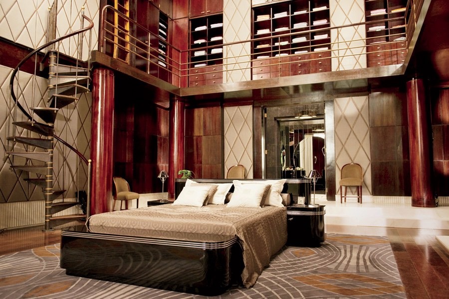
{Gatsby’s sleek and stylish 1920’s bedroom from the Baz Luhrmann film. Via Architectural Digest}
I know I have gushed endlessly over Catherine Martin’s work with Mokum, Porter’s Paints and Designer Rugs, but how can I not start with the gorgeous interior decor from the Production and Costume Designer of the movie (not to mention director’s wife).
DesignEX 13
The Hives exhibition was the stand-out for me with its gorgeous collaborative pieces. “When designers, interdisciplinary practitioners and leading industrial enterprises put their heads together, the results can be exciting, unexpected and intriguing. Curator Anne Maree-Sargeant returns the popular Hives exhibit to designEX 2013 with a highly considered display of products that bring together covetable objects from visionaries and brands under the themes of Innovation and Collaboration”.
My favourite for years has been the WebLight by Design By Them (along with everything else they do!). I fell in love with the gentle image of the aptly-named wispy-looking light set amongst a bright green forrest on their webpage years ago. “WebLight is the result of an exploration into the potential possibilities of reusing plastic bags. Made from recycled content, each WebLight is individually hand made and features an intricate pattern of texture and holes that are the direct result of its unique forming process.”
{Weblight by Design By Them}
Another creation I was looking forward to seeing in person was the precise Hoshigame by Artemide. Developed with Japanese fashion designer, Issey Miyake, the sustainably designed, foldable lampshade explores the intersection of creativity and mathematics. Made from fabric derived from recycled PET bottles, “Miyake's unique folding technology allows a single piece of fabric in a flat 2D shape to be unfolded into a 3D shade of statuesque form. The structure of the recycled material, together with an additional surface treatment allows 'Hoshigame' to perfectly keep its shape without the need for an internal frame, and to be stored flat when not in use and then re-shaped when needed.” Although smaller than I expected, it was still a thing of beauty.

{Hoshigame by Artemide + Issey Miyake}
Here are a few other highlights from the Hives exhibition and lots more from the show.
Beautiful Reading
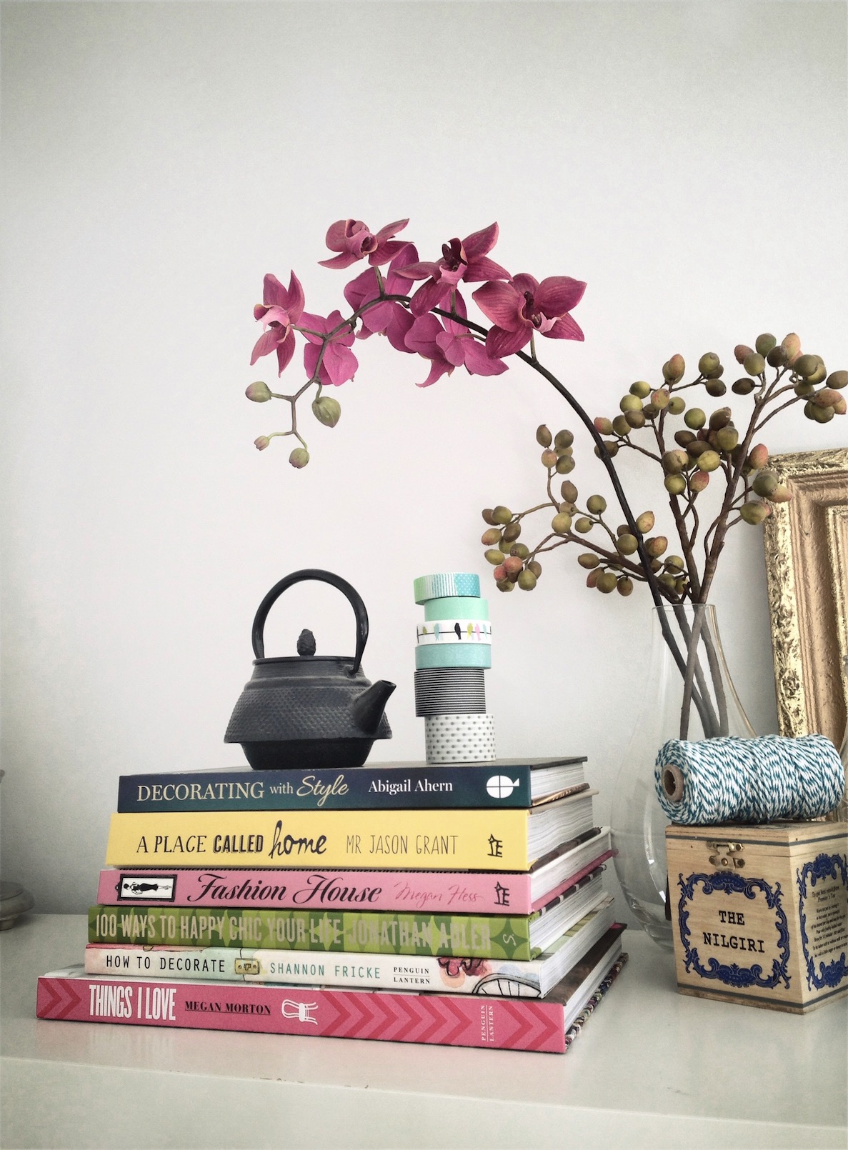
{My own little stack of inspiration-boosting tomes}
Perfect gifts for the budding decorator or interior-style aficionados, or just a private pressie for yourself. They are all available through their individual websites, with sometimes added bonuses of signing, freebies or pretty wrapping, or you could try Booktopia. Here are my recommendations.
Do you Adore?
For some insane reason, I forgot to take ‘before’ shots, so had to trawl through my databases for some random shots of the ‘back room’ aka Laundry aka office aka crap-dumping-space. Unfortunately the only before pics I could find show just how much crap normally surrounded me in the office space, but fortunately the tidy-up pre- and post-painting make the overhaul look like much more than it was.
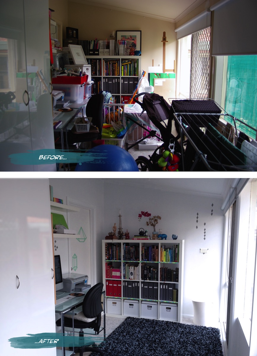
{Office before and after}
I had a bit of fun with Washi tape (and more since) after deciding against painting a decorative element and not being able to find a decal I liked. The basic tutorial for the washi tape jewel idea on the door was from Objects & Use. I’m waiting for more washi colours and patterns from etsy to go even crazier.
Now that's efficient
“Located in Barcelona's hip Born district, the tiny apartment is a remodelled pigeon loft. Christian [Schallert] says its design was inspired by the space-saving furniture aboard boats, as well as the clean lines of a small Japanese home”. I personally love that the bed slides under the balcony and converts to a step, chair or lounge. Great work by architect Barbara Appolloni. Enjoy!
xo Romona
![]()
Aqua vital!
As usual some of these are around my house already and others I am just abso coveting and dropping hints to hubby and family (this is also a good way to see if they read the blog!)

{Baby Rhino, aqua resin by Fenton & Fenton - it’s taking me back to a bit of bebop and rocksteady TMNT days}
Sydney Decoration + Design 2013 - Part 3
{Greg Natale’s Wallpaper range for Porter’s Paints}
Greg’s seminar took us on a journey starting back with his inspiration as a child and knowing quite early on what he wanted to be and do.
Sydney Decoration + Design 2013 - Part 2
{Abigail’s own lounge. Dark, inky palette brightened with multiple light points. Source}
The queen of eclecticism and dark, moody interiors, Abigail Ahern, was over from the UK in her own whirlwind Sydney sojourn. Her seminar drifted through her style guides and tricks of the trade, complemented by spectacular imagery. These spaces, tips and tricks are all summarising beautifully in her book.
Sydney Decoration + Design 2013 - Part 1
{Popper pendant lights, Designed by Andre Hnatojko}
Unfortunately, I felt like I had seen a lot of the products on display before (the Melbourne D+D 2012 wasn’t actually that long ago), but there were still a few notable pieces to be found. Yellow and bright neons featured heavily again this show. The Popper pendant lights by Andre Hnatojko below were even better in person than the many images I had pinned before.
Ruby ruby ruby ruby!

{Vintage Valentine’s Day cards, Vintage & Nostalgia Co.}
So to get in the spirit of V-day, I am sharing a bunch of my favourite red and pink products-n-pics to get you in the mood, whether you celebrate valentines day or just want a spicy boost to life. Ruby, crimson, cherry, blood, fire engine, imperial, evil-queen apple, fuchsia, magenta, rust, salmon and all the Pantones in between, whatever your shade of choice, hopefully there is something here to tickle your fancy.
Industriart
“The idea started initially as an outlet for the many and varied things that my husband and I have collected over many years. However, for two hoarders, it is difficult to part with all your treasures at once, so the concept then became a shop of 'Pure Indulgence' selling only things that we like - retro, vintage, new, serious and not-so serious.”
Make sure you get on over and check out the wonders (and bargains!) ASAP. I have my eye on more than a few of the furniture items and eclectic baubles in the front room and that cool secret back area. I can’t wait for the next Perth trip to do some real damage!

{Vintage glass treasures. Some of these are now in my personal collection}
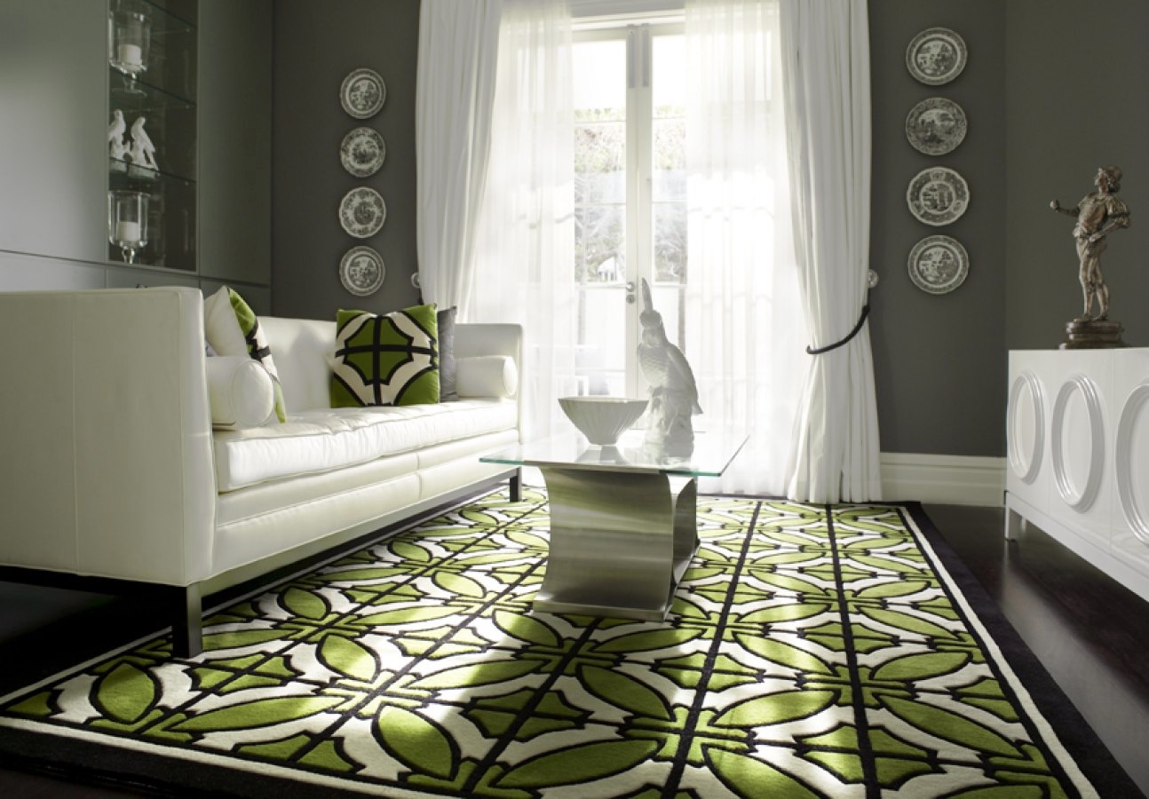
Emerald Delights
Along with pretty much all of the design and blogging world at the moment, I am in love with all the greeny goodness popping up all over the place since Pantone announced Emerald as its colour of the year for 2013. Just for a bit of visual candy, here are a few of my favourite interiors, products and miscellaneous images featuring variations of this striking gemstone hue.
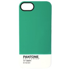
{Pantone’s limited Edition Mug and iPhone5 cover in Emerald}
{Dulux’s Empower Palette - Image styled by Bree Leech featuring Dulux Liberty, Bahaman Bliss and Misty Blue}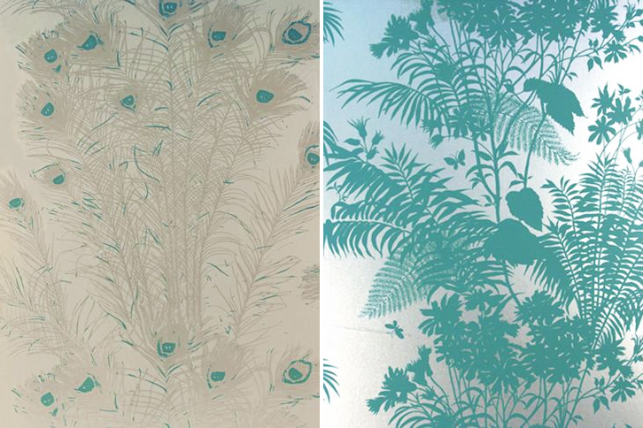
{Florence Broadhurst Peacock Feathers & Shadow Floral wallpapers from Signature Prints}
{Night Bird by Catherine Martin, Bansyu by Akira Isogawa, both at Designer Rugs}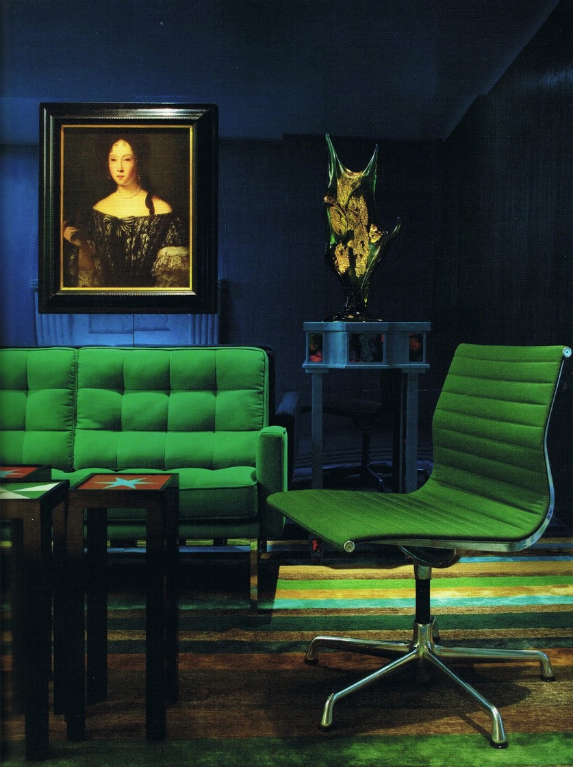
{Emerald vintage Florence Knoll & Charles Eames furniture. Interiors by Doug & Gene Meyer.}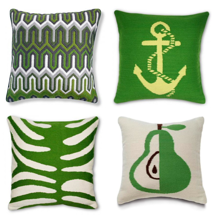
{Jonathan Adler Needlepoint pillows}
{Husque Bowl Macadamia Nut in Green}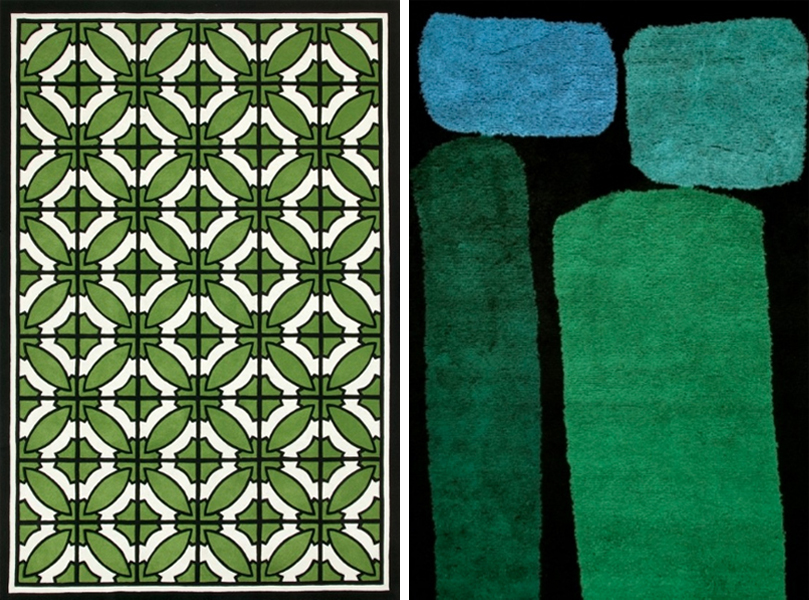
{South Beach by Greg Natale, Jewel by Dinosaur Designs, both at Designer Rugs}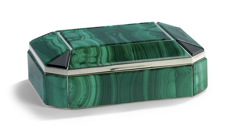
{Bianca Malachite Box by Ralph Lauren Home}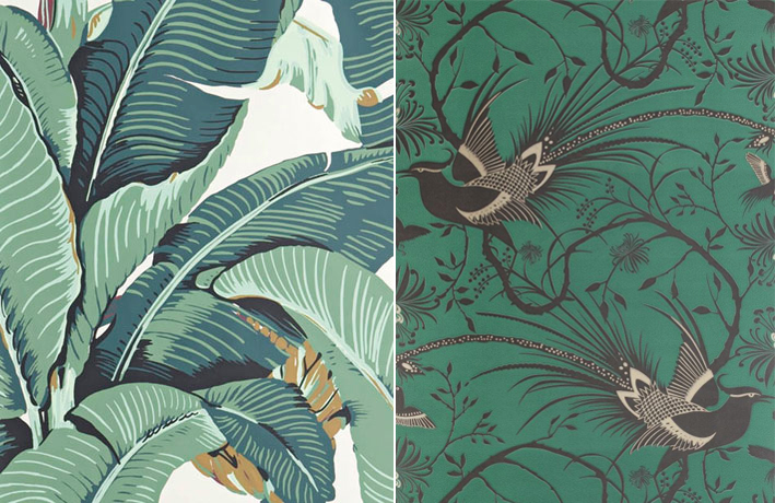
{Martinique Beverley Hills wallpaper; Catherine Martin for Mokum Imperial Pheasant in Emerald} 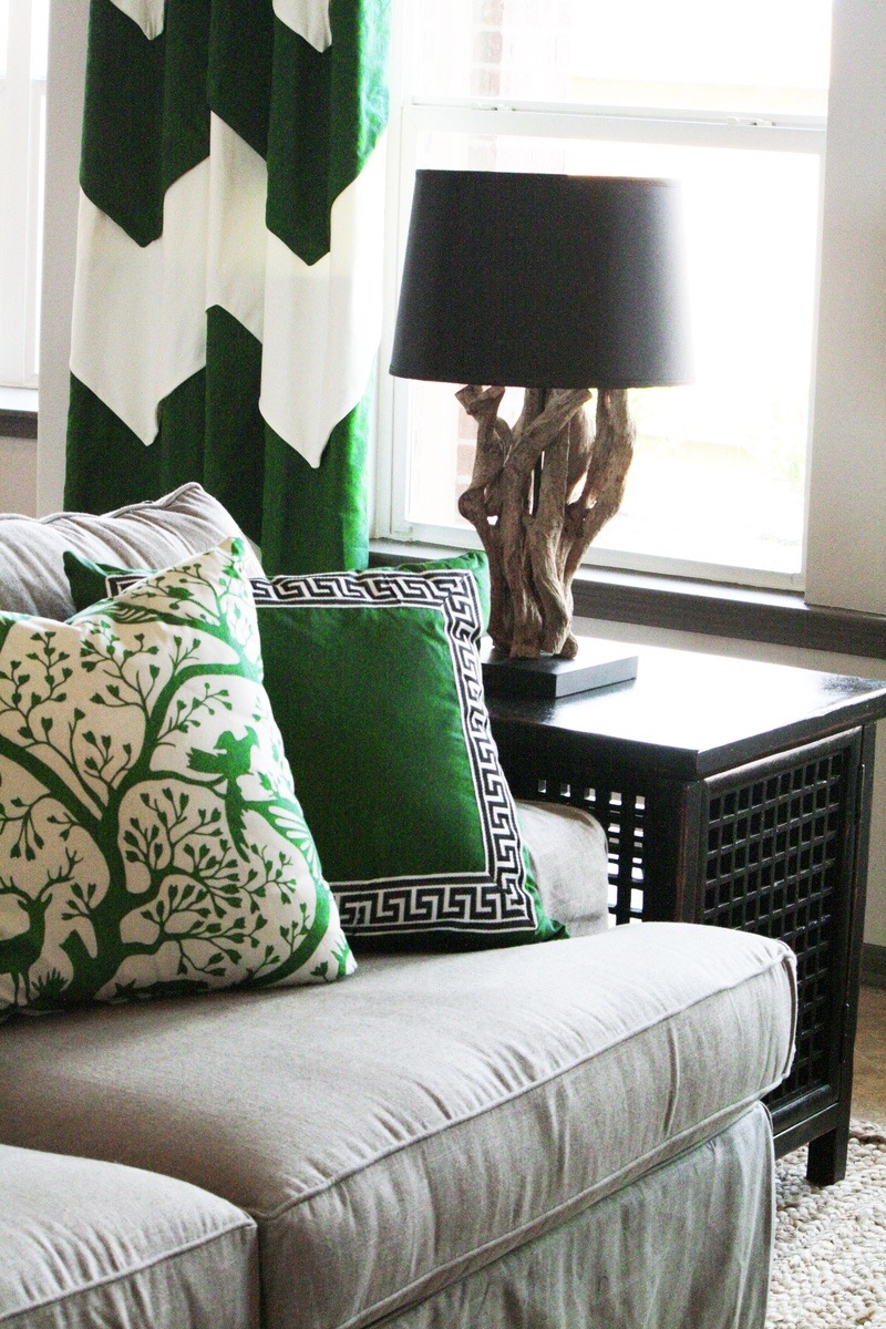
{Emerald accents. Interiors by Charm Home Design}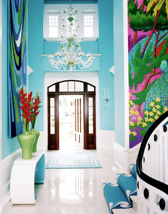
{Interiors by Diamond Baratta. Image via House of Turquoise}
{Interiors by Greg Natale, featuring his South Beach rug}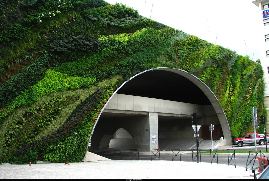
{Pont Max Juvenal, Aix en Provence, 2008. Patrick Blanc}
Of course I couldn’t resist throwing a green-walled building in there. You can see a few more on my previous post, Vertical Green. I am hoping to do another post on green walls this year, since the last one didn’t even scratch the surface of the beauty that is out there.
These bright emerald visuals make me giddy. Yes, I’ll admit some of them are straying more into teal and turquoise territory, but that is the beauty of perception - maybe your eyes will see a whole different picture. I hope you enjoyed this quick (and a little lazy) post. Until next time.
xo Romona
![]()
Bathroom... After
Work started early on a Monday morning. Dad, hubby and I got stuck into ripping off the wall tiles. As with most old houses (with the added bonus of previous owners who have attempted DIY renovations themselves) the wall structure was no longer (if ever) level or square. There was also the unhelpful surprise of most of the wall sheeting coming off with the tiles. The flooring didn’t fare any better - also ripping half up with the tiles. Previous work scraps had been tossed in the wall cavity - I like to think for reuse as insulation - and a few little creatures had been making there nests around the bath supports. On Tuesday the plumber started his work relocating the bath, shower and vanity fixtures and putting in the pipes for the new toilet (yay!). Once that was completed, we could start on sheeting and patching up the walls, floor and front of bath. Waterproofing was painted over all surfaces and allowed to dry (time for a well deserved bevie break). The rest of the week was spent cutting, tiling, painting and cleaning out dust and debris, in time for the plumber to finish up and fit off the following week. For a more visual step by step of the process, you can check out my Instagram page. You can also read more about the bathroom ‘Before’ the renovation here.
Drum roll…. the finished product! What do you think? We are very happy with it, of course, and I catch myself walking past the door quite slowly now just to admire the view. In fact on seeing this post, hubby commented that he can’t even remember the bathroom before, even though it was only two weeks ago. Purged.
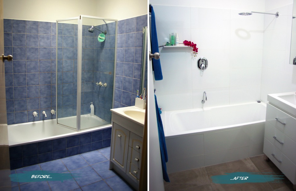
{The Sandon Bathroom - Before and After}
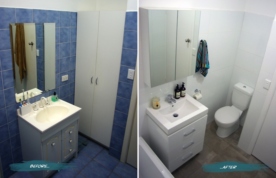
{Bathroom Vanity and Toilet - Before and After}
Here’s a summary of a few of the changes and features we have in the new and improved Sandon House Bathroom.
The vanity was moved closer to the bath to allow for the toilet, but still enough room for the much larger bath (we went from a 600mm to a 820mm wide - much more user-friendly). If we had an OH&S inspector in-house, they would definitely approve. You can read more about the troubles I’ve had with the narrow old bath in the previous post. The bath is not only wider, but taller. It took a few goes to get used to stepping over it, but it’s very handy with keeping small children from toppling over and into it. Plus during one of my habitual, long relaxing soaks, I don’t have to have the water full to the brim to actually be covered and stay warm.
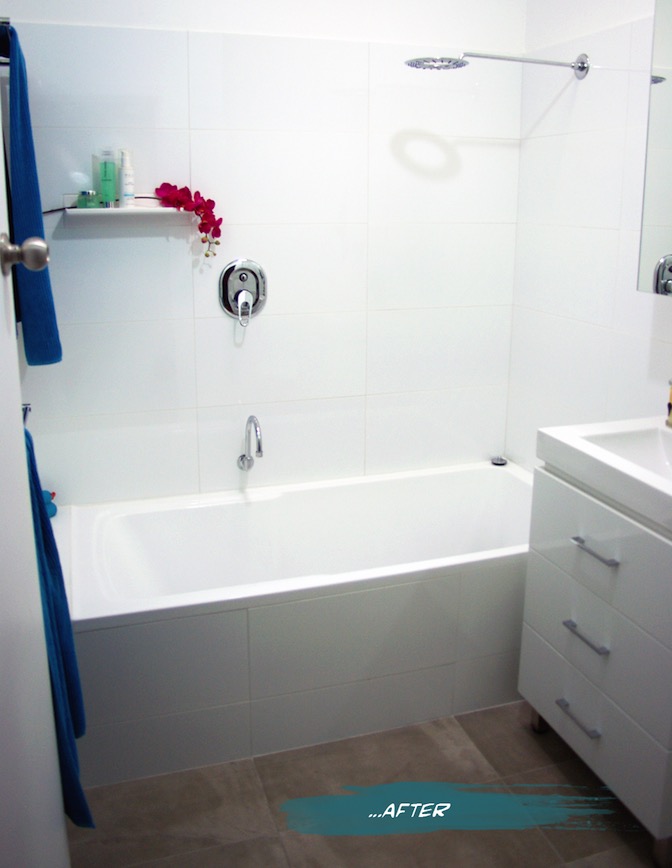
{The finished product}
Our second toilet - hooray! On plan it looked like a bit of a tight squeeze, but we have since found that there is more than enough room and it is quite a comfortable space. It’s still quite precious and we are not used to having the second option, but I’m sure that will end soon. The seat is soft-closing (the slowest we have ever seen actually - almost ridiculously so), which helps prevent slamming noises becoming a child wake-up-call in the middle of the night.
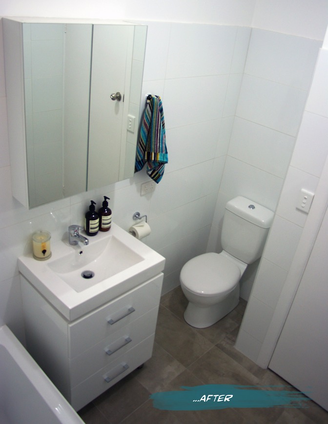
{New Mizu Vanity and Toilet from Reece}
We added a tile shelf high enough to keep expensive shampoos from becoming very expensive bubble bath, as well as far enough away from the shower head to be a pool collector. I find them a great idea when you don’t have the building room to put in alcoves or set-in shelving. As long as you keep it simple, it allows the featured items to stand out without becoming a feature itself. We added an extra towel rail from before and made them double. Not necessarily for two towels, more for the aid in drying. My husband finally gets a towel rail of his own, as opposed to the hook on the back of the door where it never really dries. At the moment the kids towels hang on the back of the door, but we allowed space for another towel rail to be added if and when we need it (big enough to hang bath sheets because once you go up from towels to sheets, you can’t go back!)
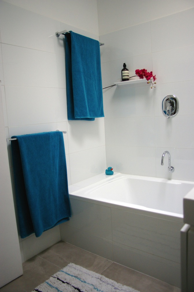
{New huge bath and surrounds}
I chose white wall tiles and a white vanity for brightness, simplicity and longevity. Even though we haven’t changed the skylight, the white reflects the light much more and creates a connection with the outside that belies its central location. The concrete-style grey porcelain floor tiles also give the space a neutrality that is much easier to style and change with soft furnishings and accessories. I had chosen a sleek minimal bath spout, but on further thought, we swapped it for a gooseneck swivel style so that we can run the bath and get it out of the way when the kids are in there, avoiding bumped heads. The Shower diverter mixer was placed far enough left that you can easily turn the water on without getting sprayed, and high enough that the kids shouldn’t be able to play with it for a little while longer. You may notice that I haven’t chosen very ‘designer-y’ fixtures. This bathroom for us is a family bathroom, and with two growing boys that will undoubtedly test the strength and endurance of the fixtures, we went to the budget end of the market. Fixtures are items that are easy enough to replace in a few years, so our money was directed more towards the items that are more difficult to change, such as the bath and tiles.

{Bright white large-format tiles allow us to play with colour}
Having said that, after years of low pressure and uncomfortable showers, the selection of the shower head was quite important. My husband wanted a good soaking while I wanted to make sure that it was still water-efficient. We found our compromise in the Halo shower head from Reece and so far soooooo good.
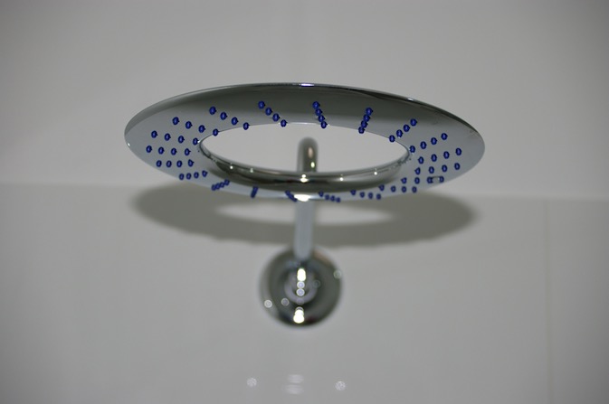
{Halo shower head from Reece}
If you would like me to post the plans, let me know - but photos are more fun, right? If there is anything that you want to ask about the project or specific products please do. I am more than happy to have conversations about it in the comments section below or over email.
FYI - Some of the items pictured and their sources:
- Bath, Vanity, Toilet and fixtures from Reece.
- Wall tiles from National Tiles
- Floor tiles, towel racks and hooks from Vision Bathrooms
- Hand towel by Missoni
- Aesop Resurrection Hand Wash and Balm
- Ecoya Metro Jar soy candle in Wild Frangipani
I hope you enjoyed this exciting little project with me. Time to plan the next one! (Sorry honey)
xo Romona
Things I Love
![]()
Spotlight on Australian Designers | Catherine Martin
Catherine Martin really needs no introduction. Costume Designer. Production Designer. Set Designer. Art Director. Oscar, AFI, BAFTA and Tony Award winner. Wife to the equally talented Baz Luhrmann. Mum. This chick does it all!
As if that wasn’t enough, design collaborations are now a regular occurrence for her, in the form of wallpapers for Porter’s Paints, rugs for Designer Rugs, textiles and bedding through Anthropologie and I’m sure the list will continue for this extremely talented Australian.
I had to think long and hard about which were my favourite pieces of Catherine’s. I could easily put down every rug in her multiple collections, and the majority of her wallpapers, but have forced myself to narrow it down to just a few.
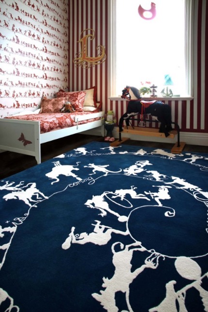
{Circus Silhouettes by Catherine Martin. Rug for Designer Rugs. Wallpaper for Porter’s Paints}
The first should be one that I was coveting for years (in preparation of my first baby’s room, while pregnant). Expectedly highly theatrical, the navy Circus Silhouettes would have been a dramatic and stylish addition to my baby boy’s room, encouraging movement and fun. Of course, budget and the fact that I would HATE to get any vomit or other baby-nasties on this beauty ceased the purchase, but its still on the ‘One-Day’ list - I think the energy and whimsy in this is ageless and definitely is not restricted to kids rooms. The walls in the image above also feature her complementing design for Porter’s Paints.
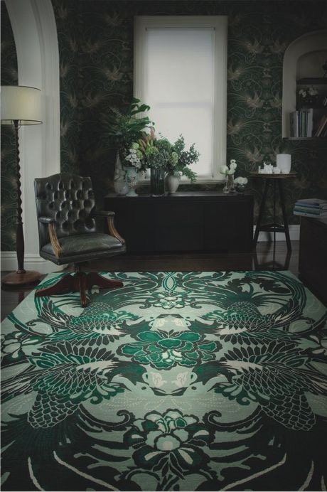
{Night Bird rug by Catherine Martin for Designer Rugs}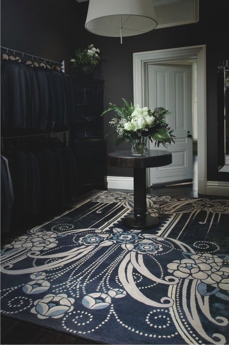
{Black Pearl rug by Catherine Martin for Designer Rugs}
Now let’s just say I love the entire Deco collection with Designer Rugs. I can’t wait to see them featured in Baz’s The Great Gatsby in May 2013. If I HAD to pick a favourite, it would probably be the magic, flow and art deco romance of Night Bird, although Black Pearl comes a very close second. Hmm... Maybe tied first. It would certainly upgrade a bedroom into a Boudoir. And how about this custom stair runner adapted from her Lace rug design - to die for!
{Lace stair runner by Catherine Martin}
{Imperial Pheasant wallpaper by Catherine Martin for Mokum Porter’s Paints. Shown here in Lacquer}
{Cockatoo wallpaper by Catherine Martin for Porter’s Paints. Shown here in Black Neutral}
Most of Catherine Martin’s wallpaper range links in with the rug designs, as a complement or feature in its own right. Mokum Imperial Pheasant comes in a range of colourways, my faves being the Ming Blue or Vintage White (seen at Grand Designs here), or for something dark and dramatic but still linking to home and Fauna Australiana, the Cockatoo wallpaper in Black Neutral is divine.
{Cockatoo Bedding available through Anthropologie}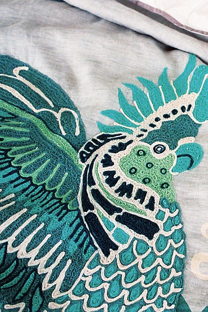
{Cockatoo Bedding Detail, Anthropologie}
To add more products to her arsenal, there is this gorgeous duvet and pillow covers in shades of green, teal, aqua and navy (my absolute favourite combo!) on a neutral grey backdrop with her signature Australiana in the form of giant Art-Deco-meets-Arts&Crafts-Movement Cockatoos. Detailed and divine.
As usual, follow the links to enjoy the rest of her collections, and I’m sure get lost in the other millions of perfect products and design collaborations that are on offer at these companies.
Now after all this exciting designer eye-candy, I’m off to Magnolia Square for some more arty goodness. Will try and lock up my cards and cash, but somehow never seem to succeed. If I can stop the retail therapy long enough to take some pictures, I may do a post about. Alternatively, it’s on all weekend so check it out yourself. Be warned. You will spend. Good luck.
xo Romona
![]()
Vertical Green
Since I went there, I have to display just a few examples of Patrick Blanc, the pioneer of Green walls in architecture and visual overachiever, including a few very close to home. While the scale is a little above domestic, take inspiration from his sculptural use of botany.
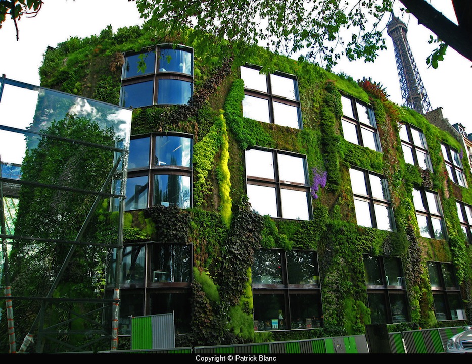
{Quai Branly Museum, Paris, 2005. Architect Jean Nouvel. Greenwall Patrick Blanc}
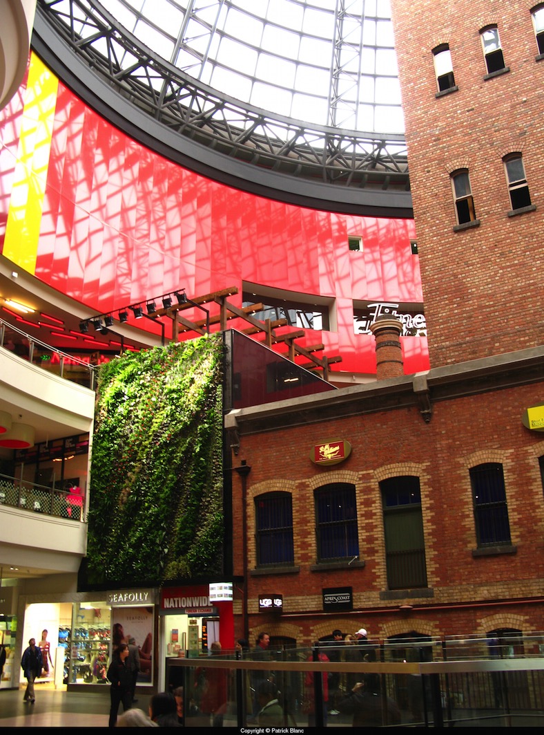
{Our own piece of Patrick Blanc at the Shot Tower, Melbourne Central, 2008}
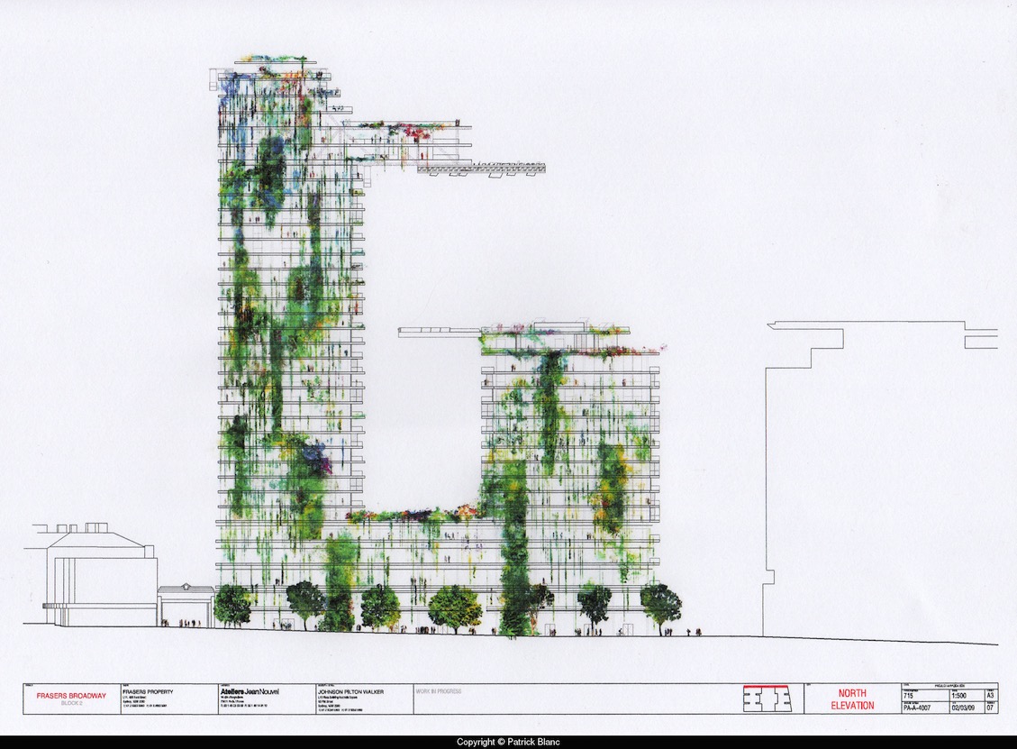
{One Central Park West, Sydney. Architect Jean Nouvel, Patrick Blanc. Due 2013}
I love that green walls have become a prevalent cafe and commercial decoration, and that most will now try and incorporate some functionality into it, with herbs and indoor veggies. Its great to see the new ways people can develop this old idea. I like this alternative to the usual terracotta and unpainted reo mesh of the signature Vertical Garden by Joost Bakker (as seen at Grand Designs). The simple white pots and white mesh offset wonderfully against the uniform dark succulents. Maybe it is just refreshing not to see the terracotta pots again. I think it’s like a popular song on the radio - you hear it so often that you can’t tell anymore if you love it or hate it, but still find yourself singing along.
{Vertical Garden by Joost Bakker for Schiavello}
This smooth sculptural wall with rounded inserts for potted herbs suits the modern bright-white kitchen. Talk about easy access and great smells. I would love this in my house.
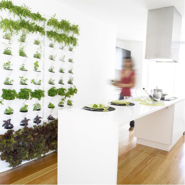
{Edible Herb garden wall complements this modern white kitchen. Source}
The simple draped Porthos between nine white pots on wall-mounted floating shelves are used to break up this double-height common wall in a warehouse conversion in Brisbane.

{Minimalist Vertical Garden by Lushe Urban Greening}
I couldn’t leave out the bright entry space to Fujitsu’s 6-star Green Star Docklands office (yes, mainly because it was worked on by yours truly while at Woodhead). The original designs did include using black mondo grass and having a dramatic monotone effect with the black glass walls, emphasising the Fujitsu red. I believe the black mondo didn’t survive too well so the bio-wall is now more in keeping with the bright greens of most green walls, but is still quite effective. The bio-filtration system used was designed by Umow Lai who worked with Woodhead on the project. The ground level foyer of the Gauge in Docklands, Victoria also sports an impressive green wall by The Greenwall Company
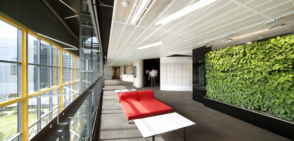
{Fujitsu Head Office, The Gauge, Docklands by Woodhead}

{Just a section of the massive foyer green wall, The Gauge, Docklands by The Greenwall Company}
There are more than a few products popping up that can be used for DIY green walls at home, ranging from the cheap and simple to the complex and often quite pricey. A few options are pictured below (or just type green wall or vertical garden into Youtube and go nuts!)
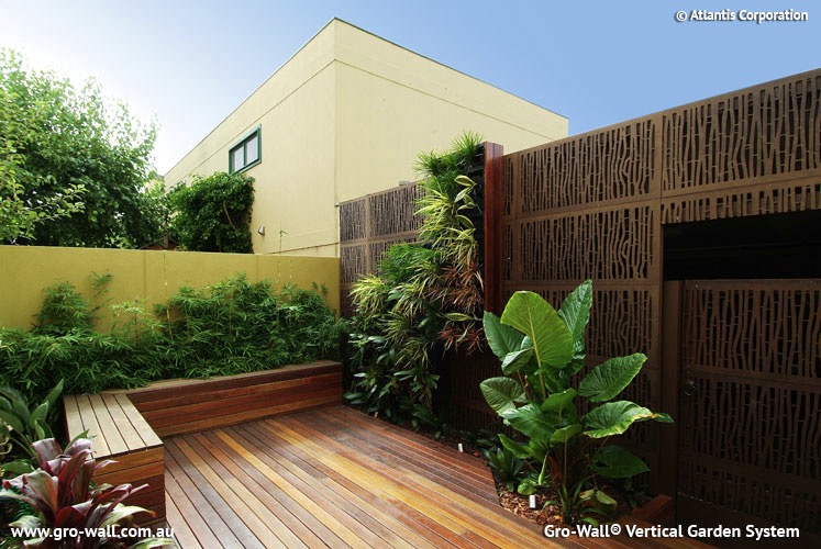
{Gro-Wall Vertical Garden System}
{Greenwall Australia’s Vertigro Home or Pro}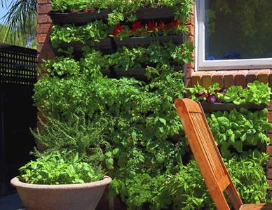
{Wallgarden’s DIY Vertical Garden, also available at Lushe}
Urbio Urban Vertical Garden is another Kickstarter project (like the previously blogged about LIFX globe). I love the simple design and the adaptability of this product. Swap out the plants for some magazines or books if they need a little outside time in the sunshine.
{Urbio Urban Vertical Garden on Kickstarter}
There are so many benefits to using green walls in design, including but not limited to:
▪ Improved air quality and reduction of odours; ▪ Improved well-being with the visual link to nature and the outdoors; ▪ Visual aesthetic of a living decoration; ▪ Supply of fresh, edible produce - herbs, fruit, vegetables, flowers; ▪ Protection from wind, heat and light; ▪ Thermal Insulation and shading; ▪ Noise buffering; and more I am sure.
Have you seen any green walls out there that blew your mind? Or used any products or DIYs for your own vertical green wall? Let us know below and share the love!
xo Romona
Rug update
{Black and Grey Noodle-pile Artizen Rug from Carpet Court, in its new home}
Inspired by the new floor dressing (and big red sale signs), I had to nab a few new cushions to brighten the space and add a pop of colour. Glad I found these two (pictured above) at Adairs, combining the latest trends of geometry and neon, with an architectural twist, in Home Republic’s Sketchbook collection. Love it. Bye for now.
xo Romona
![]()
Grand Designs Live
{Kevin McCloud - Grand Designs Superstar!}
While the highlight was obviously seeing the charming and witty Kevin McCloud speak, unfortunately, I don’t have many other great things to say. Maybe it’s design event overload, creative fatigue from the same companies obviously wanting maximum exposure. It feels like I have seen it all before and what is there is often not the cream of the design-world crop. Having said that, I did manage to snap a few interesting pieces, some now key items on my personal wish list.
Firstly, the incomparable Volker Haug. I definitely have a Design-crush on him. Probably since spying his recycled black leather and zipped up chandelier, Joker, a good many years ago at a trade event. I would happily incorporate any of his pieces into any room in my house. I think it would be great fun to start the creative process with one of his major pieces, like the massive OMG! shade, and go from there.
I liked this quirky little primary-coloured, almost diagrammatic, pendant light of his below. Simply called Cable Jewellery, you can pick and choose your components, S- or U-shaped, in a range of colours and lengths. You will have to excuse the pictures. They looked fine on my little iPhone screen but are a tad blurry up close - possibly a result of eyes darting around the room for the next design fix. There are much better pics on his webpage (with cool and quirky navigation and interaction too). He also had little terrarium light globes hanging that were so cute, as well as his aptly named Wow range.

{Cable Jewellery from Volker Haug lighting}
Next, the Mokum stand stood out with Catherine Martin’s divine Art Deco inspired fabrics and wall papers. Fitting in well with husband, Baz Lurhman’s The Great Gatsby, these opulent designs are to die for. Beautiful metallics in hues of silver, champagne and gold. So very luxe and touchable. How great would it be to have a luxurious OTT bedroom in these fabrics and papers, maybe even with one of her divine Designer Rugs Australiana-inspired or Deco Collection rugs on display.
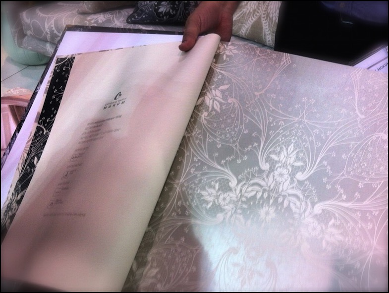
{Catherine Martin for Mokum Antique Lace Wallpaper - On the big, long wish list!}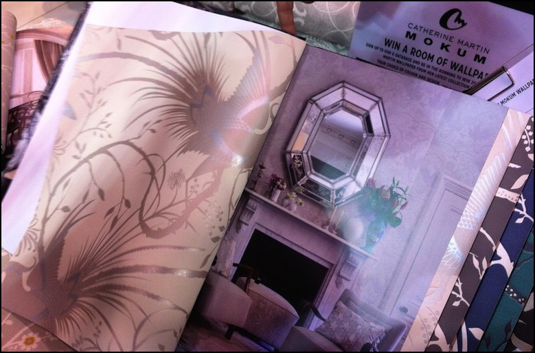
{Catherine Martin for Mokum Imperial Pheasant wallpaper on left. Apparently that’s her and Baz’s bedroom on the right. Not sure I believe that…}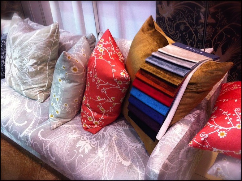
{Catherine Martin for Mokum fabrics on display. Feathers in powder blue on couch. Cushions from left Feathers in Linen, Blossom in Linen and Coral}
{Relaxed vignette with funky wire lights above}
Mobs of people and tantalising aromas drew us over to the Miele kitchen display. Forgot to actually look at the Miele products, which are always quite spiffy, because I was too engaged by Maggie Beer, laughing and having fun with the audience and fellow chef/cooks. The herb wall that they had set up was quite impressive. Yes, we’ve all seen them before and they seem to pop up everywhere now (I wish someone would do something a little more out of the box than the terracotta pots) but it is a good idea and nice gesture all the same.
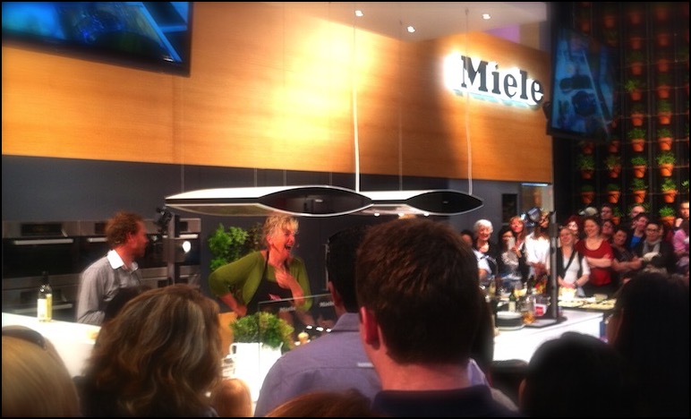
{The Scrumptious Maggie Beer cooking up a feast}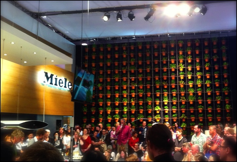
{Miele herb wall}
We did rush through quite quickly, being slightly put off by the vacuum cleaner displays and contoured pillows having a greater prominence than textiles or designer furniture. I have since seen on a few instagram and Facebook pics of others that there were a few sculptures in the garden section that might have been nice to catch, but other than that I’m hoping that the next one steps up its game to a level that the Grand Designs brand could be proud of, with a bit more architectural cred.
Let me know if you agree or disagree and what your favourite parts were if you managed to get there. Ciao for now.
xo Romona
![]()
Saturday InDesign 2012
I’m lucky to have been blessed with two very co-operative babies (my first was strapped to me in the same Baby Bjorn two years ago at the last Melbourne Saturday InDesign). Even so, it is a long day and if all things go to plan, I shall get to have my next one sans-bebe and stay for the inevitable evening festivities.
I love getting out and seeing the new products on offer, seeing other professionals and design enthusiasts cruising between show rooms with happy neon lanyards around their necks. Although it is a given these days for companies to have a wonderfully detailed and impressive looking website, there is nothing like running your hands over perfectly smooth and detailed timber or rough textural fabrics. Being stuck in the home most of the time, I relish the chance to get out to these events, and highly encourage it to all.
Our day started a bit later than intended (as usual) and the first stop was Zenith Interiors. Bright colour, neons and geometry were evident, on-trend in all things at the moment. The impressive Godfrey Hirst neon pink geometric-edged carpet was a stand-out for me. Pumping music and yummy cheesy pretzels lead the way to a visual treat in the form of the Zenith Design Competition display, featuring creative ‘outfits’ for the TIPO chair.
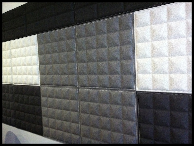
I also fell for their wonderful Buzzitiles 3d, recycled-content wall panels (below) - Although I’ve only ever specified similar for commercial fit-outs, I’m hoping to form them into a headboard for our bedroom. Love that mid-grey pyramidal form creating depth and texture.
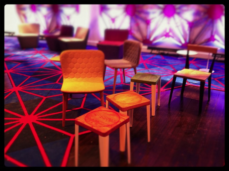
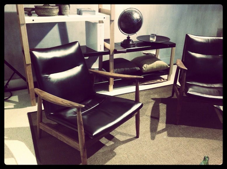
A few quick pop-ins along the way to the next destination, Stylecraft, to catch up with a friend over from Radelaide. Love when events drag people to Melbourne from all over the country! She did a great job simultaneously catching up, pouring us champers, snagging the delectable little soft shell tacos and showing off their new and current products. The styling and quality that they displayed throughout the space was first class. My mum (Artist and Designer from Perth, Melva Babarskas) was about ready to snatch the striking orange chair from the entry, while I was coveting the rich black leather armchair and its surrounds.
The last few locations were all about lighting, lighting, lighting. Euroluce’s display was fantastic as usual. De De Ce also presented a classy exhibition. Again, my impending bedroom refurb was front-of-mind, so the selection of lamps in metallics and gloss were particularly appealing. Copper and Bronze are everywhere at the moment. It’s a nice break from the chrome/silver world - still up there with gold in luxuriousness, but not quite as cocky. Yamagiwa’s Mayuhana pendant by Toyo Ito at Euroluce was a glowing beacon in the corner and would look impressive in almost any space.
A tired and hungry baby put an end to the days festivities, although it must be said that he was exceptionally well behaved for most of it. Had a great day, met wonderful-beautiful people and definitely got my design-fix for the week.
Hope you enjoyed my second post and hopefully enjoy more to come.
xo Romona
![]()