


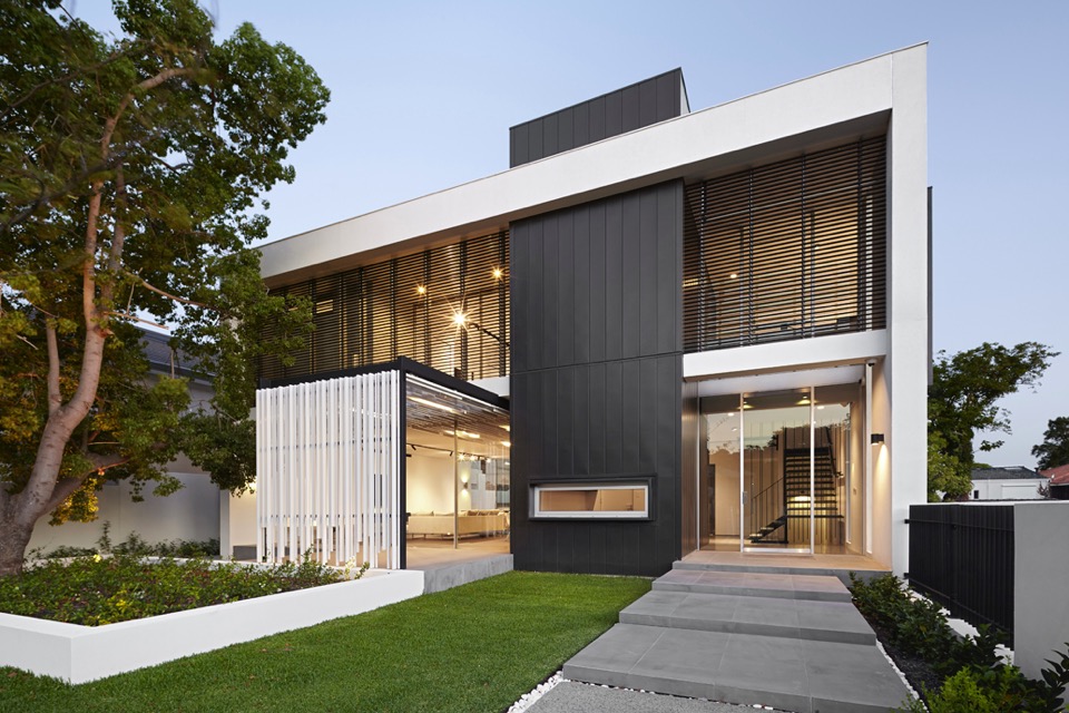
The James Street Residence by Romona Sandon Designs
In designing our home it was important for me to balance the comfort and lifestyle needs of my young family with my environmentally sustainable goals from my work in Sustainable Architecture. I wanted to test if low-cost sustainable design could still be convenient and aesthetically pleasing to the clients (my family). I also wanted to test people's perception of what an eco-house should be or look like.
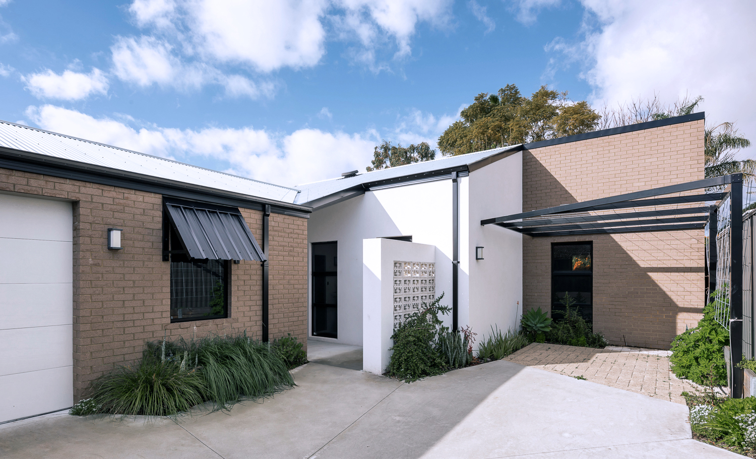
{The James Street Residence, by Romona Sandon Designs, Front facade}
With the kitchen, I wasn't aiming to do anything new or innovative. I wanted timeless and simple. A canvas devoid of colour so it could be injected by way of homewares and appliances and food and family. I guess I never strayed far from what I had always wanted, even showing this colour palette (or lack thereof) in previous posts, such as the Monochrome Kitchen. Cabinetry either flows through to the ceiling or is capped by bulkheads, to reduce surfaces that dust could collect on, reducing potential allergens.
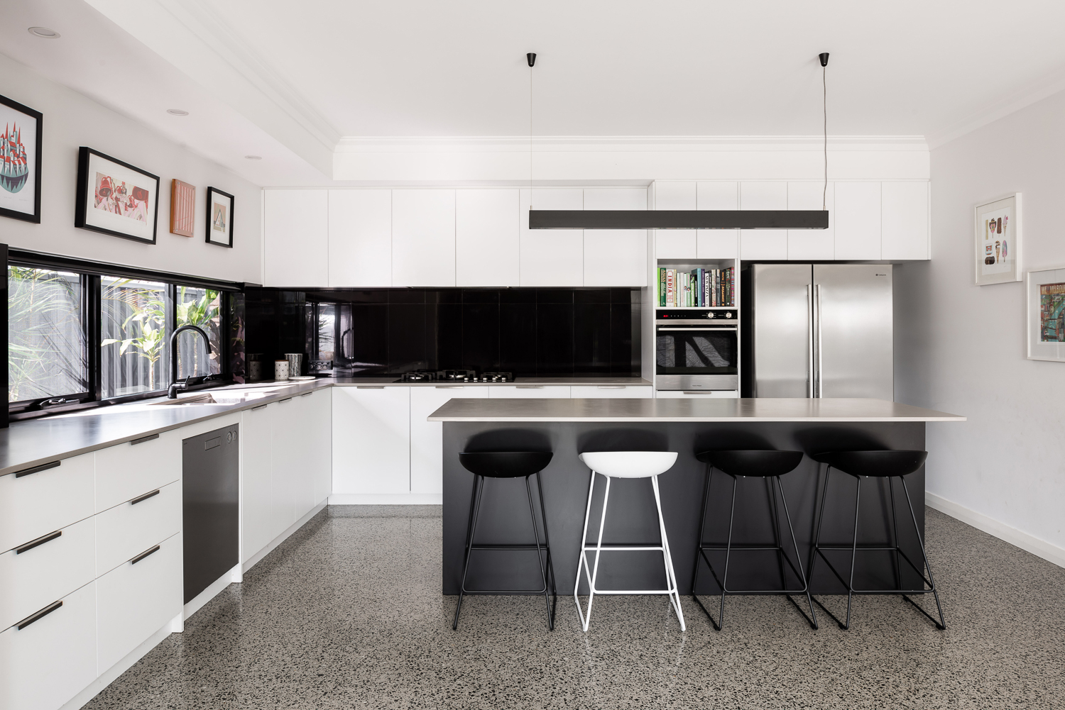
{Monochrome kitchen of the James Street Residence, by Romona Sandon Designs. Image by Dion Robeson.}
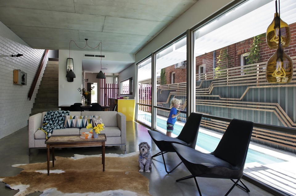
Passive solar design principles were utilised where possible within the council and R-codes on a small rear battle-axe block. Large north-facing windows and doors allow winter sun to penetrate and store heat in the thermal mass of the polished concrete floor. The polished concrete floor was high on my list of features that I really wanted in this house - surprisingly, planning for this quite early on in the design process kept the cost quite comparable with alternative floor coverings.
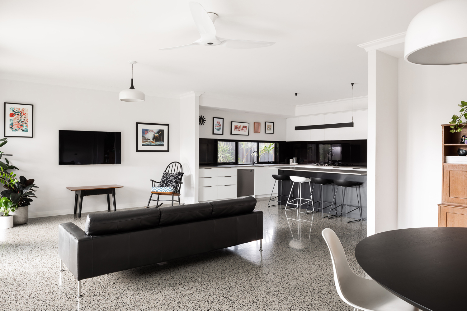
{Open-plan living space of the James Street Residence, by Romona Sandon Designs. Image by Dion Robeson.}
Insulated cavity brick construction helps contain winter heat. Cross-ventilation allows excess heat to be dissipated in summer. A SolarStar solar-powered thermostat-controlled roof cavity ventilation system also rids the building of excess heat when needed. In the two years of occupancy, no active heating or cooling has been necessary except for the Big Ass ceiling fans (their name, as well as description!)
Solatubes with integrated PV (photo-voltaic solar panel) LED day and night lighting is used in conjunction with natural daylight and low-energy lighting elsewhere. Low VOC (Volatile organic compound) paints and carpets are used throughout to reduce sick-building syndrome (off-gassing). PV's sufficiently power the house with a larger inverter for future-proofing. East/west openings were minimised and treated with Low-E glazing where unavoidable, as well as awning shading.
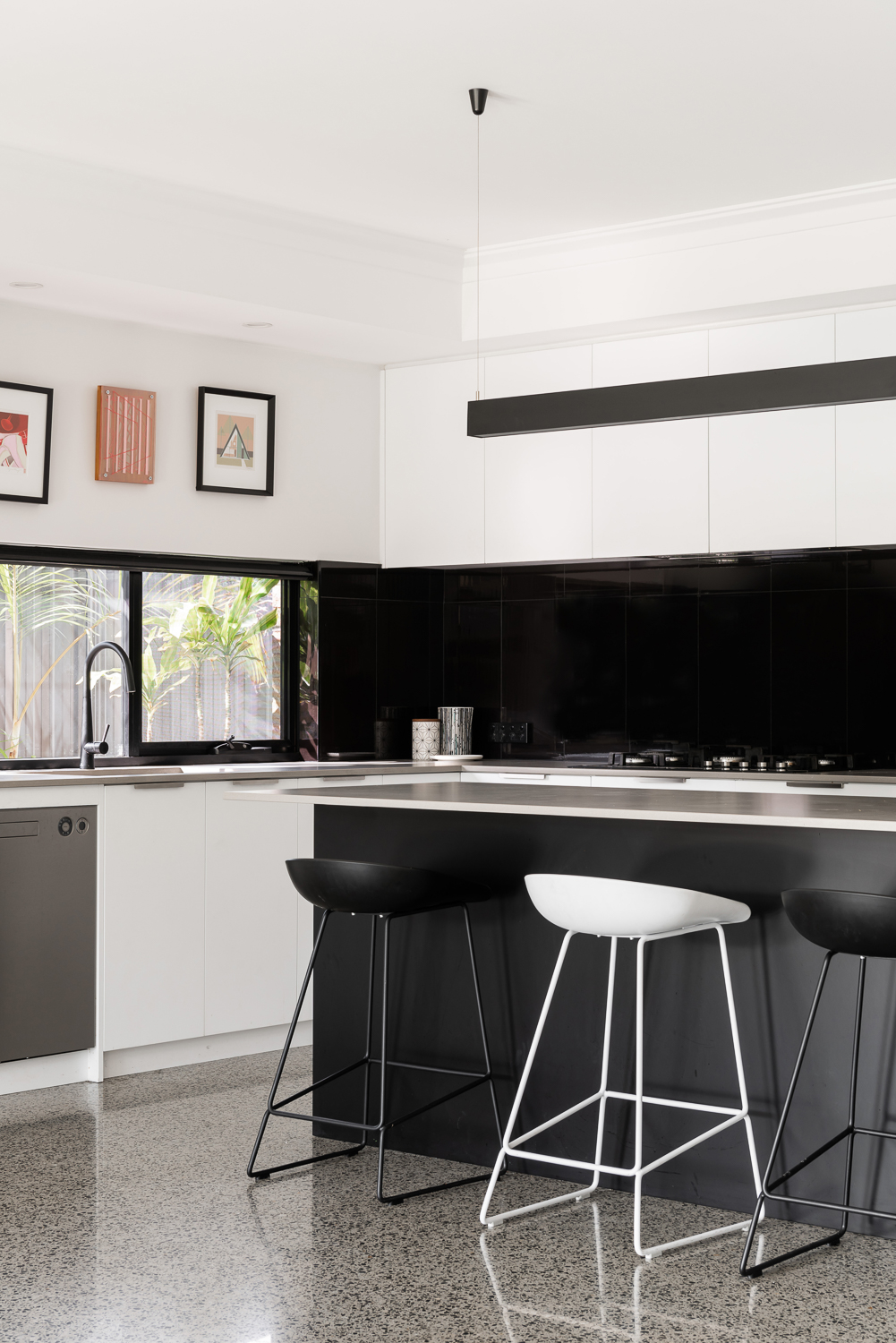
{Kitchen details of the James Street Residence, by Romona Sandon Designs. Image by Dion Robeson.}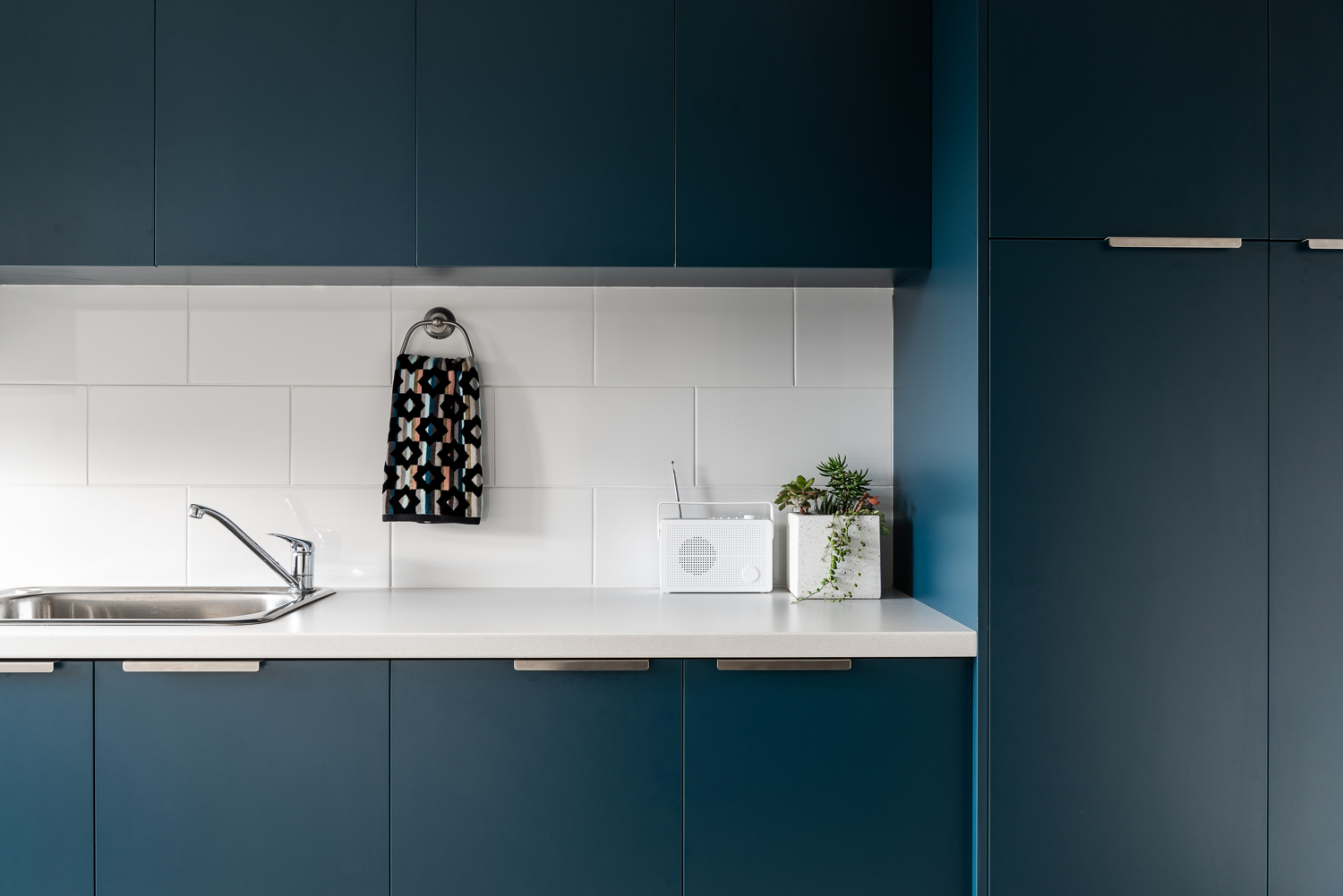
{Laundry details of the James Street Residence, by Romona Sandon Designs. Image by Dion Robeson.}
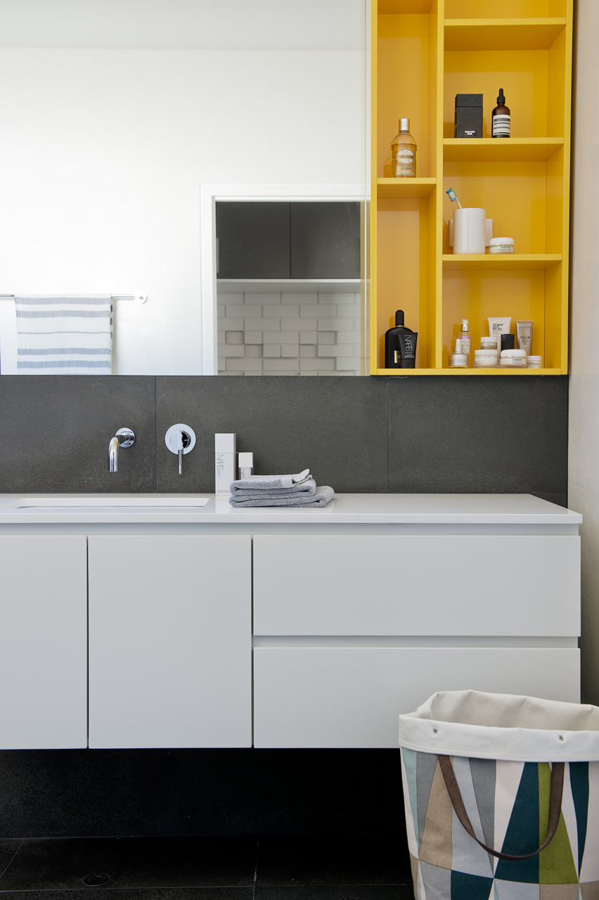
The bathrooms features hobless showers for accessibility. The glass above the half-height wall allows light to penetrate fully into the bathroom to reduce mould build up.
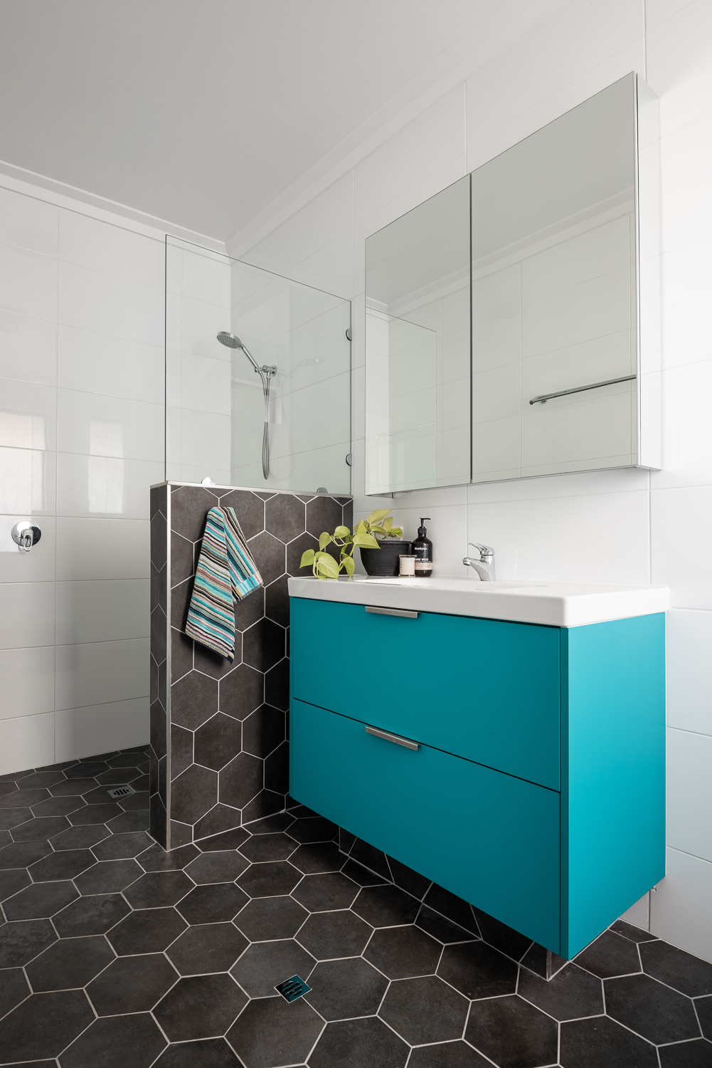
{Master ensuite details of the James Street Residence, by Romona Sandon Designs. Image by Dion Robeson.}
Curtains and blinds are opened and closed to allow optimal light and heat inside, which is also aided by deciduous vine plantings on the north for additional summer shading of openings. While we wait for the grape vine to grow, we use a combination of shade sails and a passionfruit vine that we trim back in winter to allow more sun through. In the mean time, we are drowning in fat juicy passionfruit and the kids adore it!
The garden also considered sustainable design elements in the use of reclaimed breeze blocks for the entry, edible garden courtyard and native or self-sown water-wise planting. Indoor plants are used for improved indoor air quality and visual calm.
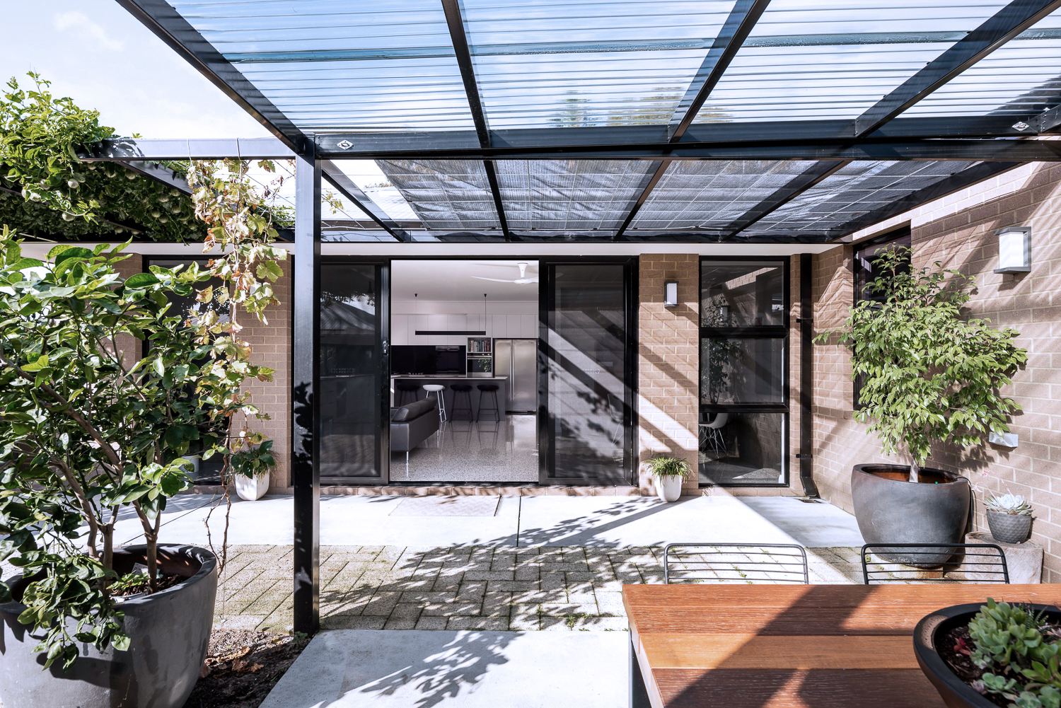
{North-facing, rear exterior of the James Street Residence, by Romona Sandon Designs.}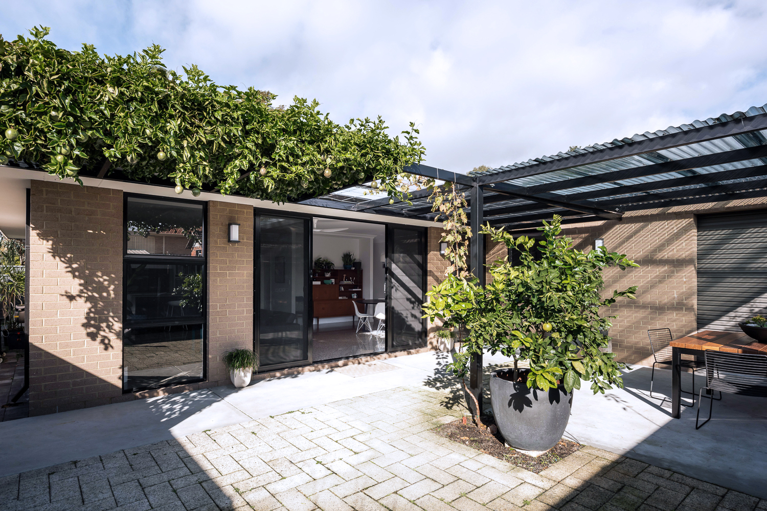
{North-facing, rear exterior of the James Street Residence, by Romona Sandon Designs.}
As a sustainable designer, I see it's discrepancies and the details that could have been improved, with time, money and less council limitations.
As an architect, I see the features that I could have amplified and where I wish our money could have stretched to.
As the client, it is perfect. It is the perfect design for how my family and I live, our budget at this stage of our life, and the place and site that we built it on. It is our home and I'm proud of it.
xo Romona![]()
Local Heroes: Gallery House by Craig Steere Architects
{Complementary materiality of off-white render, stone, timber and zinc cladding}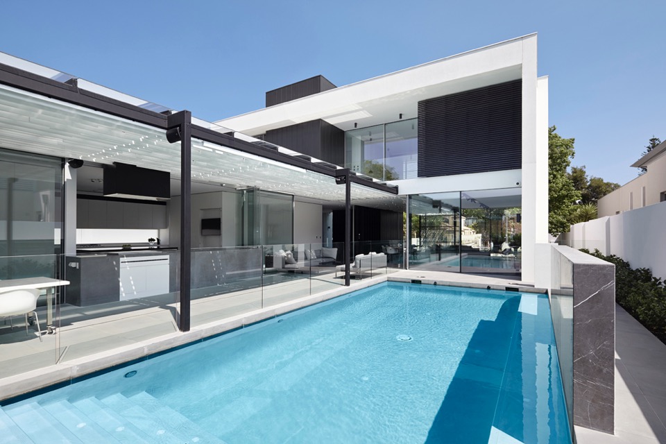
{How beautiful is that pergola?!}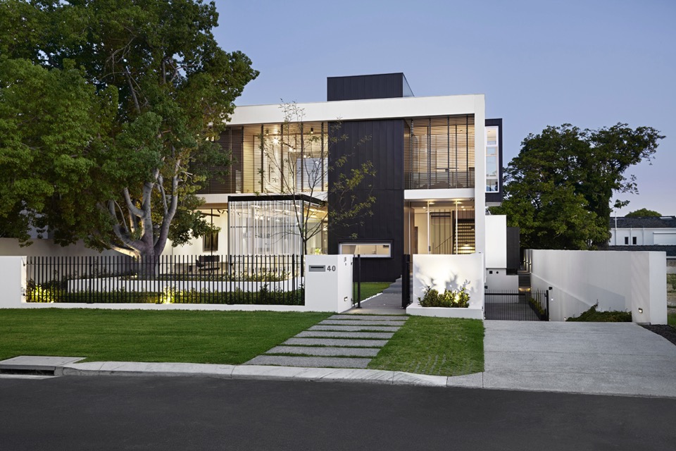
{Classic but contemporary frontage in Nedlands}
{Crossing linear elements continue with steel balustrade and stone stairs}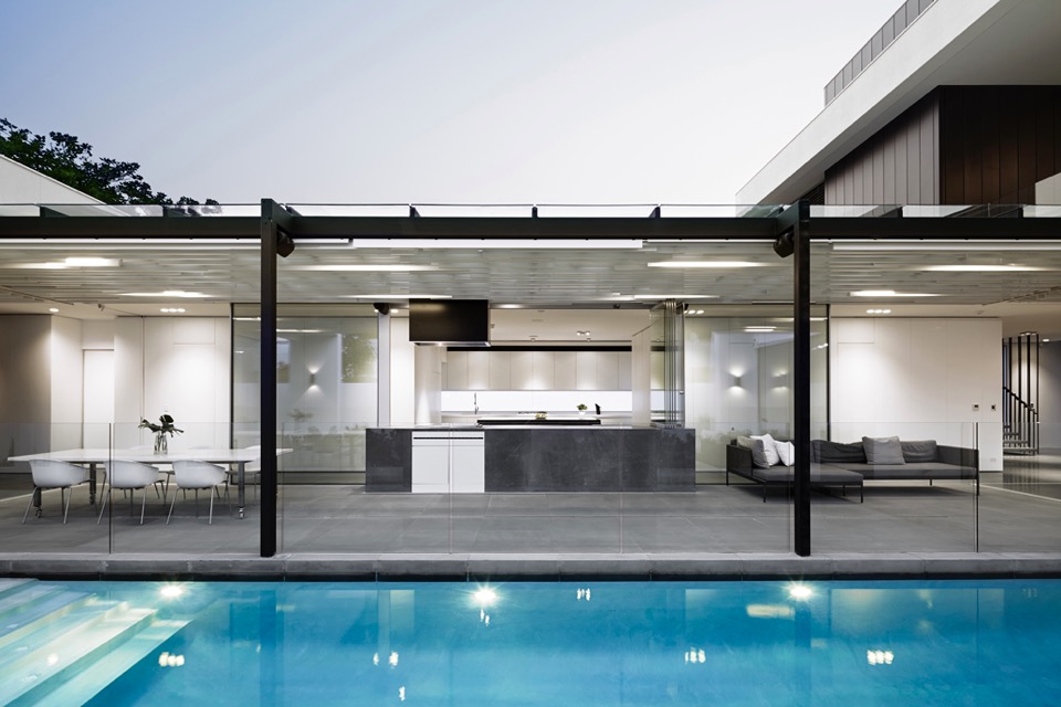
{Visual and physical connection between outside and in}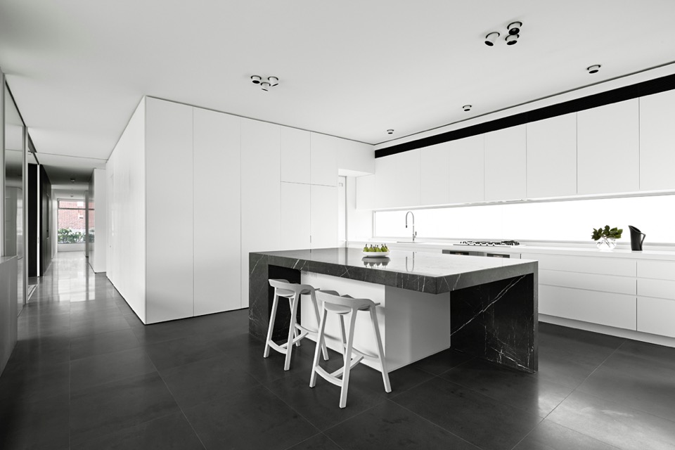
{I love a clean monochrome kitchen. It gives a great base to personalise with homely touches later}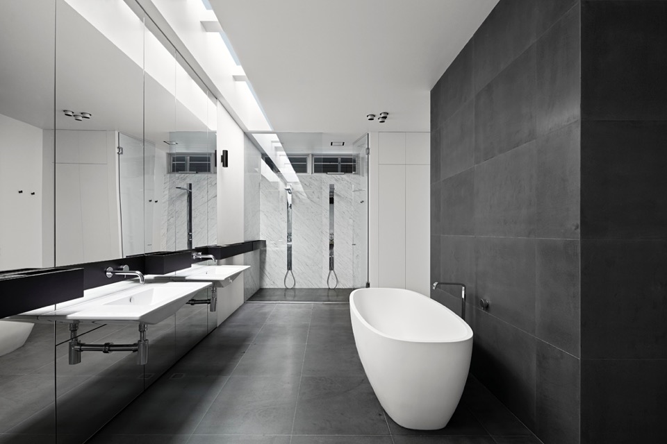
{Simple palette and colour scheme continue through into wet areas}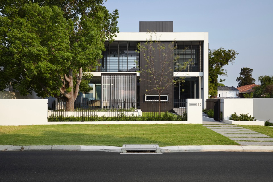
{Overlapping linear elements give aesthetic cohesion}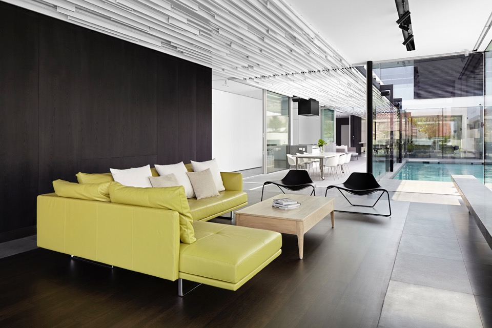
{That ceiling is amazing! I would not have enjoyed drawing up those details, but what a result!}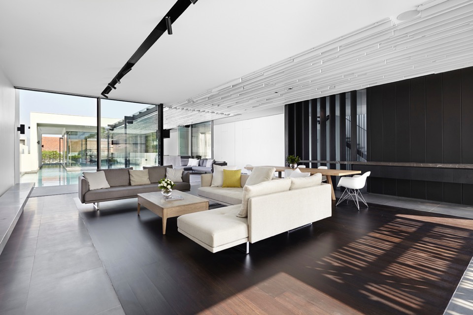
{A touch of warmth to the monochromatic palette, with timber floor insert}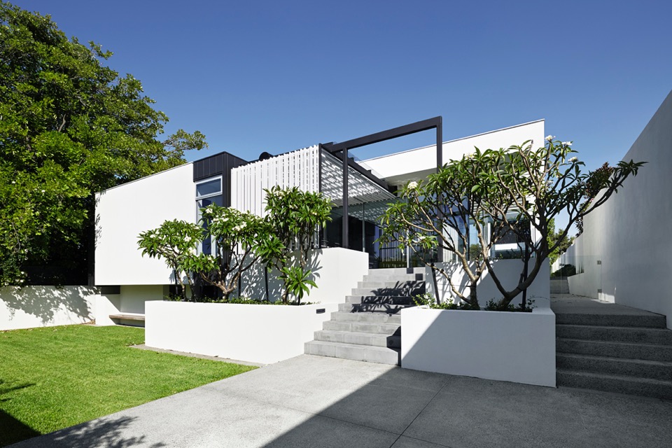
{Sculptural Frangipani trees create organic silhouettes against the linear}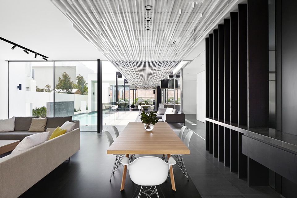
{Ceiling and pergola structures linking the pavilion and courtyard spaces}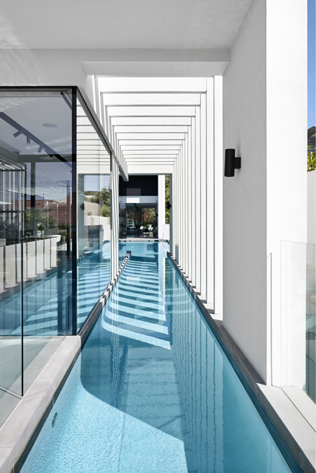
{Visually striking linear elements, that would be amazing to take in from the pool, day or night}
I feel the need to point out that while passive solar design principles have been applied with siting, material selection and active tech, the 6 star energy rating achieved is the NCC (National Construction Code) minimum, since this rating system goes up to 10 stars. Just keep this in mind, when designing or building your next home - time spent aiming for a higher rating early on will save you time and money later on.
Regardless of this small point, this house is a beautiful example of contemporary residential architecture and looks like it would be a joy to live in.
xo Romona![]()
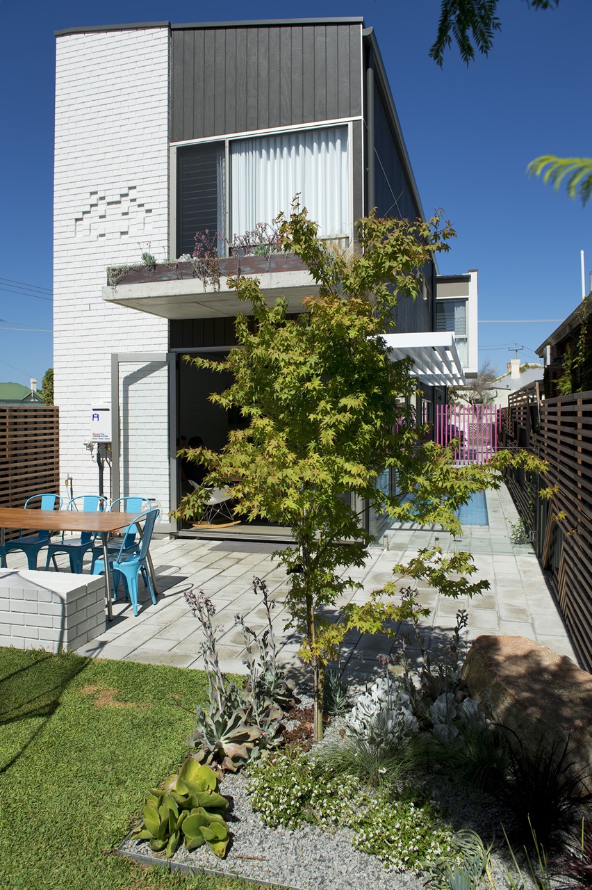
Local Heroes: Florence Street by KADA

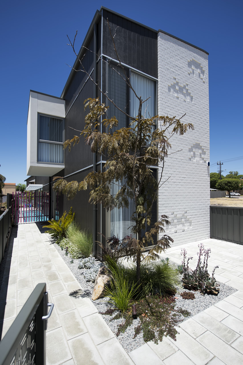
I love how the home has fun elements scattered throughout, in the form of bright sunny pops of colour or embossed brickwork space-invaders. How could you not be happy in this house?
For more information on the Florence St project visit Klopper & Davis Architects.
xo Romona![]()
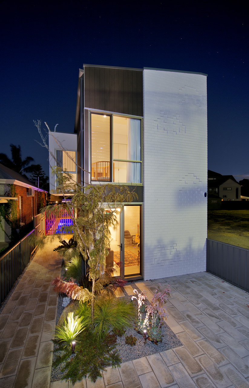
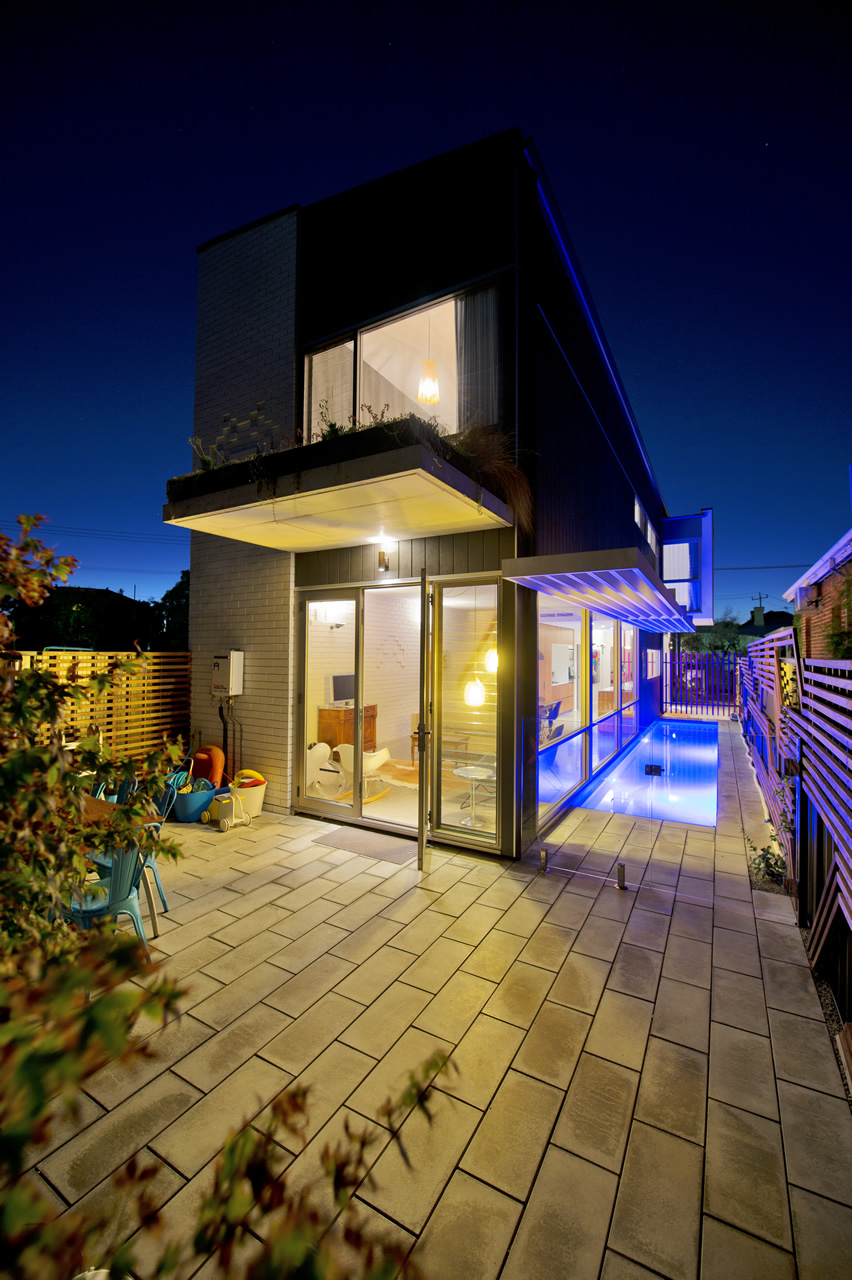
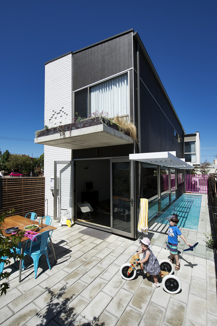
Local Heroes: Triangle House by Robeson Architects
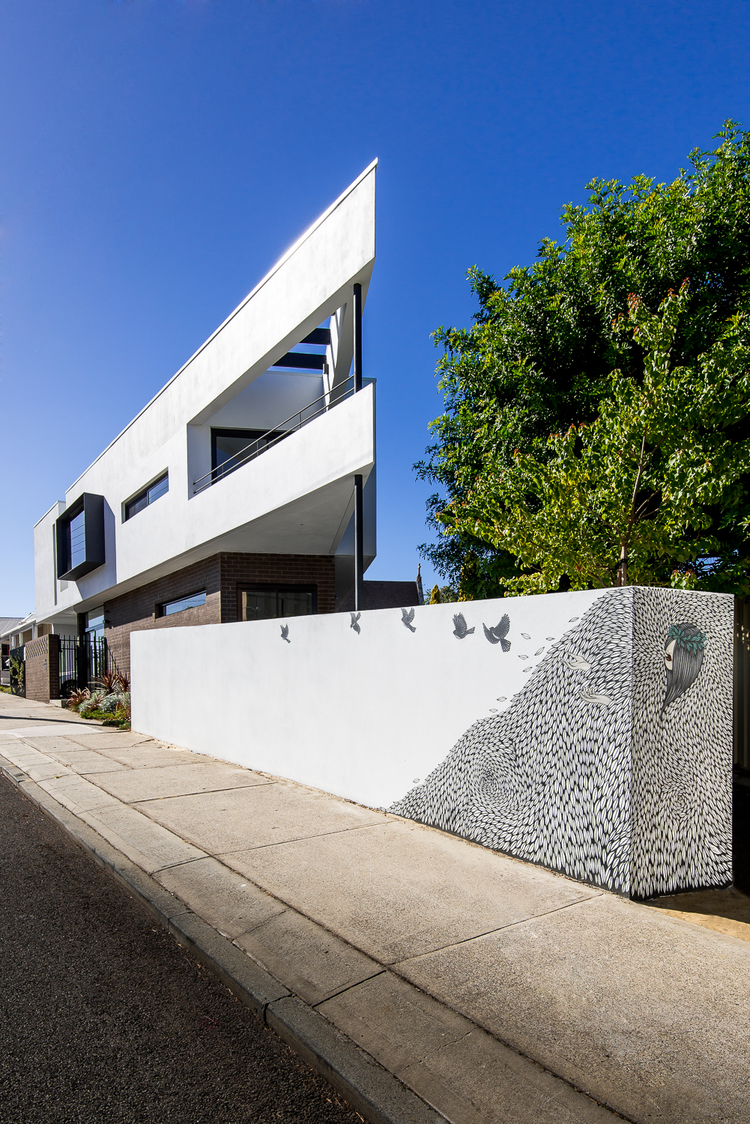
But I digress, this isn't a lecture on residential sustainability, rather the exploration of something beautiful born out of perceived limitations. Triangle House on a tight 180m2 triangular block in Mt Lawley, Perth showcases the ingenuity of Robeson Architects and to me is one example of Perth architecture at an international standard. What better way to start this series than with a project that initially grabbed me on Pinterest, but really had me hooked when I found out it was not only Australian, but super-local (Mt Lawley!) and a fellow female architect. Enjoy!
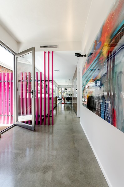
{The stunning triangular form juts out with supercool artwork below at street level by Robert Jenkins (@theblackmountains). So recognisable to me now that we have a wall of his around the corner in Bassendean, and you may have seen me go a little insta-happy over}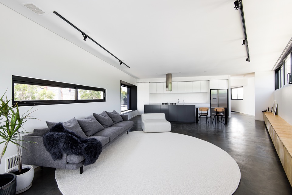
{This was one of the first images that made me fall for the place. Of course those who know me, know my tendency towards black, white and grey, but it also has all my other loves - big white kitchen, contrasting black frames, deep polished concrete flooring, minimal timber accents, big snuggly Jardan grey wool couch, indoor potted sculptural Dracaena, statement linear ceiling lighting, even the furry throw - my god Simone, you can do no wrong in my eyes! In fact, if I plonked my gorgeous tan fur-baby on that rug, the picture would be complete}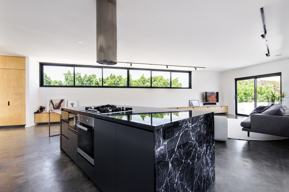
{Brutal black kitchen island wrapped in electric-veined Nero Marquita marble adds drama to the monochromatic space}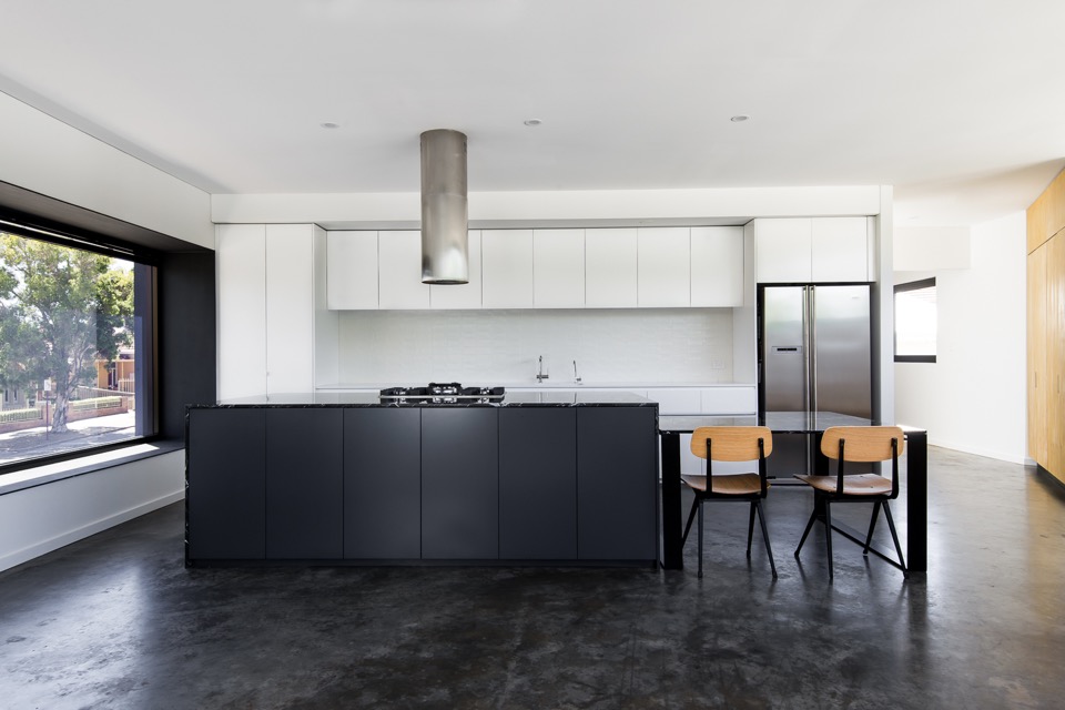
{Just a beautiful kitchen in blocked monochrome, and I love that massive projected north-facing window, done in one-way glass boxed out in steel for privacy}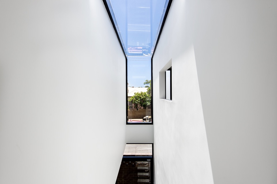
{Extending the black-framed picture window to the heavens with a waterfall skylight}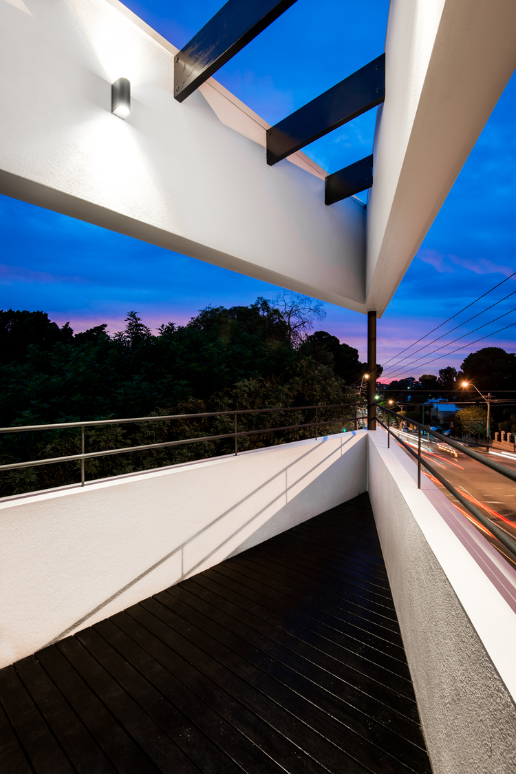
{Sharp-edged deck space making the most of a difficult site and adding a bit of drama to Vincent Street}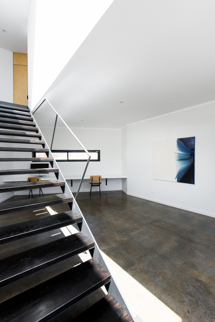
{Clean gallery feel to the downstairs office softened by multiple but complementary textures and material finishes, like the burnished concrete floor, blackened LVL stair treads and black steel}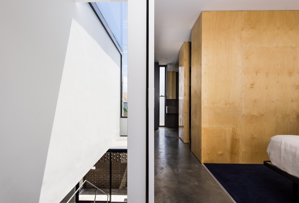
{Simple but inspiring void spaces and linear movement}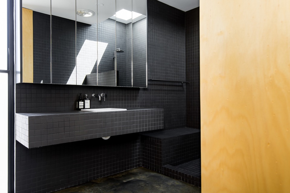
{Clean and minimal bathroom in continuous matt charcoal tile with clever hidden storage. Love the concrete bathroom floor, but I'm unable to convince my husband that I won't snap my other leg if we have that} 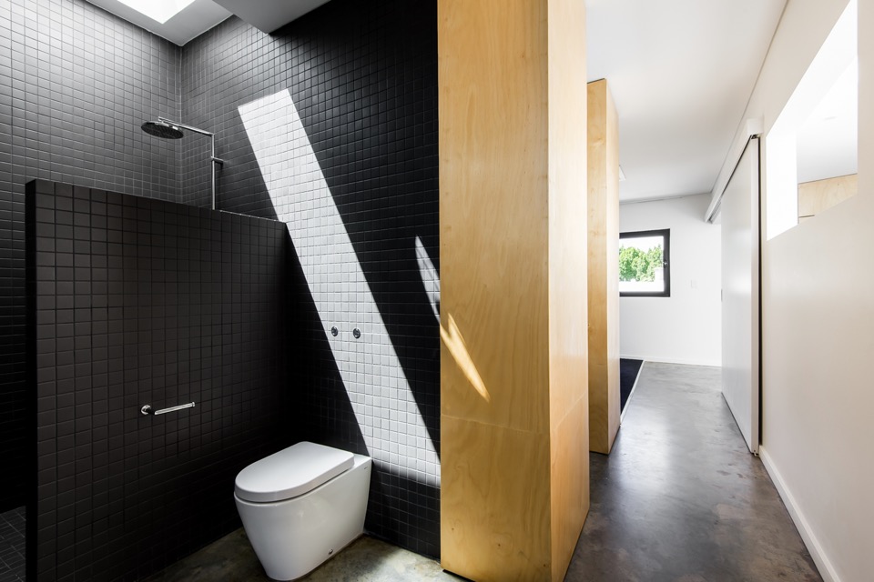
{You know it's good when even the dunny makes you go Oooo}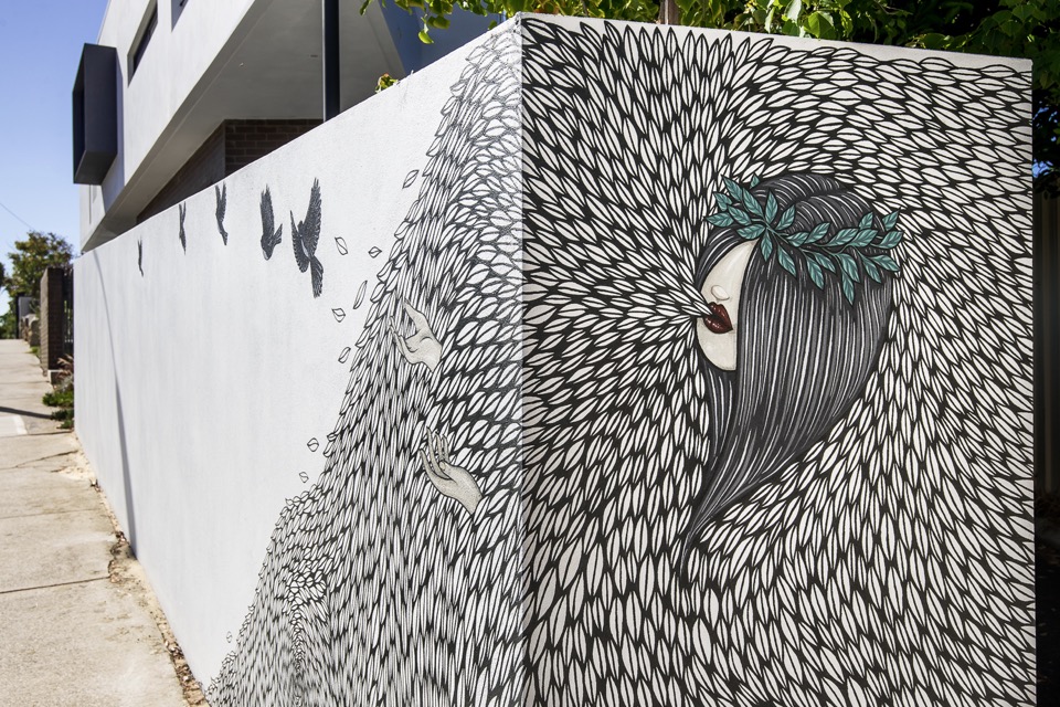
{Detail of the cool mural work at Vincent street level by Robert Jenkins}
{Image by Dion Photography}
{Image by Dion Photography}
All images are from Robeson Architects (big thanks Simone) and Dion Photography. If my house turns out even half as nice, I'll be wanting some shots done by those guys. Simply brilliant!
Doesn't it make you proud to have some lovely architecture in Perth (and Australia)? What are your thoughts on this place?
I'm hoping to showcase a bunch of other local talented architects and their projects soon, so feel free to let me know if there are any that stand out to you.
Hope you enjoyed!
xo Romona![]()
Bricks and Blocks
I have been assessing the Perth mantra of 'brick is best' and am finding that I am actually coming around to the idea. Sure, I'm not really in love with the double-brick and tile hot box that plagues most suburbs of Perth, but channelling a bit of Iwan Iwanoff can never hurt. Here are a few projects that I am in love with at the moment, that showcase bricks and blocks in all their glory.
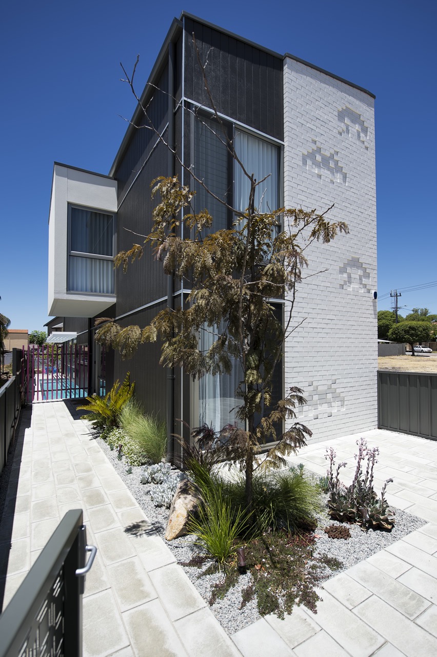
{Get your geek on with these supercool Space invaders in the Florence St House by Klopper & Davis Architects, in West Perth, Australia}
The Monochrome Kitchen
My obsession at the moment is designing the perfect kitchen for my family - it needs to be robust enough to handle the two boys, clean and simple enough for my ‘minimalist’ husband and eclectic enough to suit my many varies tastes. Easy, right!
I have always loved a black and white kitchen, the bar constantly moving on the proportional scale between the two. A few years ago, I would have been happy with almost all crisp, glossy white, but I have been swinging towards textured black with glossy white accents lately, as it seems so many of you are as well. Here are a few (and by that I mean heaps!) of black and white kitchens to get you inspired.
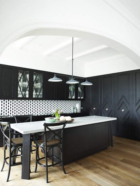
{Loved this even before I saw it was Greg Natale’s work - should have guess that from the pattern and mouldings but I always end up loving his style}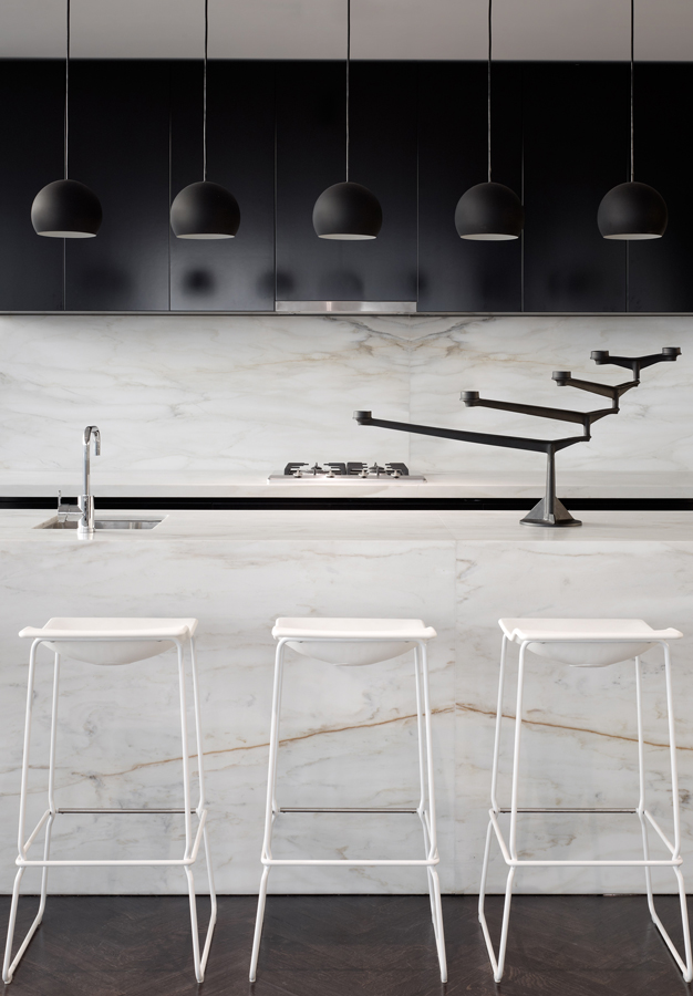
{Striking Kitchen in 33 Mackenzie Street Tower Melbourne By Elenberg Fraser}
Black and White
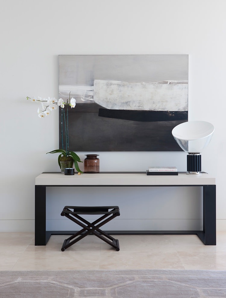
{Harbour House by uber-talented Arent&Pyke. How yum is that Christian Liaigre console table?!}