Supergraph 2015
More than just an art fair Supergraph is a three-day fiesta of graphic art, illustration and design at the Royal Exhibition Building in Carlton, Melbourne. The fair features leading graphic artists alongside our brightest emerging talent ensuring that there are original and limited edition artworks available for every taste and every budget starting at just $30. And, with creative workshops, artist led masterclasses, family-fun events and an opening night party (that I am so excited to be going to!) Supergraph is where you can be inspired or just enjoy the beautiful creativity of others.
I'm particularly looking forward to attending the 'Felt-tastic' masterclass with a gorgeous friend for a well-deserved stitch-and-bitch sesh. Well, maybe it should be glue-and-boo? Smatter-and-chatter? Cut-and-tut? ![]()
Also hoping I win one of the ballot-allocated sessions with Face-o-mat!
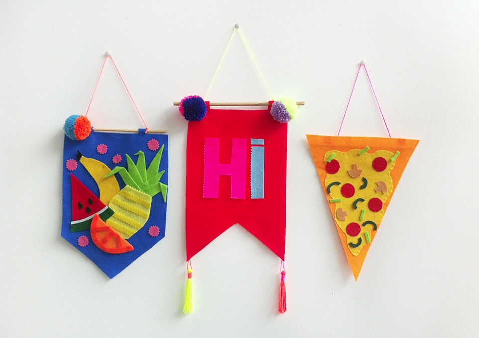
{Masterclass: Felt-tastic with Kitiya Palaskas}
Perth's Got Talent 2
Here are just a few more examples of amazing WA talent from Decor + Design Melbourne 2014.
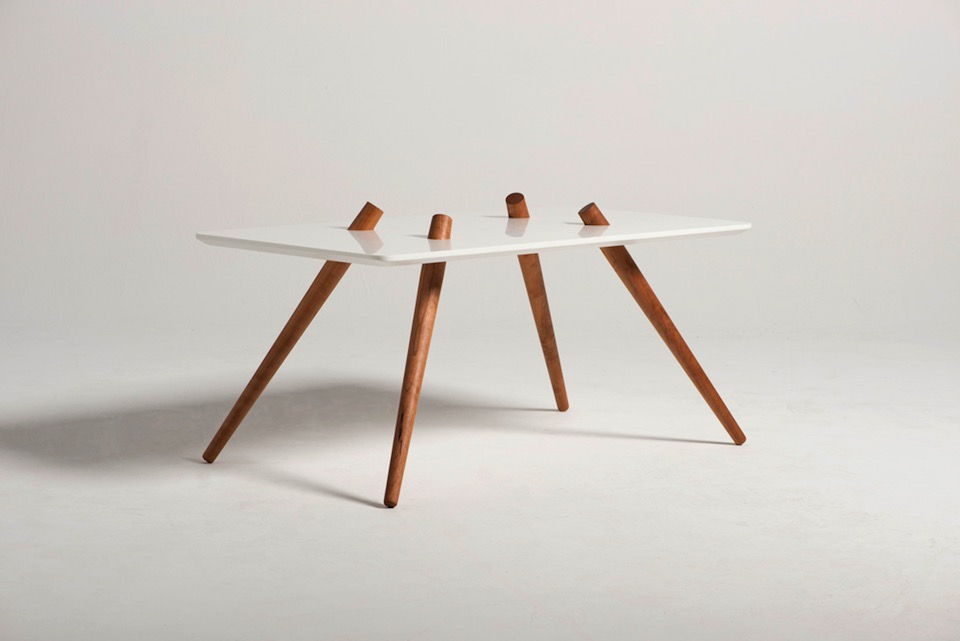
{Holiday table by Callum Campbell}
Quick distraction
Having said that, sometimes we all need a bit of aesthetic joy in our lives to remind us of people's potential to create beautiful things.
With all the above going on, I haven't yet sorted out my reams of notes, brochures and cards from the D+D conference yet, so I will leave you with just a taste of beautiful things from the conference. My iPhone pics seemed to have turned out a bit dull, so I will dedicate a couple of larger future posts to the amazing designers that I met and discovered (or rediscovered) at Decor + Design Melbourne once I have some quality images from the designers themselves. For now, enjoy this brief sample.
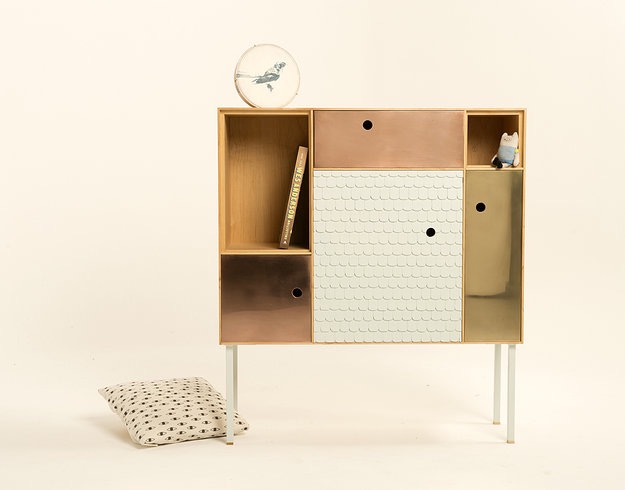
{The Reykjavik Cabinet by Amy Perejuan-Capone of Horse on Toast, just one of the many talented sandgropers on display at D+D}
Off to Melbourne I go
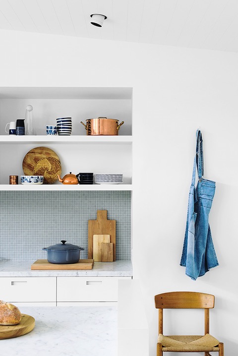
{Sorrento Beach house Interiors by Shareen Joel of Shareen Joel Design (SJD) and Share Design}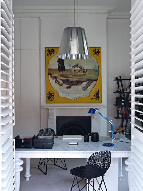
{Design by Sonia Simpfendorfer of Nexus}
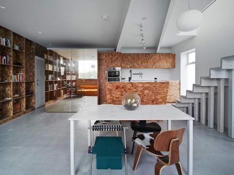
{Interiors by architecture studio Edwards Moore}
D+D Melbourne less than a week away
However, the highlight of my conference visit always seems to be the VIVID (Vibrant Visions in Design) competition. Now in it's 12th year, the talent in both the professional and student arenas never fail to amaze and inspire. It's almost a given that most of the designs seen at a VIVID competition will be featured in an abundance of mags and interiors by the end of the year. Looking forward to the return of a few previous highlights, especially Lab De Stu, Inkster Maken, Paul Townsin, Dezion Studio and Ben-Tovim Design. Just a taste below.
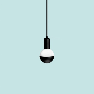
{Cup by Andre Hnatojko of Lab De Stu comes in all manner of luxe finishes, including 24k gold or rose gold, brass, copper as well as classic white and matte black}
Win Tickets to Decor + Design Melbourne's International Seminar Series
Melbourne, here I come!
Aside from catching up with all my wonderful Melburnians, I'm itching to get back to Melbourne for the Decor + Design and Furnitex conferences this July. Although rebranded from the previously called Decoration + Design, if past events are anything to go by, attendance is a must - so much designer eye candy! (I've posted about past events here). Furnitex and Vivid are always a highlight, and the international and local speakers they organise are truly inspiring. We are super lucky enough to have double passes to each D+D International Seminar Series speaker to give away - more information on the giveaway at the end of the post!
This year there is a great lineup of local and international speakers, springing from all fields of interior design and architecture, from trend-forecasters to designers.

{Kari Whitman, Interior Designer to the stars}
Melbourne Life Instyle 2013
Last week’s Melbourne Life Instyle event was set inside Melbourne’s beautiful Royal Exhibition building. I had been to events here before but never have I seen it so crammed full of designer goodies. I swear they somehow increased it to twice the size than the last time I was there - and I had the blisters and aching calves to prove it!
Unfortunately, my BFF and I were so caught up dragging each other between stands, squealing (yes, big girl squealing!) and jumping on the spot in excitement that I completely forgot to take any onsite pix. No excuse, but, well, we were basically sprinting between stands since they were all so beautiful and we only had a few hours away from kids in which to see it all. Although if you ask our wonderful husbands, we were gone much longer than anticipated! I may have to do another post on some of the best designs because we saw them pre-release and I prefer to let the actual designers launch their products (and not get in any trouble - no-one likes a PO’d artist!)
Here are some of my favourite stands from the show and their pretty pretty wares.
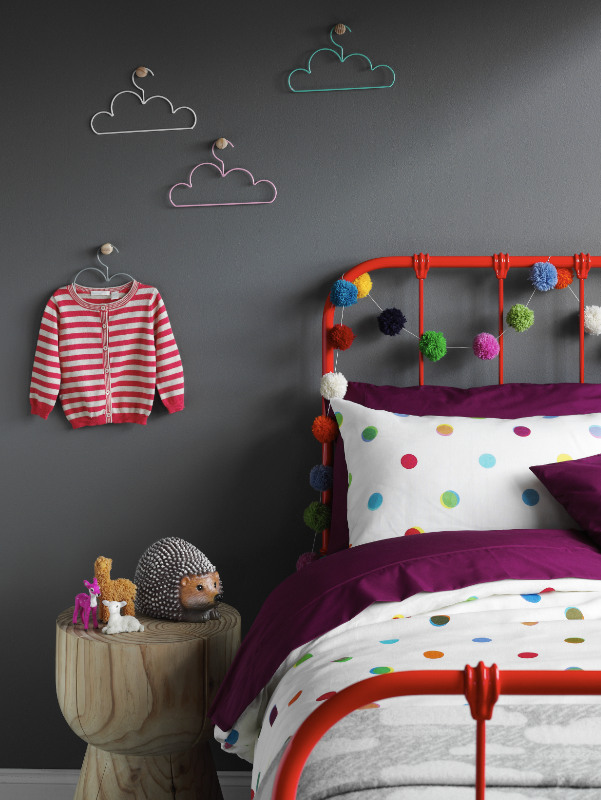
{Cloud coat hangers, Pom Pom garland and furry animals by Down to the Woods. Who wouldn’t want this entire setup for a cute little girls room?}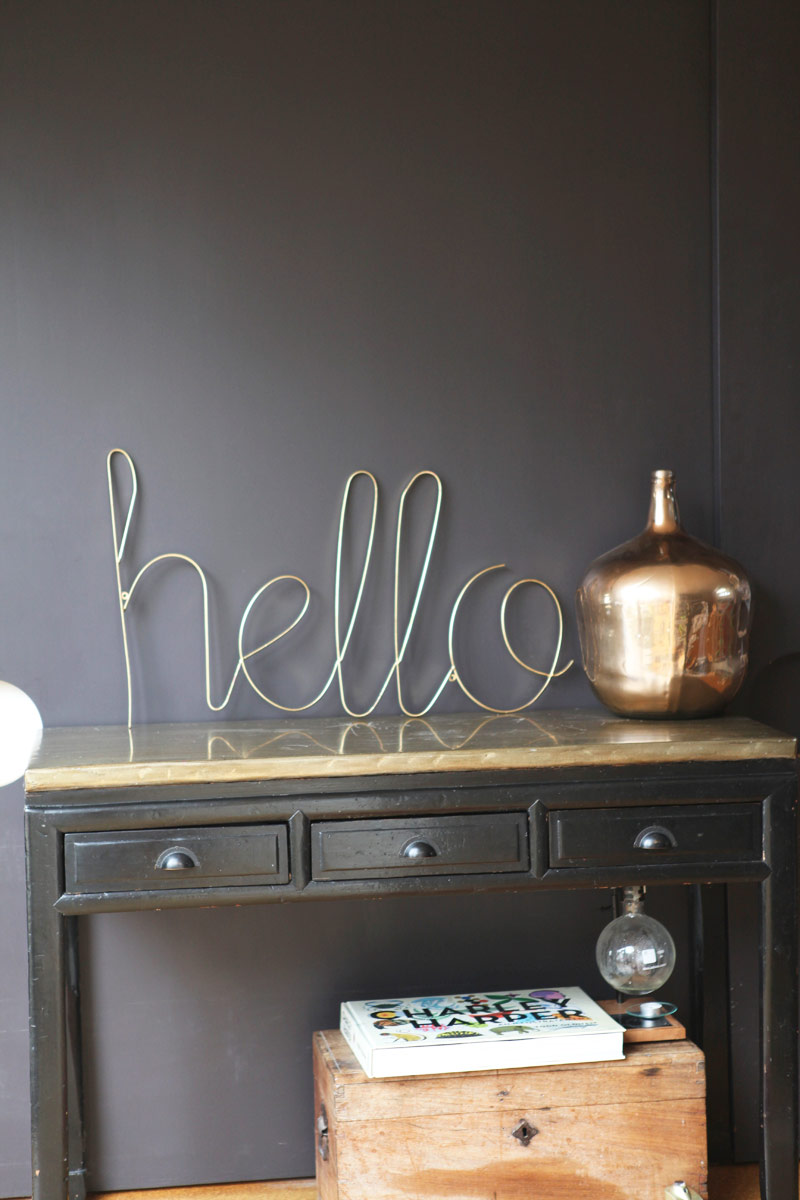
{Hello sign in limited edition Gold by Down to the Woods for some fun glamour}
Melbourne Decoration + Design 2013
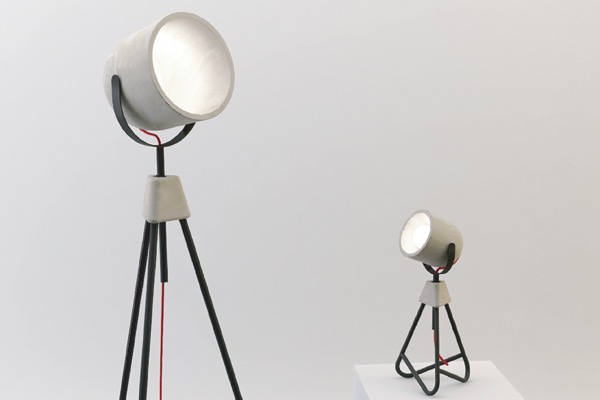
{Paul Townsin’s Me + Me Too Lamps, made of moulded concrete and so, so beautiful in person}
DesignEX 13
The Hives exhibition was the stand-out for me with its gorgeous collaborative pieces. “When designers, interdisciplinary practitioners and leading industrial enterprises put their heads together, the results can be exciting, unexpected and intriguing. Curator Anne Maree-Sargeant returns the popular Hives exhibit to designEX 2013 with a highly considered display of products that bring together covetable objects from visionaries and brands under the themes of Innovation and Collaboration”.
My favourite for years has been the WebLight by Design By Them (along with everything else they do!). I fell in love with the gentle image of the aptly-named wispy-looking light set amongst a bright green forrest on their webpage years ago. “WebLight is the result of an exploration into the potential possibilities of reusing plastic bags. Made from recycled content, each WebLight is individually hand made and features an intricate pattern of texture and holes that are the direct result of its unique forming process.”
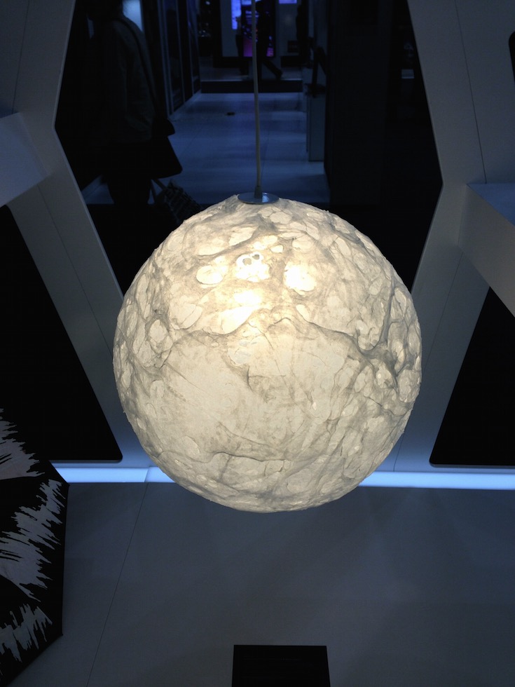
{Weblight by Design By Them}
Another creation I was looking forward to seeing in person was the precise Hoshigame by Artemide. Developed with Japanese fashion designer, Issey Miyake, the sustainably designed, foldable lampshade explores the intersection of creativity and mathematics. Made from fabric derived from recycled PET bottles, “Miyake's unique folding technology allows a single piece of fabric in a flat 2D shape to be unfolded into a 3D shade of statuesque form. The structure of the recycled material, together with an additional surface treatment allows 'Hoshigame' to perfectly keep its shape without the need for an internal frame, and to be stored flat when not in use and then re-shaped when needed.” Although smaller than I expected, it was still a thing of beauty.
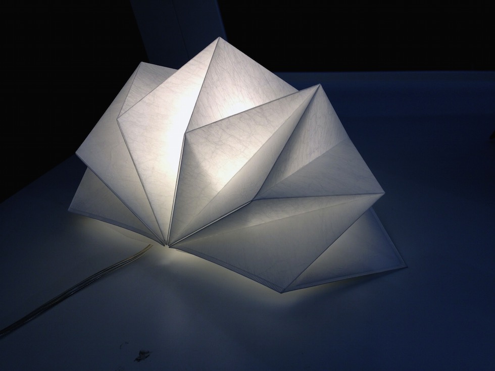
{Hoshigame by Artemide + Issey Miyake}
Here are a few other highlights from the Hives exhibition and lots more from the show.
Sydney Decoration + Design 2013 - Part 3
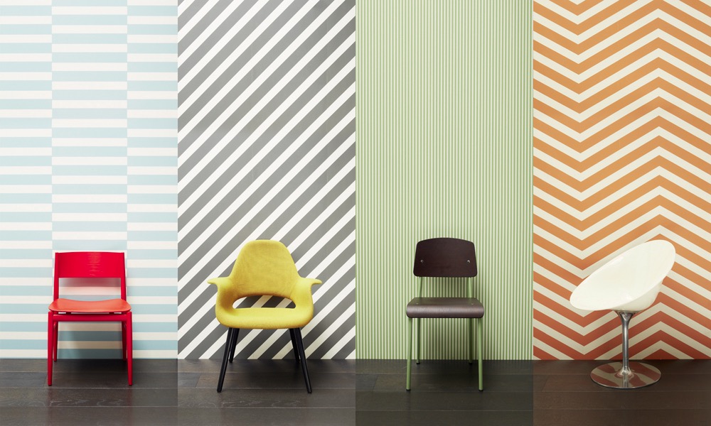
{Greg Natale’s Wallpaper range for Porter’s Paints}
Greg’s seminar took us on a journey starting back with his inspiration as a child and knowing quite early on what he wanted to be and do.
Sydney Decoration + Design 2013 - Part 2
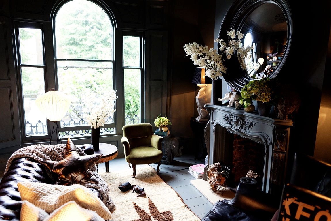
{Abigail’s own lounge. Dark, inky palette brightened with multiple light points. Source}
The queen of eclecticism and dark, moody interiors, Abigail Ahern, was over from the UK in her own whirlwind Sydney sojourn. Her seminar drifted through her style guides and tricks of the trade, complemented by spectacular imagery. These spaces, tips and tricks are all summarising beautifully in her book.
Sydney Decoration + Design 2013 - Part 1
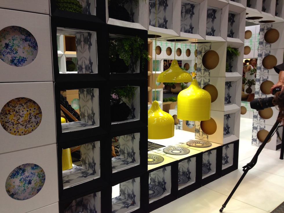
{Popper pendant lights, Designed by Andre Hnatojko}
Unfortunately, I felt like I had seen a lot of the products on display before (the Melbourne D+D 2012 wasn’t actually that long ago), but there were still a few notable pieces to be found. Yellow and bright neons featured heavily again this show. The Popper pendant lights by Andre Hnatojko below were even better in person than the many images I had pinned before.
Decoration + Design
Just a quick note to let you know that I’m off to Sydney tomorrow to catch up with friends and colleagues as well as take in the sights at Decoration+Design.
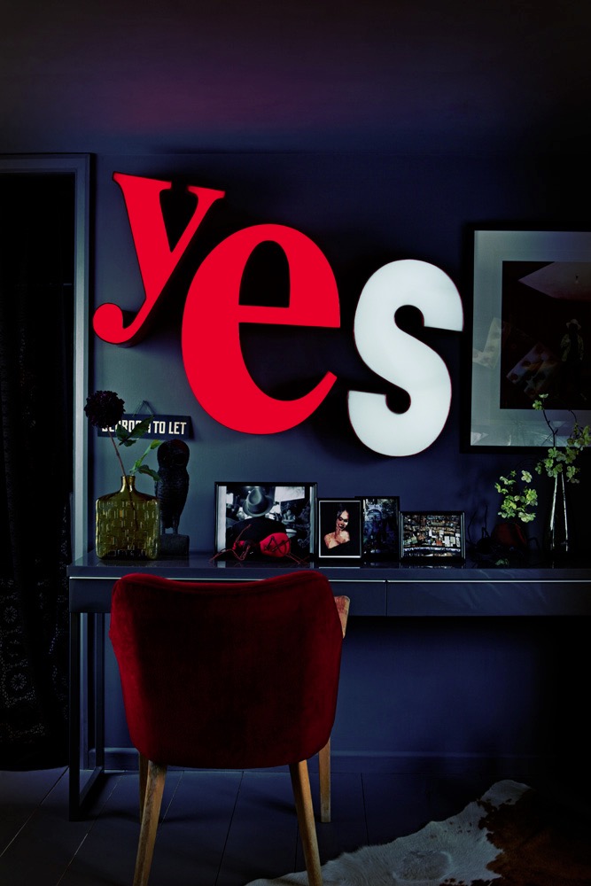
{Atelier Abigail Ahern. Image from her seriously cool blog}
Super excited about the seminars by Abigail Ahern and Greg Natale. Here’s a sneak peak at their work…
Grand Designs Live
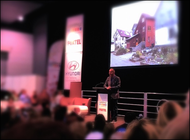
{Kevin McCloud - Grand Designs Superstar!}
While the highlight was obviously seeing the charming and witty Kevin McCloud speak, unfortunately, I don’t have many other great things to say. Maybe it’s design event overload, creative fatigue from the same companies obviously wanting maximum exposure. It feels like I have seen it all before and what is there is often not the cream of the design-world crop. Having said that, I did manage to snap a few interesting pieces, some now key items on my personal wish list.
Firstly, the incomparable Volker Haug. I definitely have a Design-crush on him. Probably since spying his recycled black leather and zipped up chandelier, Joker, a good many years ago at a trade event. I would happily incorporate any of his pieces into any room in my house. I think it would be great fun to start the creative process with one of his major pieces, like the massive OMG! shade, and go from there.
I liked this quirky little primary-coloured, almost diagrammatic, pendant light of his below. Simply called Cable Jewellery, you can pick and choose your components, S- or U-shaped, in a range of colours and lengths. You will have to excuse the pictures. They looked fine on my little iPhone screen but are a tad blurry up close - possibly a result of eyes darting around the room for the next design fix. There are much better pics on his webpage (with cool and quirky navigation and interaction too). He also had little terrarium light globes hanging that were so cute, as well as his aptly named Wow range.
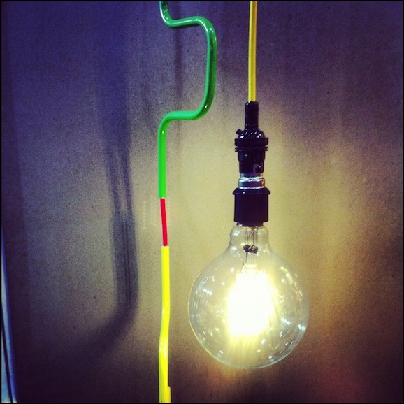
{Cable Jewellery from Volker Haug lighting}
Next, the Mokum stand stood out with Catherine Martin’s divine Art Deco inspired fabrics and wall papers. Fitting in well with husband, Baz Lurhman’s The Great Gatsby, these opulent designs are to die for. Beautiful metallics in hues of silver, champagne and gold. So very luxe and touchable. How great would it be to have a luxurious OTT bedroom in these fabrics and papers, maybe even with one of her divine Designer Rugs Australiana-inspired or Deco Collection rugs on display.

{Catherine Martin for Mokum Antique Lace Wallpaper - On the big, long wish list!}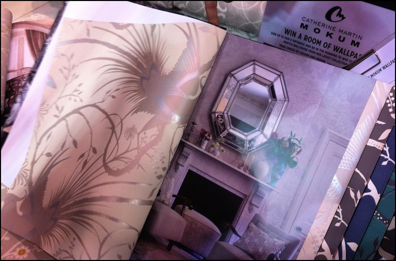
{Catherine Martin for Mokum Imperial Pheasant wallpaper on left. Apparently that’s her and Baz’s bedroom on the right. Not sure I believe that…}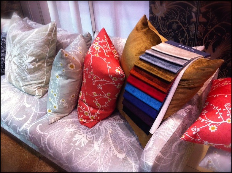
{Catherine Martin for Mokum fabrics on display. Feathers in powder blue on couch. Cushions from left Feathers in Linen, Blossom in Linen and Coral}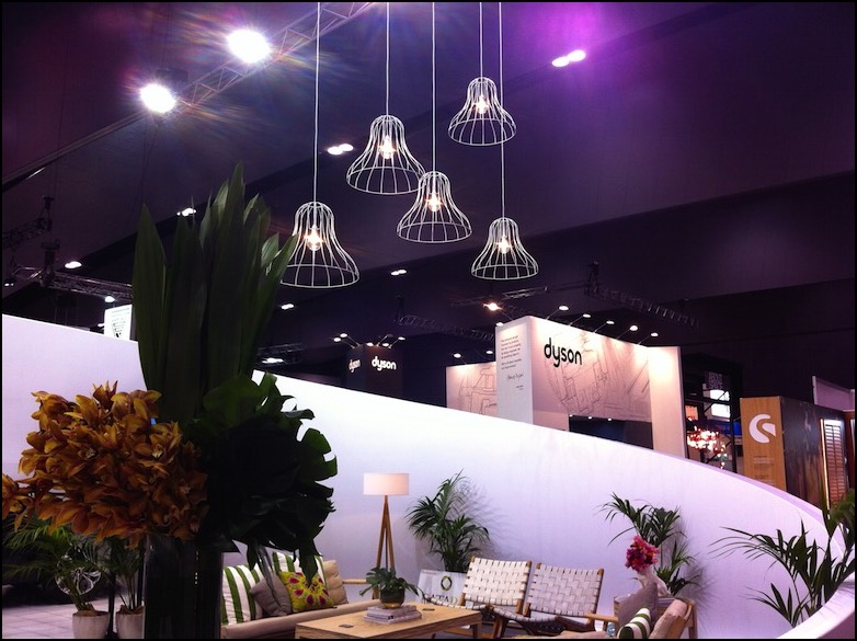
{Relaxed vignette with funky wire lights above}
Mobs of people and tantalising aromas drew us over to the Miele kitchen display. Forgot to actually look at the Miele products, which are always quite spiffy, because I was too engaged by Maggie Beer, laughing and having fun with the audience and fellow chef/cooks. The herb wall that they had set up was quite impressive. Yes, we’ve all seen them before and they seem to pop up everywhere now (I wish someone would do something a little more out of the box than the terracotta pots) but it is a good idea and nice gesture all the same.
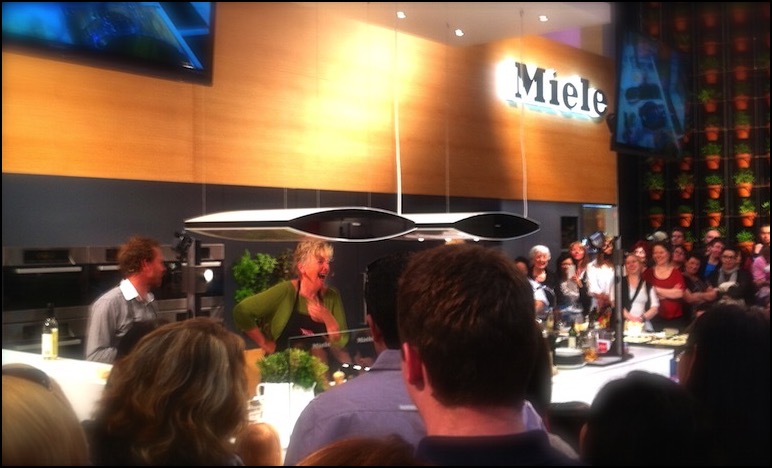
{The Scrumptious Maggie Beer cooking up a feast}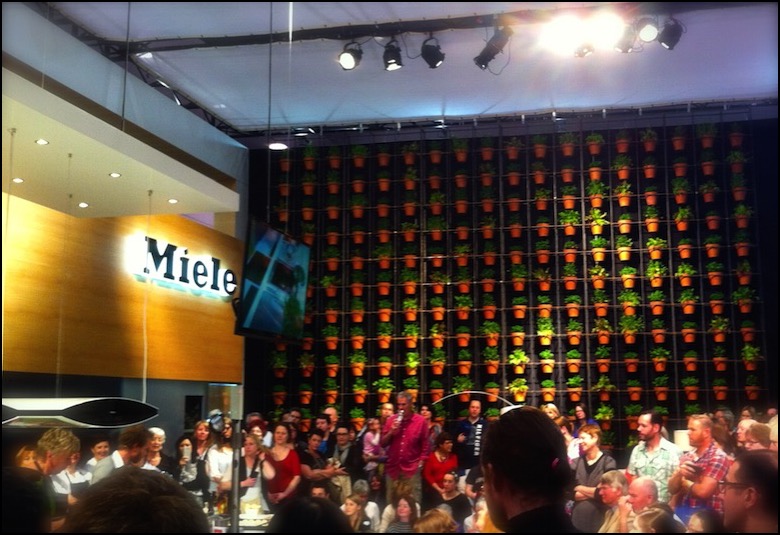
{Miele herb wall}
We did rush through quite quickly, being slightly put off by the vacuum cleaner displays and contoured pillows having a greater prominence than textiles or designer furniture. I have since seen on a few instagram and Facebook pics of others that there were a few sculptures in the garden section that might have been nice to catch, but other than that I’m hoping that the next one steps up its game to a level that the Grand Designs brand could be proud of, with a bit more architectural cred.
Let me know if you agree or disagree and what your favourite parts were if you managed to get there. Ciao for now.
xo Romona
![]()
Saturday InDesign 2012
I’m lucky to have been blessed with two very co-operative babies (my first was strapped to me in the same Baby Bjorn two years ago at the last Melbourne Saturday InDesign). Even so, it is a long day and if all things go to plan, I shall get to have my next one sans-bebe and stay for the inevitable evening festivities.
I love getting out and seeing the new products on offer, seeing other professionals and design enthusiasts cruising between show rooms with happy neon lanyards around their necks. Although it is a given these days for companies to have a wonderfully detailed and impressive looking website, there is nothing like running your hands over perfectly smooth and detailed timber or rough textural fabrics. Being stuck in the home most of the time, I relish the chance to get out to these events, and highly encourage it to all.
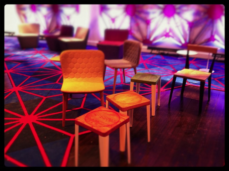
Our day started a bit later than intended (as usual) and the first stop was Zenith Interiors. Bright colour, neons and geometry were evident, on-trend in all things at the moment. The impressive Godfrey Hirst neon pink geometric-edged carpet was a stand-out for me. Pumping music and yummy cheesy pretzels lead the way to a visual treat in the form of the Zenith Design Competition display, featuring creative ‘outfits’ for the TIPO chair.
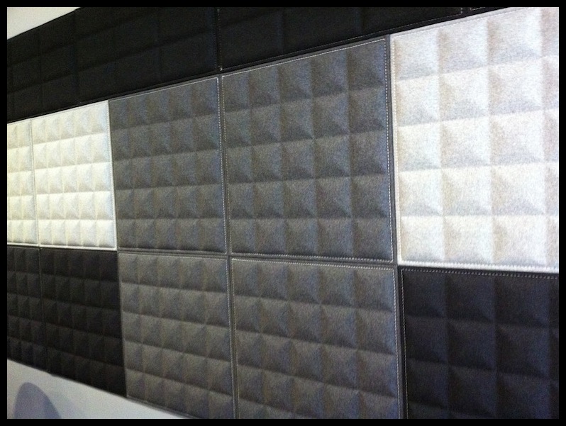
I also fell for their wonderful Buzzitiles 3d, recycled-content wall panels (below) - Although I’ve only ever specified similar for commercial fit-outs, I’m hoping to form them into a headboard for our bedroom. Love that mid-grey pyramidal form creating depth and texture.
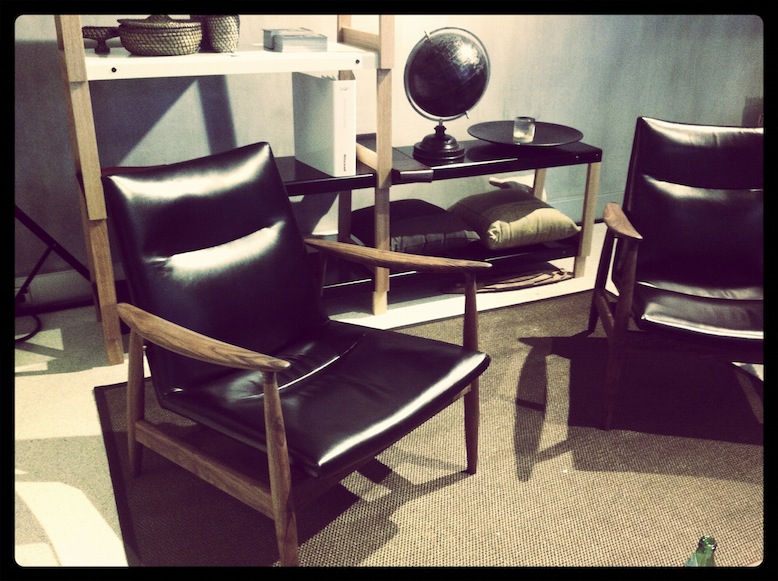
A few quick pop-ins along the way to the next destination, Stylecraft, to catch up with a friend over from Radelaide. Love when events drag people to Melbourne from all over the country! She did a great job simultaneously catching up, pouring us champers, snagging the delectable little soft shell tacos and showing off their new and current products. The styling and quality that they displayed throughout the space was first class. My mum (Artist and Designer from Perth, Melva Babarskas) was about ready to snatch the striking orange chair from the entry, while I was coveting the rich black leather armchair and its surrounds.
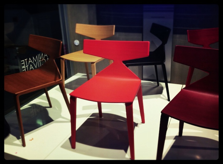
The last few locations were all about lighting, lighting, lighting. Euroluce’s display was fantastic as usual. De De Ce also presented a classy exhibition. Again, my impending bedroom refurb was front-of-mind, so the selection of lamps in metallics and gloss were particularly appealing. Copper and Bronze are everywhere at the moment. It’s a nice break from the chrome/silver world - still up there with gold in luxuriousness, but not quite as cocky. Yamagiwa’s Mayuhana pendant by Toyo Ito at Euroluce was a glowing beacon in the corner and would look impressive in almost any space.
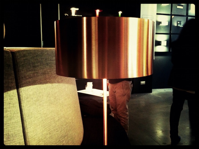
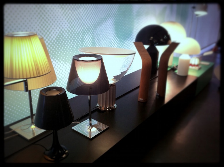
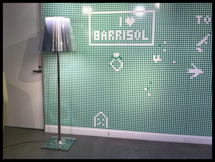
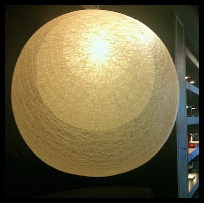
A tired and hungry baby put an end to the days festivities, although it must be said that he was exceptionally well behaved for most of it. Had a great day, met wonderful-beautiful people and definitely got my design-fix for the week.
Hope you enjoyed my second post and hopefully enjoy more to come.
xo Romona
![]()
Perth's Got Talent
I've tried not to be too limiting of my selection of designs that I found at the conference, so if you notice that your design is not here, just know that I was so overwhelmed by the talent, I may have forgotten to grab a card or scribble a note. For now, enjoy all this sunny WA talent and I'm sure I'll have another post soon with more.
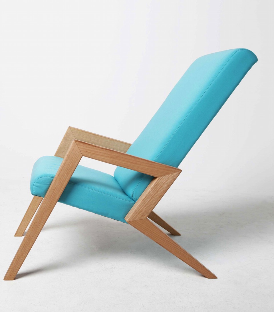
{Aerial Chair by Megan Devenish-Krauth, industrial designer at Megmeg. I want this!}


