


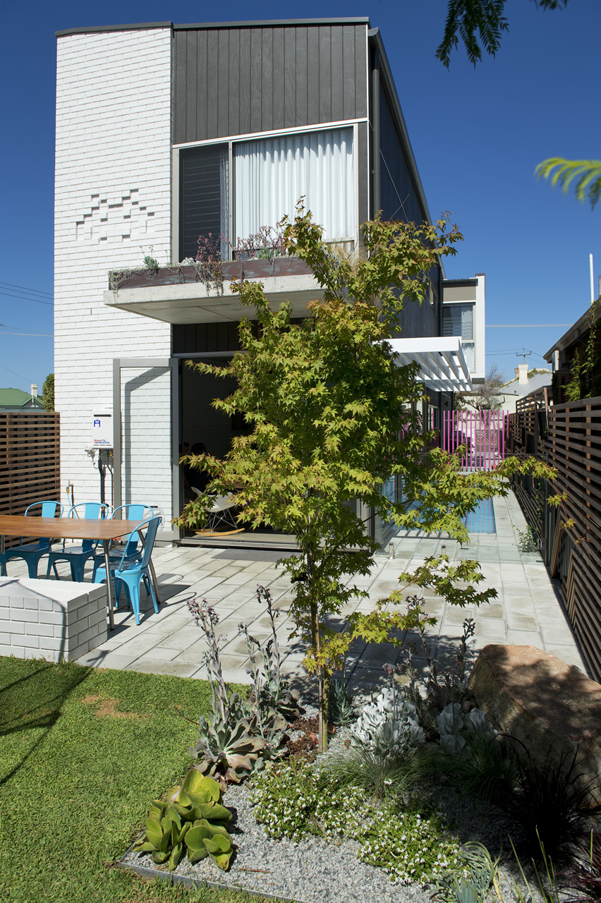
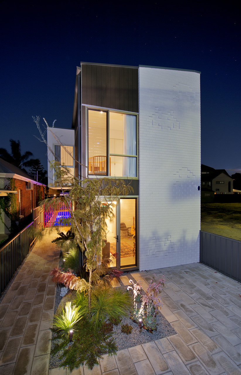
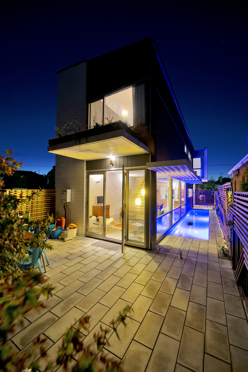
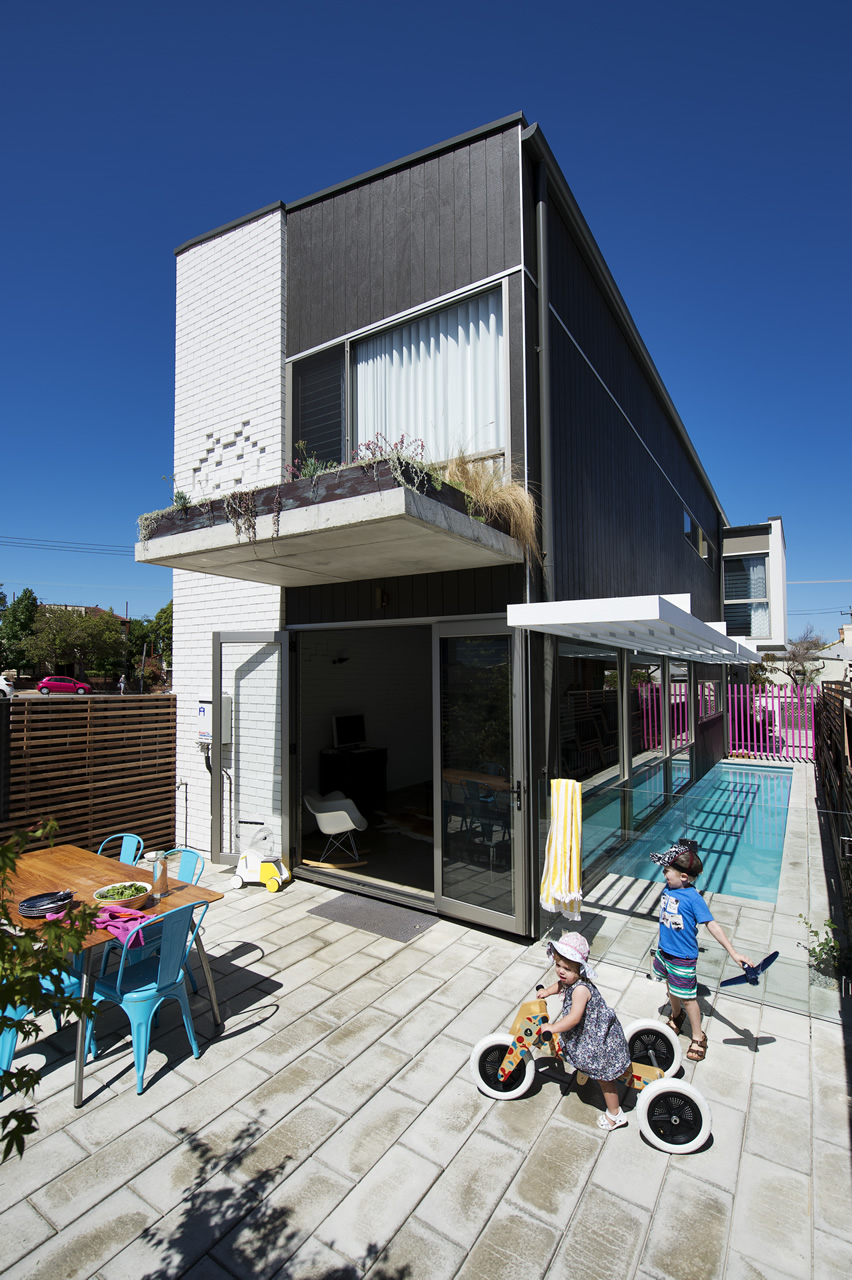
The James Street Residence by Romona Sandon Designs
In designing our home it was important for me to balance the comfort and lifestyle needs of my young family with my environmentally sustainable goals from my work in Sustainable Architecture. I wanted to test if low-cost sustainable design could still be convenient and aesthetically pleasing to the clients (my family). I also wanted to test people's perception of what an eco-house should be or look like.
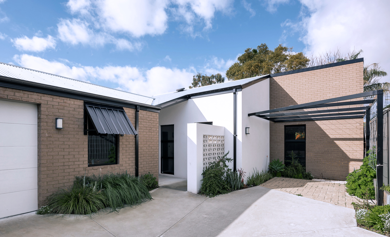
{The James Street Residence, by Romona Sandon Designs, Front facade}
With the kitchen, I wasn't aiming to do anything new or innovative. I wanted timeless and simple. A canvas devoid of colour so it could be injected by way of homewares and appliances and food and family. I guess I never strayed far from what I had always wanted, even showing this colour palette (or lack thereof) in previous posts, such as the Monochrome Kitchen. Cabinetry either flows through to the ceiling or is capped by bulkheads, to reduce surfaces that dust could collect on, reducing potential allergens.
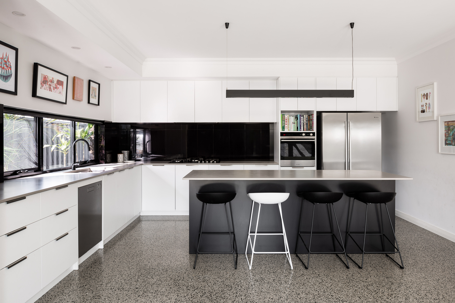
{Monochrome kitchen of the James Street Residence, by Romona Sandon Designs. Image by Dion Robeson.}
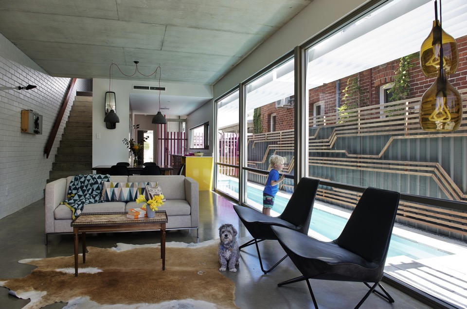
Passive solar design principles were utilised where possible within the council and R-codes on a small rear battle-axe block. Large north-facing windows and doors allow winter sun to penetrate and store heat in the thermal mass of the polished concrete floor. The polished concrete floor was high on my list of features that I really wanted in this house - surprisingly, planning for this quite early on in the design process kept the cost quite comparable with alternative floor coverings.
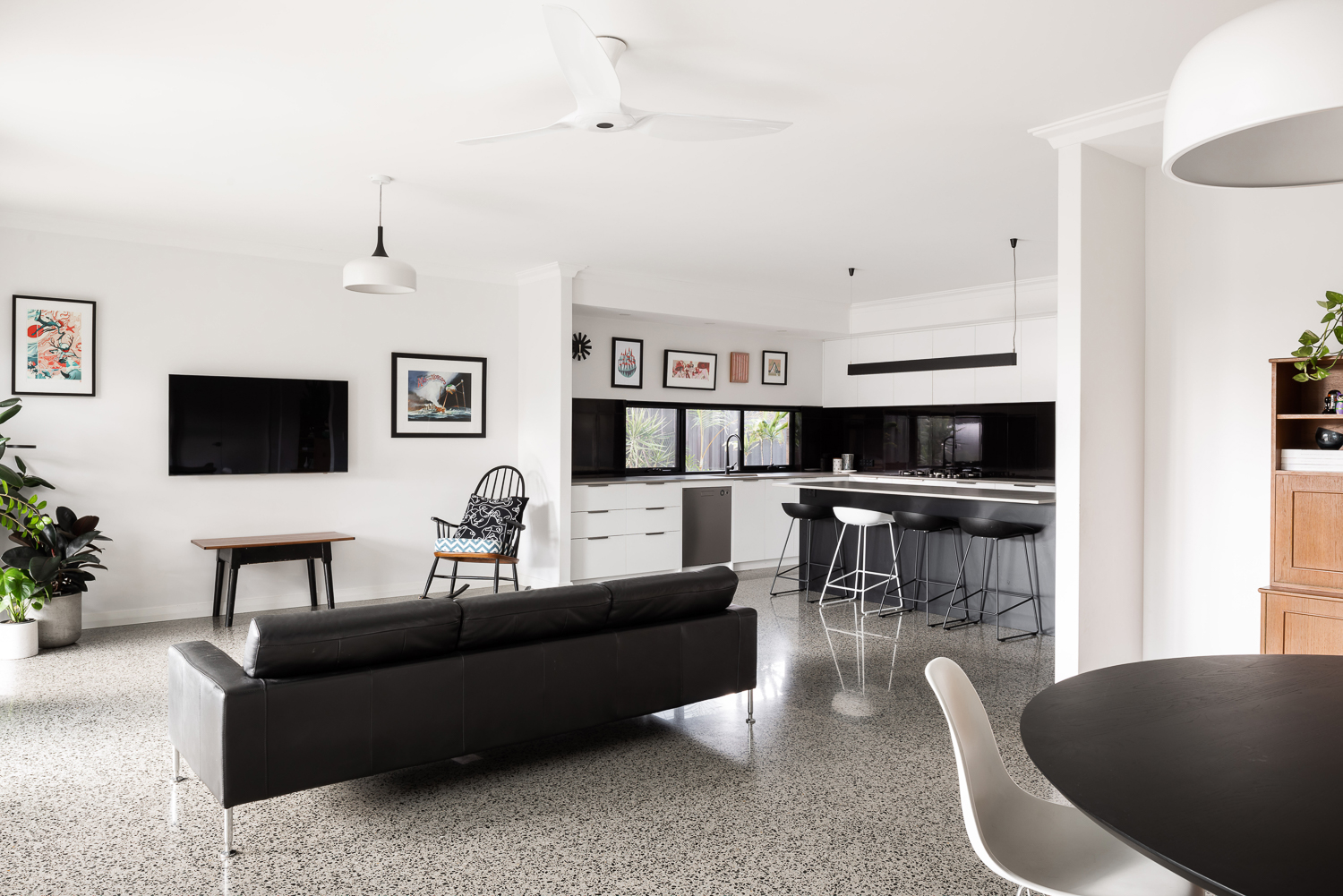
{Open-plan living space of the James Street Residence, by Romona Sandon Designs. Image by Dion Robeson.}
Insulated cavity brick construction helps contain winter heat. Cross-ventilation allows excess heat to be dissipated in summer. A SolarStar solar-powered thermostat-controlled roof cavity ventilation system also rids the building of excess heat when needed. In the two years of occupancy, no active heating or cooling has been necessary except for the Big Ass ceiling fans (their name, as well as description!)
Solatubes with integrated PV (photo-voltaic solar panel) LED day and night lighting is used in conjunction with natural daylight and low-energy lighting elsewhere. Low VOC (Volatile organic compound) paints and carpets are used throughout to reduce sick-building syndrome (off-gassing). PV's sufficiently power the house with a larger inverter for future-proofing. East/west openings were minimised and treated with Low-E glazing where unavoidable, as well as awning shading.
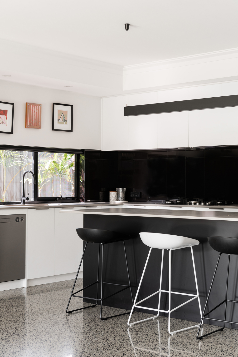
{Kitchen details of the James Street Residence, by Romona Sandon Designs. Image by Dion Robeson.}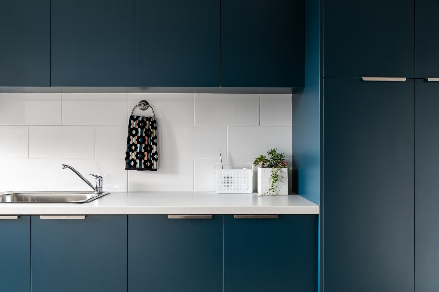
{Laundry details of the James Street Residence, by Romona Sandon Designs. Image by Dion Robeson.}
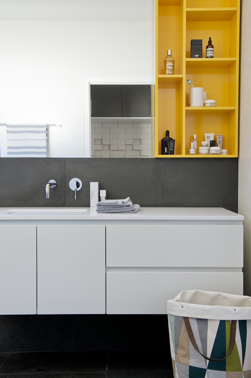
The bathrooms features hobless showers for accessibility. The glass above the half-height wall allows light to penetrate fully into the bathroom to reduce mould build up.
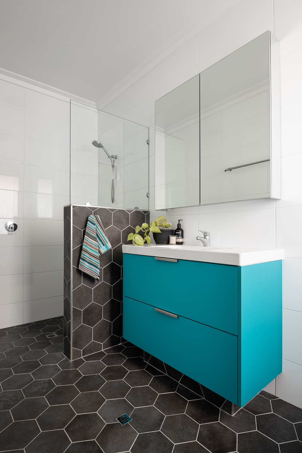
{Master ensuite details of the James Street Residence, by Romona Sandon Designs. Image by Dion Robeson.}
Curtains and blinds are opened and closed to allow optimal light and heat inside, which is also aided by deciduous vine plantings on the north for additional summer shading of openings. While we wait for the grape vine to grow, we use a combination of shade sails and a passionfruit vine that we trim back in winter to allow more sun through. In the mean time, we are drowning in fat juicy passionfruit and the kids adore it!
The garden also considered sustainable design elements in the use of reclaimed breeze blocks for the entry, edible garden courtyard and native or self-sown water-wise planting. Indoor plants are used for improved indoor air quality and visual calm.
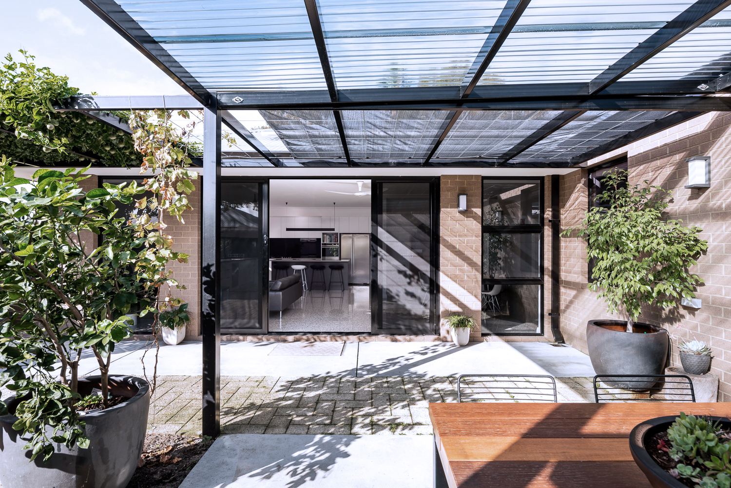
{North-facing, rear exterior of the James Street Residence, by Romona Sandon Designs.}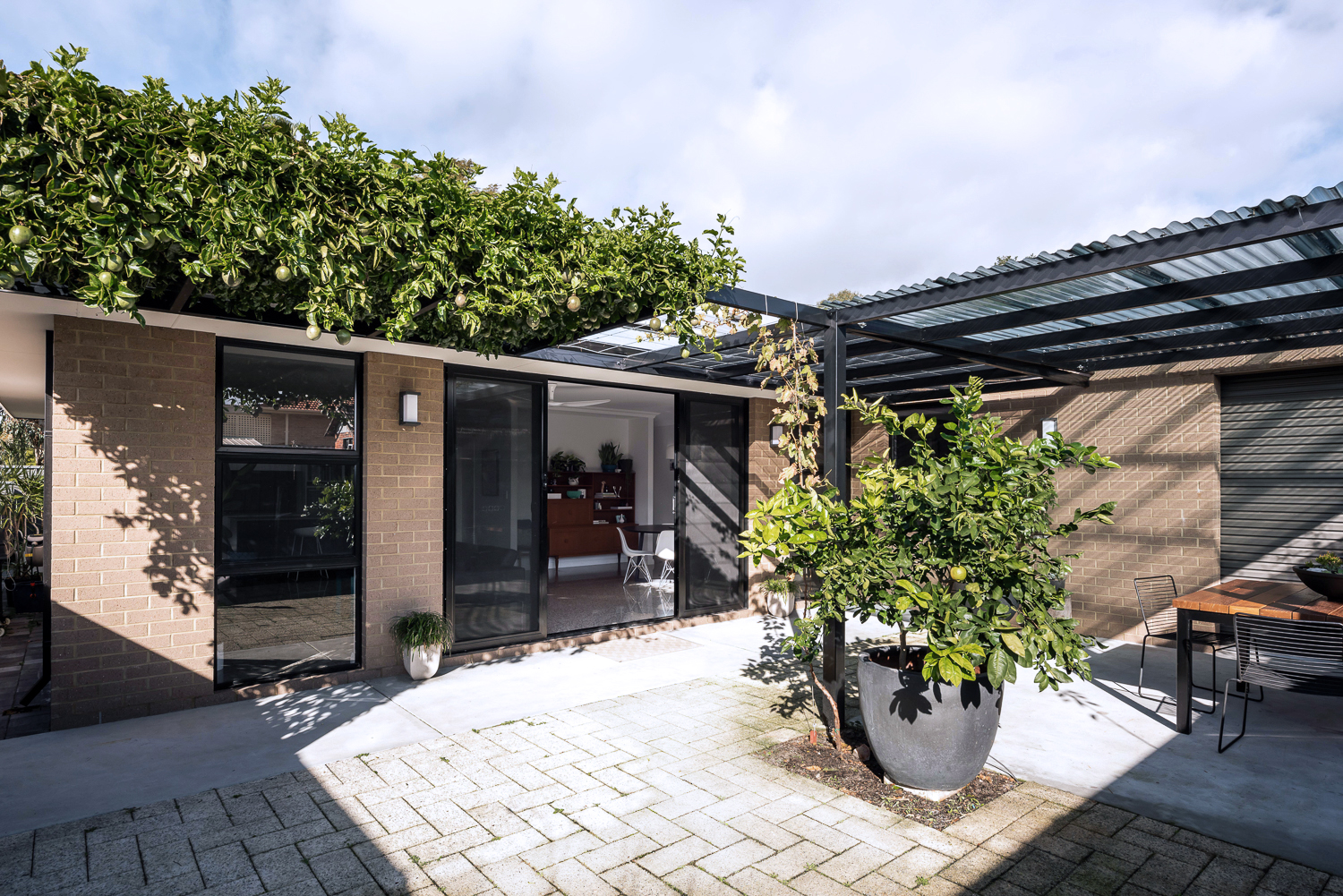
{North-facing, rear exterior of the James Street Residence, by Romona Sandon Designs.}
As a sustainable designer, I see it's discrepancies and the details that could have been improved, with time, money and less council limitations.
As an architect, I see the features that I could have amplified and where I wish our money could have stretched to.
As the client, it is perfect. It is the perfect design for how my family and I live, our budget at this stage of our life, and the place and site that we built it on. It is our home and I'm proud of it.
xo Romona![]()
Local Heroes: Gallery House by Craig Steere Architects
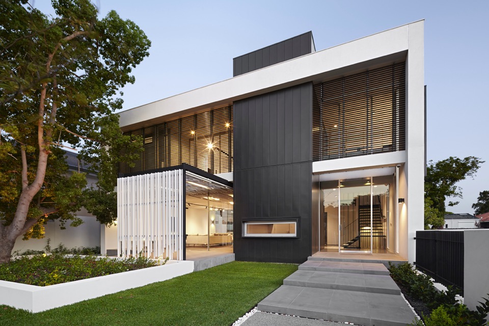
{Complementary materiality of off-white render, stone, timber and zinc cladding}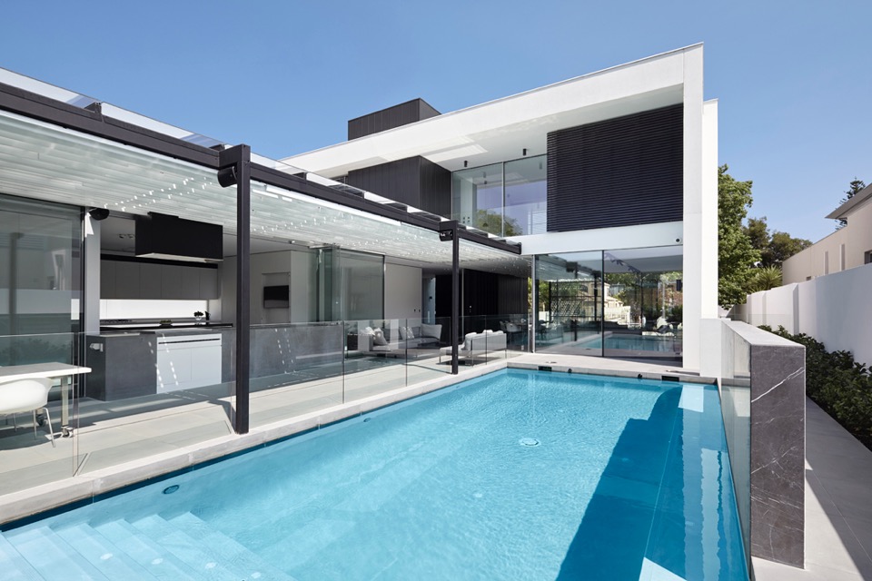
{How beautiful is that pergola?!}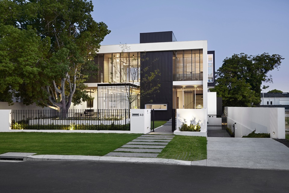
{Classic but contemporary frontage in Nedlands}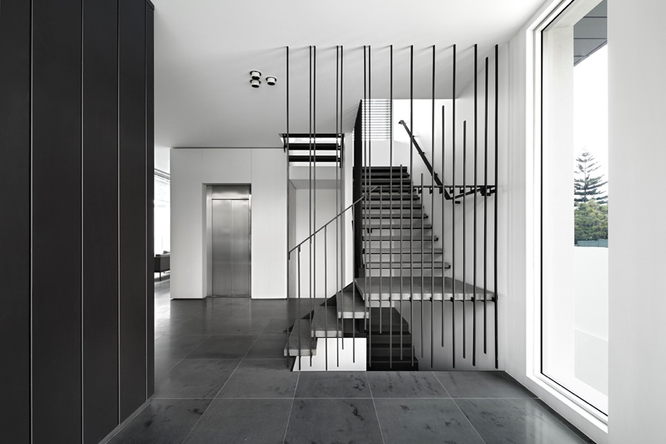
{Crossing linear elements continue with steel balustrade and stone stairs}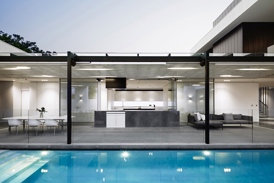
{Visual and physical connection between outside and in}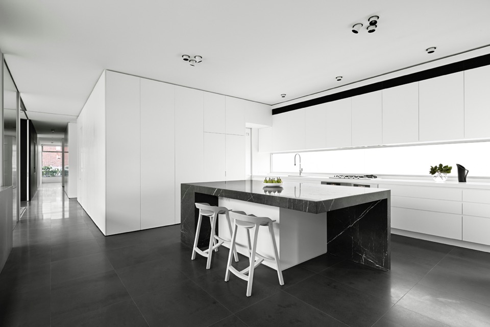
{I love a clean monochrome kitchen. It gives a great base to personalise with homely touches later}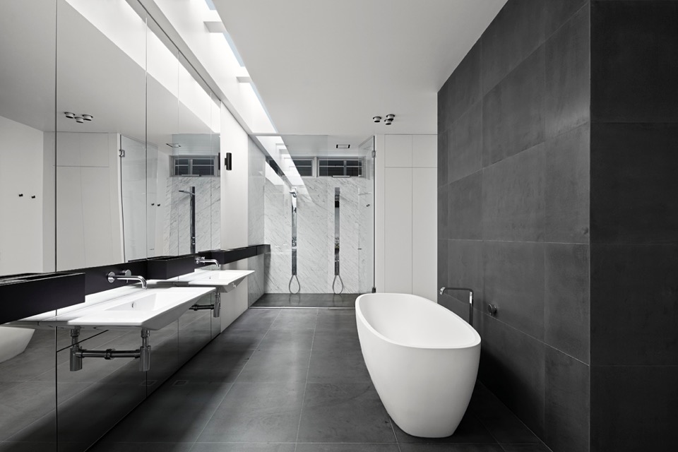
{Simple palette and colour scheme continue through into wet areas}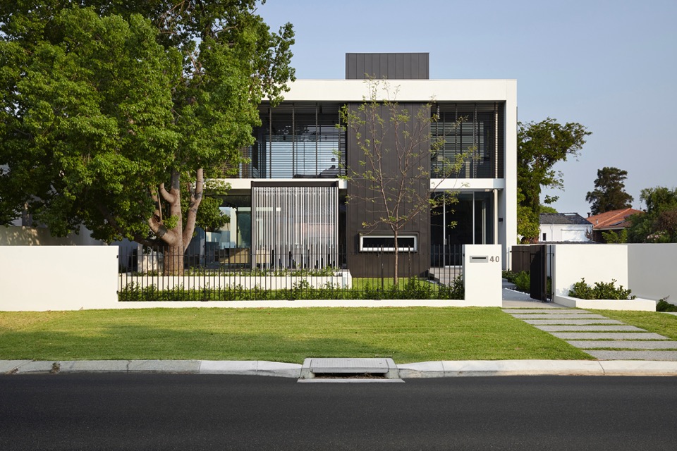
{Overlapping linear elements give aesthetic cohesion}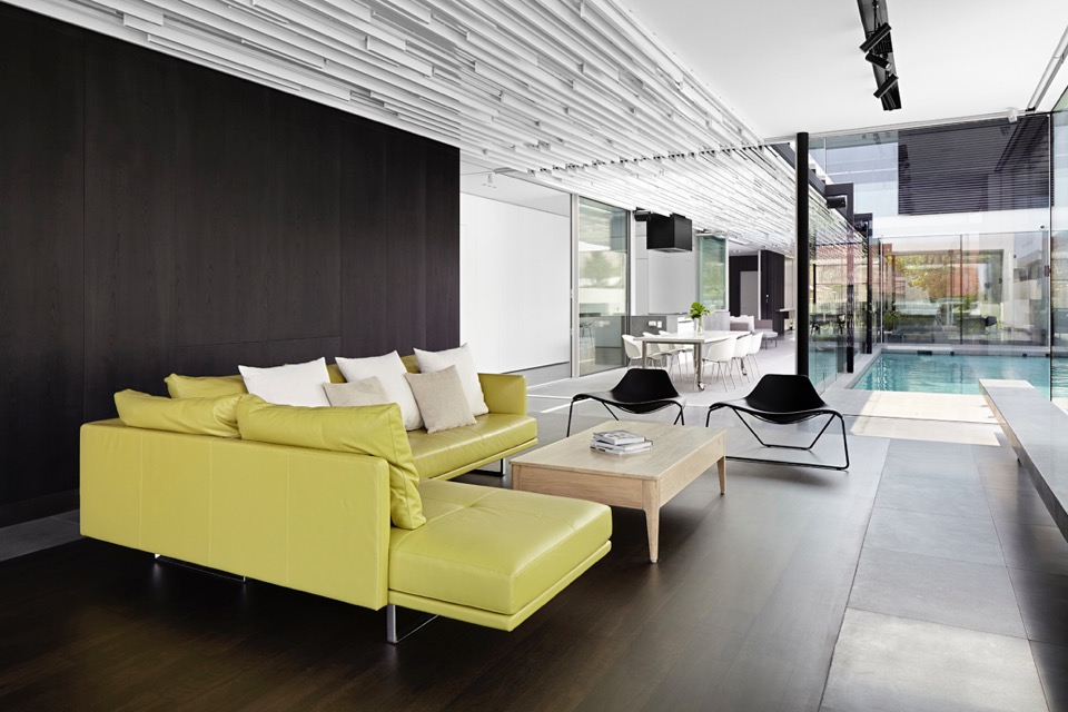
{That ceiling is amazing! I would not have enjoyed drawing up those details, but what a result!}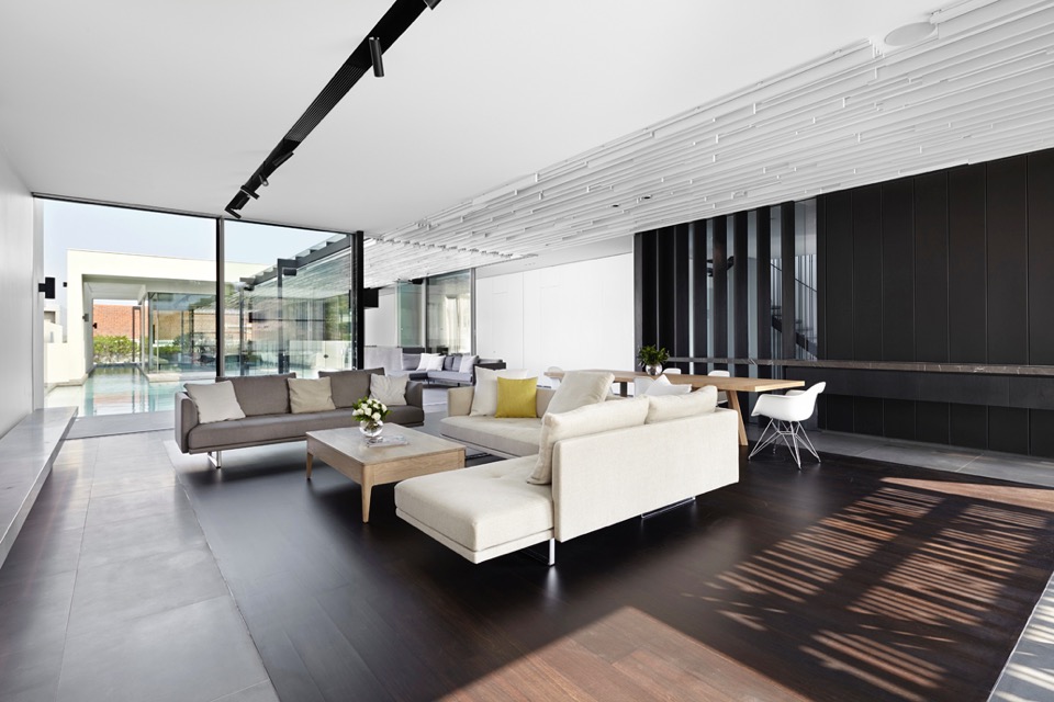
{A touch of warmth to the monochromatic palette, with timber floor insert}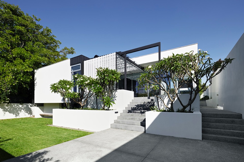
{Sculptural Frangipani trees create organic silhouettes against the linear}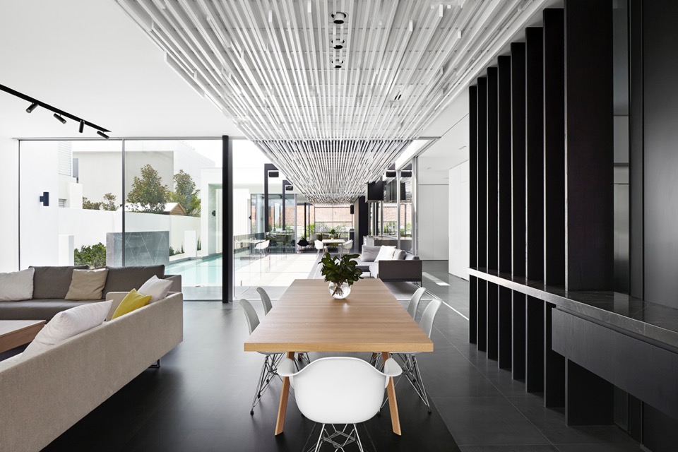
{Ceiling and pergola structures linking the pavilion and courtyard spaces}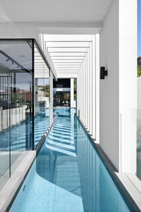
{Visually striking linear elements, that would be amazing to take in from the pool, day or night}
I feel the need to point out that while passive solar design principles have been applied with siting, material selection and active tech, the 6 star energy rating achieved is the NCC (National Construction Code) minimum, since this rating system goes up to 10 stars. Just keep this in mind, when designing or building your next home - time spent aiming for a higher rating early on will save you time and money later on.
Regardless of this small point, this house is a beautiful example of contemporary residential architecture and looks like it would be a joy to live in.
xo Romona![]()
Modern House at Big Hill
House at Big Hill by Kerstin Thompson Architects, near Victoria's Great Ocean Road, is characterised by a strong, triangular form and a restrained, honest material palette. Semi-recessed into the site, the home opens up to take advantage of the surrounding coastal and bush views. I love the simplicity of the smooth natural grey concrete block walls and concrete floor, with the subtle warmth of the plywood accents for storage and partitions. The black ceilings allow them to disappear and push the viewer through the walled space to the spectacular views beyond. Although definitely robust in form, this form creates intimate spaces where light and shadow, cool and warm, smooth and textured complement rather than compete.
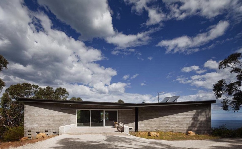
{The dark roof form helps blend the house into the bush landscape}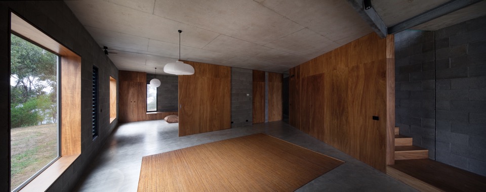
{Contrasting smooth cool concrete floors and natural grey block walls with warm continuous blackbutt plywood Armourpanel surfaces by Big River} 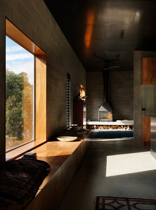
{Dark picture frame windows are recessed to create deep plywood window seats for soaking up the surrounds}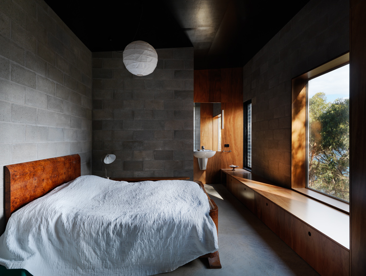
{Bedroom with Armourpanel plywood storage doubling as deep window seat}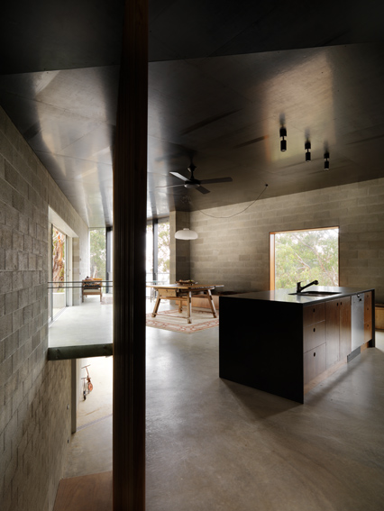
{Open kitchen kept simple with concrete and dark timbers}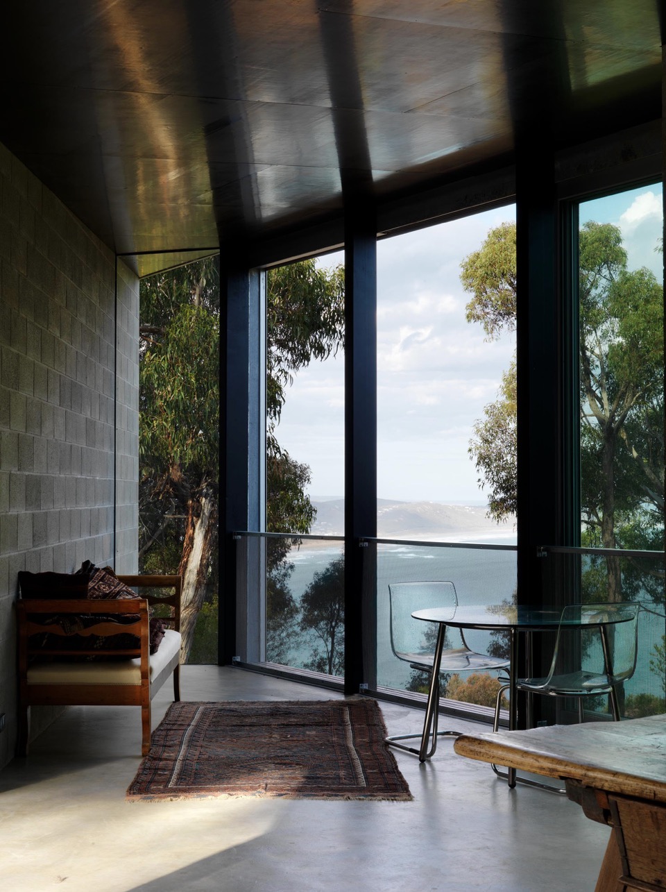
{Space furniture in this living space retains the view as the hero}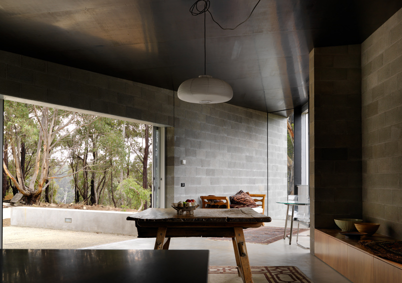
{Opening to the bush beyond}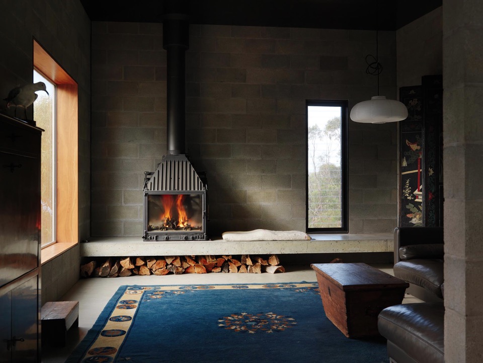
{Insitu concrete step doubles as seat and storage}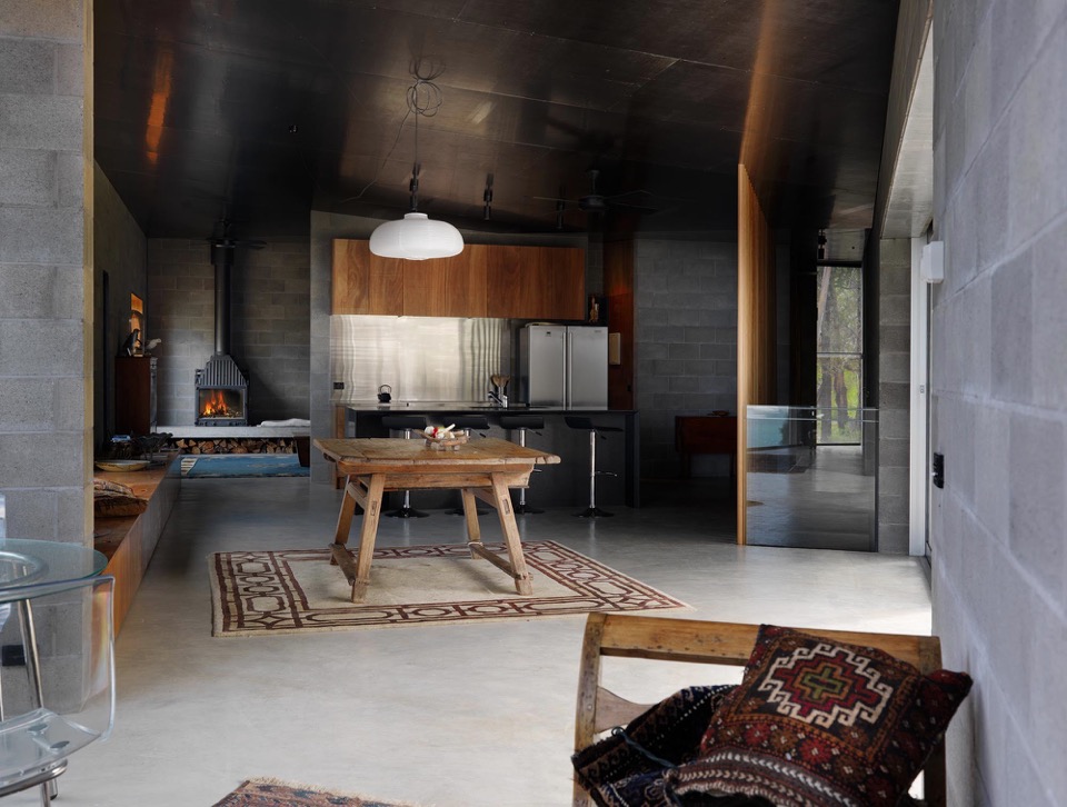
{Custom plywood joinery doubles as seating and storage, minimising need for additional furniture}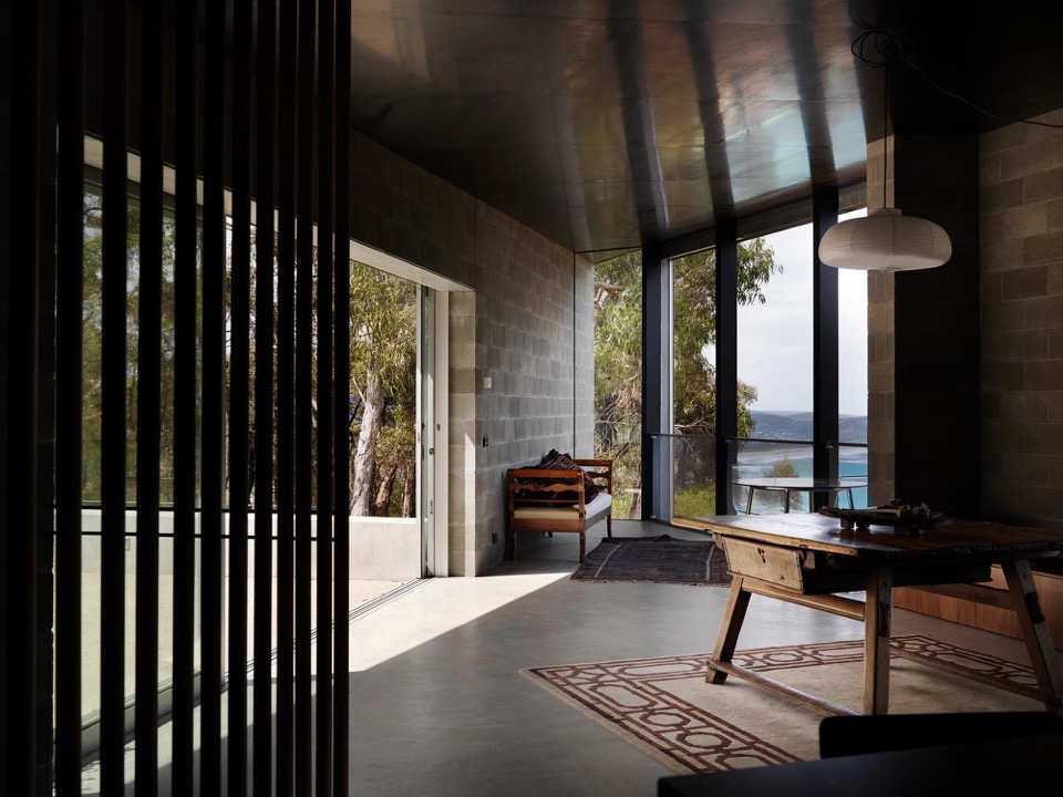
{Smooth concrete floors flow to outdoor spaces}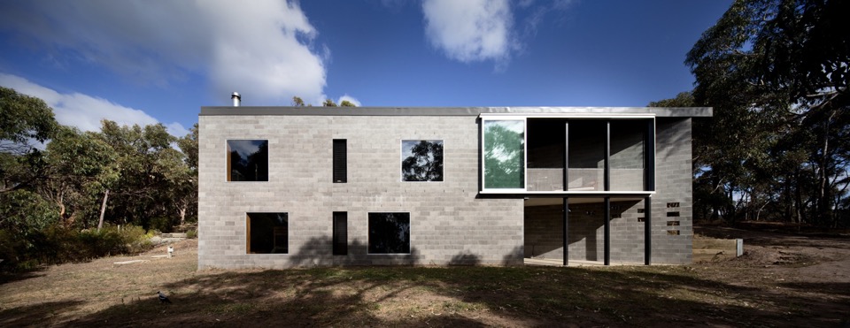
{Robust form to lower terrain}
Images courtesy of Kerstin Thompson Architects and photographed by Trevor Mein.
xo Romona![]()
Local Heroes: Florence Street by KADA
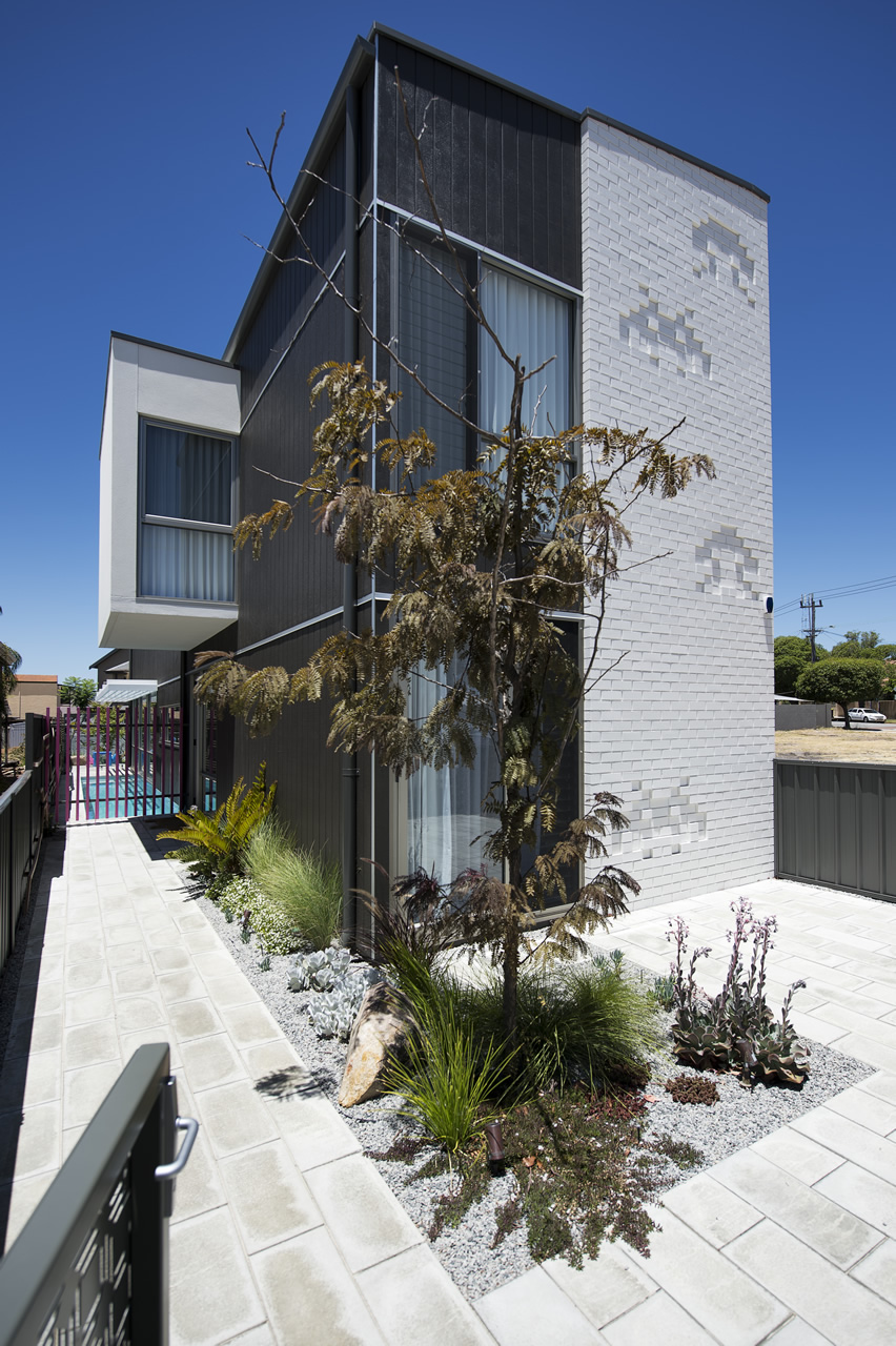
I love how the home has fun elements scattered throughout, in the form of bright sunny pops of colour or embossed brickwork space-invaders. How could you not be happy in this house?
For more information on the Florence St project visit Klopper & Davis Architects.
xo Romona![]()
Local Heroes: Marimekko House by Ariane Prevost
This stunning multi-material home in Perth suburb of Mosman Park is by the outrageously talented Ariane Prevost. Architect's designing and constructing for themselves (with of course plenty of time, patience, money, attention to detail, great trades and an agreeable partner) can result in the most amazing homes! Her abstract use of seemingly mundane materials comes together in an exciting collection of interweaving spaces. And how great is that kitchen?! A simple palette of colours taken from the raw materials and textures of the building, layered with artwork and those amazing Marimekko fabric covered soft furnishings. These fabrics and patterns inspired the enveloping cor-ten screens that give the house its name.
{Cor-ten Marimekko-inspired cut screens to the front facade allowing privacy to this open-planned home. Image by Heather Robbins of Red Images Fine Photography via House Nerd (an awesome Perth blog you should also check out!)}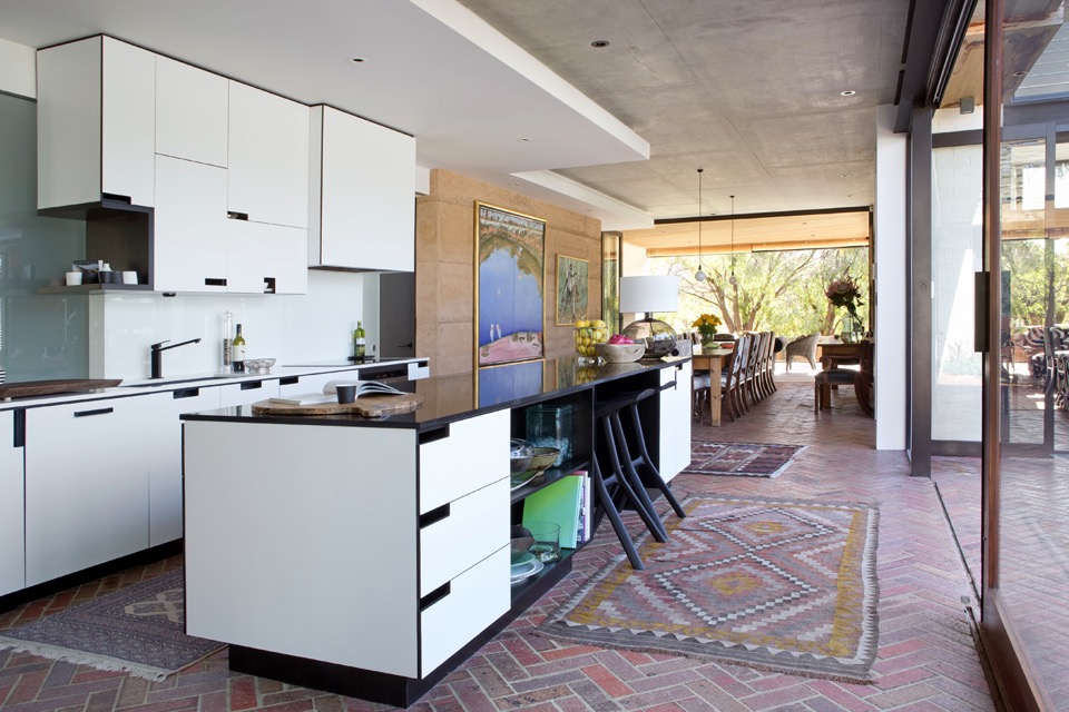
{Brick herringbone floors throughout internal spaces allow seamless blending to exterior zones. Image by Angelita Bonetti}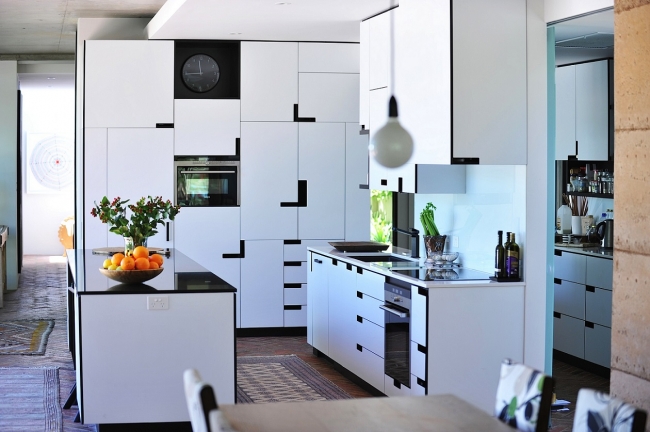
{That stunningly detailed monochrome kitchen! Image by Red Images}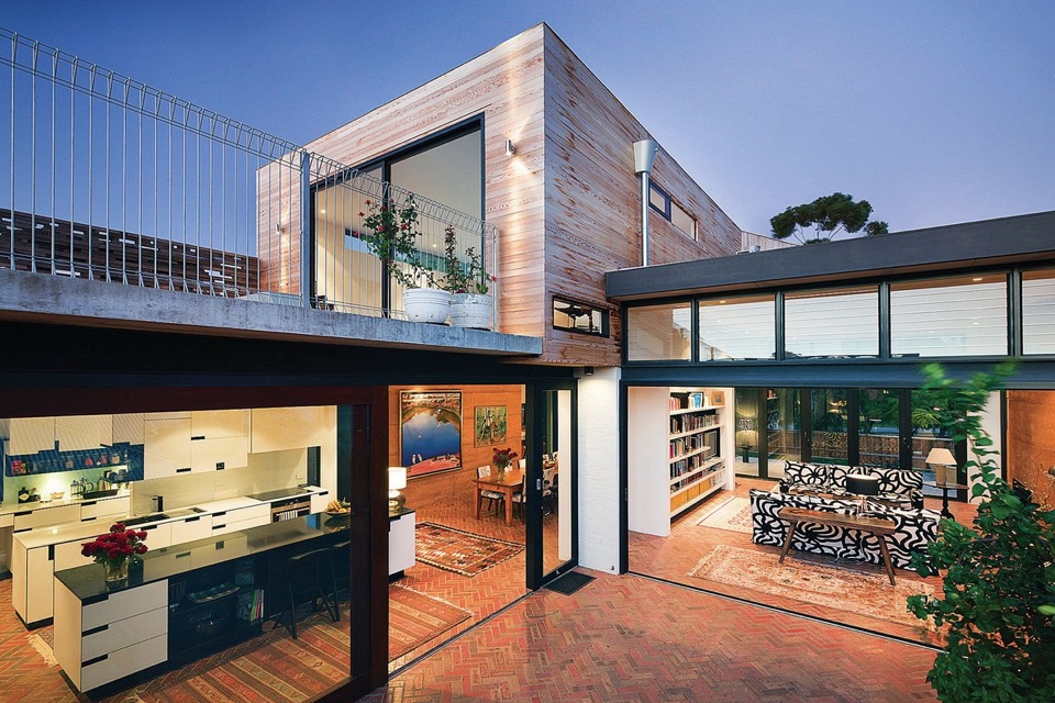
{Creative use of typically common materials adds interest and worth beyond the actual costs}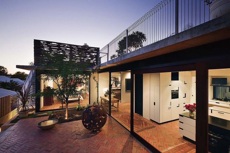
{Love that monochrome, tetrus-like joinery patterning. Working closely with cabinet makers and joiners resulting in stunning outcomes}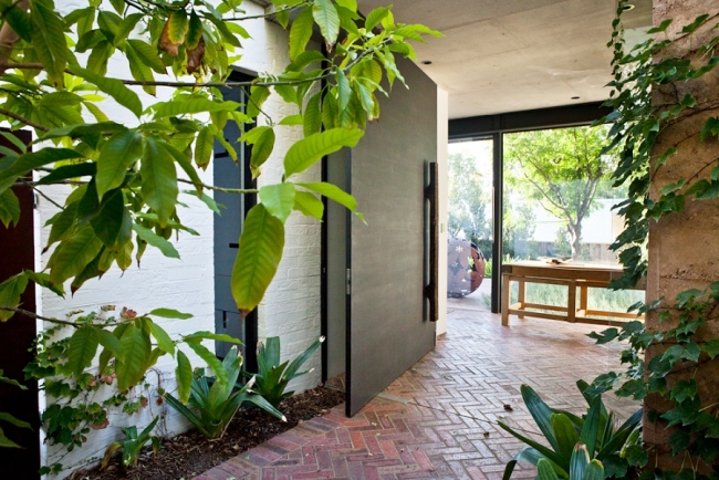
{Massive front door with handle made from a piece of old bridge timber. Image by Red Images}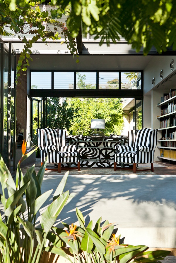
{That monochrome Marimekko fabric! Image by Red Images}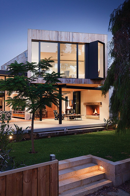
{Open facade and spaces blurs the line between inside and out. Image by Bo Wong}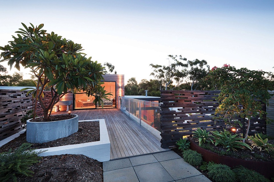
{Landscaped roof terrace with screens from reclaimed roofing timbers}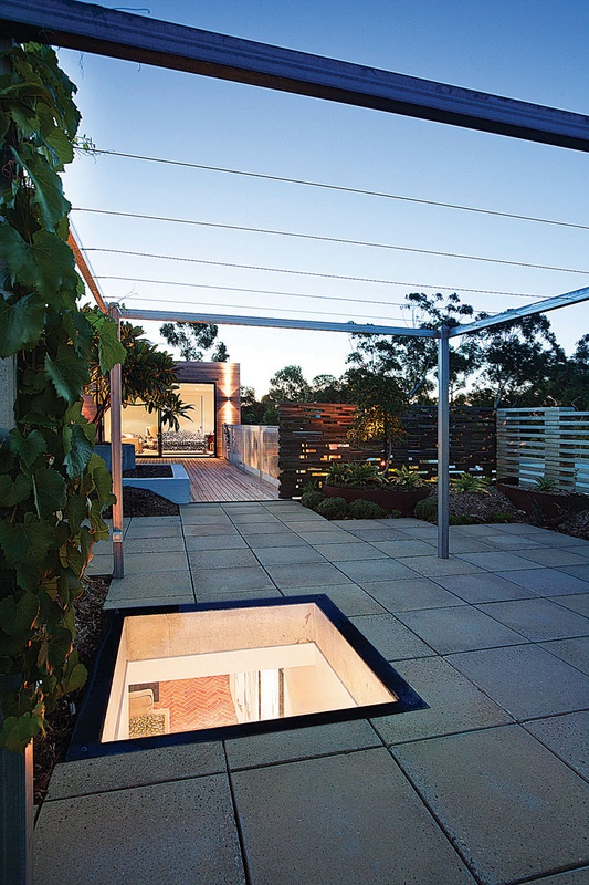
{Deciduous grape-vine pergolas for summer shade allowing winter sun penetration}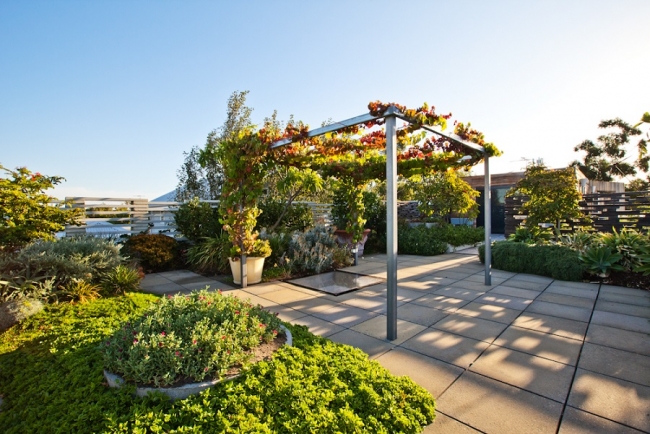
{Roof terrace at a later date, with succulents and vines now fully established and so lush. Image by Red Images}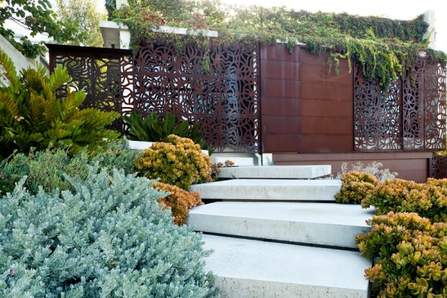
{Trailing concrete steps through lush succulents. Image by Red Images}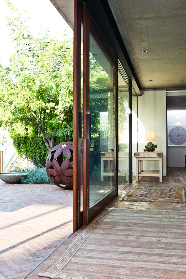
{Blurring the divide between outside and in. Image by Red Images}
It must be amazing to live in such an open and flowing home, although I must admit that my severely-mosquito-attracting skin does shudder just a little. Might just have to plant a little extra Lavender, Spearmint and Lemongrass around.
Hope you enjoyed!
xo Romona![]()
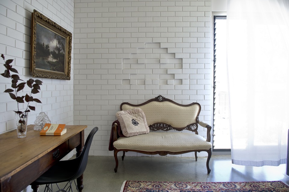
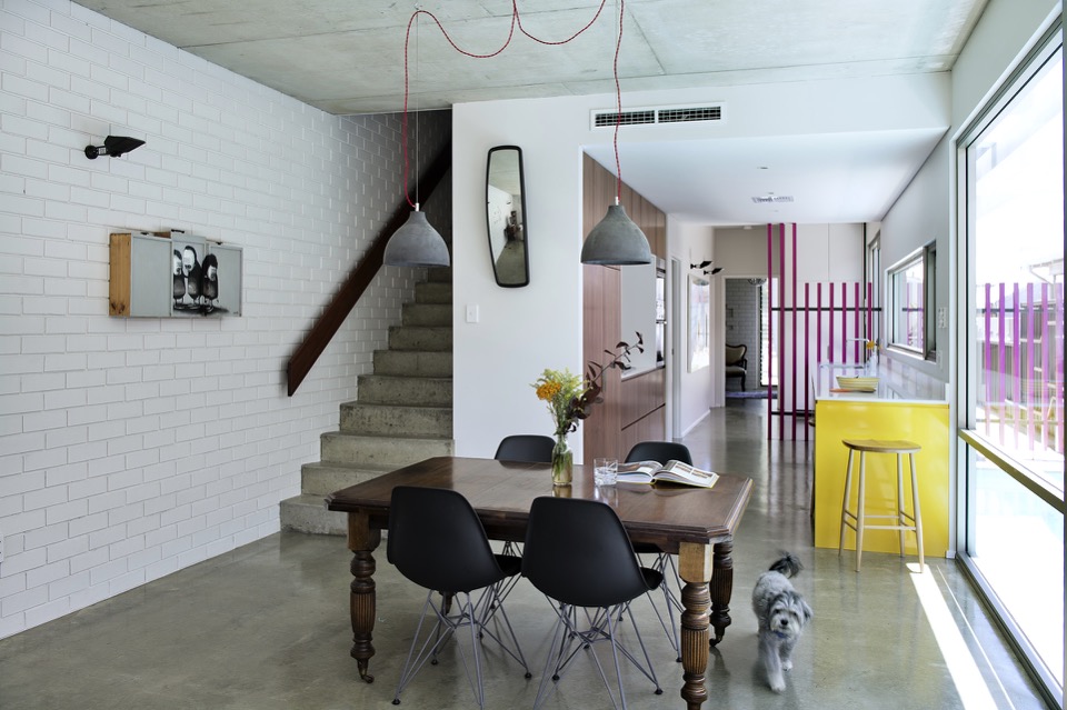
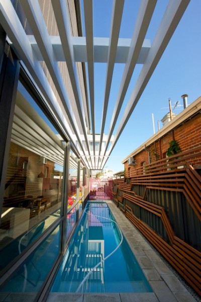
Local Heroes: Triangle House by Robeson Architects
But I digress, this isn't a lecture on residential sustainability, rather the exploration of something beautiful born out of perceived limitations. Triangle House on a tight 180m2 triangular block in Mt Lawley, Perth showcases the ingenuity of Robeson Architects and to me is one example of Perth architecture at an international standard. What better way to start this series than with a project that initially grabbed me on Pinterest, but really had me hooked when I found out it was not only Australian, but super-local (Mt Lawley!) and a fellow female architect. Enjoy!
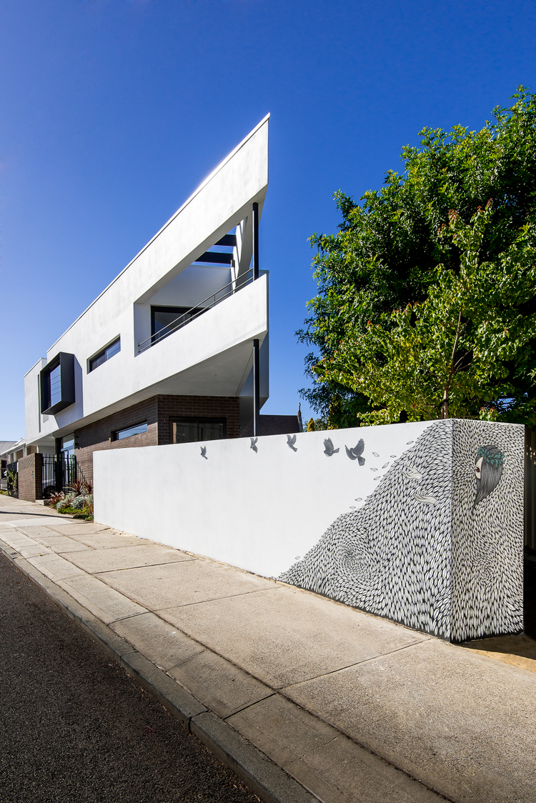
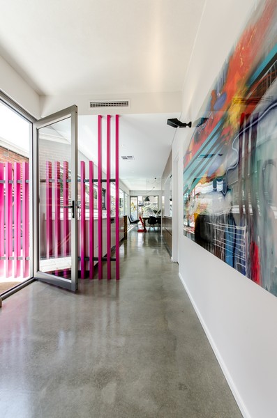
{The stunning triangular form juts out with supercool artwork below at street level by Robert Jenkins (@theblackmountains). So recognisable to me now that we have a wall of his around the corner in Bassendean, and you may have seen me go a little insta-happy over}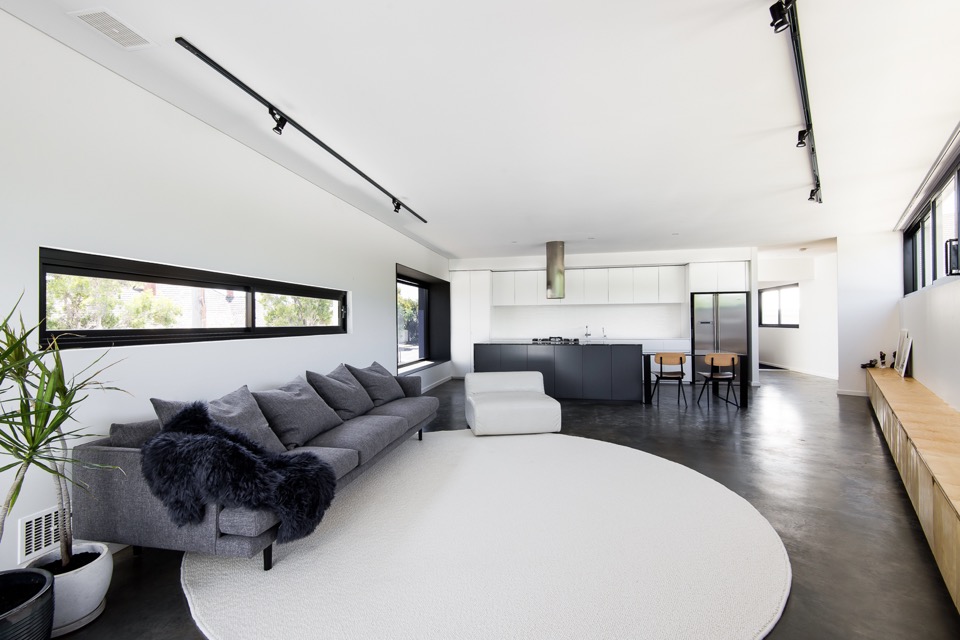
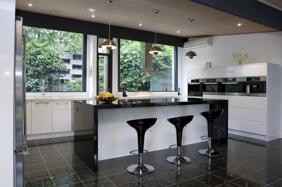
{This was one of the first images that made me fall for the place. Of course those who know me, know my tendency towards black, white and grey, but it also has all my other loves - big white kitchen, contrasting black frames, deep polished concrete flooring, minimal timber accents, big snuggly Jardan grey wool couch, indoor potted sculptural Dracaena, statement linear ceiling lighting, even the furry throw - my god Simone, you can do no wrong in my eyes! In fact, if I plonked my gorgeous tan fur-baby on that rug, the picture would be complete}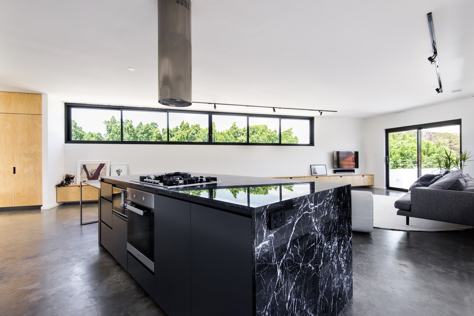
{Brutal black kitchen island wrapped in electric-veined Nero Marquita marble adds drama to the monochromatic space}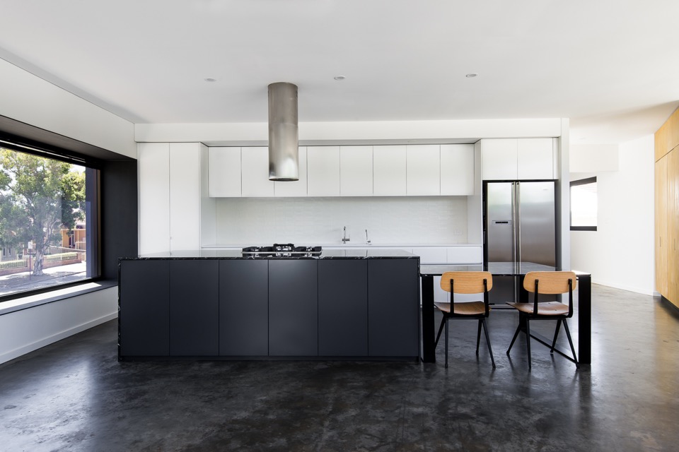
{Just a beautiful kitchen in blocked monochrome, and I love that massive projected north-facing window, done in one-way glass boxed out in steel for privacy}
{Extending the black-framed picture window to the heavens with a waterfall skylight}
{Sharp-edged deck space making the most of a difficult site and adding a bit of drama to Vincent Street}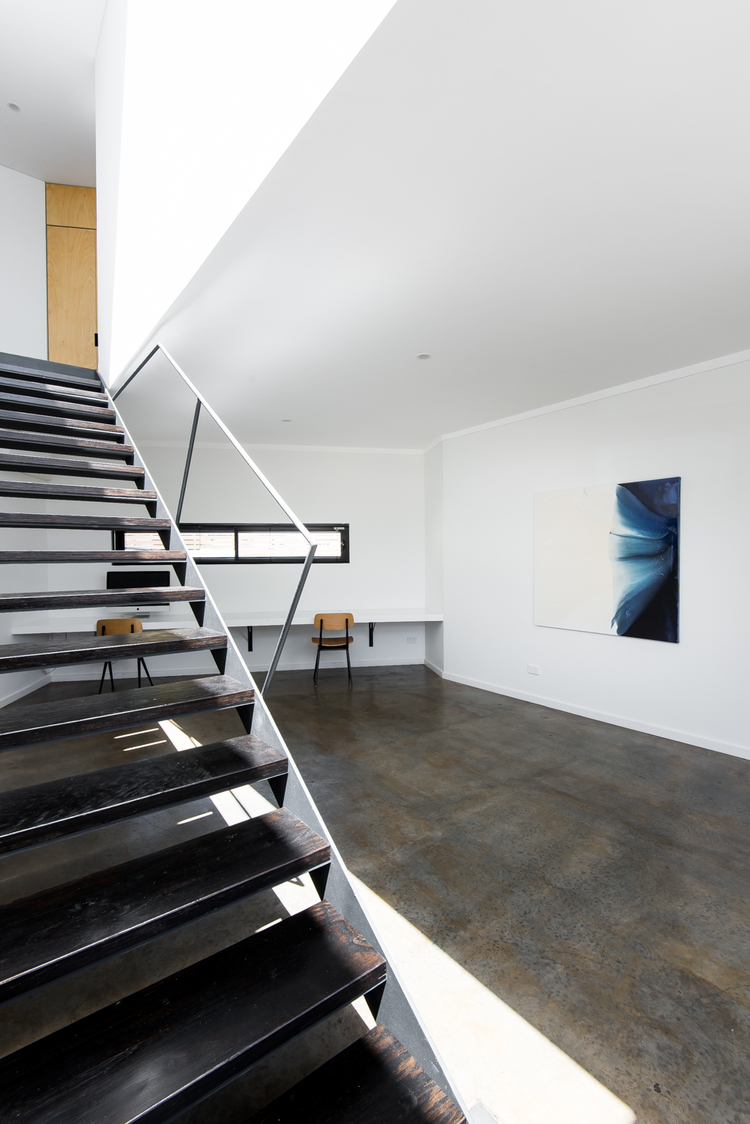
{Clean gallery feel to the downstairs office softened by multiple but complementary textures and material finishes, like the burnished concrete floor, blackened LVL stair treads and black steel}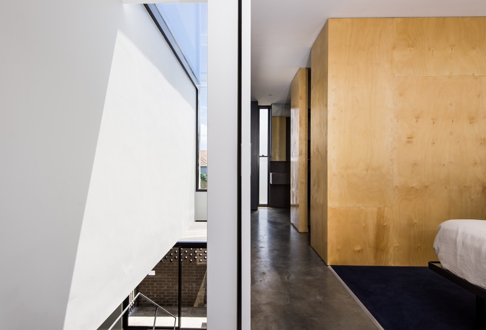
{Simple but inspiring void spaces and linear movement}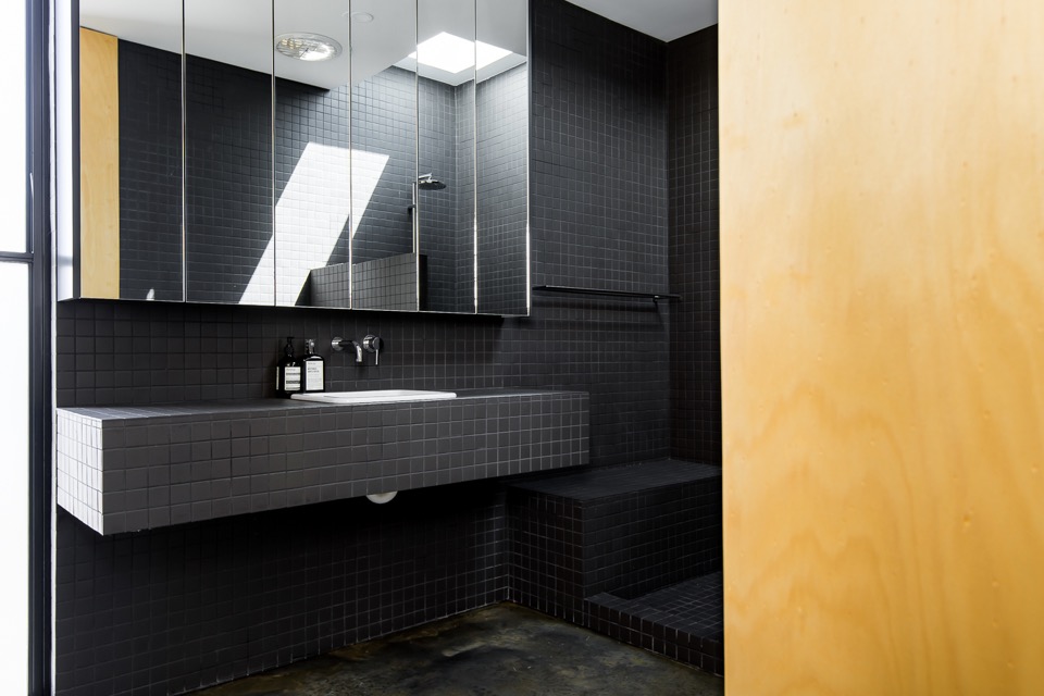
{Clean and minimal bathroom in continuous matt charcoal tile with clever hidden storage. Love the concrete bathroom floor, but I'm unable to convince my husband that I won't snap my other leg if we have that} 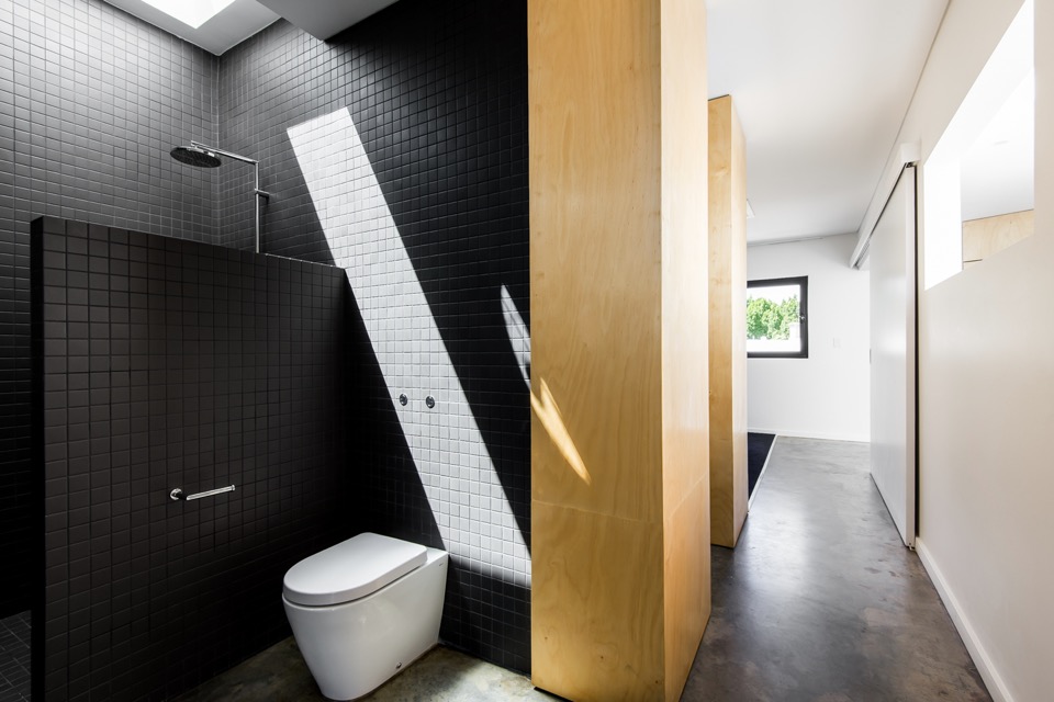
{You know it's good when even the dunny makes you go Oooo}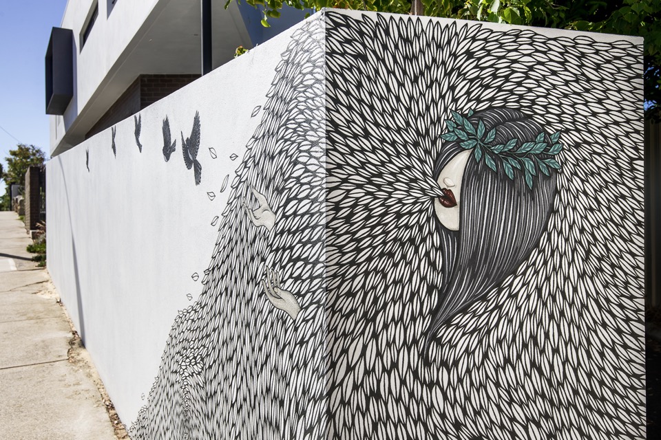
{Detail of the cool mural work at Vincent street level by Robert Jenkins}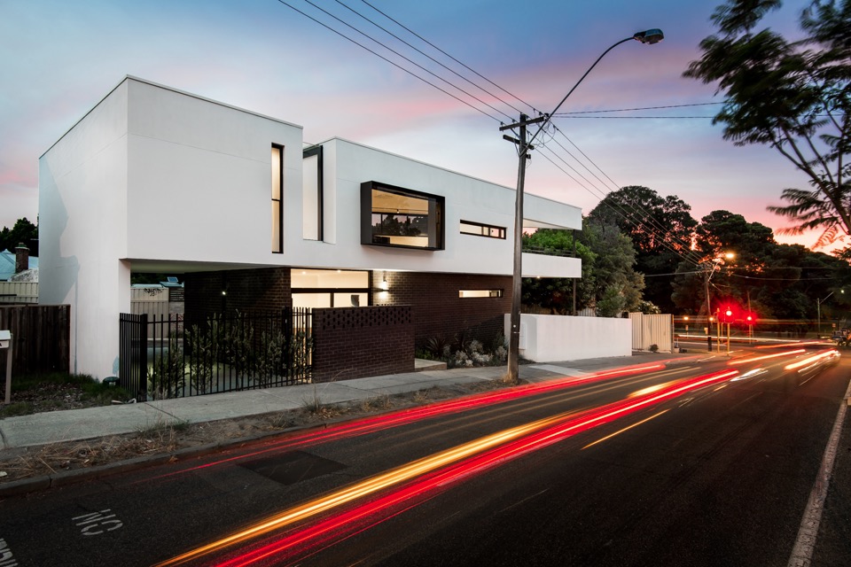
{Image by Dion Photography}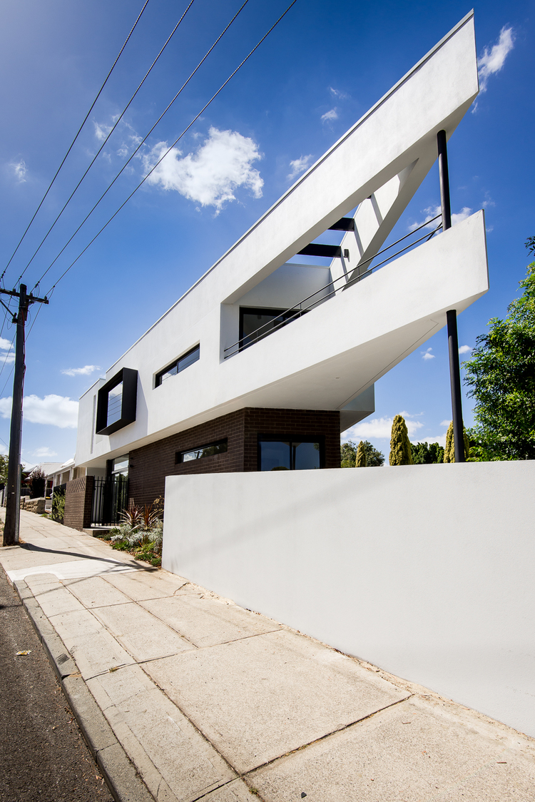
{Image by Dion Photography}
All images are from Robeson Architects (big thanks Simone) and Dion Photography. If my house turns out even half as nice, I'll be wanting some shots done by those guys. Simply brilliant!
Doesn't it make you proud to have some lovely architecture in Perth (and Australia)? What are your thoughts on this place?
I'm hoping to showcase a bunch of other local talented architects and their projects soon, so feel free to let me know if there are any that stand out to you.
Hope you enjoyed!
xo Romona![]()
Good Kitchen Design: How to make the most of your space
Your kitchen should be designed to work in sync with your lifestyle, yet too often it is the opposite way around. As home design continues to revolutionise itself the modern kitchen is a world away from its past incarnations. Previously seen as a room of preparation and storage, the modern kitchen is open, inviting and acts as the epicentre of the home, truly the heart of the modern family unit. This rise in status has resulted in an increased desire for a kitchen that reflects upon the household, effective and efficient. Check out these newest kitchen design rules to mould your own classic, modern kitchen.
Establish your Design Reasoning
The first and most important design rule is to decide what motivation you have for your kitchen. This can be divided into three broad categories; Functionality - If your kitchen has inadequate bench, storage or stove space you may be inclined to re-design. Style - If you're looking to update your kitchen with modern cabinetry, appliances or colour schemes. Value - If you're looking to add additional value to your home for re-sale value. Without establishing your design motivation you'll end up with a scattered and poorly functional kitchen.
Start with the Kitchen Triangle
The Kitchen Triangle, or 'work triangle' as defined by the National Kitchen and Bath association, is an imaginary line drawn between the three vital work stations of your kitchen. The sink, oven top and fridge. You should be able to easily transition to each centre without the space being cluttered or too far apart (not more than three metres between each point).
Aesthetics
If the Kitchen Triangle is a symbol of an efficient kitchen, your surfaces, cabinetry and appliances will represent the style. Try to maintain streamlined surfaces, cabinets should reach the ceiling or run flush with a bulkhead. This limits wasted space which impairs your design with inefficiency, as well as preventing a recess for catching dust. Consider integrating appliances within the design through the use of integrated front panels. This technique can blend a dishwasher into the overall style of your kitchen seamlessly.

Lighting and Colour
Lighting and colour are also key components of strong kitchen design. Be aware that colours may dictate mood in certain homes. Neutral palates are thought to create calm while using bright, bold colours on splashbacks can create a more direct aesthetic. When it comes to lighting, consider using energy efficient LED’s or compact fluorescents in work spaces. Adding dimming switches or floor lights can also be used to create mood and atmosphere at your discretion.
Designing your ultimate kitchen, a room which is both effective and efficient while retaining a warmth, joy and connection, is a massive undertaking. As the centre of your families health and wellbeing there are a range of factors from design, to mathematical and aesthetic, which will dictate your finished product. Consider the needs of your family and your home and with these hints and tips you’ve taken the first step towards your perfect, designer kitchen.
I hope you found these kitchen design tips useful. Let me know what you think ![]()
xo Romona
* All images from The Kitchen Place.![]()
Follow my blog with Bloglovin
A beginner’s guide to illuminating your home
All too often, lighting is seen as merely an interior design afterthought. However, with a little creative thinking, lights can dramatically enhance the look of homes. If you’re new to property design and you want to make the very most of the illuminations now available, take a look at these simple but effective suggestions.
Maximise natural light
Firstly, bear in mind that it’s not just artificial lights that can help to boost the appeal of your property. Sunlight can also play a major role in this. By allowing solar rays to stream into your rooms, you can give them a more spacious, airy and open feel. With this in mind, it’s important to select suitable window dressings. One great way to ensure you make the most of the natural light on offer is to take advantage of the sunscreen roller blinds available from window furnishing specialists like The Blinds Company. These products filter natural light to keep rooms bright while also reducing heat and glare, and stopping harmful UV rays from entering your home.
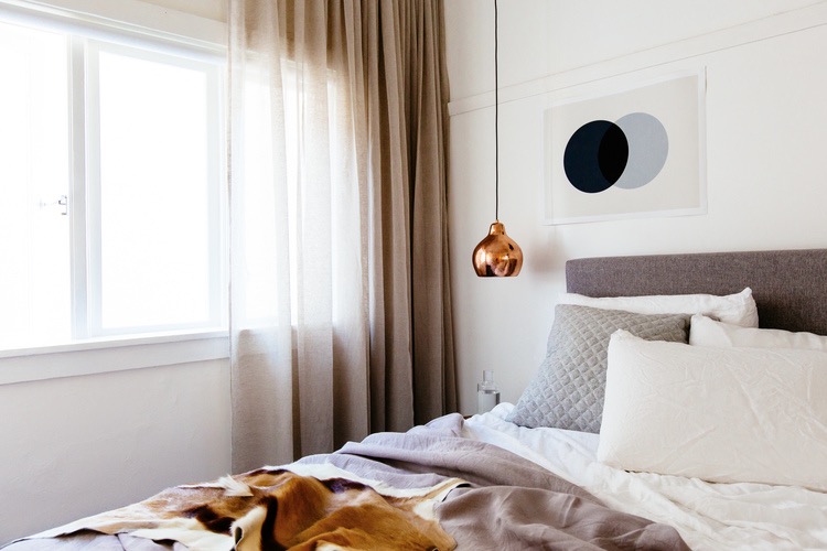
{Full height sheer curtains provide light, texture and interest to this bedroom space in Bondi by C+M Studio. Photography by Caroline McCredie}
The Monochrome Kitchen
My obsession at the moment is designing the perfect kitchen for my family - it needs to be robust enough to handle the two boys, clean and simple enough for my ‘minimalist’ husband and eclectic enough to suit my many varies tastes. Easy, right!
I have always loved a black and white kitchen, the bar constantly moving on the proportional scale between the two. A few years ago, I would have been happy with almost all crisp, glossy white, but I have been swinging towards textured black with glossy white accents lately, as it seems so many of you are as well. Here are a few (and by that I mean heaps!) of black and white kitchens to get you inspired.
{Loved this even before I saw it was Greg Natale’s work - should have guess that from the pattern and mouldings but I always end up loving his style}
{Striking Kitchen in 33 Mackenzie Street Tower Melbourne By Elenberg Fraser}
Black and White
{Harbour House by uber-talented Arent&Pyke. How yum is that Christian Liaigre console table?!}
Terrariums and Potted Green
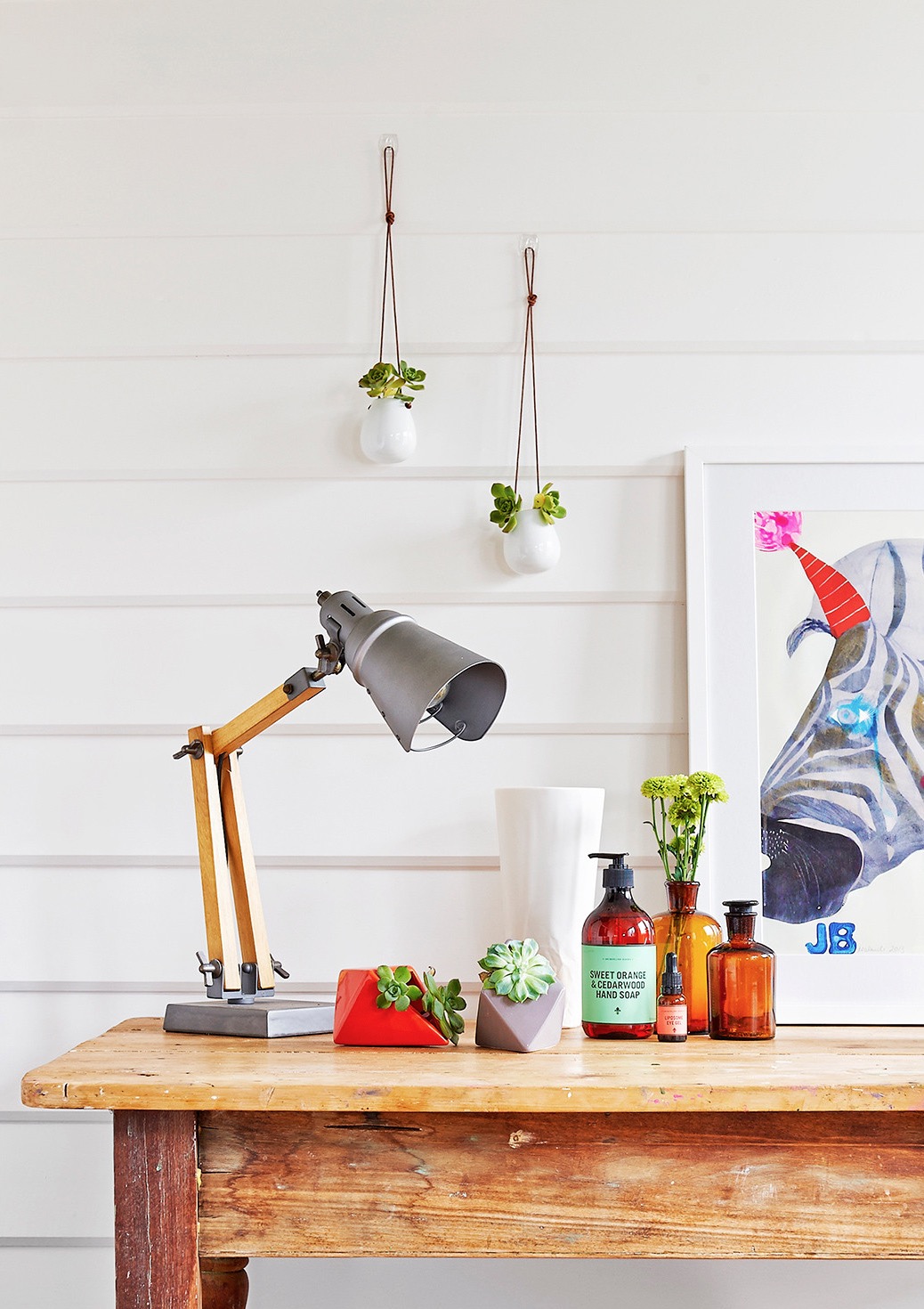
{Ceramic Diamond Planters on table and Petite hanging Vase on the wall, both by LoveHate and available at Cranmore Home}
Concrete jungle
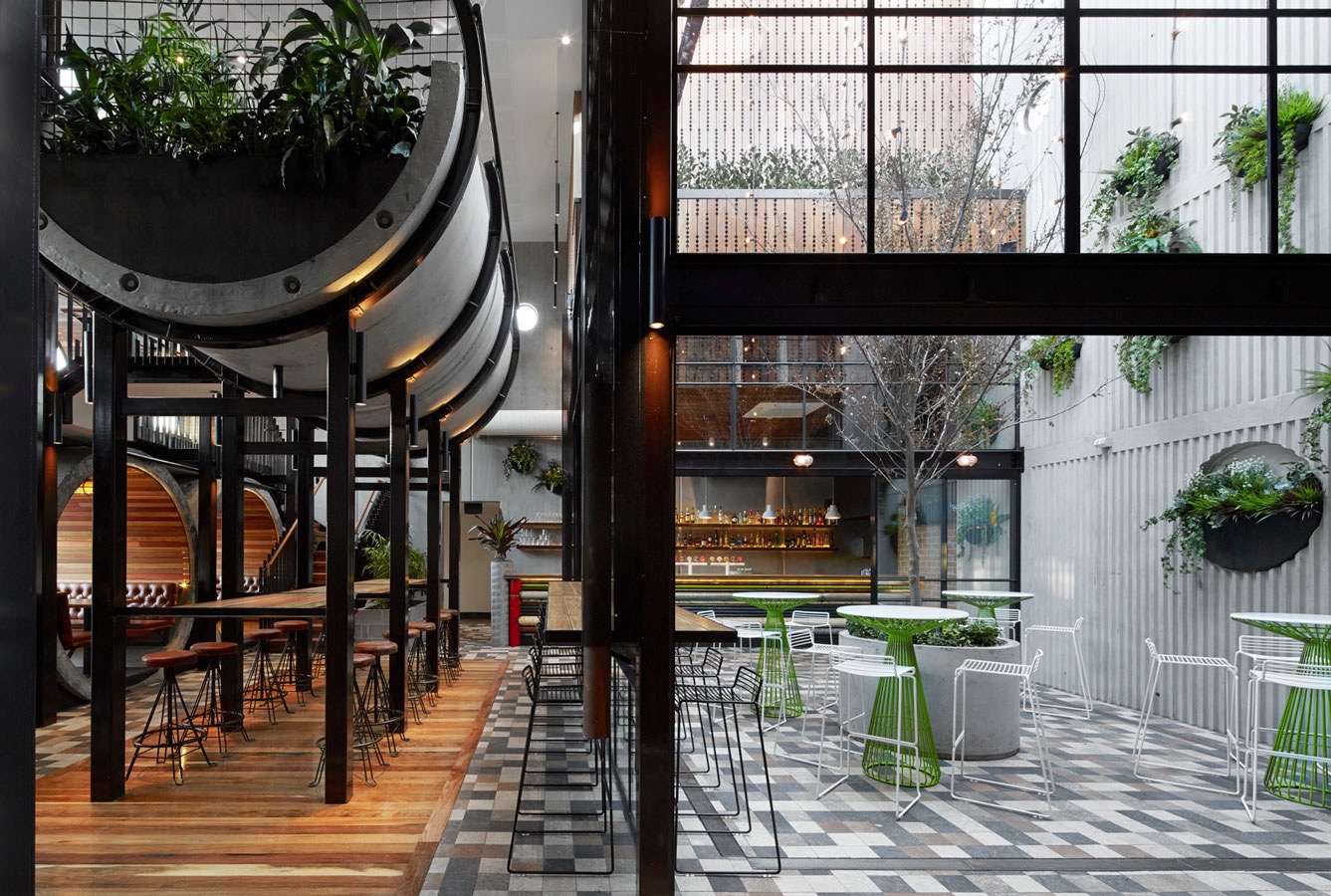
{Prahran Hotel interiors by Techné Architects}
Home Open
Before I get too soppy, the main reasons for this post were to give you some cheap update ideas for your home, a few tips for simple styling for sale and giving you a sneaky-peak into our lives and home. Enjoy.
Here are some simple tips for refreshing your home before sale:
1. Keep colours neutral.
You may love neon pink or cobalt blue but not everyone will - and not everyone has the imagination to see past it if they don’t like it. You don’t have to avoid colour, just stick to colour in flowers, soft furnishings and artwork.
2. Keep spaces bright.
I do love a good moody Abigail Ahern or Kelly Wearstler room, but I think this belongs in a space that you are going to inhabit for the long term. If you want to maximise the range of interest, keep it light, bright and airy. Lighting at many different levels adds interest - think combinations of candles, table lamps, floor lamps, overheads, wall sconces or whatever you have at your disposal.
3. Fresh flowers and plants (or even good fakes ones) are a must.
They bring colour, style and life (or appearance of life if faux) to your space, not to mention fragrance. Just don’t let the fragrance be too overpowering - air out spaces, keep water fresh and replace flowers if they start to get a bit droopy or pongy.
4. Decluttering is a given really.
Noone want to buy the house of a hoarder, who knows what else you might find after purchase. Pair back your living spaces and tidy display areas. That doesn’t mean depersonalise or make it impossible to live, but presenting the space how people would like to live (i.e. neat, organised, stylish) sells a lifestyle not just a house.
Feel free to disagree as every house has it’s own personality. Below are a few before and after’s of our own house to give you some ideas.
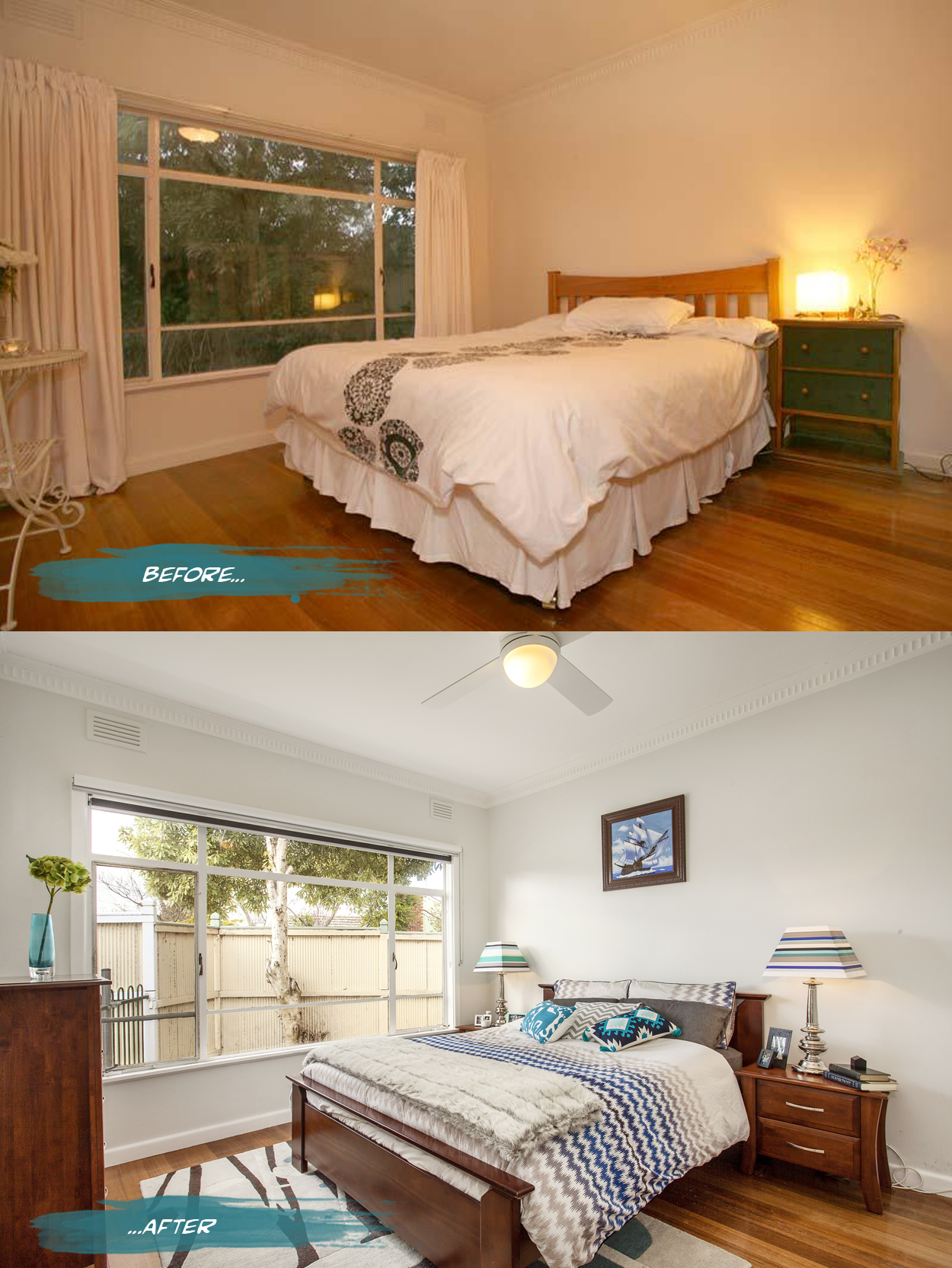
{In the master bedroom, all the curtains were removed from the house to bring more light into the spaces and reduce some of the heaviness of the rooms. Both block out blinds and sunshaders are in the bedrooms while just blockouts are in the living spaces. The walls are a pale grey, Nippon Nighthawk 1, and the ceiling light was replaced by a fan and light for much more comfortable summer sleeps. Adding a rug, cushions and throws for softness as well as customising my lamp shades makes it a bit more personal. Spaces can still have personality while being clutter free - just choose a few key pieces like books and photo frames to make the space feel lived in and not like a showroom}
Vertical Green #2
I have been through some of the benefits of green walls with some examples previously, here, but since there have been so many fantastic examples of late, I felt the need to give you all a second helping of green delights.
{The Florafelt F12 Greenwall growing panel by Fytogreen Australia as used in Kim & Matt's outdoor space on The Block Sky High 2013. The panels are made from 100% recycled PET plastic felt and are available from The Block Shop}
Now that's efficient
“Located in Barcelona's hip Born district, the tiny apartment is a remodelled pigeon loft. Christian [Schallert] says its design was inspired by the space-saving furniture aboard boats, as well as the clean lines of a small Japanese home”. I personally love that the bed slides under the balcony and converts to a step, chair or lounge. Great work by architect Barbara Appolloni. Enjoy!
xo Romona
![]()
Vertical Green
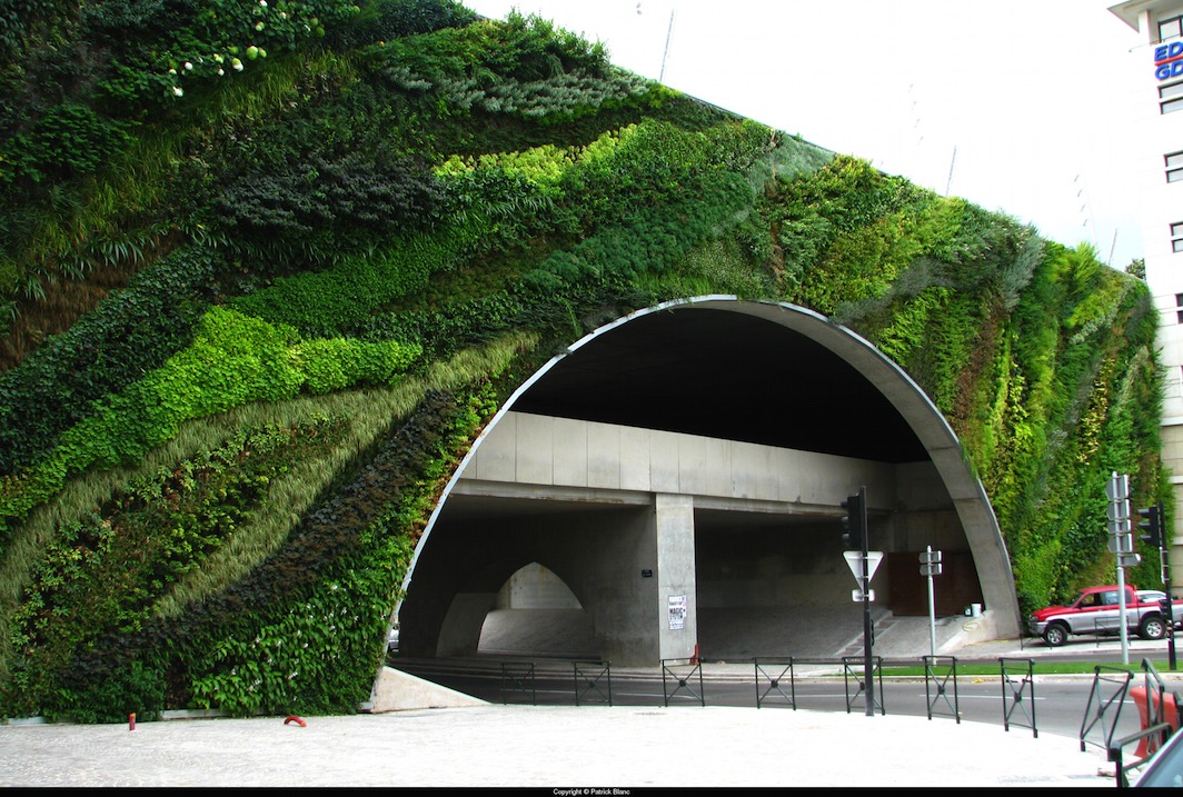
Since I went there, I have to display just a few examples of Patrick Blanc, the pioneer of Green walls in architecture and visual overachiever, including a few very close to home. While the scale is a little above domestic, take inspiration from his sculptural use of botany.
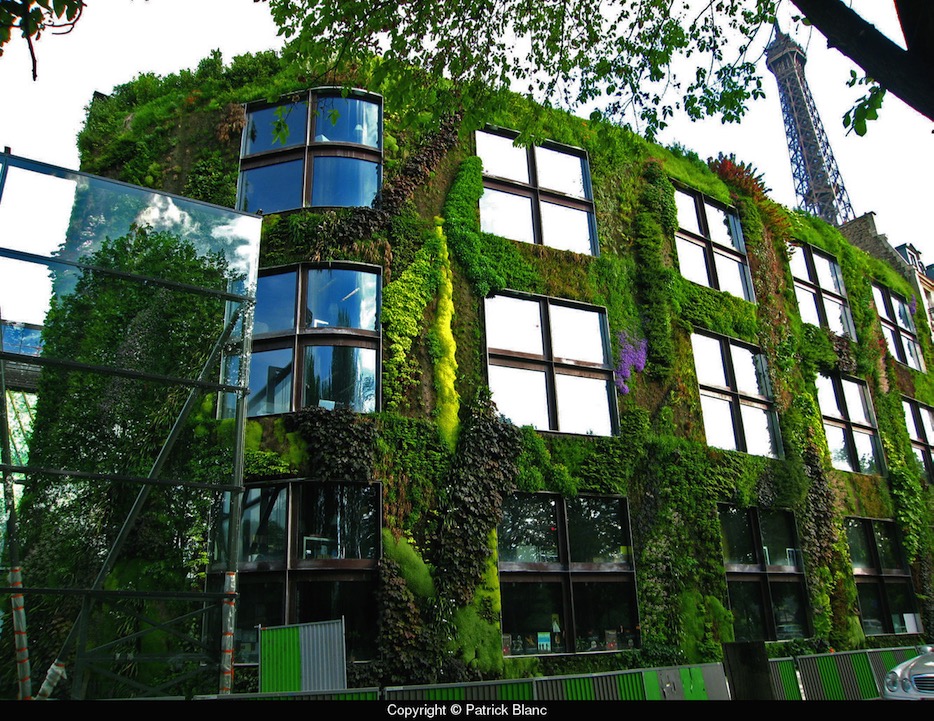
{Quai Branly Museum, Paris, 2005. Architect Jean Nouvel. Greenwall Patrick Blanc}
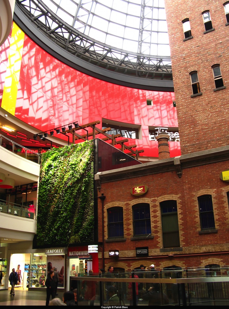
{Our own piece of Patrick Blanc at the Shot Tower, Melbourne Central, 2008}
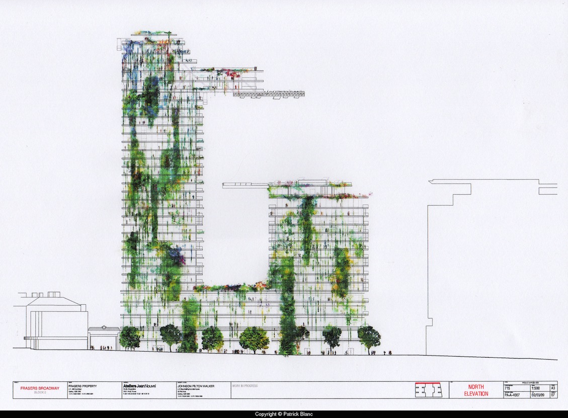
{One Central Park West, Sydney. Architect Jean Nouvel, Patrick Blanc. Due 2013}
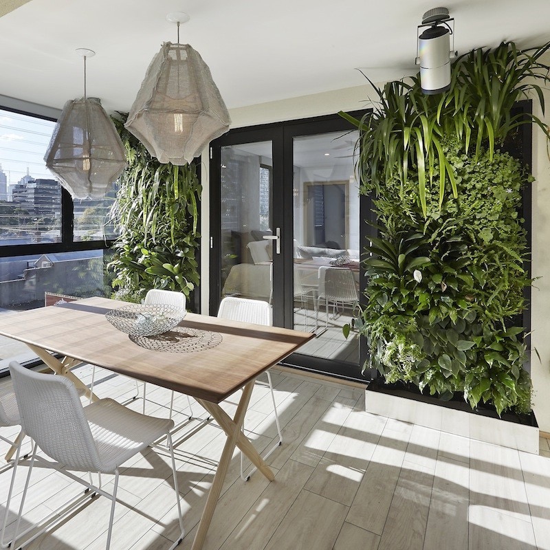
I love that green walls have become a prevalent cafe and commercial decoration, and that most will now try and incorporate some functionality into it, with herbs and indoor veggies. Its great to see the new ways people can develop this old idea. I like this alternative to the usual terracotta and unpainted reo mesh of the signature Vertical Garden by Joost Bakker (as seen at Grand Designs). The simple white pots and white mesh offset wonderfully against the uniform dark succulents. Maybe it is just refreshing not to see the terracotta pots again. I think it’s like a popular song on the radio - you hear it so often that you can’t tell anymore if you love it or hate it, but still find yourself singing along.
{Vertical Garden by Joost Bakker for Schiavello}
This smooth sculptural wall with rounded inserts for potted herbs suits the modern bright-white kitchen. Talk about easy access and great smells. I would love this in my house.
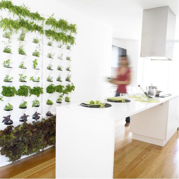
{Edible Herb garden wall complements this modern white kitchen. Source}
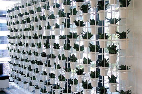
The simple draped Porthos between nine white pots on wall-mounted floating shelves are used to break up this double-height common wall in a warehouse conversion in Brisbane.
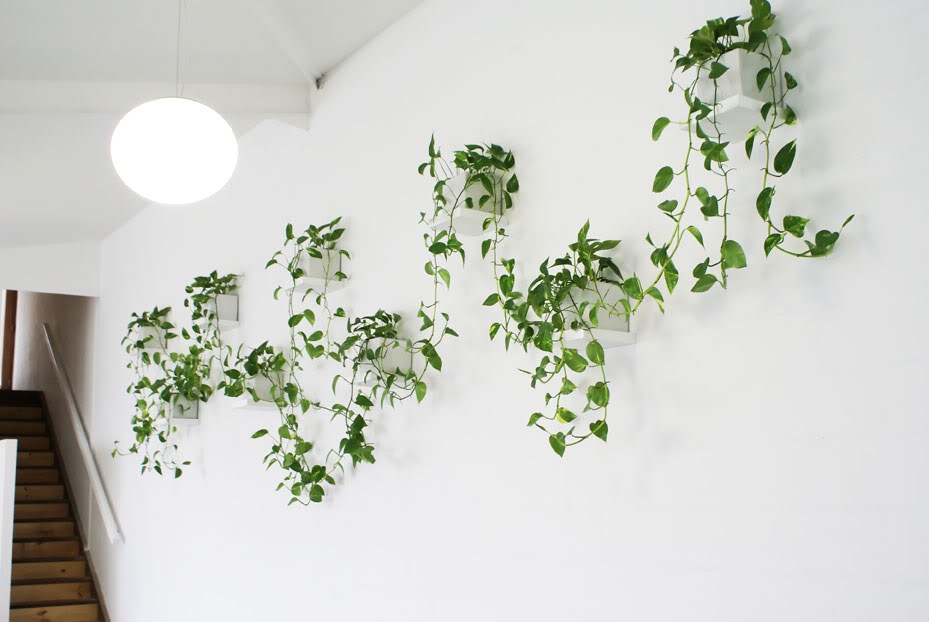
{Minimalist Vertical Garden by Lushe Urban Greening}
I couldn’t leave out the bright entry space to Fujitsu’s 6-star Green Star Docklands office (yes, mainly because it was worked on by yours truly while at Woodhead). The original designs did include using black mondo grass and having a dramatic monotone effect with the black glass walls, emphasising the Fujitsu red. I believe the black mondo didn’t survive too well so the bio-wall is now more in keeping with the bright greens of most green walls, but is still quite effective. The bio-filtration system used was designed by Umow Lai who worked with Woodhead on the project. The ground level foyer of the Gauge in Docklands, Victoria also sports an impressive green wall by The Greenwall Company
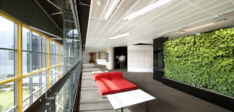
{Fujitsu Head Office, The Gauge, Docklands by Woodhead}

{Just a section of the massive foyer green wall, The Gauge, Docklands by The Greenwall Company}
There are more than a few products popping up that can be used for DIY green walls at home, ranging from the cheap and simple to the complex and often quite pricey. A few options are pictured below (or just type green wall or vertical garden into Youtube and go nuts!)
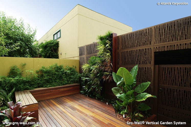
{Gro-Wall Vertical Garden System}
{Greenwall Australia’s Vertigro Home or Pro}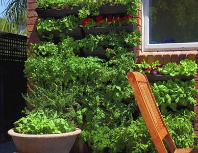
{Wallgarden’s DIY Vertical Garden, also available at Lushe}
Urbio Urban Vertical Garden is another Kickstarter project (like the previously blogged about LIFX globe). I love the simple design and the adaptability of this product. Swap out the plants for some magazines or books if they need a little outside time in the sunshine.
{Urbio Urban Vertical Garden on Kickstarter}
There are so many benefits to using green walls in design, including but not limited to:
▪ Improved air quality and reduction of odours; ▪ Improved well-being with the visual link to nature and the outdoors; ▪ Visual aesthetic of a living decoration; ▪ Supply of fresh, edible produce - herbs, fruit, vegetables, flowers; ▪ Protection from wind, heat and light; ▪ Thermal Insulation and shading; ▪ Noise buffering; and more I am sure.
Have you seen any green walls out there that blew your mind? Or used any products or DIYs for your own vertical green wall? Let us know below and share the love!
xo Romona