The James Street Residence by Romona Sandon Designs
In designing our home it was important for me to balance the comfort and lifestyle needs of my young family with my environmentally sustainable goals from my work in Sustainable Architecture. I wanted to test if low-cost sustainable design could still be convenient and aesthetically pleasing to the clients (my family). I also wanted to test people's perception of what an eco-house should be or look like.
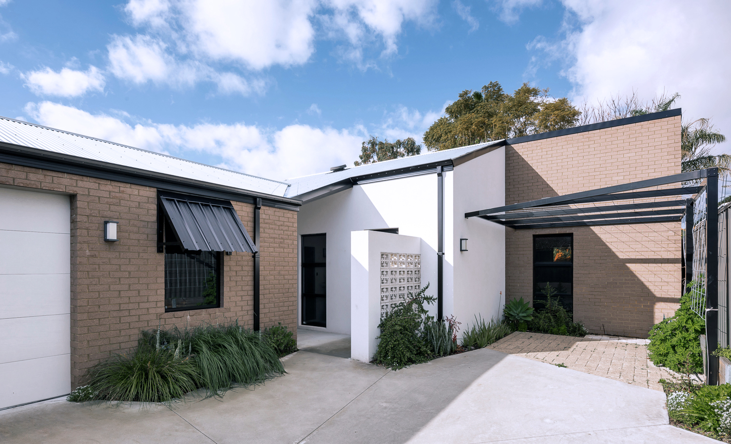
{The James Street Residence, by Romona Sandon Designs, Front facade}
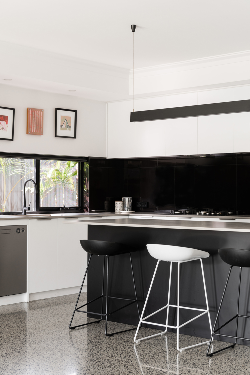
With the kitchen, I wasn't aiming to do anything new or innovative. I wanted timeless and simple. A canvas devoid of colour so it could be injected by way of homewares and appliances and food and family. I guess I never strayed far from what I had always wanted, even showing this colour palette (or lack thereof) in previous posts, such as the Monochrome Kitchen. Cabinetry either flows through to the ceiling or is capped by bulkheads, to reduce surfaces that dust could collect on, reducing potential allergens.
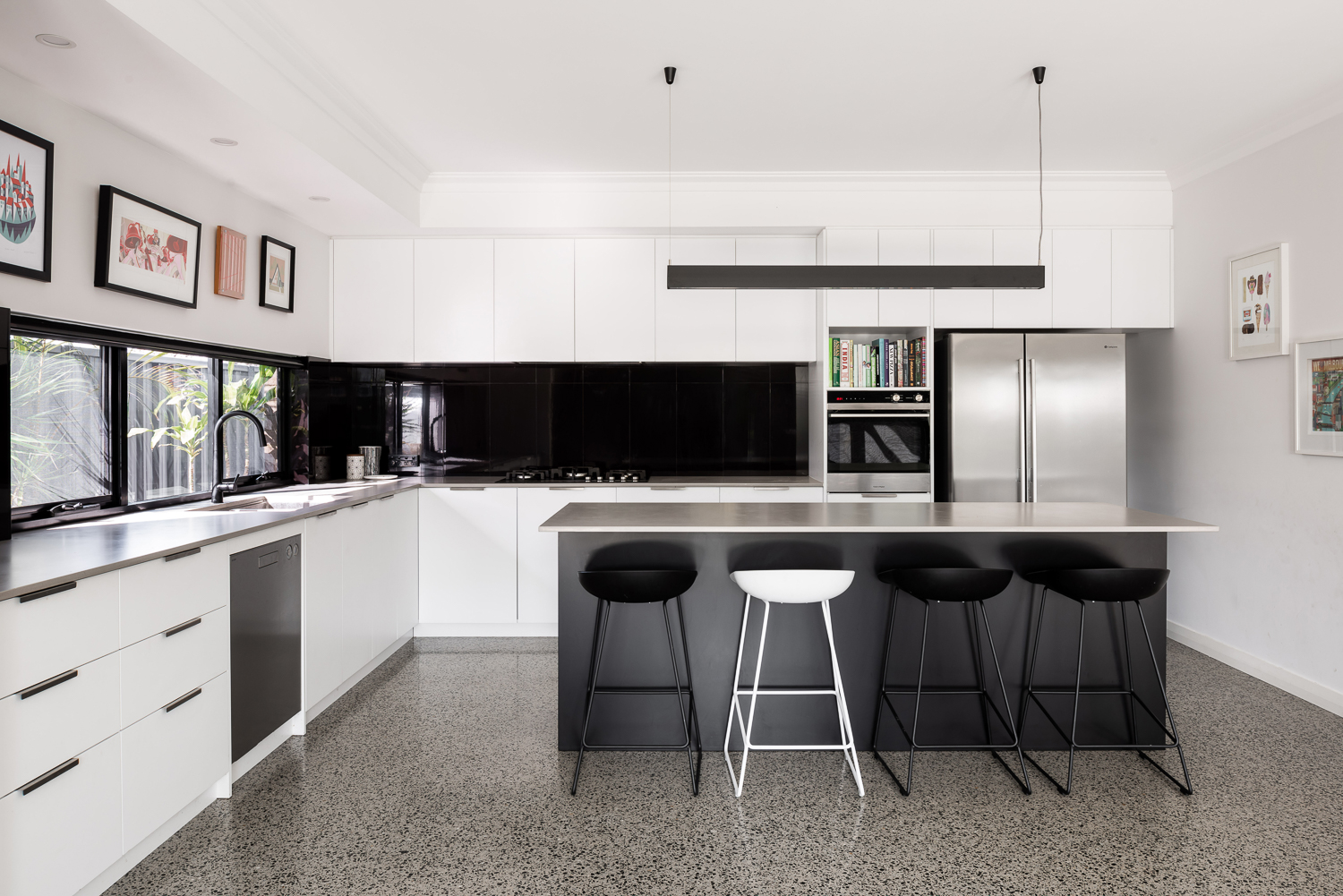
{Monochrome kitchen of the James Street Residence, by Romona Sandon Designs. Image by Dion Robeson.}
Passive solar design principles were utilised where possible within the council and R-codes on a small rear battle-axe block. Large north-facing windows and doors allow winter sun to penetrate and store heat in the thermal mass of the polished concrete floor. The polished concrete floor was high on my list of features that I really wanted in this house - surprisingly, planning for this quite early on in the design process kept the cost quite comparable with alternative floor coverings.
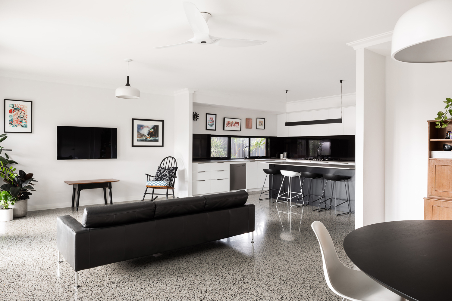
{Open-plan living space of the James Street Residence, by Romona Sandon Designs. Image by Dion Robeson.}
Insulated cavity brick construction helps contain winter heat. Cross-ventilation allows excess heat to be dissipated in summer. A SolarStar solar-powered thermostat-controlled roof cavity ventilation system also rids the building of excess heat when needed. In the two years of occupancy, no active heating or cooling has been necessary except for the Big Ass ceiling fans (their name, as well as description!)
Solatubes with integrated PV (photo-voltaic solar panel) LED day and night lighting is used in conjunction with natural daylight and low-energy lighting elsewhere. Low VOC (Volatile organic compound) paints and carpets are used throughout to reduce sick-building syndrome (off-gassing). PV's sufficiently power the house with a larger inverter for future-proofing. East/west openings were minimised and treated with Low-E glazing where unavoidable, as well as awning shading.
{Kitchen details of the James Street Residence, by Romona Sandon Designs. Image by Dion Robeson.}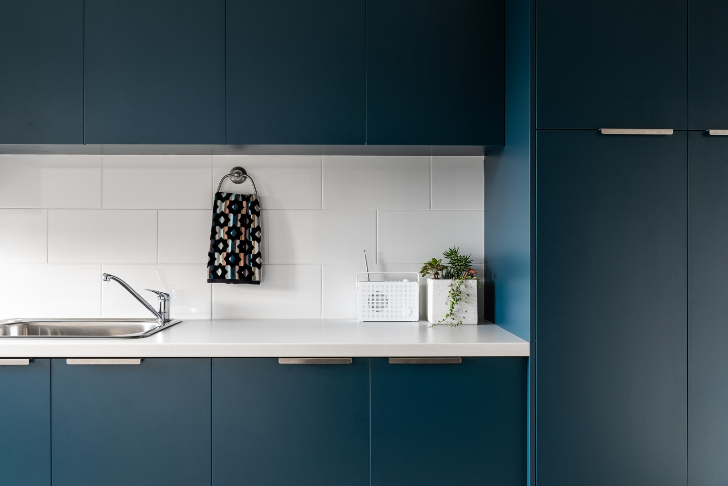
{Laundry details of the James Street Residence, by Romona Sandon Designs. Image by Dion Robeson.}
The bathrooms features hobless showers for accessibility. The glass above the half-height wall allows light to penetrate fully into the bathroom to reduce mould build up.
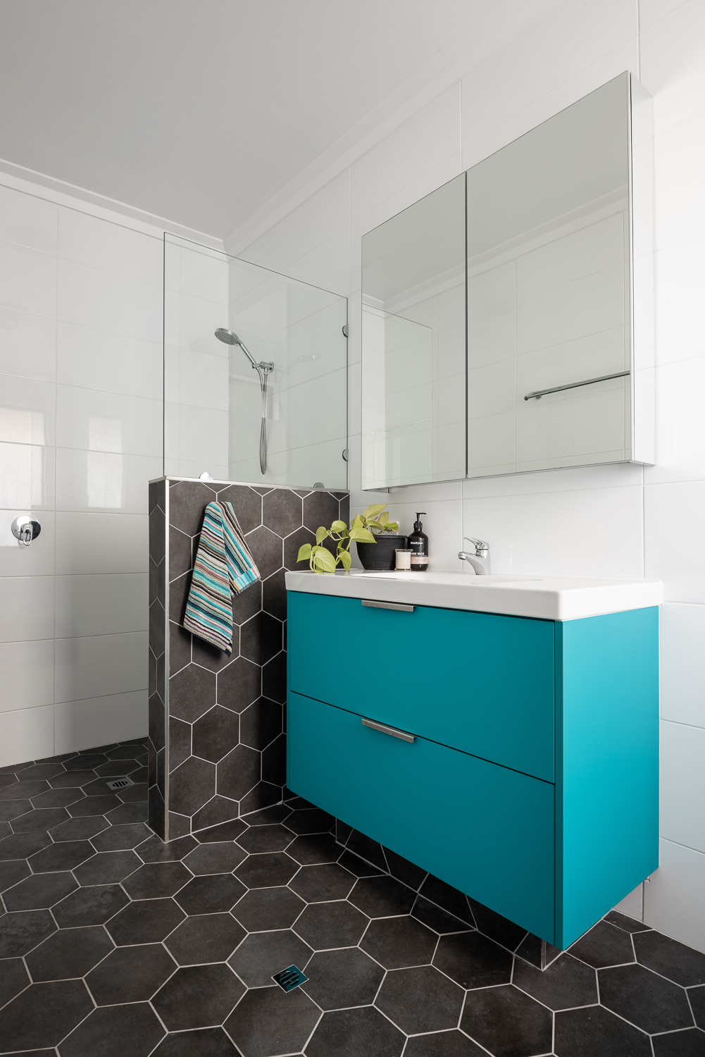
{Master ensuite details of the James Street Residence, by Romona Sandon Designs. Image by Dion Robeson.}
Curtains and blinds are opened and closed to allow optimal light and heat inside, which is also aided by deciduous vine plantings on the north for additional summer shading of openings. While we wait for the grape vine to grow, we use a combination of shade sails and a passionfruit vine that we trim back in winter to allow more sun through. In the mean time, we are drowning in fat juicy passionfruit and the kids adore it!
The garden also considered sustainable design elements in the use of reclaimed breeze blocks for the entry, edible garden courtyard and native or self-sown water-wise planting. Indoor plants are used for improved indoor air quality and visual calm.
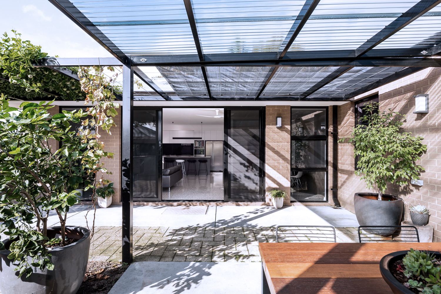
{North-facing, rear exterior of the James Street Residence, by Romona Sandon Designs.}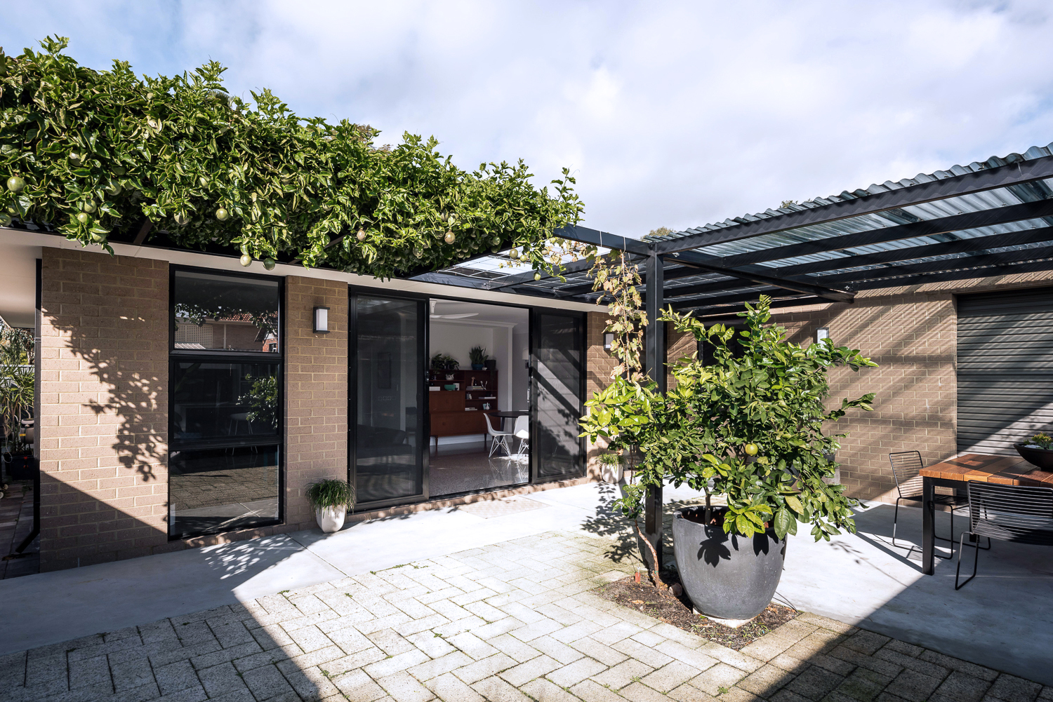
{North-facing, rear exterior of the James Street Residence, by Romona Sandon Designs.}
As a sustainable designer, I see it's discrepancies and the details that could have been improved, with time, money and less council limitations.
As an architect, I see the features that I could have amplified and where I wish our money could have stretched to.
As the client, it is perfect. It is the perfect design for how my family and I live, our budget at this stage of our life, and the place and site that we built it on. It is our home and I'm proud of it.
xo Romona![]()
May Lust List
I thought I'd do a small post on a couple of designs and products that I am totally lusting after right now. I've been on a self-imposed homewares embargo (mainly so I can have some fun once we are in the new house, and also, like I said, no paid work = no spare mula!) so here are a few things that would be added-to-cart asap in any other circumstance… well, maybe with a lotto win, but one can dream. Or I can just live vicariously through any of you lucky people who happen to purchase up after seeing this.
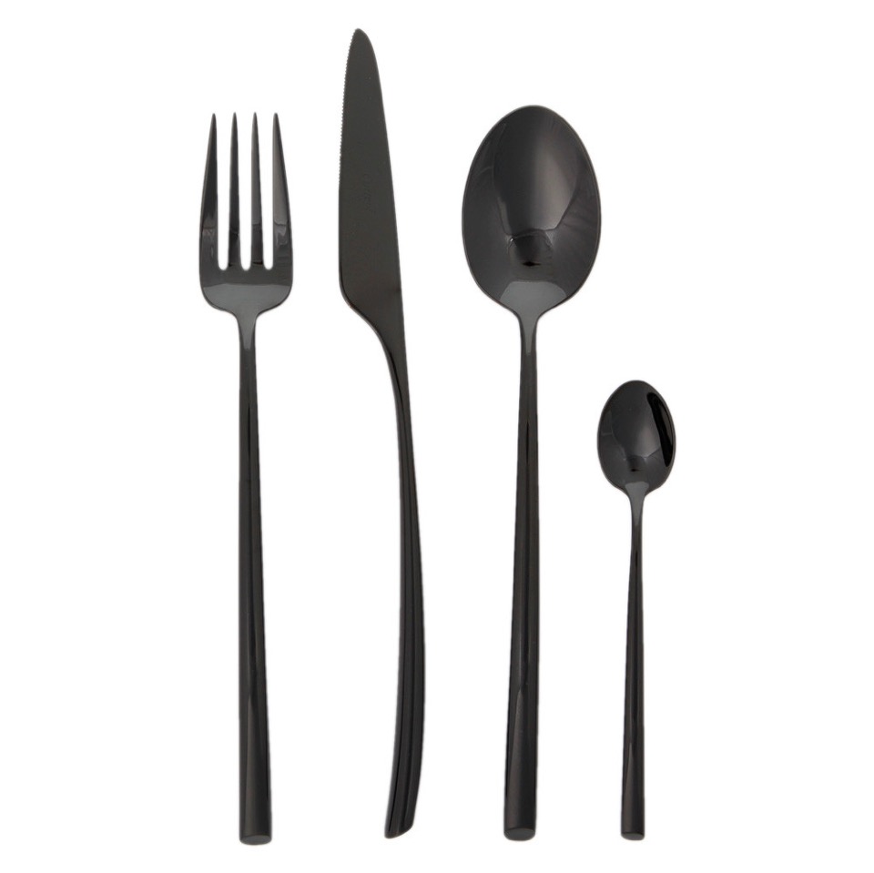
{A Cutipol Mezzo cutlery set}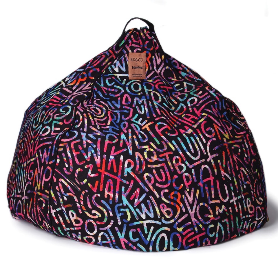
{An Elise Raspanti Art Series Kip & Co beanbag!}
{Blue Heaven LED Neon artwork (or any of their ice creams) by Electric Confetti}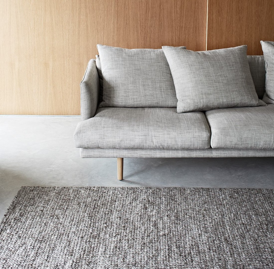
{Sierra weave Armadillo & Co rug in Pumice has been on my list since I felt it at a trade fair a few years ago. Sooo soft and luxurious!}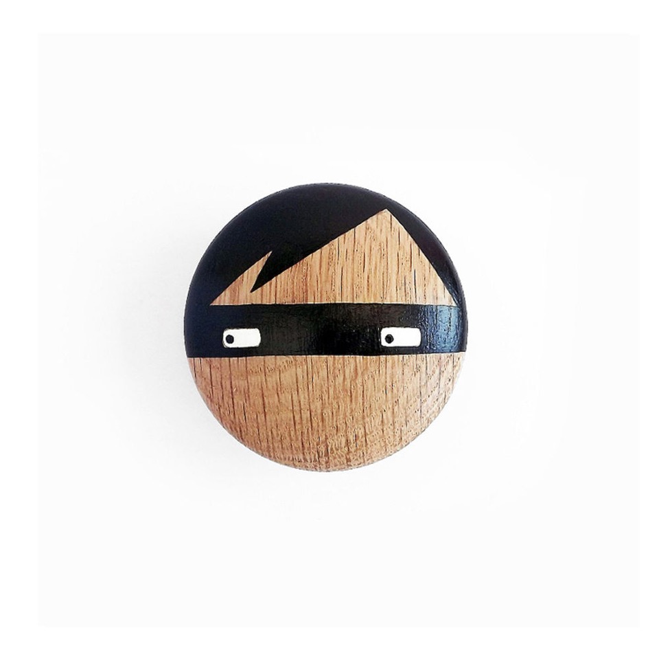
{Love this Sketch Inc for Lucie Kaas Thief Wall Hook by Urbaani, available at Top3. Becky Kemp's Kokeshi Dolls are also fantastic - check out her insta @sketchinc to see some of her amazing work}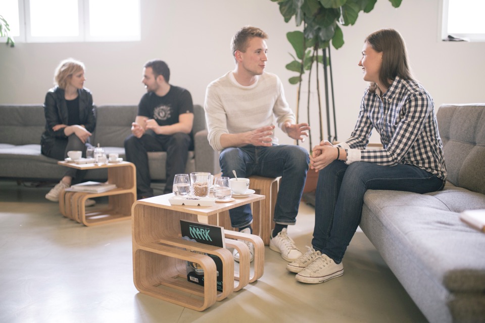
{The impressively multi-functional Woodieful chair/table/storage/bucket from new start-up Woodieful in Slovenia. I love adaptable 'slashie' furniture! It is available through their Kickstarter campaign here, although you better hurry - only 9 days to go. And yes, they do ship to Australia!}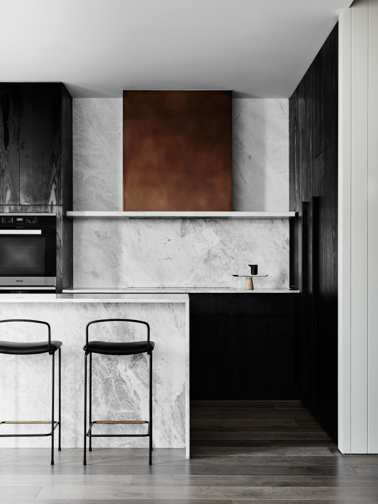
{These Dita stools from Grazia & Co, seen here in the stunning Port Phillip Bay penthouse apartment by We Are Huntly. Photo by Brooke Holm}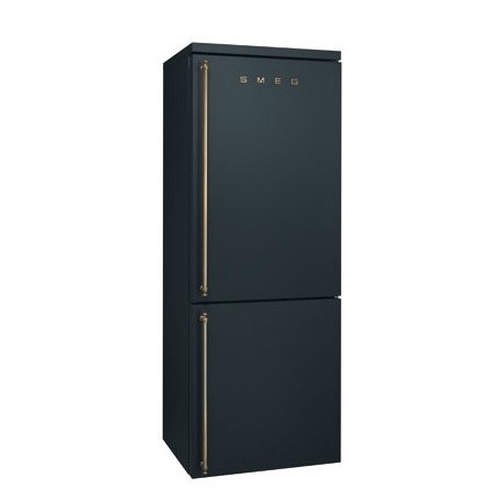
{A matte black Anthracite finish Smeg fridge, because why not}
Spotlight on Australian Designers | Anaesthetic
So once again, my spotlight shines brightly on a successful lighting design company. The talented duo of Ben and Kiri Wahrlich (actually Kiwi's but that has never stopped us claiming people before), can't be labelled 'emerging' talent any more - they are definitely design fixtures (pardon the pun) with their beautiful range of lighting, furniture and homewares products as Anaesthetic. My own home (currently in planning stage - I dropped the plans off this morning and now am holding my breath for limited council changes) sported several of their lighting products in different stages of concept, from the kitchen to the entry to the dining room. I've shown both their Hide leather pendants and Kasa concrete homewares work here before, here and here back in 2013 & 2014. My current faves however are their Constellation pendants - I'd love to have the Southern Cross above my head as I enter home or sit down to dinner in a darkened room.
I could go on about their design and engineering credentials, their accolades and their awards, but I think their products are best to soak up visually. Hopefully the photos suffice, for now.
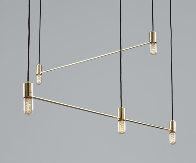
{Constellation Lights 'Southern Cross' by Anaesthetic in beautiful polished brass}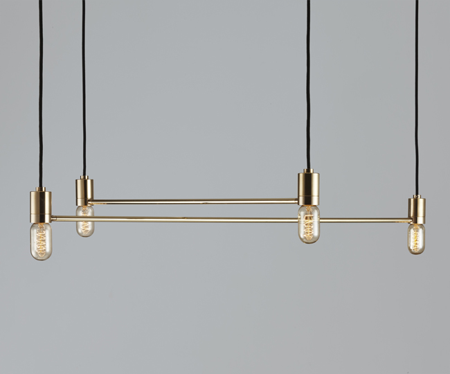
{Constellation Lights by Anaesthetic in luxurious polished brass}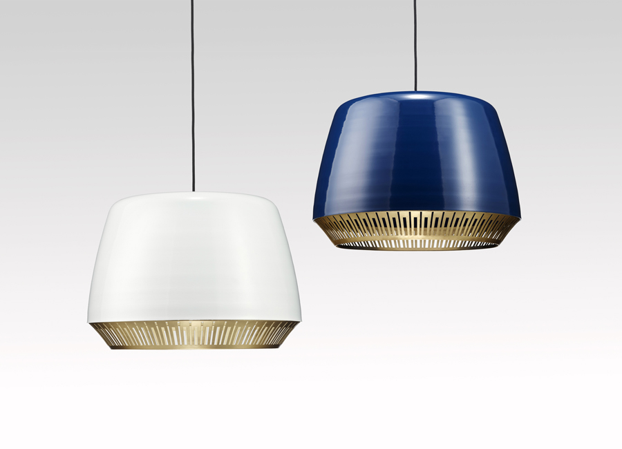
{Bezel pendant lights by Anaesthetic with its spun aluminium powder-coated top with piano-inspired polished brass 'bezel'}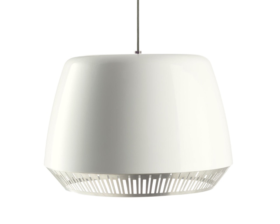
{Bezel pendant light by Anaesthetic with its spun aluminium top powder-coated white with piano-inspired polished aluminium 'bezel'}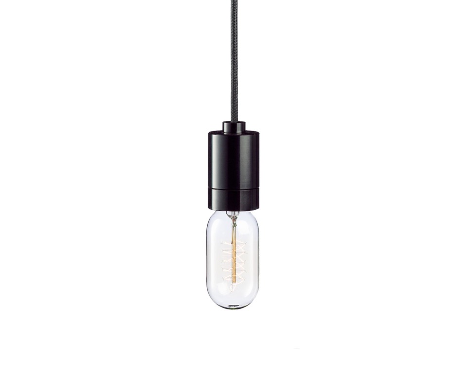
{Bala pendant light by Anaesthetic in black}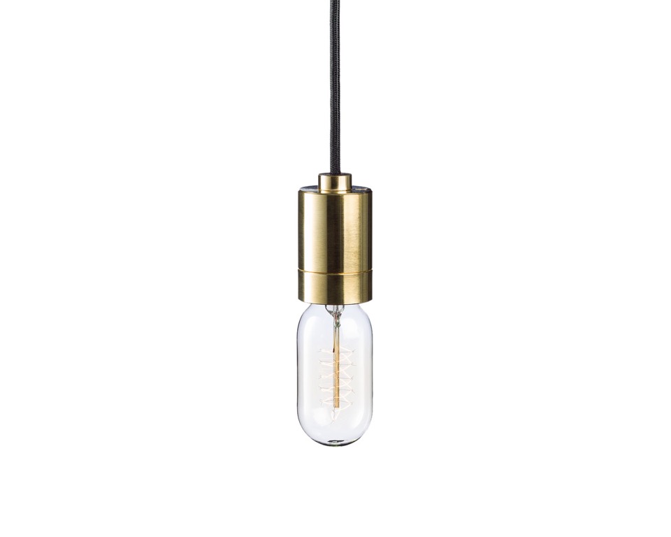
{Bala pendant light by Anaesthetic in precision machined polished brass}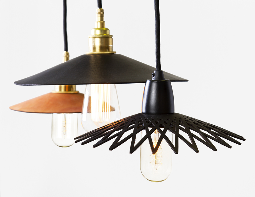
{Hide pendant lights by Anaesthetic with individually cut leather shades}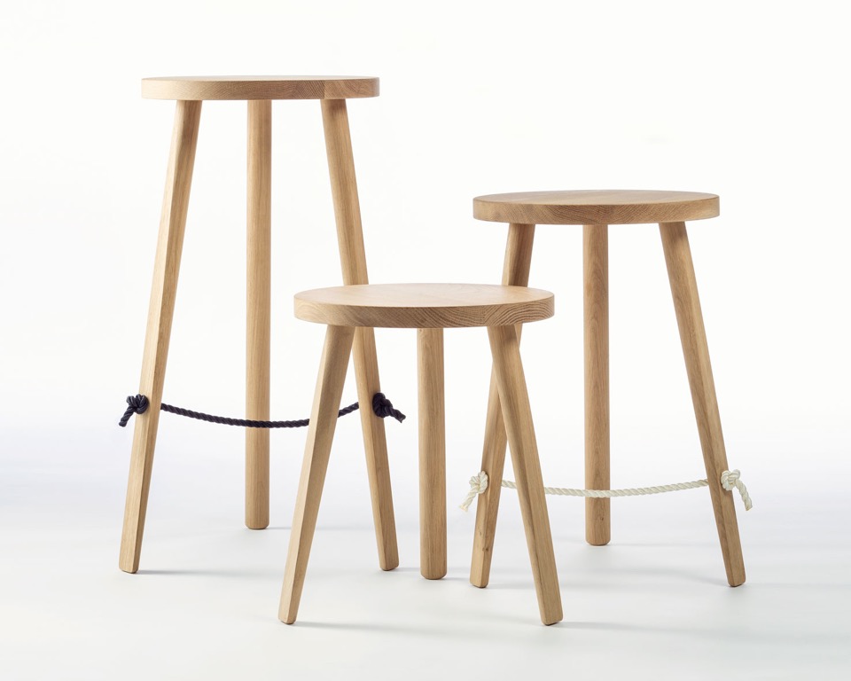
{Mariner stools by Anaesthetic made from American White Oak with navy or white braided rope foot rests sourced from sailing yachts, hence the name}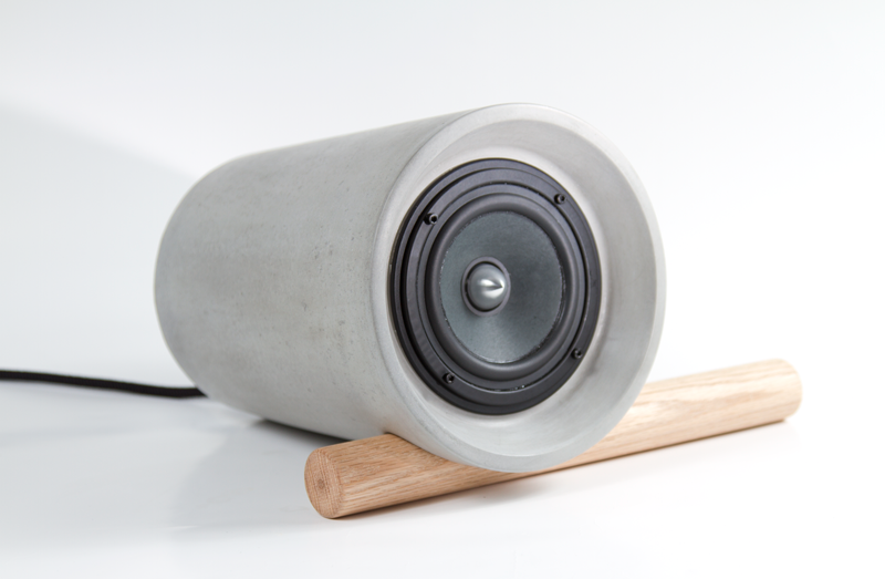
{Jack concrete bluetooth speaker}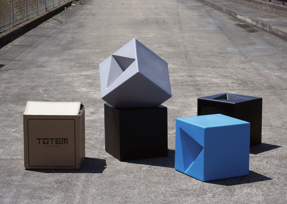
{Totem stackable stools from recyclable LPDE}
Anaesthetic will be exhibiting at the Sydney Indesign event from August 13-15, so get along to soak up some of the talent. Wish I could be there!
xo Romona![]()
Put A Cork In It
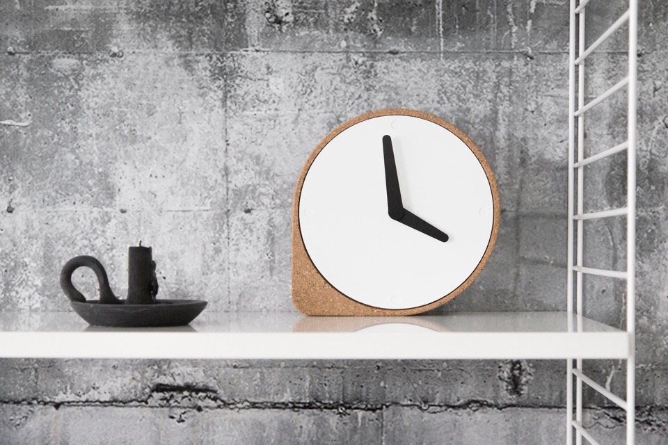
{Clork by Puik Art in collaboration with Ilias Ernst. Simple forms combined with the natural material gives the ‘Clork’ a great look and feel. Its left corner stable in the present, while the circular right side allows time to roll by, Clork comes in natural coloured cork or graphic black}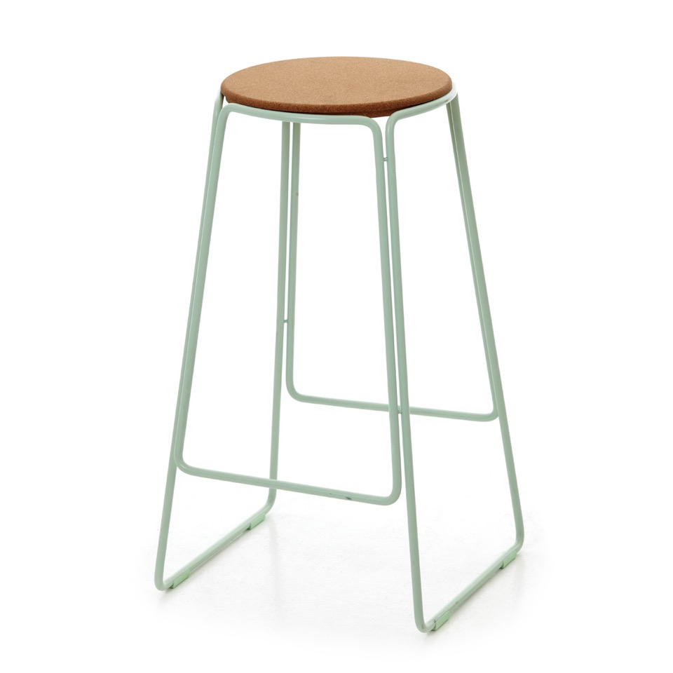
{The Smed bar stool by Great Dane Furniture and OX DENMARQ, showcases simple design with simple materials. The Smed Bar Stool consists of a blacksmith crafted, powder coated steel frame with cork seat in either fresh mint, brass or white}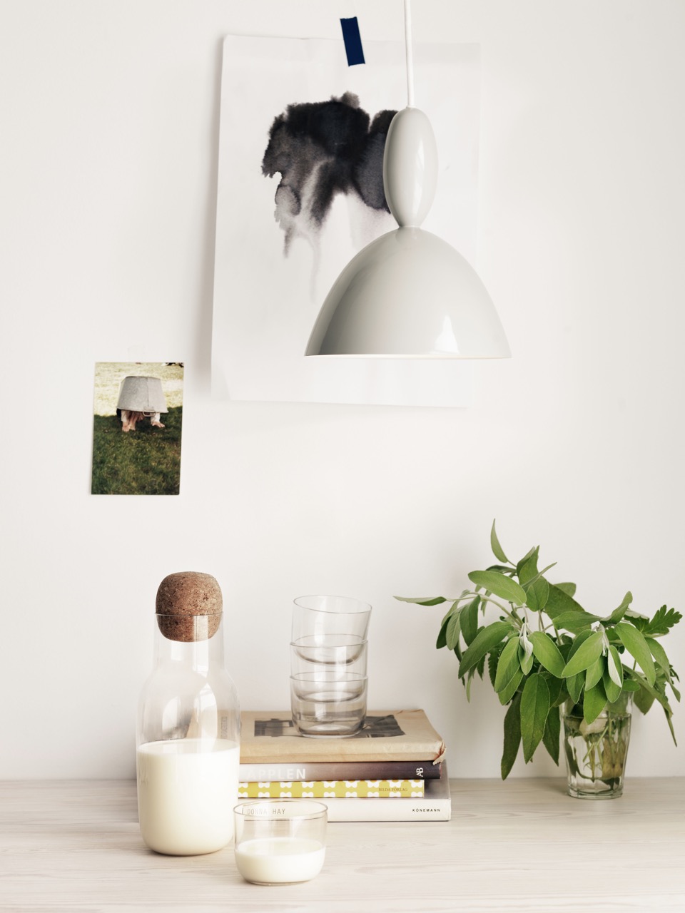
{Muuto's sexy little Corky carafe checks me out every time I walk in to a store stocking Muuto. “The shape of the Corky carafe is inspired by the archetypical bottle. It is a straightforward combination of glass and cork that functions equally well as a wine carafe, a water jug or even a milk bottle. Corky has a simple and familiar form but with a characteristic and oversized detail. The Corky drinking glasses are small and light companions for the Corky carafe. With a low-key and light expression, they are suited for both everyday use and special occasions with friends and family.” says creator Andreas Engesvik. Available at Living Edge}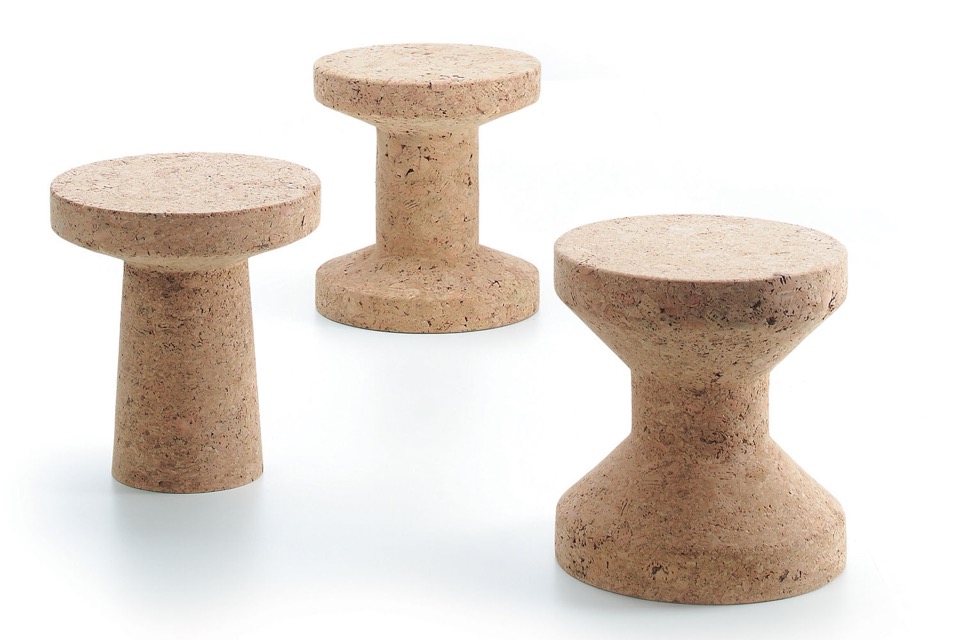
{Cork Family stools/side tables, Vitra by Jasper Morrison available from Space Furniture are a quirky addition to your home or office interior. Nothing like a giant pushpin in the corner}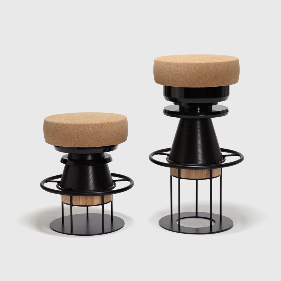
{Tembo is a stool made of stacked pieces of wood, metal, and cork by La Chance and Note Design Studio, available from Living Edge. This ‘modern totem’ has a playful and bulky aspect recalling children’s toys and African tomtoms (Tembo means elephant foot in Swahili)}
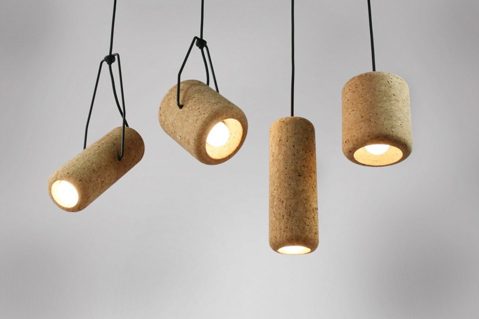
{Corker pendant lights by Max Harper, are inspired by the iconic cork hats that, for better or worse, are linked to Australiana. Corker playfully mocks this cultural iconography in a modern design context. Australian designed and made, each piece is hand turned by local craftsmen in Sydney from agglomerated cork. Cork is a hardy yet renewable, bio-degradable and recyclable resource, designed for disassembly, ensuring parts end up reclaimed, recycled or disposed of appropriately}
Realising that this post has ended up a lot more Scandi than Aussie (except for the last one), but they just do so many great things. All available here in Australia though, so enjoy enjoy.
xo Romona![]()
The Dining Room Dilemma
I'm not a ridiculous spender. In fact I am quite fiscally tight. But when it comes to my home, I want quality. That doesn't have to cost the earth - I can happily sit on sturdy well-made chairs from a past era road-side collection that have been buffed back into shape. I just don't want to give in to the fast and frequent flashes of 'Vintage replicas' all over my screens and junk mail pages.
Currently we have four of my favourite white Eames Eiffel based DSRs. You know the ones that you probably see everywhere, as that filthy filthy word 'REPLICAS'. Yuck! If I am to accept crap, it at least has to be original crap! Don't mass produce someone elses hard work and (previously) inimitable creativity and flog them off at $39 a pop. It just shits me.
I'll admit to owning two *shudder* replicas at one stage. I had my four beauties from Living Edge and on moving from an apartment to a house, and bringing two kids into the world, needed at least two more chairs. I succumbed. But boy did they grate on me. Every time I walked past the room those ugly shiny plastic things glared at me. Sure, no one else could tell the difference - apparently - but I could. And I had given in to the mass marketing of these cheap charlatans riding on the coat-tails of others.
So when I could stand them no longer, when I'd had enough of moving them to the most unused corner of the room, when I had scrubbed at dried Weetbix (that seemed to wipe easily from the others) one time too many, I made the decision. Those puppies went straight onto gumtree. The respondents came fast and eager - even though I assured them that they were… *ewww* replicas. I got the same price I had paid for them originally back in my hands, along with my now relieved conscience.
But now we only have four chairs again.
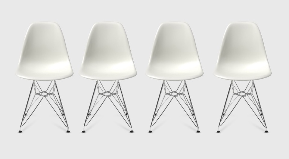
{Eames® Moulded Plastic Side Chair Eiffel Base (DSR) from Living Edge}
Raw geology
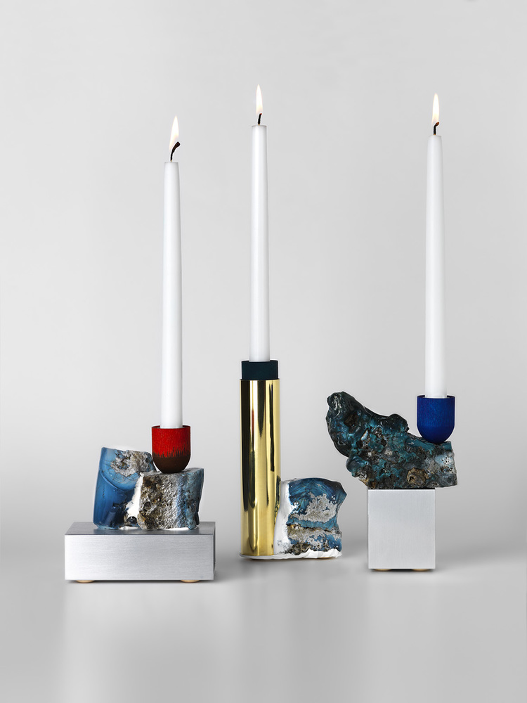
{Table top-objects featuring re-appropriated industrial waste, more specifically scrap iron found in a Swedish forest, forms the basis for David Taylor's Slag series of candlesticks}
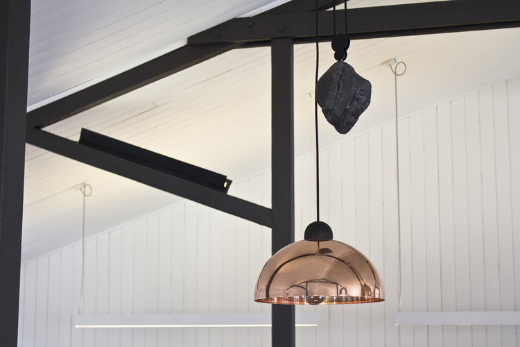
{Up-Down Light from Ben-Tovim Design is a contemporary twist on the classic industrial age height adjustable pendant light. A range of striking natural materials contrast with simple geometric forms to create a light that mixes functionality with a bold design statement}
Perth's Got Talent 2
Here are just a few more examples of amazing WA talent from Decor + Design Melbourne 2014.
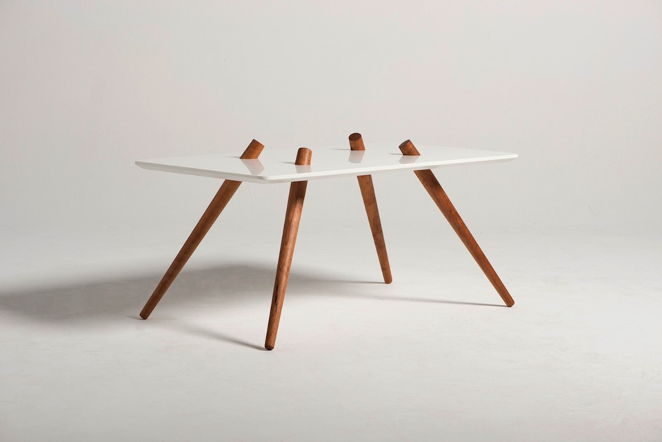
{Holiday table by Callum Campbell}
Kid-size creations
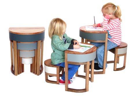
{Tables Four Two in the classic grey colour set by Sheree B Product Design. She also does other colour schemes, but this was the best. She is incredibly friendly and helpful too!}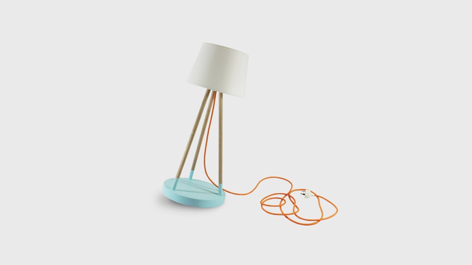
{Treehorn Designs Oh Buoy small lamp in blue. Not sure if I would put this in the boys room or steal it for myself}
Quick distraction
Having said that, sometimes we all need a bit of aesthetic joy in our lives to remind us of people's potential to create beautiful things.
With all the above going on, I haven't yet sorted out my reams of notes, brochures and cards from the D+D conference yet, so I will leave you with just a taste of beautiful things from the conference. My iPhone pics seemed to have turned out a bit dull, so I will dedicate a couple of larger future posts to the amazing designers that I met and discovered (or rediscovered) at Decor + Design Melbourne once I have some quality images from the designers themselves. For now, enjoy this brief sample.
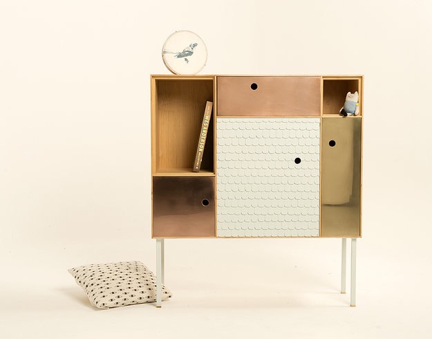
{The Reykjavik Cabinet by Amy Perejuan-Capone of Horse on Toast, just one of the many talented sandgropers on display at D+D}
Spotlight on Australian Designers | Lab De Stu
Made up of Melburnians Adam Lynch, Dale Hardiman and André Hnatojko, these guys have kicked arse on the national and international design award scene since 2011. DQ calls them 'Industry Giants', and being in their very early 20's that is saying something!
Although I could have added every image from the website, I'll leave this pretty little teaser for you and let you explore their simple but beautiful website yourself. I'm sure I will have more to add later, once I've seen their wares at D+D this week.
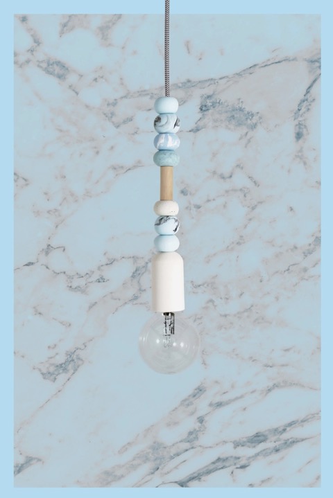
{The Up Up pendant is a collaboration between Dale Hardiman from Lab De Stu and artist / jewellery designer Emily Green. Emily's signature polymer clay beads combine with Dale's lighting design prowess to present a beautiful collection of pendants. Picking this image from the colour range was quite difficult. I changed my mind several times}
Re-use Revolution breeds new App
To celebrate the launch of the app, Will and the team are offering a $250 giveaway to 5 lucky people. More information on the giveaway at the end of the post!
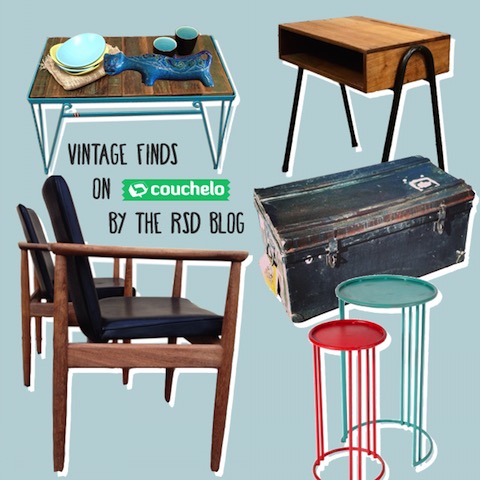
So get in there all my lucky, wonderful Melbourne and Sydney readers and snatch them up quick - or if you are feeling generous, feel free to send some of them my way ![]() .
.
Black and White
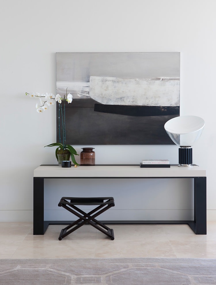
{Harbour House by uber-talented Arent&Pyke. How yum is that Christian Liaigre console table?!}
Nautical dreams
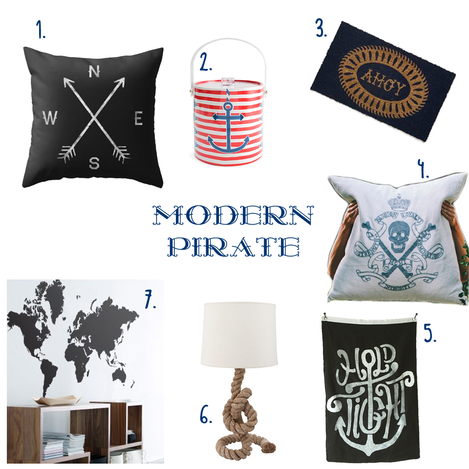
{ 1. Compass cushion, 2. Côte d'Azur Ice bucket, 3. Ahoy Door Mat, 4. Skull & Crossbones Cushion, 5. Hold Tight wall flag, 6. Pier Rope Table lamp, 7. World Map Sticker }
Melbourne Decoration + Design 2013
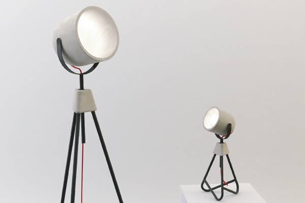
{Paul Townsin’s Me + Me Too Lamps, made of moulded concrete and so, so beautiful in person}
Great Gatsby!
Really, who wouldn’t love this opulent, polished, brilliantly deco bedroom. OTT? No way!
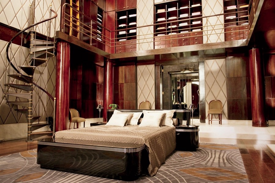
{Gatsby’s sleek and stylish 1920’s bedroom from the Baz Luhrmann film. Via Architectural Digest}
I know I have gushed endlessly over Catherine Martin’s work with Mokum, Porter’s Paints and Designer Rugs, but how can I not start with the gorgeous interior decor from the Production and Costume Designer of the movie (not to mention director’s wife).
DesignEX 13
The Hives exhibition was the stand-out for me with its gorgeous collaborative pieces. “When designers, interdisciplinary practitioners and leading industrial enterprises put their heads together, the results can be exciting, unexpected and intriguing. Curator Anne Maree-Sargeant returns the popular Hives exhibit to designEX 2013 with a highly considered display of products that bring together covetable objects from visionaries and brands under the themes of Innovation and Collaboration”.
My favourite for years has been the WebLight by Design By Them (along with everything else they do!). I fell in love with the gentle image of the aptly-named wispy-looking light set amongst a bright green forrest on their webpage years ago. “WebLight is the result of an exploration into the potential possibilities of reusing plastic bags. Made from recycled content, each WebLight is individually hand made and features an intricate pattern of texture and holes that are the direct result of its unique forming process.”
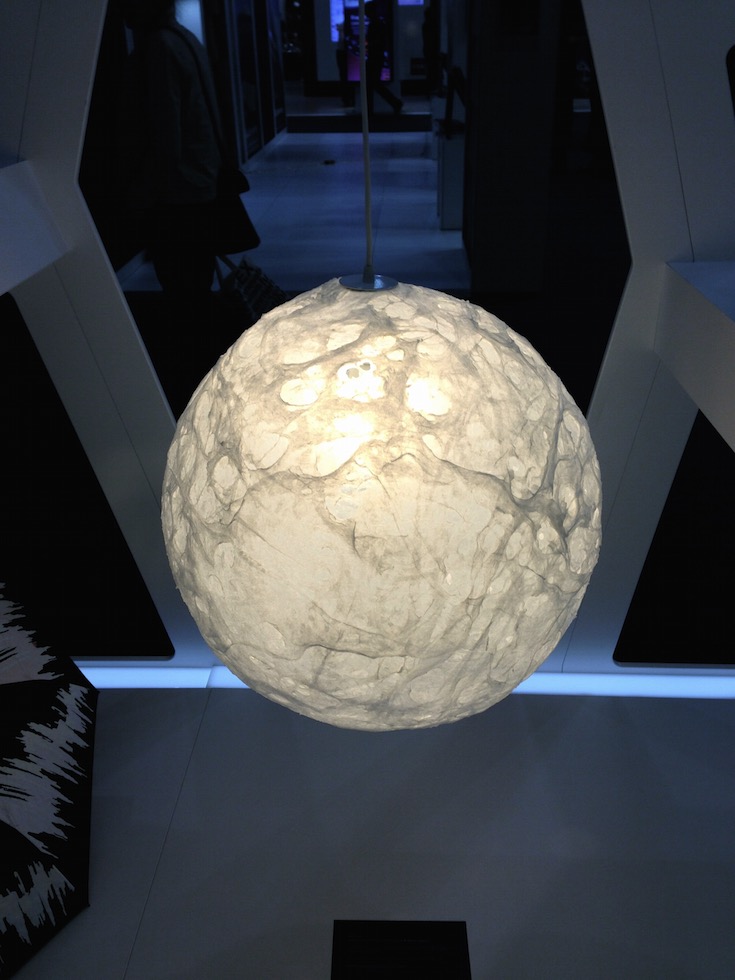
{Weblight by Design By Them}
Another creation I was looking forward to seeing in person was the precise Hoshigame by Artemide. Developed with Japanese fashion designer, Issey Miyake, the sustainably designed, foldable lampshade explores the intersection of creativity and mathematics. Made from fabric derived from recycled PET bottles, “Miyake's unique folding technology allows a single piece of fabric in a flat 2D shape to be unfolded into a 3D shade of statuesque form. The structure of the recycled material, together with an additional surface treatment allows 'Hoshigame' to perfectly keep its shape without the need for an internal frame, and to be stored flat when not in use and then re-shaped when needed.” Although smaller than I expected, it was still a thing of beauty.
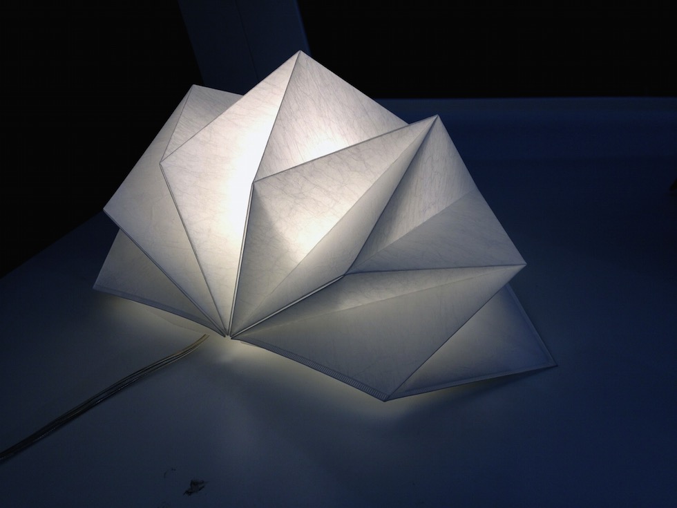
{Hoshigame by Artemide + Issey Miyake}
Here are a few other highlights from the Hives exhibition and lots more from the show.
Orange Brights
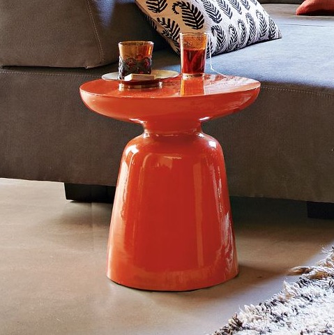
{For a bright statement piece, The Martini side table in Persimmon from West Elm}
When highlighting orange, I couldn’t go past Greg Natale’s stunning Chevron wallpaper in Burnt Mandarin. I know I harp on about his products, but why not when they are just so special. Read on for more beautiful, bright orange delights!
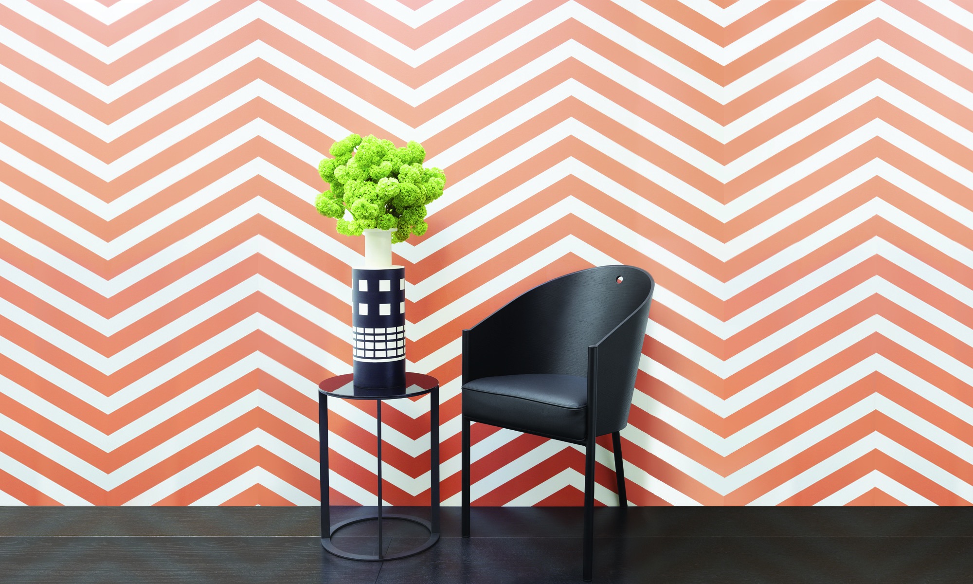
{Greg Natale’s stunning Chevron wallpaper in Burnt Mandarin through Porter’s Paints}
Aqua vital!
As usual some of these are around my house already and others I am just abso coveting and dropping hints to hubby and family (this is also a good way to see if they read the blog!)
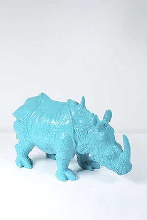
{Baby Rhino, aqua resin by Fenton & Fenton - it’s taking me back to a bit of bebop and rocksteady TMNT days}
Royal Blue Relief
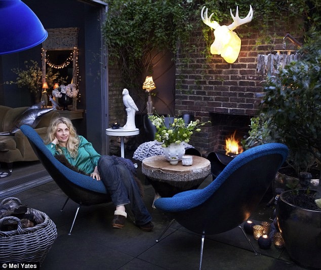
{Abigail Ahern enjoying her cosy outdoor living space. Love that bold pendant and those chairs - not sure I could leave them outside though!}
Blues range from soft and calming, to bold electric hues. They can be on the cool or warm side of the scale and really be made to suit any personality or mood. Since the range is so vast, for this post I’m going to stick to the sapphire and navy shades (teal deserves its own, don’t you think). Some of these are in my personal collection and some are just on the wish list.
READ MORE >>>Sydney Decoration + Design 2013 - Part 3
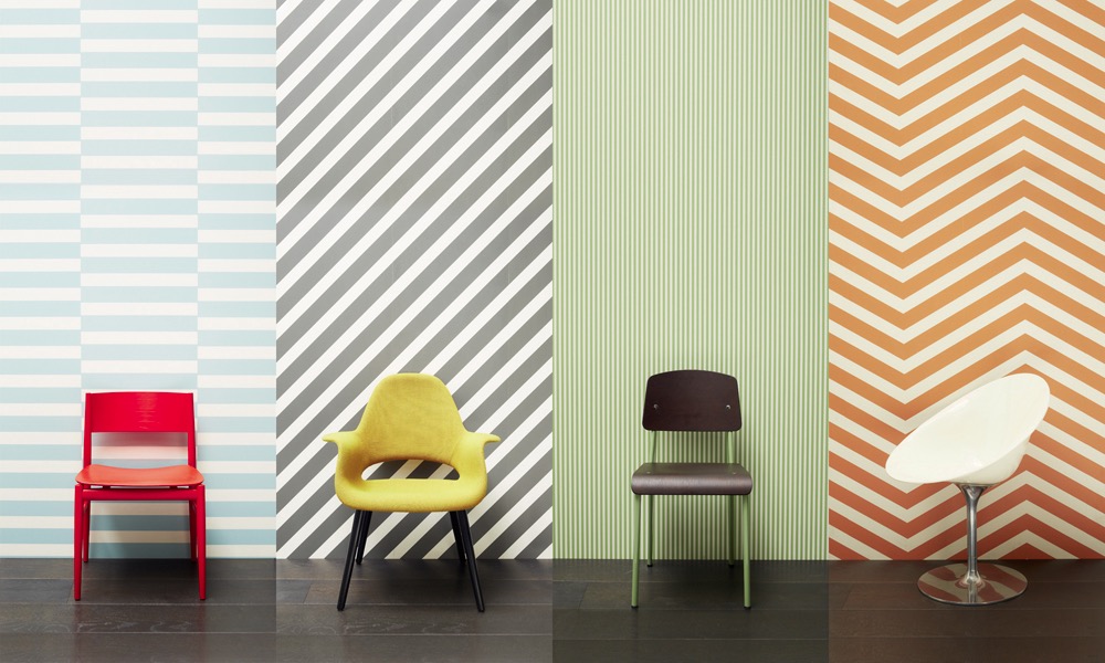
{Greg Natale’s Wallpaper range for Porter’s Paints}
Greg’s seminar took us on a journey starting back with his inspiration as a child and knowing quite early on what he wanted to be and do.
Sydney Decoration + Design 2013 - Part 2
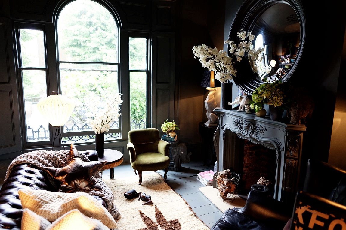
{Abigail’s own lounge. Dark, inky palette brightened with multiple light points. Source}
The queen of eclecticism and dark, moody interiors, Abigail Ahern, was over from the UK in her own whirlwind Sydney sojourn. Her seminar drifted through her style guides and tricks of the trade, complemented by spectacular imagery. These spaces, tips and tricks are all summarising beautifully in her book.
Sydney Decoration + Design 2013 - Part 1
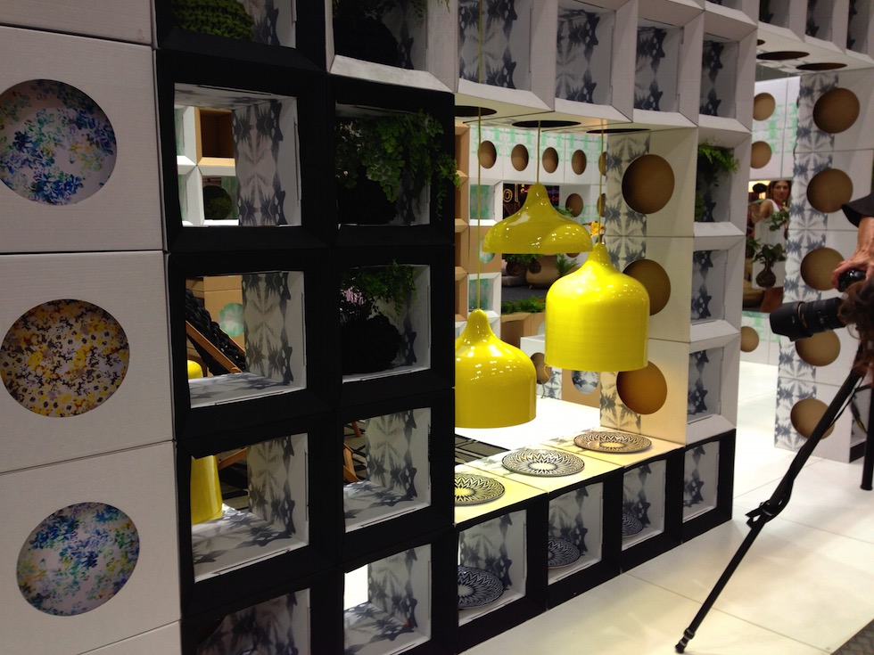
{Popper pendant lights, Designed by Andre Hnatojko}
Unfortunately, I felt like I had seen a lot of the products on display before (the Melbourne D+D 2012 wasn’t actually that long ago), but there were still a few notable pieces to be found. Yellow and bright neons featured heavily again this show. The Popper pendant lights by Andre Hnatojko below were even better in person than the many images I had pinned before.
Industriart
“The idea started initially as an outlet for the many and varied things that my husband and I have collected over many years. However, for two hoarders, it is difficult to part with all your treasures at once, so the concept then became a shop of 'Pure Indulgence' selling only things that we like - retro, vintage, new, serious and not-so serious.”
Make sure you get on over and check out the wonders (and bargains!) ASAP. I have my eye on more than a few of the furniture items and eclectic baubles in the front room and that cool secret back area. I can’t wait for the next Perth trip to do some real damage!
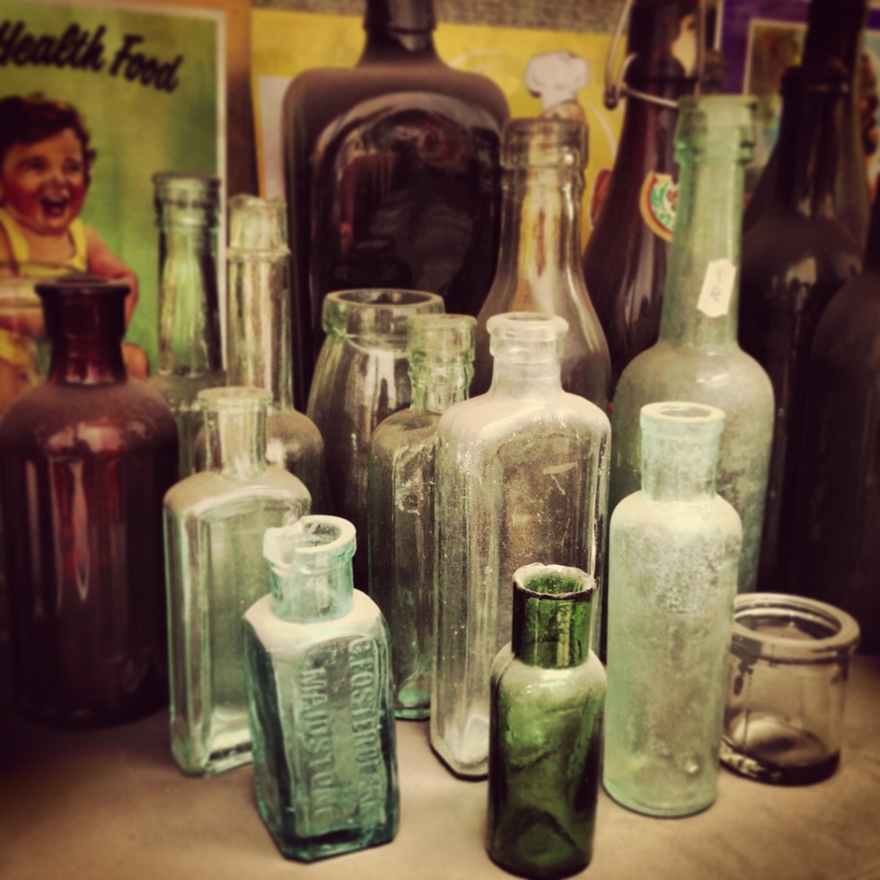
{Vintage glass treasures. Some of these are now in my personal collection}
Emerging Designers

P.S. Don’t forget, its a members only website, so sign up and expect to get blown away by beautiful designs and sales straight to your inbox.
xo Romona
![]()
Emerald Delights
Along with pretty much all of the design and blogging world at the moment, I am in love with all the greeny goodness popping up all over the place since Pantone announced Emerald as its colour of the year for 2013. Just for a bit of visual candy, here are a few of my favourite interiors, products and miscellaneous images featuring variations of this striking gemstone hue.
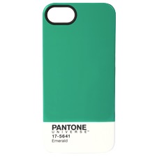
{Pantone’s limited Edition Mug and iPhone5 cover in Emerald}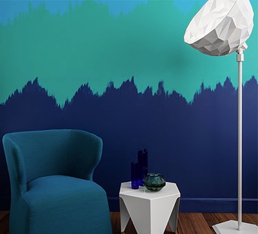
{Dulux’s Empower Palette - Image styled by Bree Leech featuring Dulux Liberty, Bahaman Bliss and Misty Blue}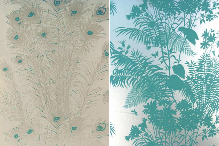
{Florence Broadhurst Peacock Feathers & Shadow Floral wallpapers from Signature Prints}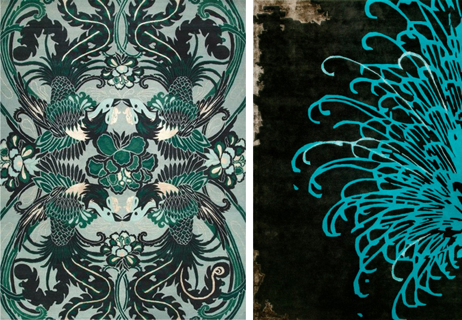
{Night Bird by Catherine Martin, Bansyu by Akira Isogawa, both at Designer Rugs}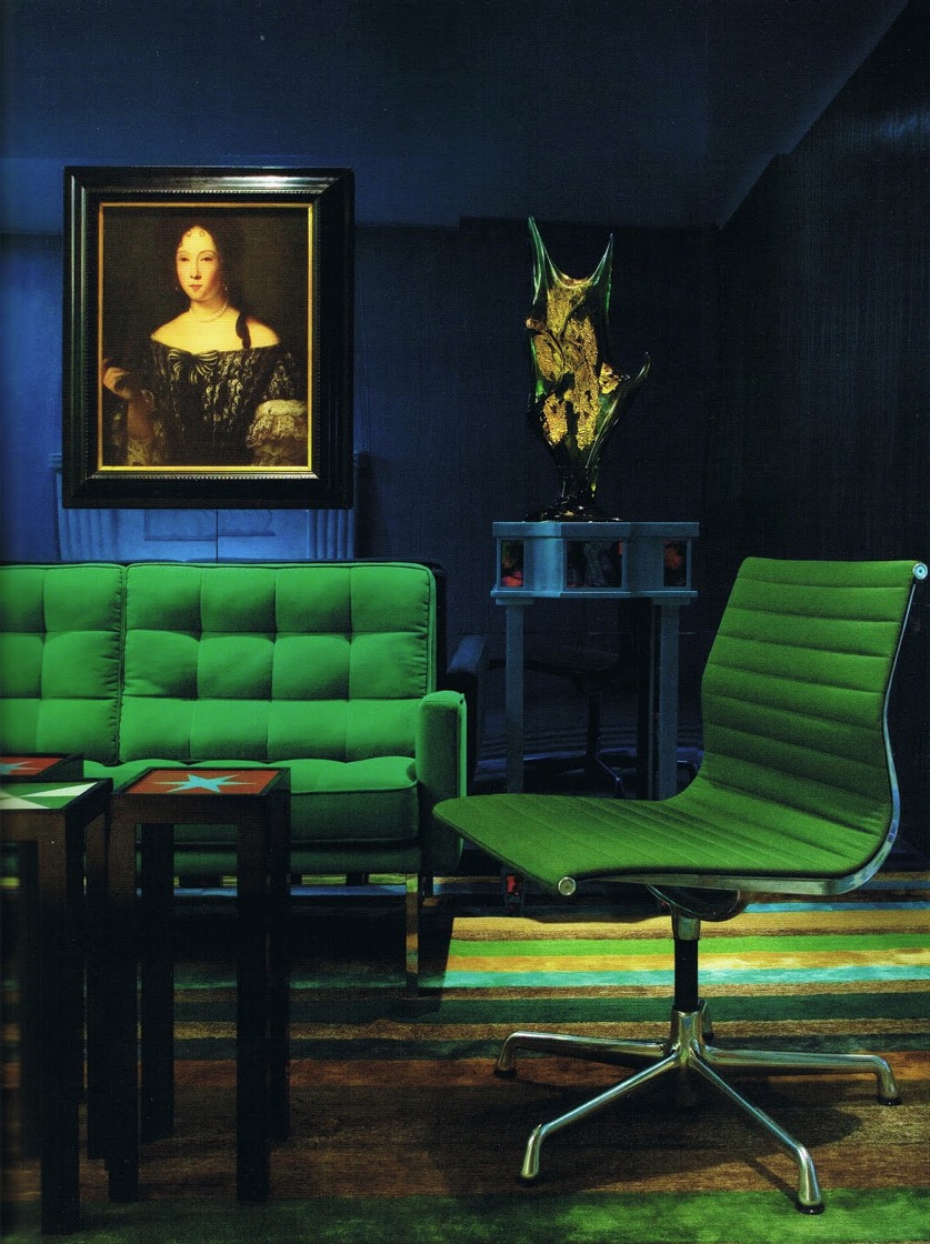
{Emerald vintage Florence Knoll & Charles Eames furniture. Interiors by Doug & Gene Meyer.}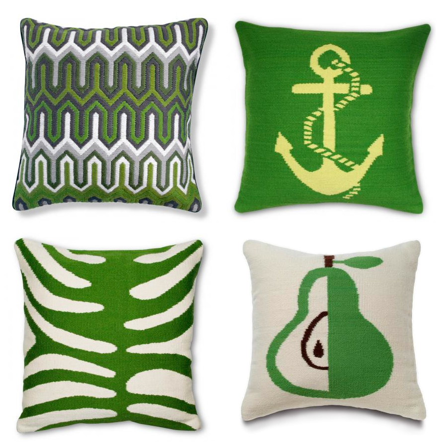
{Jonathan Adler Needlepoint pillows}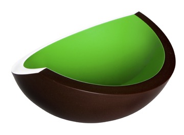
{Husque Bowl Macadamia Nut in Green}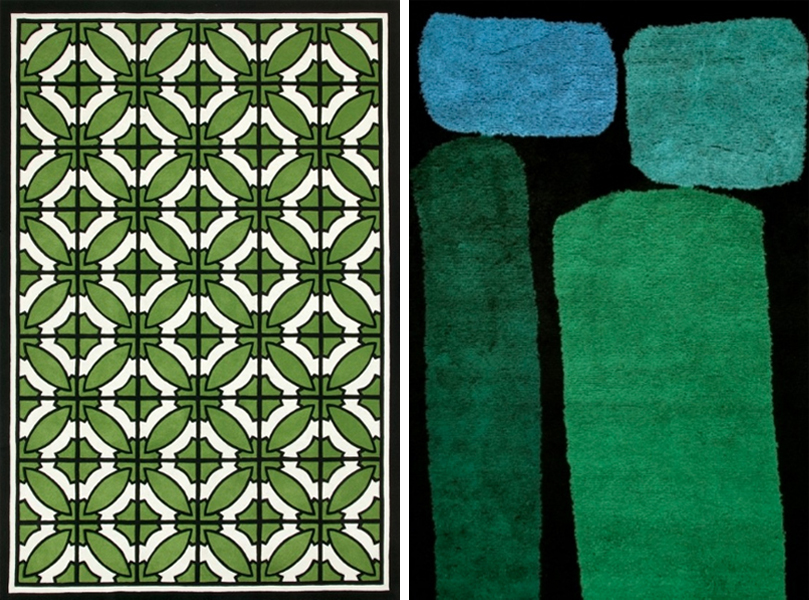
{South Beach by Greg Natale, Jewel by Dinosaur Designs, both at Designer Rugs}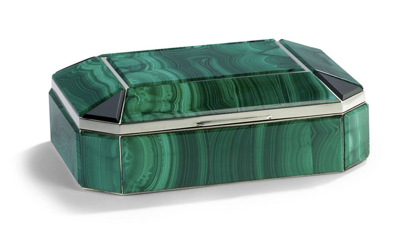
{Bianca Malachite Box by Ralph Lauren Home}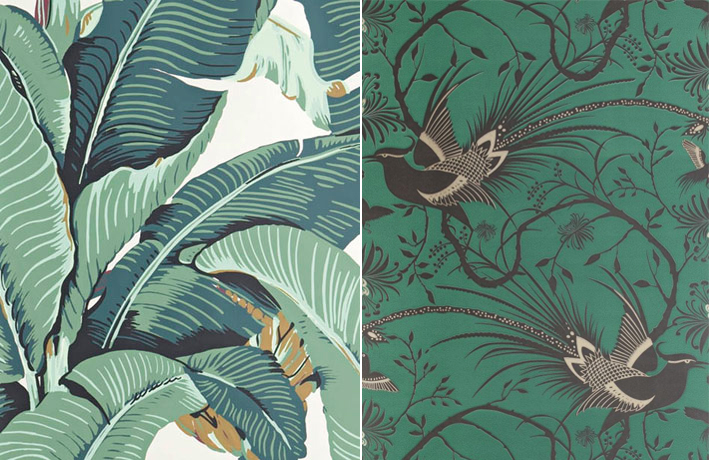
{Martinique Beverley Hills wallpaper; Catherine Martin for Mokum Imperial Pheasant in Emerald} 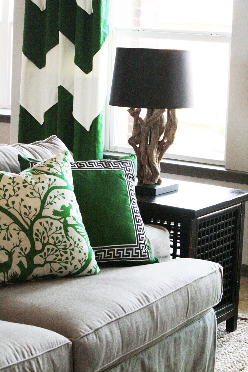
{Emerald accents. Interiors by Charm Home Design}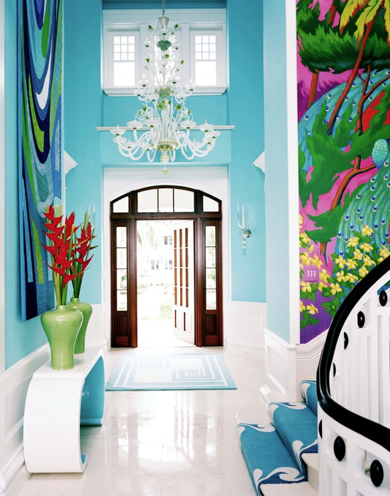
{Interiors by Diamond Baratta. Image via House of Turquoise}
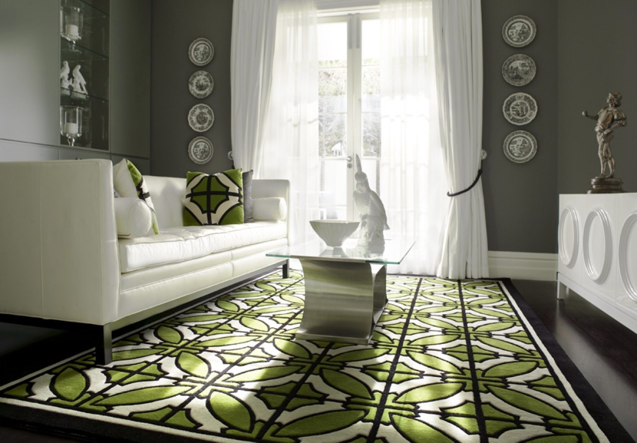
{Interiors by Greg Natale, featuring his South Beach rug}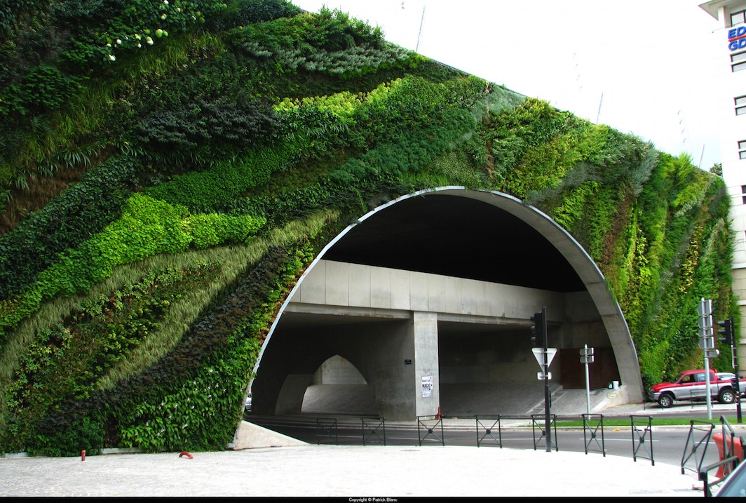
{Pont Max Juvenal, Aix en Provence, 2008. Patrick Blanc}
Of course I couldn’t resist throwing a green-walled building in there. You can see a few more on my previous post, Vertical Green. I am hoping to do another post on green walls this year, since the last one didn’t even scratch the surface of the beauty that is out there.
These bright emerald visuals make me giddy. Yes, I’ll admit some of them are straying more into teal and turquoise territory, but that is the beauty of perception - maybe your eyes will see a whole different picture. I hope you enjoyed this quick (and a little lazy) post. Until next time.
xo Romona
![]()
Spotlight on Australian Designers | Simone LeAmon
Her literary contributions are a great read. Simone explores What is the Price of Creativity? And How Do We Value The Future of Australian Design? addressing succinctly the report Do You Really Expect To Get Paid? by economists David Throsby and Anita Zednik. Another piece by Simone in Indesign magazine explores What it is to be ‘Australian-Made’. Links to her other articles can be found on the webpage.
A true multi-disciplinarian, she has excelled in design in many forms - furniture, jewellery, product design, lighting, artworks, events, interior design and more. Here are a few of my favourite pieces of hers.
Named after the insect species, the Lepidoptera chair takes it form from studies of the anatomy of butterflies wings, folding fabric salvaged from automotive textile remnants. Bright, stylish and beautiful - both Simone and the chair!
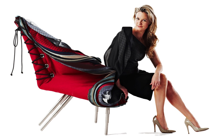
{Lepidoptera chair, using Automotive textile remnants}
The Ricotta floor lamp is evocative of the making process of its namesake. Uniform lines and bright chartreuse powder coated steel make this an elegant and modern statement piece.
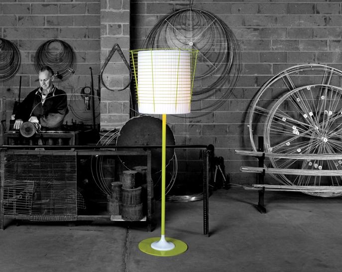
{Ricotta Floor Lamp, Simone LeAmon for Rakumba Lighting}
I am a sucker for statement jewellery. Anyone who knows me, knows that. You can never be too fat or skinny, too short or tall, too dark or light, for stunning high-impact jewellery. LeAmon’s Limited Over pieces are sleek and sculptural, crafted from Bronze and 316 Stainless Steel wax castings of her original Bowling Arm jewellery. The originals used leather waste from cricket balls. The two pieces in the collection, Grubber and Popper, are each named after a different bowling style in the game. I would have to defer to my husband to get any more information on that, or maybe consult with our old Test Match game.
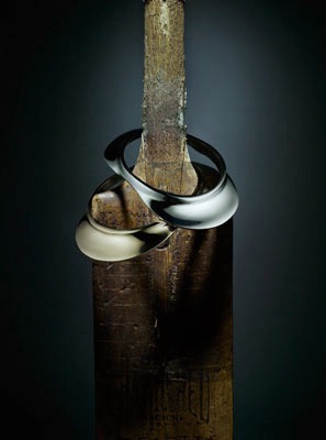
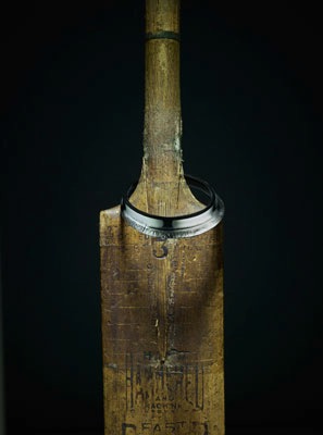
{Limited Over, Grubber (left) and Popper (right) special edition jewellery in bronze and stainless steel}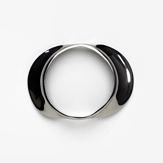
{Limited Over, Grubber special edition jewellery in 316 stainless steel}
Hope you enjoyed the second Spotlight on Australian Designers. I hope to bring you more soon - it’s a long list of lovelies!
Who are some Australian designers that you love or have influenced you in some way?
xo Romona
![]()
Spotlight on Australian Designers | Helen Kontouris
Her design ethos is perhaps best described in her own words. “We live & breathe a culture of dreams, process & creativity. Our approach to each project is an opportunity to discover, learn, evolve, simplify, interpret, innovate and create. Strong creative partnerships are formed through our commitment, value, contribution & growth of our clients businesses. Our role as designer is not to give you the safe or predictable result. We sometimes challenge & redefine the project to enable us to explore the possibilities we strongly believe in, whilst always respecting the client’s decision.”
“We believe ecology in design today, rests on the role of the designer as cultural architect, creating products with clear purpose, intelligent material appropriateness & function that arrest you with their beauty & promote a movement ‘against throwawayism’. You are emotionally attached enough not to discard it. When you no longer need it, give it to someone whom you know admires it or to charity for those who need it more now, than you."
I love that responsibility is taken as the designer to promote, encourage and even demand a holistic lifecycle approach to both the purchase and the retirement of their products. There is no reason that a product should not continue its life-after-you in one form or another, whether it is in perfect condition (go ebay or lucky friends), restorable (gumtree or second hand store), or completely decrepit (recycle those bits into something else or see what can be picked up for recycling by your council). Oh, how I miss the mass hard rubbish display around the neighbourhood at council collection time - it hurts to see people’s unwanted treasures now get picked up quickly and efficiently on individual basis, crushed into nothingness, when those poor items could easily have had another life or two. I digress.
She has a fun and informative website and blog, in which you get to read about her design processes and the happenings in the life of a talented designer, as well as peruse her many fabulous designs in detail, including the ones below. All images are from her website, which you can check out here.
Here are a few of my favourite pieces of hers.
The Penelope is a simple and classic steel and timber beauty, that was on display at Stylecraft during Saturday InDesign 2012. The masculine, honest structure of the legs complements the smooth streamlined timber top, allowing the polished woodgrain to feature.
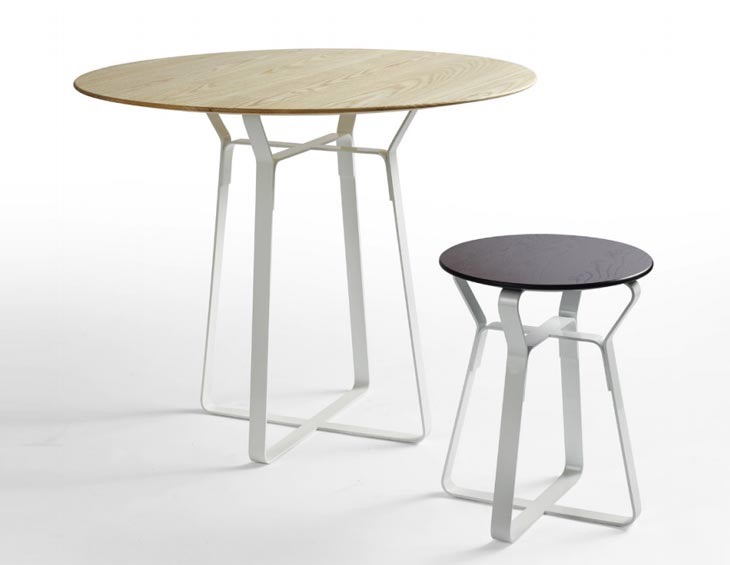
{Penelope Table and side table/stool - available at Stylecraft}
Her Scoop Egg Cup & Spoon collaboration with Alessi is a stand-out. What can I say - I am sure you have all seen this lovely, sculptural piece before. Beautiful but functional is epitomised in this lustrous and decadent egg cup. What a glamourous Sunday breakfast would be had with this baby. Puts my cheapo wire one to shame! It is now on the Christmas list.
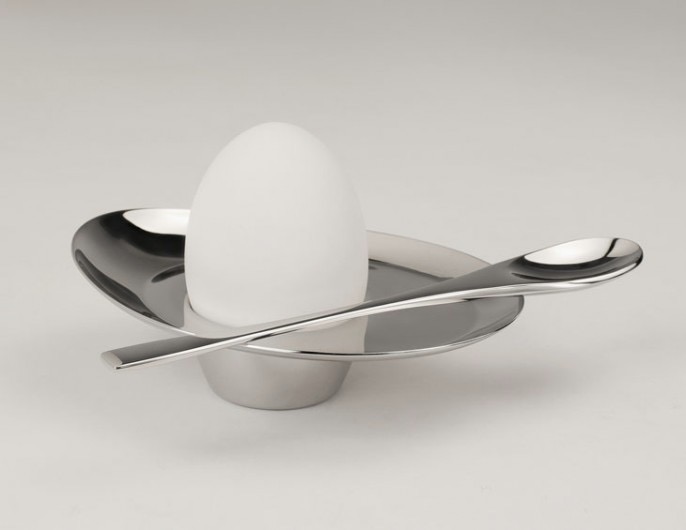
{Scoop Egg cup & Spoon for Alessi - Available at most department stores or online}
The La La Lamp is a floor lamp made of two conic, internally opaline coated fabric shades with a noiseless IGBT technology dimmer. Classic geometry combined with quirky lines create a real feature for any space. Unfortunately, I can’t find exact stockists in Australia, but it was featured at a Schiavello event and since they also stock her La La Stool, I am sure they could help you out.
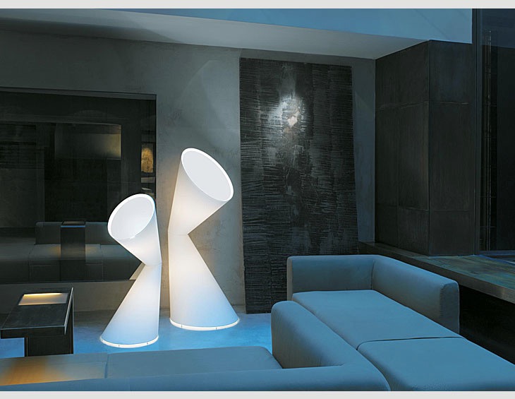
{La La Lamp for Kundalini Italy}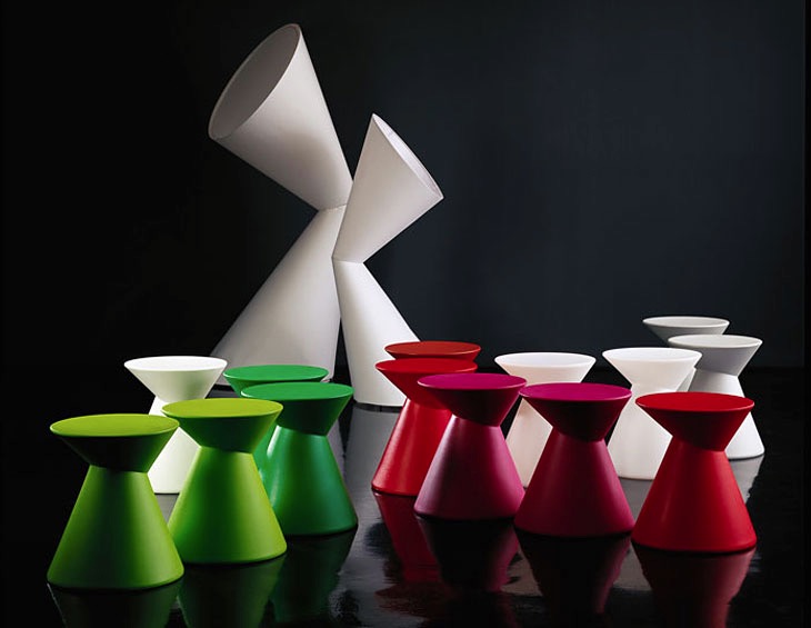
{La La Stool, Available at Schiavello}
The graceful lines and soft appearance of the Panier stool belies the fact that it is made from 100% recyclable Polyethylene and suitable for indoors or outdoors. Shortlisted for the best 'Object – furniture and lighting' in the IDEA Awards 2012 (to be announced November), this design highlights yet another triumph for Helen.
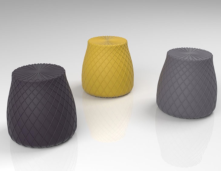
{Panier Stool, Available at Space}
I hope you enjoyed the first of what I hope will be many posts shining the spotlight on Australian Design.
Who is your favourite Australian Designer?
xo Romona
![]()
Unearthing Treasures
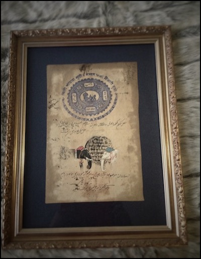
Inspired by Carpet Court’s new Love the Look competition (How hard is it to choose between team Darren and team Stacey!), I went rummaging through my boxes of trinkets and collected items from my travels and explorations. You know the ones - the pieces you’ll put up in your one-day house (the one with room to spare - a library, a sitting room, a chic powder room off the entry foyer, maybe even a gift-wrapping room à la Martha Stewart). The piece that caught my eye was right there on my bedroom wall. The exquisite hand-painted Indian wedding ceremony on a government stamped paper that I found in a market in Jaipur, India.
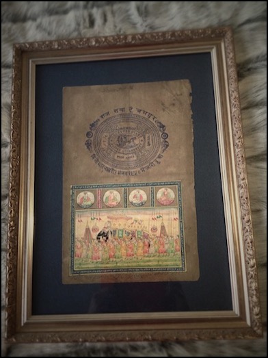
{Indian Government Stamp and painted Wedding Ceremony Artwork, from a market in Jaipur, India}
Another work from the same market is the black and white elephant heads (below right). Until I photographed them for this competition, I had forgotten how much I liked looking at all the scribbly detail in them.
{Indian Government Stamp and painted Elephant head Artwork, from a market in Jaipur, India}
They are totally out of place in my current bedroom. As it stands, it’s a mismatched explosion of objects - and not in a good way (thus the desire to refurb it, stat!) I love mixing vintage with contemporary, but the pieces have to be right and I feel it has to be done with a cautious hand and keen eye.
I had been meaning to reinvent my bedroom into a palace worthy of old Hollywood. Glamourous crystal and blinding chrome. Tufted velvet and mirrored lucite-legged vanities. All look but don’t touch. Now though, I am having to remind myself that yes, although I love the look of these in magazines, could I live there? Especially with two young boys (one who likes to crawl into bed with us after pushing most things off the dresser with his cars, and another that I’m sure will do the same as soon as he is able to get out of the cot).
I’ve decided to go back to basics. Firstly, I have to decide what, if anything, I want to keep from my current room or if there is anything that I already own that I want to introduce into the new room (such as an art work or armchair). I think I will be keeping more than I’d like to (budgetary reasons), but upcycling is under-rated, so I’ll see how I can change the items that I can’t afford to replace, to fit the new style. If you follow me on Pinterest, you may have noticed that my DIY folder is getting more of a work out lately than usual. With two kids, and without the disposable income that we had before them, I can hardly do the complete Jonathan Adler meets Kelly Wearstler that I’d like to.
Secondly, research images that attract and excite me, and define what it is about that image that gets me going. Is it the whole package, a particular furniture item, the colours - warm or cool, the scale, the layout, the fact that its tidy, what? Then see how it can be applied or worked into the canvas that is my room. Again, Pinterest and Houzz are wonderful resources for finding inspiration and products. Of course, its always fun flicking through drool-worthy magazines like Belle, Real Living, Sanctuary and Home Beautiful when you can find the time. I embrace my iDevices, but I am not quite ready to part with my monthly deliveries of hard copies just yet, thank you.
Luckily time is on my side. With a bathroom renovation due in October, it may be a few more months before I have the spare coin to put towards the fabrics or wall paper that will make it really worth doing. There’s nothing wrong with taking time to make sure that you really do love that particular pattern you chose, and not just because its on-trend or was used in that house by that guy in that magazine, you know the one! For now, I am just trying to remind myself to keep the basics somewhat neutral, so I can really go nuts on the replaceable items like headboard fabric or bedding or window dressing.
OK, so I think I have successfully gone completely off topic. Maybe one day I’ll be able to do it with the charm and imperceptible manner of Ross Noble or Billy Connolly. Until then, I will just say that I will revisit the idea of finding hidden treasures in your home when inspiration strikes. I’m hoping to also bring you a little introduction to our planned bathroom reno coming up - I look forward to some peer feedback if you feel like it. Ciao for now.
xo Romona
P.S. (again) Sorry that comments aren’t allowed at the moment. I really want to hear any feedback you have but iWeb is disagreeing with me and I need to find a new program. Excuses, excuses!
Please feel free to email/tweet/FB post me - would love to hear from you!
UPDATE: Hopefully comments should work now….
![]()
Saturday InDesign 2012
I’m lucky to have been blessed with two very co-operative babies (my first was strapped to me in the same Baby Bjorn two years ago at the last Melbourne Saturday InDesign). Even so, it is a long day and if all things go to plan, I shall get to have my next one sans-bebe and stay for the inevitable evening festivities.
I love getting out and seeing the new products on offer, seeing other professionals and design enthusiasts cruising between show rooms with happy neon lanyards around their necks. Although it is a given these days for companies to have a wonderfully detailed and impressive looking website, there is nothing like running your hands over perfectly smooth and detailed timber or rough textural fabrics. Being stuck in the home most of the time, I relish the chance to get out to these events, and highly encourage it to all.
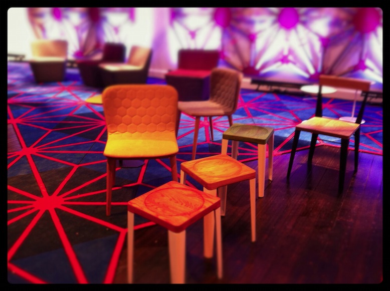
Our day started a bit later than intended (as usual) and the first stop was Zenith Interiors. Bright colour, neons and geometry were evident, on-trend in all things at the moment. The impressive Godfrey Hirst neon pink geometric-edged carpet was a stand-out for me. Pumping music and yummy cheesy pretzels lead the way to a visual treat in the form of the Zenith Design Competition display, featuring creative ‘outfits’ for the TIPO chair.
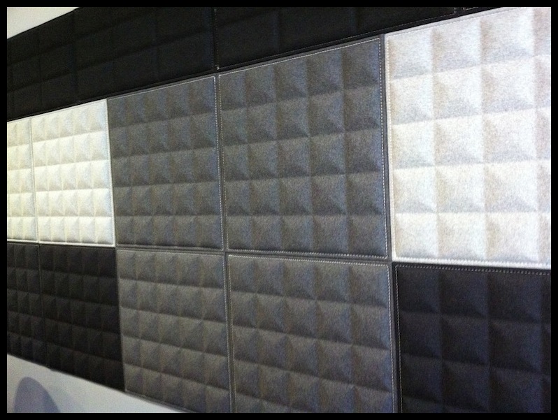
I also fell for their wonderful Buzzitiles 3d, recycled-content wall panels (below) - Although I’ve only ever specified similar for commercial fit-outs, I’m hoping to form them into a headboard for our bedroom. Love that mid-grey pyramidal form creating depth and texture.
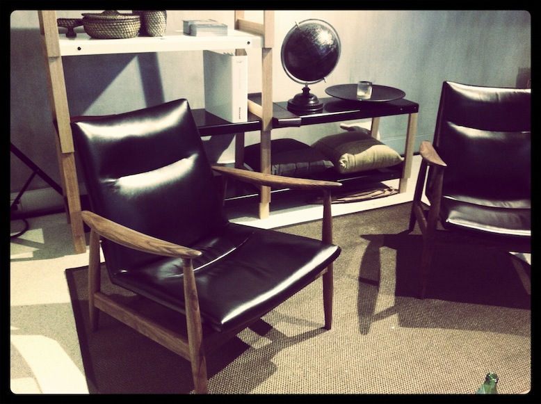
A few quick pop-ins along the way to the next destination, Stylecraft, to catch up with a friend over from Radelaide. Love when events drag people to Melbourne from all over the country! She did a great job simultaneously catching up, pouring us champers, snagging the delectable little soft shell tacos and showing off their new and current products. The styling and quality that they displayed throughout the space was first class. My mum (Artist and Designer from Perth, Melva Babarskas) was about ready to snatch the striking orange chair from the entry, while I was coveting the rich black leather armchair and its surrounds.
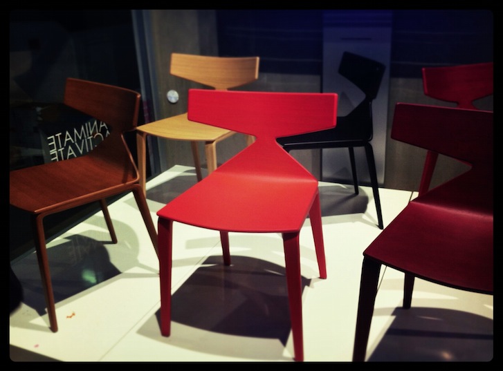
The last few locations were all about lighting, lighting, lighting. Euroluce’s display was fantastic as usual. De De Ce also presented a classy exhibition. Again, my impending bedroom refurb was front-of-mind, so the selection of lamps in metallics and gloss were particularly appealing. Copper and Bronze are everywhere at the moment. It’s a nice break from the chrome/silver world - still up there with gold in luxuriousness, but not quite as cocky. Yamagiwa’s Mayuhana pendant by Toyo Ito at Euroluce was a glowing beacon in the corner and would look impressive in almost any space.
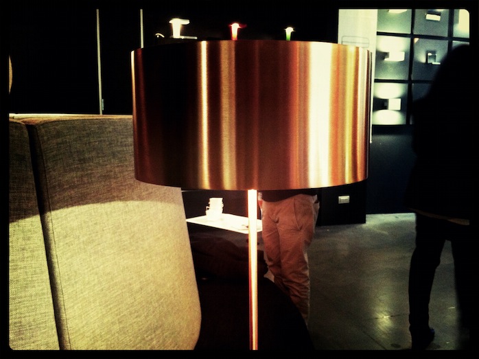
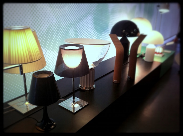
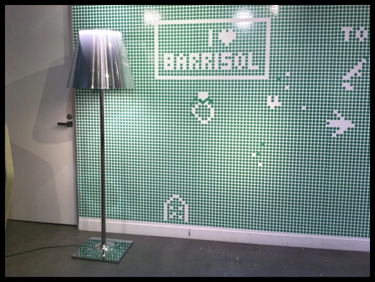
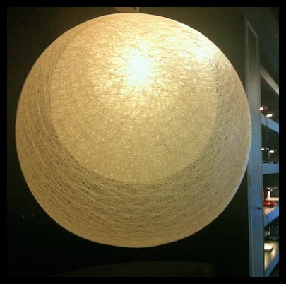
A tired and hungry baby put an end to the days festivities, although it must be said that he was exceptionally well behaved for most of it. Had a great day, met wonderful-beautiful people and definitely got my design-fix for the week.
Hope you enjoyed my second post and hopefully enjoy more to come.
xo Romona
![]()
Perth's Got Talent
I've tried not to be too limiting of my selection of designs that I found at the conference, so if you notice that your design is not here, just know that I was so overwhelmed by the talent, I may have forgotten to grab a card or scribble a note. For now, enjoy all this sunny WA talent and I'm sure I'll have another post soon with more.
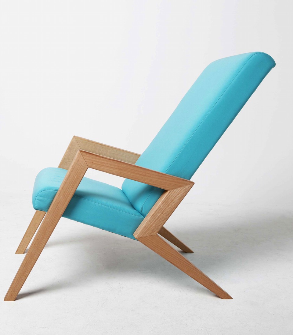
{Aerial Chair by Megan Devenish-Krauth, industrial designer at Megmeg. I want this!}

