


Chrissy Time
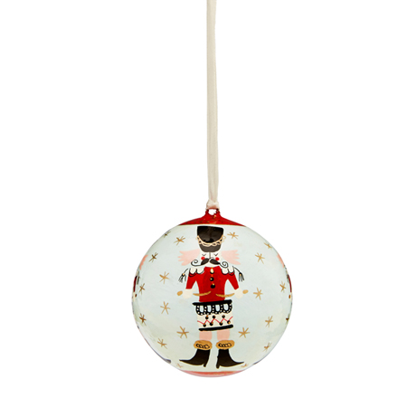
{Beautifully crafted Papier-mâché Christmas ornaments by Mozi. I have a few from last year, so can't wait to get some more to add to the collection}
Terrariums and Potted Green
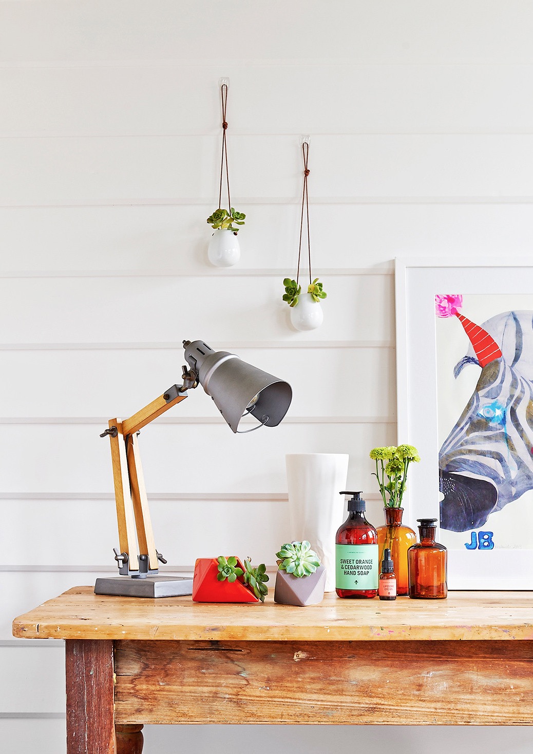
{Ceramic Diamond Planters on table and Petite hanging Vase on the wall, both by LoveHate and available at Cranmore Home}
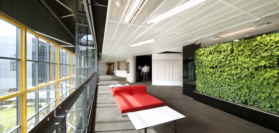
Concrete jungle
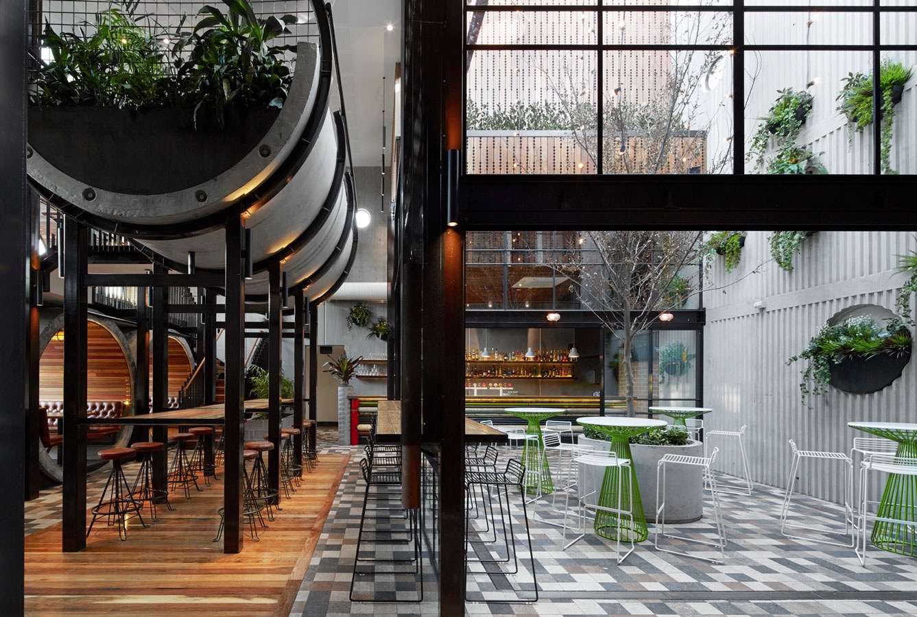
{Prahran Hotel interiors by Techné Architects}
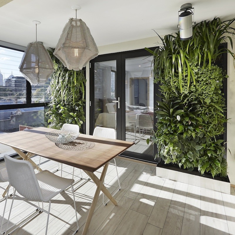
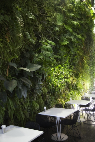
Vertical Green #2
I have been through some of the benefits of green walls with some examples previously, here, but since there have been so many fantastic examples of late, I felt the need to give you all a second helping of green delights.
{The Florafelt F12 Greenwall growing panel by Fytogreen Australia as used in Kim & Matt's outdoor space on The Block Sky High 2013. The panels are made from 100% recycled PET plastic felt and are available from The Block Shop}
Do you Adore?
For some insane reason, I forgot to take ‘before’ shots, so had to trawl through my databases for some random shots of the ‘back room’ aka Laundry aka office aka crap-dumping-space. Unfortunately the only before pics I could find show just how much crap normally surrounded me in the office space, but fortunately the tidy-up pre- and post-painting make the overhaul look like much more than it was.
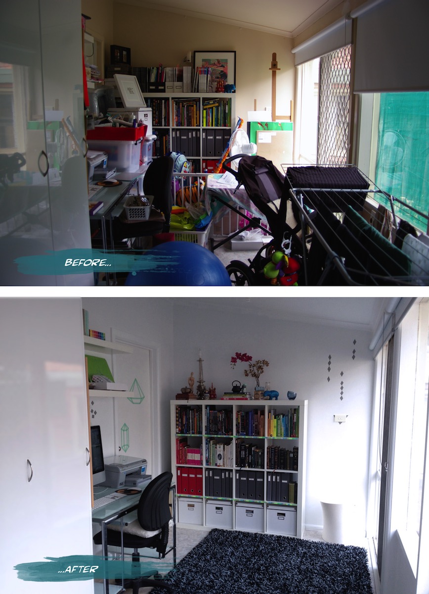
{Office before and after}
I had a bit of fun with Washi tape (and more since) after deciding against painting a decorative element and not being able to find a decal I liked. The basic tutorial for the washi tape jewel idea on the door was from Objects & Use. I’m waiting for more washi colours and patterns from etsy to go even crazier.
Now that's efficient
“Located in Barcelona's hip Born district, the tiny apartment is a remodelled pigeon loft. Christian [Schallert] says its design was inspired by the space-saving furniture aboard boats, as well as the clean lines of a small Japanese home”. I personally love that the bed slides under the balcony and converts to a step, chair or lounge. Great work by architect Barbara Appolloni. Enjoy!
xo Romona
![]()
Sydney Decoration + Design 2013 - Part 3
{Greg Natale’s Wallpaper range for Porter’s Paints}
Greg’s seminar took us on a journey starting back with his inspiration as a child and knowing quite early on what he wanted to be and do.
Sydney Decoration + Design 2013 - Part 2
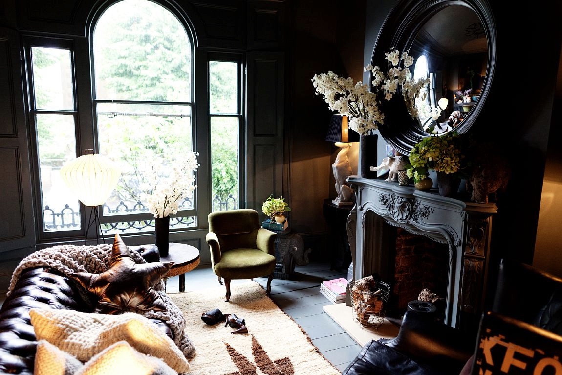
{Abigail’s own lounge. Dark, inky palette brightened with multiple light points. Source}
The queen of eclecticism and dark, moody interiors, Abigail Ahern, was over from the UK in her own whirlwind Sydney sojourn. Her seminar drifted through her style guides and tricks of the trade, complemented by spectacular imagery. These spaces, tips and tricks are all summarising beautifully in her book.
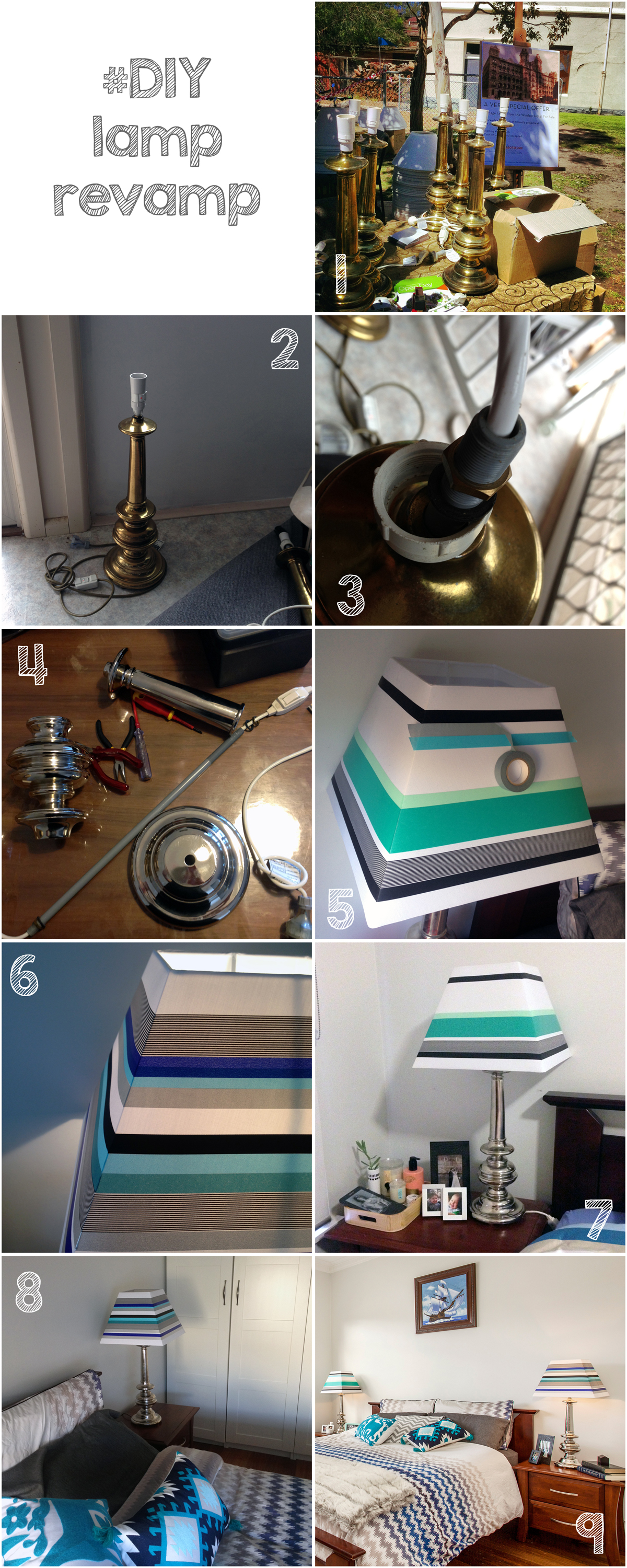
Lamp revamp
Bathroom... After
Work started early on a Monday morning. Dad, hubby and I got stuck into ripping off the wall tiles. As with most old houses (with the added bonus of previous owners who have attempted DIY renovations themselves) the wall structure was no longer (if ever) level or square. There was also the unhelpful surprise of most of the wall sheeting coming off with the tiles. The flooring didn’t fare any better - also ripping half up with the tiles. Previous work scraps had been tossed in the wall cavity - I like to think for reuse as insulation - and a few little creatures had been making there nests around the bath supports. On Tuesday the plumber started his work relocating the bath, shower and vanity fixtures and putting in the pipes for the new toilet (yay!). Once that was completed, we could start on sheeting and patching up the walls, floor and front of bath. Waterproofing was painted over all surfaces and allowed to dry (time for a well deserved bevie break). The rest of the week was spent cutting, tiling, painting and cleaning out dust and debris, in time for the plumber to finish up and fit off the following week. For a more visual step by step of the process, you can check out my Instagram page. You can also read more about the bathroom ‘Before’ the renovation here.
Drum roll…. the finished product! What do you think? We are very happy with it, of course, and I catch myself walking past the door quite slowly now just to admire the view. In fact on seeing this post, hubby commented that he can’t even remember the bathroom before, even though it was only two weeks ago. Purged.
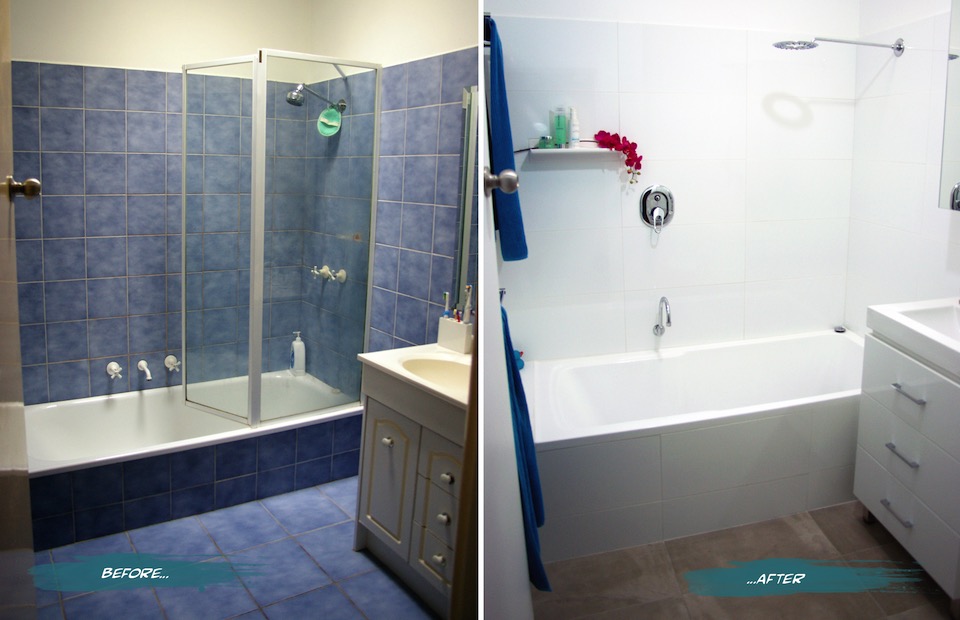
{The Sandon Bathroom - Before and After}
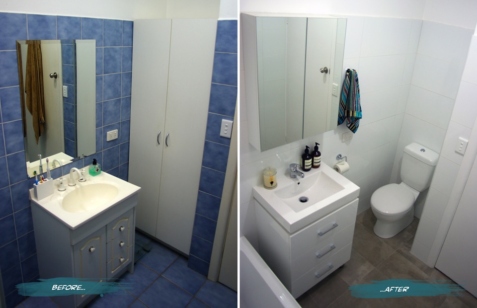
{Bathroom Vanity and Toilet - Before and After}
Here’s a summary of a few of the changes and features we have in the new and improved Sandon House Bathroom.
The vanity was moved closer to the bath to allow for the toilet, but still enough room for the much larger bath (we went from a 600mm to a 820mm wide - much more user-friendly). If we had an OH&S inspector in-house, they would definitely approve. You can read more about the troubles I’ve had with the narrow old bath in the previous post. The bath is not only wider, but taller. It took a few goes to get used to stepping over it, but it’s very handy with keeping small children from toppling over and into it. Plus during one of my habitual, long relaxing soaks, I don’t have to have the water full to the brim to actually be covered and stay warm.
{The finished product}
Our second toilet - hooray! On plan it looked like a bit of a tight squeeze, but we have since found that there is more than enough room and it is quite a comfortable space. It’s still quite precious and we are not used to having the second option, but I’m sure that will end soon. The seat is soft-closing (the slowest we have ever seen actually - almost ridiculously so), which helps prevent slamming noises becoming a child wake-up-call in the middle of the night.
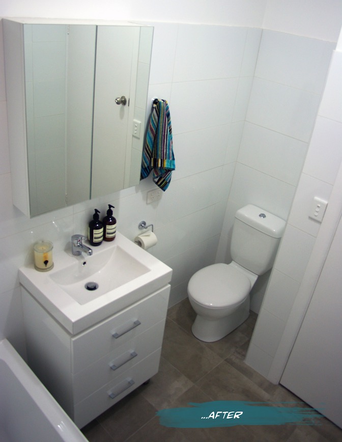
{New Mizu Vanity and Toilet from Reece}
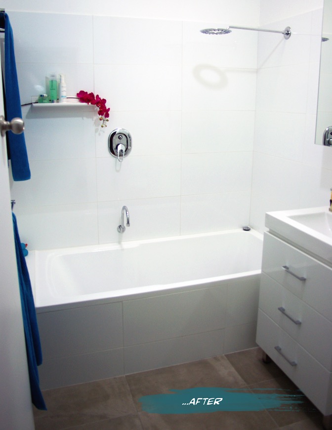
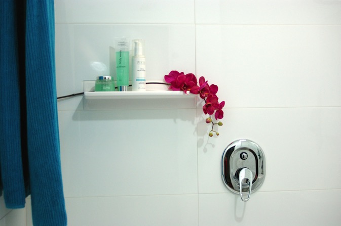
We added a tile shelf high enough to keep expensive shampoos from becoming very expensive bubble bath, as well as far enough away from the shower head to be a pool collector. I find them a great idea when you don’t have the building room to put in alcoves or set-in shelving. As long as you keep it simple, it allows the featured items to stand out without becoming a feature itself. We added an extra towel rail from before and made them double. Not necessarily for two towels, more for the aid in drying. My husband finally gets a towel rail of his own, as opposed to the hook on the back of the door where it never really dries. At the moment the kids towels hang on the back of the door, but we allowed space for another towel rail to be added if and when we need it (big enough to hang bath sheets because once you go up from towels to sheets, you can’t go back!)
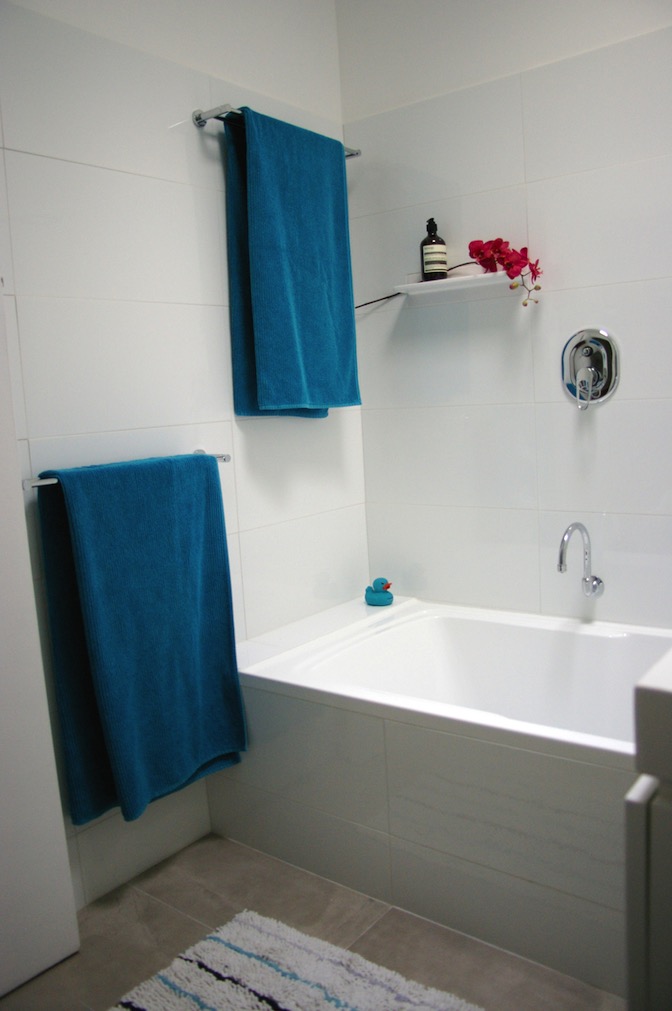
{New huge bath and surrounds}
I chose white wall tiles and a white vanity for brightness, simplicity and longevity. Even though we haven’t changed the skylight, the white reflects the light much more and creates a connection with the outside that belies its central location. The concrete-style grey porcelain floor tiles also give the space a neutrality that is much easier to style and change with soft furnishings and accessories. I had chosen a sleek minimal bath spout, but on further thought, we swapped it for a gooseneck swivel style so that we can run the bath and get it out of the way when the kids are in there, avoiding bumped heads. The Shower diverter mixer was placed far enough left that you can easily turn the water on without getting sprayed, and high enough that the kids shouldn’t be able to play with it for a little while longer. You may notice that I haven’t chosen very ‘designer-y’ fixtures. This bathroom for us is a family bathroom, and with two growing boys that will undoubtedly test the strength and endurance of the fixtures, we went to the budget end of the market. Fixtures are items that are easy enough to replace in a few years, so our money was directed more towards the items that are more difficult to change, such as the bath and tiles.
{Bright white large-format tiles allow us to play with colour}
Having said that, after years of low pressure and uncomfortable showers, the selection of the shower head was quite important. My husband wanted a good soaking while I wanted to make sure that it was still water-efficient. We found our compromise in the Halo shower head from Reece and so far soooooo good.
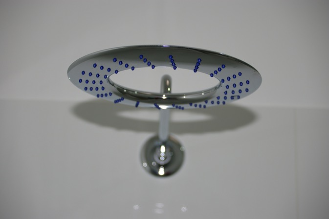
{Halo shower head from Reece}
If you would like me to post the plans, let me know - but photos are more fun, right? If there is anything that you want to ask about the project or specific products please do. I am more than happy to have conversations about it in the comments section below or over email.
FYI - Some of the items pictured and their sources:
- Bath, Vanity, Toilet and fixtures from Reece.
- Wall tiles from National Tiles
- Floor tiles, towel racks and hooks from Vision Bathrooms
- Hand towel by Missoni
- Aesop Resurrection Hand Wash and Balm
- Ecoya Metro Jar soy candle in Wild Frangipani
I hope you enjoyed this exciting little project with me. Time to plan the next one! (Sorry honey)
xo Romona
Bathroom Before…
First up, I would like to justify why we wanted to do this. It's not a cheap exercise and I think updating a bathroom for aesthetic sake alone can be costly, time-consuming and if not done correctly won’t give you the value-add you were expecting.
If you are going to rip it all out, take the time to assess what works and what doesn't.
What features you like and what you detest? What do the occupants need? Is your situation changing - will you need to accommodate growing children, elderly or disabled access? How easy it is to move around, do you bump into anything, are the towel racks too low, too high or too few? Do you need to update your fixtures and fitting to more sustainable, water-saving options? If you are thinking of selling in the future, what would appeal to the largest audience?
Obviously, the aesthetic update is always a big motivator. I love blue, but not this blue and not this pattern and not in this quantity, all over the floors and walls. Yes, of course, I have seen much worse in my travels, and if there were not other issues with the bathroom we could have easily put up with it for a few more years or until we moved on elsewhere. So here are a few of the glaring issues that we have had in our years with this bathroom.
Problem One - The Bath
The existing bath was just that. A Bath. Not a shower bath. Definitely not something that any person (let alone an occasionally pregnant person) should be standing up in. The narrow 600mm wide rounded-bottom bath has always been a bit of a nightmare to shower in. Elbows knocking into glass panes, tiles and fixtures, knees knocking while attempting to stay upright with splayed feet on a narrow curving base. Nothing to hang on to that wouldn't go down for the count with you. I learnt the hard way that you should back out rather than turn around to get out while heavily pregnant - hint - you get stuck… really stuck! An embarrassing few minutes can be spent deciding whether to soap or scream your way out of it.
Problem Two - The Vanity
While admittedly the rest of the house isn't level either (a problem made even more apparent while dad cursed his way through a lot of the refurb), the vanity was especially tilted. Angling towards the back wall to create the perfect ecosystem for a rainbow collection of mould and nasties. Although we wiped it down often, it wouldn't take long to fight its way back and I definitely would not have wanted to see a swab of that cultivated and rising out of a petrie dish. The chipboard doors were also moisture damaged, splitting from their nasty cream laminate.
Problem Three - The Toilet (or lack there of)
A husband, two rapidly growing boys (one starting potty training), friends with numerous young, interstate family and guests that stay with us, and an inexplicable need to all go to the toilet at once meant that our single sad little toilet was not meeting expectations. A second toilet - never thought that would be a major player on my wish list. No longer having to hold it while others day dream or read or check emails or whatever it is that some seem to do on the toilet for so long. The privacy. The convenience. Oh, could it possibly ever be true?!
Originally there was also the problem of icky dirty beige-cream walls, ceilings, doors, frames, everywhere (throughout the house not just the bathroom) but this has been slowly rectified. Vivid White is over all doors and frames, and a soft grey (Nippon Nighthawk) covers most walls (except wet area, which have moisture resistant Vivid White paint on all surfaces). I must admit that the simple few coats of white paint over the walls and ceiling in the bathroom made it much more tolerable and bought us some time to save.
Here are a few before pictures to visualise what we were dealing with.
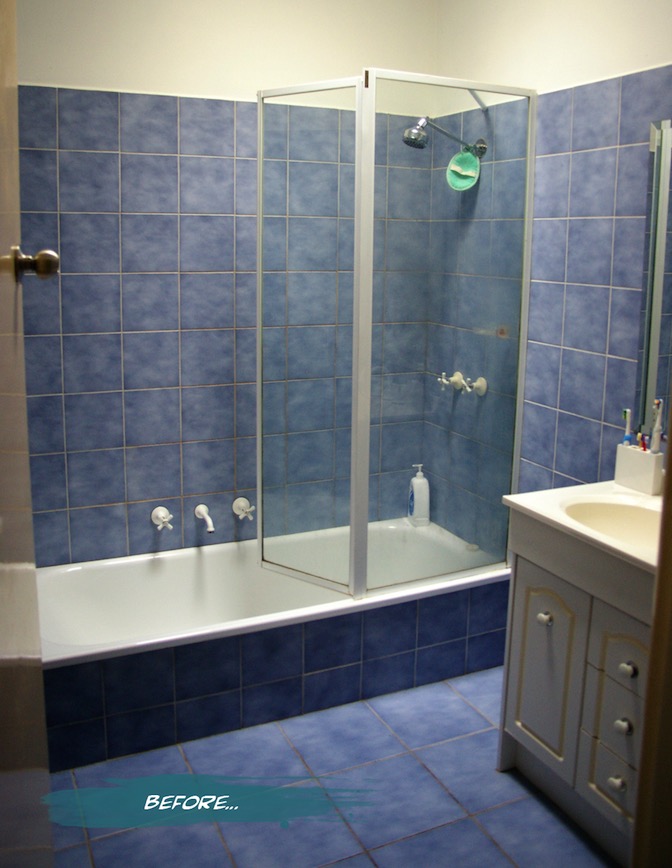
{Before: The bright blue mottled tiles on the walls and floor, too-narrow bath and far-from-level vanity.}
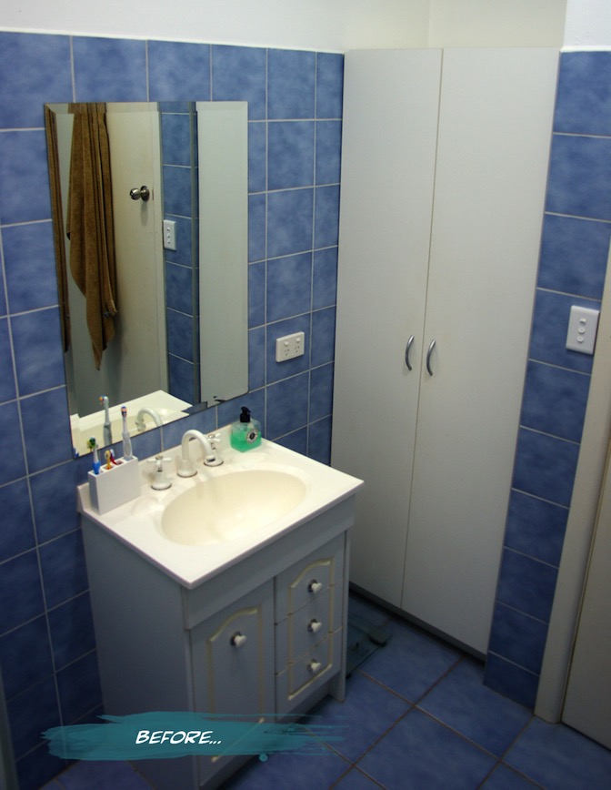
{Before: The falling apart vanity and flatpack cupboard taking up valuable floor space}
I realise that it doesn’t look that bad from a distance. It was the details and the functionality that really cemented the idea of renovating. Some of you may have noticed, if you follow me on Instagram or Twitter, that we have nearly finished the transition from old and shabby to sleek and modern. Although Dad and Hubby did their parts super quick, and the plumber has been very obliging with his time, we still have a few things that we are waiting on (shower screen and a few finishing touches). I’ll pop some pics and deets of the finished results up very soon. Stay tuned…
xo Romona
![]()
Let the Demolition Begin
Just a quick note to let you know that I will be a bit absent over the next week or two - demolition starts on our one and only bathroom on Monday, and work will be speedy to fit in with my wonderful parent's visit to help (all the way from Perth). Dad's a builder, so I am very much relying on his instruction, knowledge and old-school builder attitude of getting in there and doing it right. I will hopefully have time to take lots of pictures and put together a before-and-after piece once it’s finished. Since I've put it in writing now, I really hope that it turns out great!
Hopefully with the parents over I might also get a little babysitting and have time to put together another post or two - bonus!
Until then, hope you have a happy and colourful weekend.
xo Romona
PS. Stay tuned to my Instagram for occasional progress updates
Vertical Green
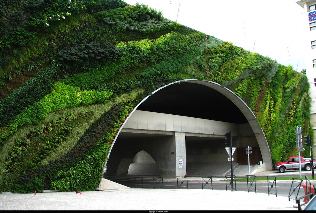
Since I went there, I have to display just a few examples of Patrick Blanc, the pioneer of Green walls in architecture and visual overachiever, including a few very close to home. While the scale is a little above domestic, take inspiration from his sculptural use of botany.
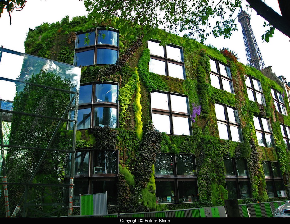
{Quai Branly Museum, Paris, 2005. Architect Jean Nouvel. Greenwall Patrick Blanc}
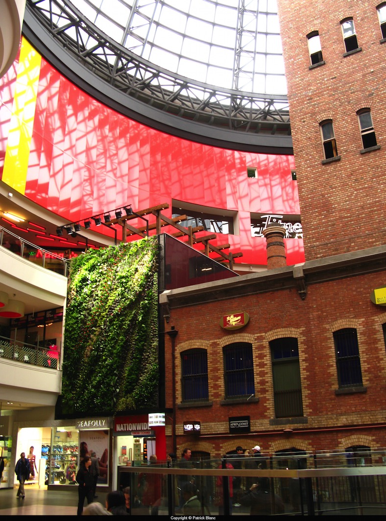
{Our own piece of Patrick Blanc at the Shot Tower, Melbourne Central, 2008}
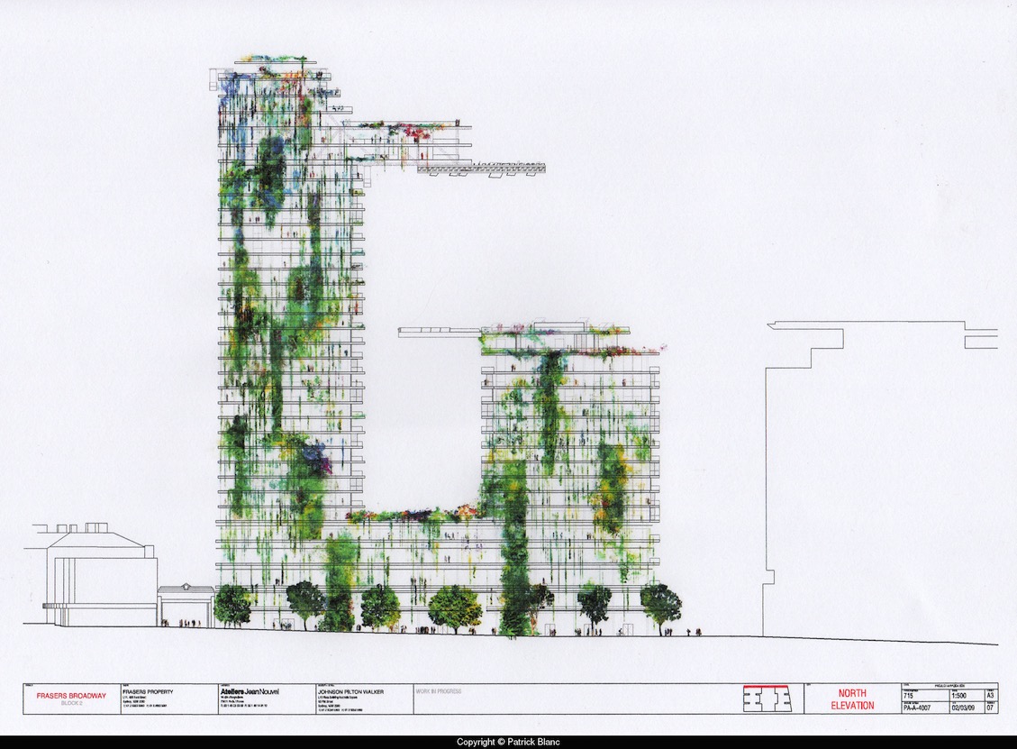
{One Central Park West, Sydney. Architect Jean Nouvel, Patrick Blanc. Due 2013}
I love that green walls have become a prevalent cafe and commercial decoration, and that most will now try and incorporate some functionality into it, with herbs and indoor veggies. Its great to see the new ways people can develop this old idea. I like this alternative to the usual terracotta and unpainted reo mesh of the signature Vertical Garden by Joost Bakker (as seen at Grand Designs). The simple white pots and white mesh offset wonderfully against the uniform dark succulents. Maybe it is just refreshing not to see the terracotta pots again. I think it’s like a popular song on the radio - you hear it so often that you can’t tell anymore if you love it or hate it, but still find yourself singing along.
{Vertical Garden by Joost Bakker for Schiavello}
This smooth sculptural wall with rounded inserts for potted herbs suits the modern bright-white kitchen. Talk about easy access and great smells. I would love this in my house.
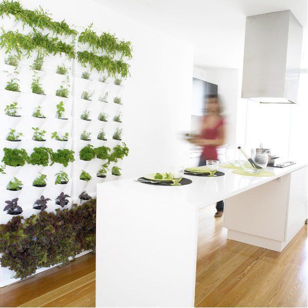
{Edible Herb garden wall complements this modern white kitchen. Source}
The simple draped Porthos between nine white pots on wall-mounted floating shelves are used to break up this double-height common wall in a warehouse conversion in Brisbane.
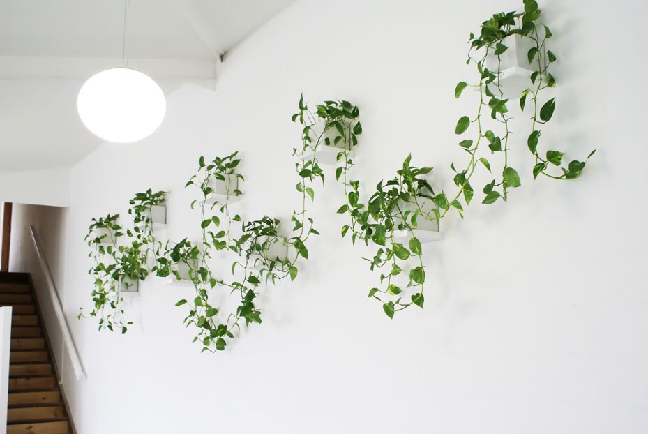
{Minimalist Vertical Garden by Lushe Urban Greening}
I couldn’t leave out the bright entry space to Fujitsu’s 6-star Green Star Docklands office (yes, mainly because it was worked on by yours truly while at Woodhead). The original designs did include using black mondo grass and having a dramatic monotone effect with the black glass walls, emphasising the Fujitsu red. I believe the black mondo didn’t survive too well so the bio-wall is now more in keeping with the bright greens of most green walls, but is still quite effective. The bio-filtration system used was designed by Umow Lai who worked with Woodhead on the project. The ground level foyer of the Gauge in Docklands, Victoria also sports an impressive green wall by The Greenwall Company
{Fujitsu Head Office, The Gauge, Docklands by Woodhead}
{Just a section of the massive foyer green wall, The Gauge, Docklands by The Greenwall Company}
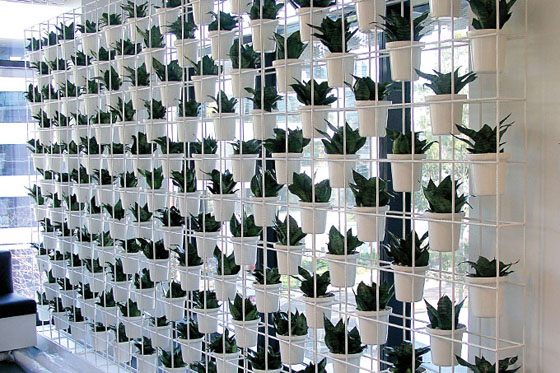
There are more than a few products popping up that can be used for DIY green walls at home, ranging from the cheap and simple to the complex and often quite pricey. A few options are pictured below (or just type green wall or vertical garden into Youtube and go nuts!)
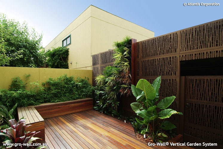
{Gro-Wall Vertical Garden System}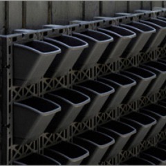
{Greenwall Australia’s Vertigro Home or Pro}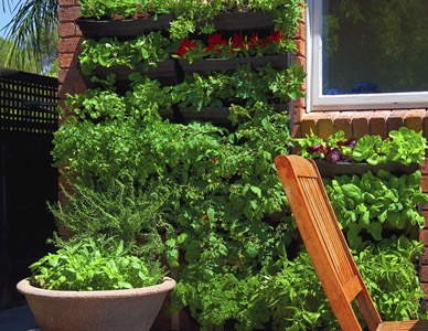
{Wallgarden’s DIY Vertical Garden, also available at Lushe}
Urbio Urban Vertical Garden is another Kickstarter project (like the previously blogged about LIFX globe). I love the simple design and the adaptability of this product. Swap out the plants for some magazines or books if they need a little outside time in the sunshine.
{Urbio Urban Vertical Garden on Kickstarter}
There are so many benefits to using green walls in design, including but not limited to:
▪ Improved air quality and reduction of odours; ▪ Improved well-being with the visual link to nature and the outdoors; ▪ Visual aesthetic of a living decoration; ▪ Supply of fresh, edible produce - herbs, fruit, vegetables, flowers; ▪ Protection from wind, heat and light; ▪ Thermal Insulation and shading; ▪ Noise buffering; and more I am sure.
Have you seen any green walls out there that blew your mind? Or used any products or DIYs for your own vertical green wall? Let us know below and share the love!
xo Romona
Rug luck
While work at Woodhead in Perth was very rewarding in most ways, it also paid off with an employee of the month prize, giving me my first official free rug. A delicious turquoise shag rug. This rug is quite famous among family and friends. It has travelled the world. Tufts and strands and small samples of it were found in Paris hotels, Russian bars, our previous apartment’s lobby in Docklands, all around Perth and Melbourne and Sydney and Brisbane. Hitching a ride on shoes and suitcases and anything it can get on. Somehow, with all the fluff that we found around the place and in the vacuum cleaner, it still managed to survive and look quite fresh. Now ten years later, he has since moved on to another good home courtesy of Gumtree and is hopefully still managing to get in some travel.
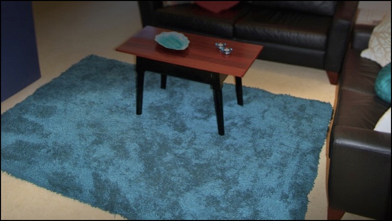
{First of the freebies: Turquoise Shag rug and Upcycled Coffee Table}
The next rug in the saga I am still desperately in love with. A competition entry (of which I am sure by now you have realised I am quite fond of) lead to me winning this beautiful rug from Designer Rugs’ Saffron Collection. I went to the showroom in St Kilda to pick her out. The smoky greys and stand-out teal of the Bowral (in cement) spoke to me. Loved the Asian and botanical influence in the pattern, without being too in-your-face florally. Although I am sure, if the budget of the prize had allowed, I would have gone for one of their stunning Akira Isogawa collaborations, but the quality and look of this rug is exceptional.
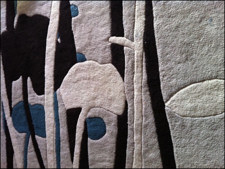
{Designer Rugs Bowral in Cement - close up of my baby}
Now to my recent win (yes I am a lucky b.arch when I see it summarised like this). Carpet Court’s love the look competition let me pick from their Artizen collection. It looks hardy and family friendly, without sacrificing style. With a two year old and a bub just starting solids, cleanability is a big plus. The below image is from their page, but I’ll post one in situ once I get it.
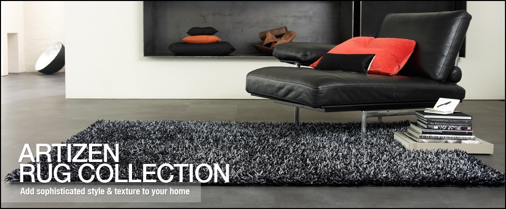
{Image courtesy of Carpet Court}
In revision, it reads like a brag board, all “look at me, how lucky am I”. But the point I was eventually going to make was that everyone can create style and beauty in their home without spending a lot of money. Sure, not everyone wins their furniture or accessories, but with bountiful resources out there like eBay, Gumtree and even curb-side pickups, there is no excuse not to be creative and have fun with your interiors. The gazillion tutorials on Pinterest and Youtube for DIY of Ikea and other similarly cheap starting blocks, means that anyone can now have a designer home.
The coffee table in the first photo with our since-passed turquoise rug was made from a found and refurbished hall table cut down to size, then re-topped with sanded, buffed, polished and varnished jarrah fence pickets. My eldest has a cool industrial hanger for his jackets (yes plural, at least ten that fit - he is a Melbourne boy!) from another curb-side pickup find, relieved of its rust and sprayed fire engine red. Our outdoor table is someone’s old dining table sanded and oiled, with legs painted a bright Santorini blue. Actually, looking at the photo again, I think its time to stain the top of that outdoor table - or stop ignoring the tired old decking and give them a good oil too.
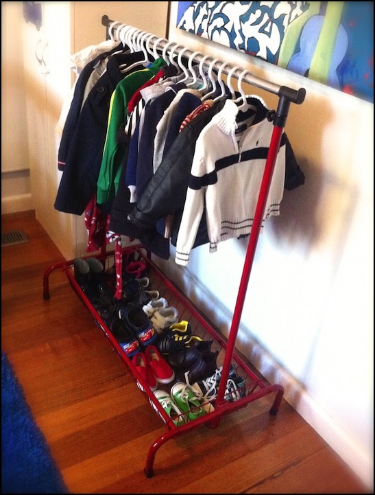
{Upcycled Coat Rack - Refurbished Road Side treasure}
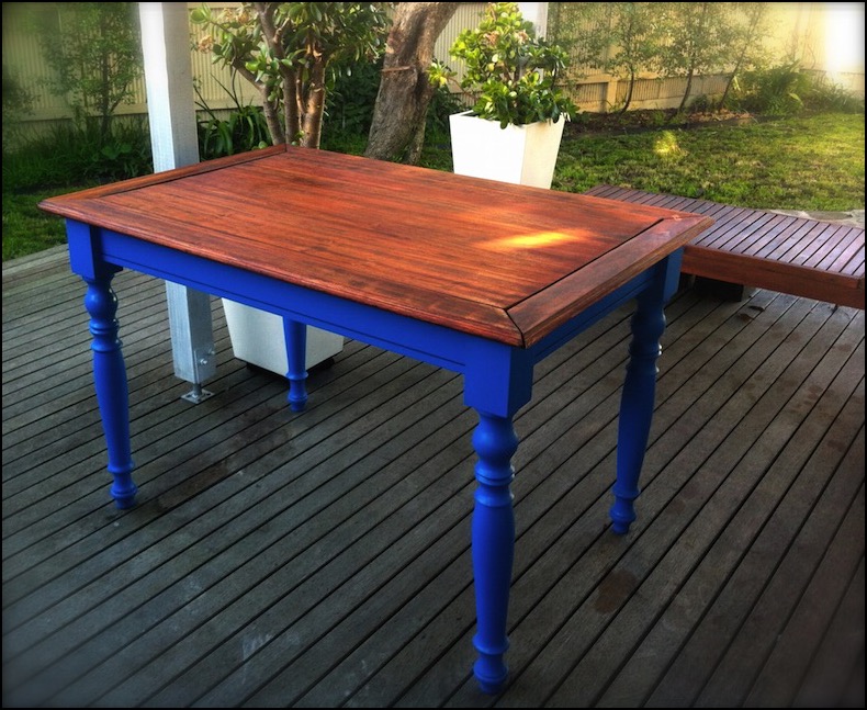
{Upcycled Outdoor table - Refurbished Road Side treasure}
With a bunch of cool finds, a little inspiration and a bit more perspiration you can create almost anything. Also, when you’ve paid nothing (or next to nothing) for it, you’ll be less precious about mixing it up and changing things around every so often.
And if all else fails, enter a few competitions and see how you go. You can’t complain if you don’t give it a go.
xo Romona
![]()